The Future of Web Dev
The Future of Web Dev
Schema-First Form Generator for Svelte – autoform-svelte
Generate schema-driven forms in Svelte with autoform-svelte. Use zodAdapter, field metadata, and shadcn-svelte for styled output.
autoform-svelte is a schema-first form generator for Svelte that creates complete, interactive forms directly from a JSON Schema or Zod schema definition.
It reads your schema at runtime, maps each field type to the correct HTML control, and binds form state through Svelte 5’s $state reactive primitive. No manual field wiring is needed.
Features
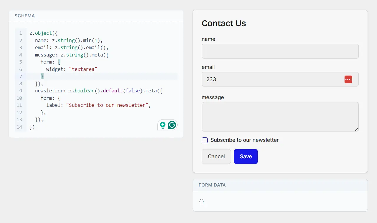
🔌 Adapter-Based Schema Support: Ships with zodAdapter for Zod v4 and jsonSchemaAdapter for plain JSON Schema.
🎛️ Field Metadata API: Attach a .meta({ form: { ... } }) block to any Zod field to override the label, placeholder, widget type, or object key ordering.
🎨 Theming System: The native HTML theme works without configuration. The shadcn-svelte theme wires your existing shadcn component imports into the renderer through createShadcnTheme().
🌐 Global Theme Provider: Wrap multiple <Autoform> instances in <AutoformProvider> to apply a shared theme and adapter across all forms.
📋 Zod Type Coverage: Renders text inputs, number inputs, checkboxes, select dropdowns, grouped object fields, arrays with add/remove controls, discriminated unions as variant switchers, and datetime pickers.
🔑 Dynamic Key-Value Fields: .catchall() and z.record() types render as editable key-value pair lists.
✅ Event-Based Validation: Fires a submit event with bound data on success, an error event with a string array on validation failure, and a cancel event on dismissal.
🔢 Bindable Data Object: The data prop binds two-way to a $state variable.
Use Cases
- Admin Panels: Generate forms for managing resources where schemas already exist, such as content models or user profiles.
- Settings Pages: Build configuration interfaces from JSON schemas that define available options and defaults.
- CRUD Workflows: Create, update, and delete forms driven by backend data models expressed as schemas.
- Dynamic Forms: Render forms based on user‑selected schemas, for example in form builders or survey tools.
How to Use It
Table Of Contents
Installation
Install the core package with your package manager.
bun install autoform-svelteIf your project uses Zod schemas, install Zod separately.
bun install zodBasic Usage with JSON Schema
The <Autoform> component accepts a raw JSON Schema object. The jsonSchemaAdapter is the default, so no adapter prop is required.
<script lang="ts">
  import { Autoform } from "autoform-svelte";
  const schema = {
    type: "object",
    properties: {
      username: { type: "string" },
      age: { type: "number" },
      active: { type: "boolean" },
    },
    required: ["username"],
  };
  let data = $state({ username: "", age: 0, active: false });
</script>
<Autoform
  {schema}
  bind:data
  onsubmit={(e) => console.log("submitted", e.detail.data)}
  oncancel={() => console.log("cancelled")}
/>
Usage with Zod
Import zodAdapter and pass it to the adapter prop. Define your schema as a standard Zod object.
<script lang="ts">
  import { Autoform } from "autoform-svelte";
  import { zodAdapter } from "autoform-svelte/adapters/zod";
  import { z } from "zod";
  const schema = z.object({
    email: z.string().email(),
    subscribe: z.boolean().default(false),
    role: z.enum(["admin", "editor", "viewer"]),
  });
  let data = $state({
    email: "",
    subscribe: false,
    role: "viewer",
  });
</script>
<Autoform
  {schema}
  adapter={zodAdapter}
  bind:data
  title="User Settings"
  submitLabel="Save Settings"
  onsubmit={(e) => console.log("saved", e.detail.data)}
  onerror={(e) => console.error("errors", e.detail.errors)}
/>
Custom Adapter
Use createCustomAdapter() when your schema library can serialize its schema to a plain JSON-compatible object.
import { createCustomAdapter } from "autoform-svelte";
const myAdapter = createCustomAdapter((schema) => schema.toJSON());
Pass myAdapter to the adapter prop on any <Autoform> instance.
Field Metadata
Attach a .meta() block to individual Zod fields to control widget type, label text, and placeholder copy.
import { z } from "zod";
const schema = z.object({
  bio: z.string().meta({
    form: {
      label: "About You",
      widget: "textarea",
      placeholder: "Write a short bio",
    },
  }),
  age: z.number().meta({
    form: {
      label: "Your Age",
      placeholder: "e.g. 28",
    },
  }),
});
To allow reordering of object keys in the rendered form, set reorderable: true on the object type.
const schema = z.object({
  title: z.string(),
  body: z.string(),
}).meta({
  form: {
    reorderable: true,
  },
});
Theming: Native HTML (Default)
The native theme renders plain HTML elements with no additional setup. Pass only the schema and event handlers.
<Autoform schema={jsonSchema} onsubmit={handleSubmit} />Theming: shadcn-svelte
Create a theme file that imports your shadcn-svelte components and passes them to createShadcnTheme().
// src/lib/theme.ts
import { createShadcnTheme } from "autoform-svelte/themes/shadcn";
import { Button } from "$lib/components/ui/button";
import { Input } from "$lib/components/ui/input";
import { Textarea } from "$lib/components/ui/textarea";
import { Checkbox } from "$lib/components/ui/checkbox";
import { Label } from "$lib/components/ui/label";
import * as Select from "$lib/components/ui/select";
import * as Card from "$lib/components/ui/card";
import * as Field from "$lib/components/ui/field";
export const shadcnTheme = createShadcnTheme({
  Button,
  Input,
  Textarea,
  Checkbox,
  Label,
  Field,
  Select,
  Card,
});
Pass the theme to a single form instance with the theme prop.
<script lang="ts">
  import { Autoform } from "autoform-svelte";
  import { zodAdapter } from "autoform-svelte/adapters/zod";
  import { shadcnTheme } from "$lib/theme";
  import { z } from "zod";
  const schema = z.object({
    name: z.string().min(1),
    notes: z.string().optional(),
  });
  let data = $state({ name: "", notes: "" });
</script>
<Autoform
  {schema}
  adapter={zodAdapter}
  theme={shadcnTheme}
  bind:data
  onsubmit={(e) => console.log(e.detail.data)}
/>
Global Theme with AutoformProvider
Wrap multiple forms in <AutoformProvider> to set a shared theme and adapter at the top level. Each child <Autoform> inherits the provider’s configuration.
<script lang="ts">
  import { Autoform, AutoformProvider } from "autoform-svelte";
  import { zodAdapter } from "autoform-svelte/adapters/zod";
  import { shadcnTheme } from "$lib/theme";
  import { userSchema, settingsSchema } from "$lib/schemas";
  let userData = $state({});
  let settingsData = $state({});
</script>
<AutoformProvider theme={shadcnTheme} adapter={zodAdapter}>
  <Autoform schema={userSchema} bind:data={userData} onsubmit={handleUser} />
  <Autoform schema={settingsSchema} bind:data={settingsData} onsubmit={handleSettings} />
</AutoformProvider>
API Reference
Props
| Prop | Type | Default | Description |
|---|---|---|---|
schema | unknown | required | The schema object the adapter parses |
adapter | SchemaAdapter | jsonSchemaAdapter | Schema-to-field-tree converter |
data | Record<string, any> | {} | Bindable two-way form data object |
title | string | — | Optional heading rendered above the form |
submitLabel | string | "Save" | Text on the submit button |
cancelLabel | string | "Cancel" | Text on the cancel button |
theme | AutoformTheme | nativeTheme | UI component theme |
Events
| Event | Payload | Description |
|---|---|---|
submit | { data } | Fires after the form passes validation |
cancel | — | Fires when the cancel button is clicked |
error | { errors: string[] } | Fires when validation fails; carries an array of error strings |
Supported Zod Types
| Zod Type | Rendered Control |
|---|---|
z.string() | Text input (default); textarea via form.widget metadata |
z.number() | Number input |
z.boolean() | Checkbox |
z.enum([...]) | Select dropdown |
z.object({...}) | Grouped field section |
z.array(...) | List with add and remove controls |
z.discriminatedUnion(...) | Variant switcher |
z.string().datetime() | Date/time picker |
.catchall() / z.record() | Editable key-value pair list |
Field Metadata Keys
| Key | Type | Default | Description |
|---|---|---|---|
form.widget | "input" | "textarea" | "input" | Widget override for string fields |
form.label | string | — | Overrides the auto-generated field label |
form.placeholder | string | — | Placeholder text for input, textarea, select, date, and number controls |
form.reorderable | boolean | false | Adds key reordering controls to object fields |
Related Resources
- Svelte: The component framework that autoform-svelte targets.
- Zod: TypeScript-first schema validation library.
- shadcn-svelte: Svelte port of shadcn/ui.
- JSON Schema: Open standard for describing data structures.
- 10 Best Form Builder Plugins To Generate Forms From JSON Data
FAQs
Q: How do I handle a field that is conditionally required?
A: Use Zod’s .superRefine() or a z.discriminatedUnion() at the schema level. The discriminated union type renders as a variant switcher, so the form shows only the fields relevant to the active variant.
Q: Can I add custom field components outside of the shadcn-svelte theme?
A: Use createCustomAdapter() to intercept schema nodes, and build your own theme object that maps field types to your component implementations. The theming API is not restricted to shadcn-svelte; any Svelte component set works as long as it conforms to the AutoformTheme interface.
Q: What happens when validation fails?
A: The form fires an error event with { errors: string[] }. Each string in the array corresponds to a failed validation rule. No submit event fires until all validation rules pass.
Q: Is <AutoformProvider> required for a single form?
A: No. Pass theme and adapter directly to the <Autoform> component for single-form usage. <AutoformProvider> exists only to avoid repeating those props across multiple form instances in the same component tree.