The Future of Web Dev
The Future of Web Dev
Animated UI Component Library With Framer Motion and Three.js – MeetUI
An animated UI component library built with Framer Motion, Tailwind CSS, and Three.js. Copy components directly into your Next.js project.
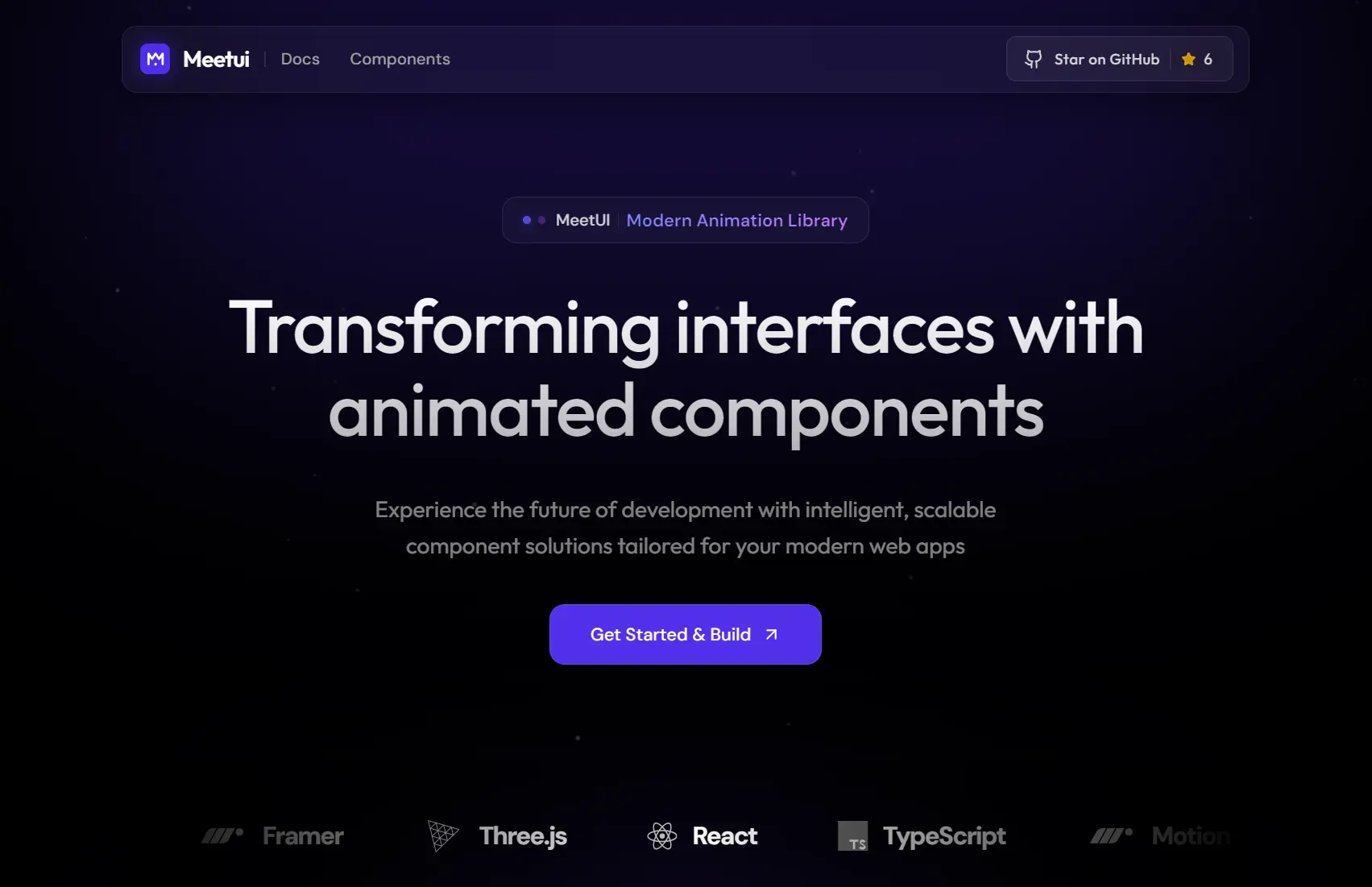
MeetUI is an animated UI component library built on Next.js 15+ (App Route), Tailwind CSS v4, React Three Fiber, and Framer Motion.
Each component lands in your project as editable source code. You own every file and can modify styling, animation timing, and layout at will.
Features
🗂️ Copy-Paste: Components arrive as source files. You copy the code and drop it into your src/components/ui/ directory.
🎞️ Motion Animations: All motion effects run through Framer Motion, including text reveals, card transitions, cursor interactions, and scroll-triggered effects.
🧊 React Three Fiber: 3D components use @react-three/fiber and @react-three/drei for Three.js rendering directly inside React.
🎨 Tailwind CSS Theming: Colors and typography tokens live inside @theme {} blocks in your CSS file.
🔷 TypeScript: Every component ships with full type definitions.
📐 Next.js 15 App Router Structure: The project follows the App Router file structure with pages and layouts inside src/app/.
Use Cases
- Marketing Sites: Add scroll-triggered text animations and magnetic cursor effects to landing pages.
- Portfolio Showcases: Use the staggered testimonials and hover galleries to display work samples.
- Interactive Dashboards: Implement animated counters and glow cards for metric displays.
- Experimental Projects: Combine the orbit ecosystem with 3D elements for creative coding experiments.
How to Use It
1. Install core dependencies. You can swap npm for yarn, pnpm, or bun based on your preference.
npm install framer-motion clsx tailwind-merge lucide-react2. Components that use Three.js rendering, such as fluid toggles or particle-based effects, need additional packages:
npm install @react-three/fiber @react-three/drei three3. Browse the MeetUI component library and copy the source code for the component you want. Paste the file into your src/components/ui/ directory. For example, if you copy the GlowCard component, the file would go here:
src/
└── components/
    └── ui/
        └── glow-card.tsx
4. Once the file is in place, import it directly from your components path:
import { GlowCard } from "@/components/ui/glow-card"
export default function HomePage() {
  return (
    <main>
      <GlowCard>
        <h2>Project Title</h2>
        <p>Short description of this project.</p>
      </GlowCard>
    </main>
  )
}
5. MeetUI reads color and typography tokens from your globals.css. Open that file and add your @theme block:
@theme {
  --color-primary: oklch(0.637 0.237 311);
  --color-secondary: oklch(0.541 0.281 293);
  --color-accent: oklch(0.685 0.169 237);
  --font-heading: "Inter", sans-serif;
  --font-mono: "JetBrains Mono", monospace;
}
Change any token value and every component that references it updates automatically. You can define as many tokens as your design system needs.
Components Included
Text Animations
| Component | Description |
|---|---|
| Blur Reveal | Text fades in from a blurred state |
| Stretch Text | Characters stretch horizontally on reveal |
| Split Text Reveal | Lines or words split apart on entry |
| Typewriter Text | Characters appear sequentially, typewriter style |
| Morphing Text | One text string morphs into another |
| Scroll Fill Text | Text fills with color as you scroll |
| Shatter Text | Text breaks into fragments on trigger |
| Gooey Text | Characters merge with a gooey liquid effect |
| Text Underline | Animated underline draw on hover or scroll |
| Sparkles Text | Sparkle particles scatter around text |
| Rubber Band Text | Characters snap with a rubber band physics feel |
| Spotlight Text | A light beam scans across the text |
| Pattern Text | Text fills with a repeating pattern texture |
| Hyper Text | Characters scramble and resolve into readable text |
| Stacked Block Text | Text blocks stack and shift on scroll |
UI Components
| Component | Description |
|---|---|
| Liquid Text Hover | Text distorts with a liquid effect on hover |
| Mask Text Hover | A mask reveals text on cursor entry |
| Zajno Text Hover | Letter-level hover distortion effect |
| Looping Words | Words cycle through in a continuous loop |
| Staggered Testimonials | Testimonial cards animate in with stagger timing |
| Glass Toggle | A frosted glass toggle switch with 3D depth |
| Animated Counter | Numbers count up on scroll or trigger |
| Marquee | Horizontal ticker with configurable speed |
| Stacked Carousel | Cards stack and fan out in a carousel layout |
| Highlight Gallery | Gallery with highlight or spotlight on hover |
| Stacked Info Cards | Cards stack with depth and spread on interaction |
| Bouncing Loader | Dots or elements bounce in a loader pattern |
| Glow Card | Card with a radial glow that follows the cursor |
| Content Reveal Card | Card reveals content on hover with a masked transition |
| Wave Card | Card border animates in a wave pattern |
| Luminous Card | Card with a luminous light-bleed effect |
| Social Clock | Clock face built from social media iconography |
| Follow Eyes | Eye elements that track the cursor |
| Floating Tech Stack | Tech icons float in a layered arrangement |
| Isometric Tech Grid | Tech icons arranged in an isometric grid |
| Hover Name Gallery | Gallery items reveal names on hover |
| Social Icon Hover | Social icons animate and scale on hover |
| Text Image Reveal | An image reveals beneath text on hover |
| Full Screen Menu | A full viewport overlay navigation |
| Interactive Hover Menu | Menu items react to cursor proximity |
| Floating Tilt Tags | Tags tilt in 3D on hover |
| Morphing Card Stack | A stack of cards morphs between states |
| Testimonials Split | Testimonials split across two columns with motion |
| Orbit Ecosystem | Elements orbit a central point continuously |
Mouse Interactions
| Component | Description |
|---|---|
| Magnetic Cursor | The cursor snaps toward interactive elements |
| Click Ripple | A ripple wave expands from each click point |
| Aurora Cursor | A colorful aurora trail follows the cursor |
| Shooting Star | A shooting star effect trails cursor movement |
| Ring Cursor | A circular ring follows the cursor with spring physics |
| Pixel Cursor Trail | Pixel squares trail behind cursor movement |
Buttons
| Component | Description |
|---|---|
| Shiny Button | Button with an animated sheen sweep on hover |
| Drawer Button | Button that expands a drawer panel on click |
| Splash Button | Button triggers a splash or burst effect on click |
Related Resources
- Framer Motion: The animation library that backs MeetUI’s motion effects,.
- React Three Fiber: The React renderer for Three.js used by MeetUI’s 3D components.
FAQs
Q: Do I need the full project repository to use MeetUI components?
A: No. You copy individual component files from the MeetUI site and paste them into your own project.
Q: Can I use MeetUI components in an existing Next.js project?
A: Yes. Copy the component file into your src/components/ui/ directory, install any listed peer dependencies, and import the component wherever you need it.
Q: What if I only need standard React without Next.js?
A: MeetUI components are React files. They work in any React setup as long as you install Framer Motion and the other required packages.
Q: How do I add a new component to the registry?
A: The docs/ADDING_COMPONENTS.md file in the repository covers this process. The registry stores component metadata and code strings inside src/lib/components-data/.