The Future of Web Dev
The Future of Web Dev
Copy-Paste UI Component Library for Next.js with Base UI and Tailwind – 9ui
A collection of customizable components built with Base UI & Tailwind CSS. Copy, paste, and tailor to your Next.js project.
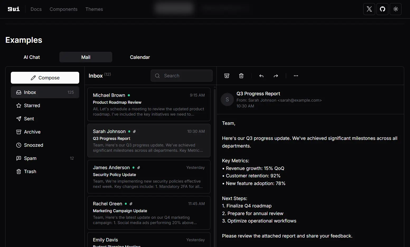
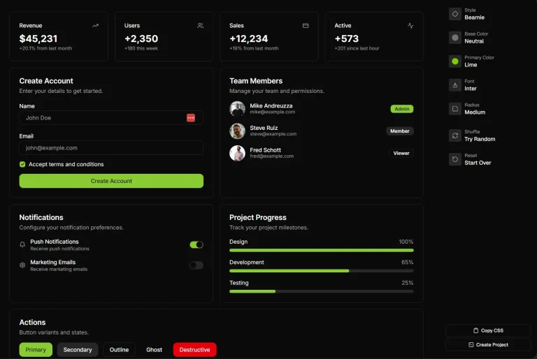
9ui is a collection of 40+ customizable UI components for Next.js & React apps, built with Base UI and Tailwind CSS.
Unlike traditional libraries that require npm installation, 9ui lets you select the components you need and copy/paste them directly to your project.
Features
🧩 Copy-paste implementation – No npm installation required.
⚙️ Over 40 customizable components – From basic UI elements to complex interactive widgets.
🖌️ Semantic color tokens – Theme system with practical color applications.
🎨 Built with Base UI and Tailwind CSS – Combines accessibility with styling flexibility.
🔍 Built-in accessibility – Leverages Base UI’s accessible foundation.
🌓 Dark mode support – Ready for light and dark interfaces.
Use Cases
- Rapid Prototyping: Quickly assemble UIs for new projects or features by copying needed components.
- Custom Design Systems: Build a unique design system where full control over component styling is paramount.
- Integrating with Existing Tailwind Projects: Add pre-built, yet customizable, components to applications already using Tailwind CSS.
- Learning Headless UI Concepts: Explore how headless components (Base UI) and utility-first CSS (Tailwind) can work together.
- Projects Requiring Specific Styling: Ideal for projects where standard component library designs do not fit the brand or user experience goals.
Installation
1. Setup shadcn: Follow the official shadcn installation guide to prepare your project.
2. Install Base UI: Add Base UI components to your project using npm:
npm install @base-ui-components/react3. Add Root Class: Modify your application’s layout file (e.g., layout.tsx) to include the Root class:
// layout.tsx
<body>
  <div className="Root">{children}</div>
</body>
4. Update globals.css: Add the necessary Base UI styles to your global CSS file:
/* globals.css */
@tailwind base;
@tailwind components;
@tailwind utilities;
/* Existing code */
@layer base {
  .Root {
    @apply bg-background isolate;
  }
}
5. Add 9ui Theme: Integrate the 9ui theme into your project using the shadcn CLI:
npx shadcn@latest add "https://9ui.dev/r/theme.json"Usage
Here is an example of how to add and use the Accordion component.
Installation via CLI:
Use the shadcn CLI to add the accordion component to your project:
npx shadcn@latest add https://9ui.dev/r/accordion.jsonThis command will add the accordion files to your components/ui directory (or your configured components path).
Example: Accordion Component
Create a file, for instance accordion-demo.tsx, and use the imported Accordion components:
// accordion-demo.tsx
import {
  Accordion,
  AccordionContent,
  AccordionItem,
  AccordionTrigger,
} from "@/components/ui/accordion"; // Adjust path if necessary
export function AccordionDemo() {
  return (
    <Accordion className="mx-auto w-96" orientation="vertical">
      <AccordionItem value="item-1">
        <AccordionTrigger>Is it an accordion?</AccordionTrigger>
        <AccordionContent>
          Yes, it is an accordion. It is a component that allows you to collapse
          and expand content.
        </AccordionContent>
      </AccordionItem>
      <AccordionItem value="item-2">
        <AccordionTrigger>Is it animated?</AccordionTrigger>
        <AccordionContent>
          Yes, it is animated. The component supports collapse and expand animations.
        </AccordionContent>
      </AccordionItem>
      <AccordionItem value="item-3">
        <AccordionTrigger>Is it customizable?</AccordionTrigger>
        <AccordionContent>
          Yes, it is customizable. You can modify its appearance and behavior.
        </AccordionContent>
      </AccordionItem>
    </Accordion>
  );
}
Related Resources
- Base UI: The headless component library that 9ui is built upon. It provides unstyled, accessible UI primitives. Base UI Documentation
- Tailwind CSS: A utility-first CSS framework used for styling 9ui components. Tailwind CSS Documentation
- shadcn/ui: The project that inspired 9ui’s approach to component distribution and CLI usage. Many concepts are similar. shadcn/ui Website
- Lucide Icons: The default icon library used in 9ui components. Lucide Icons Website
FAQs
Q: How do I customize the appearance of 9ui components?
A: You customize components by directly editing their code after adding them to your project. You can apply Tailwind CSS utility classes and modify the component structure as needed. Theming is also supported via CSS variables.
Q: Why can’t I install 9ui components via npm?
A: 9ui adopts a copy-and-paste methodology. This gives you full ownership and control over the component code within your project, facilitating deeper customization than typical npm packages might allow.
Q: What are the benefits of using OKLCH for colors in 9ui’s theming?
A: OKLCH offers a wider color gamut, better color interpolation for smoother transitions, and perceptual uniformity, which results in more natural-looking color variations in your theme.