The Future of Web Dev
The Future of Web Dev
Full-Featured React/Next.js Calendar Library – ilamy Calendar
React/Next.js calendar library with month, week, day, and resource views. Handles RRULE patterns, event dragging, and internationalization.
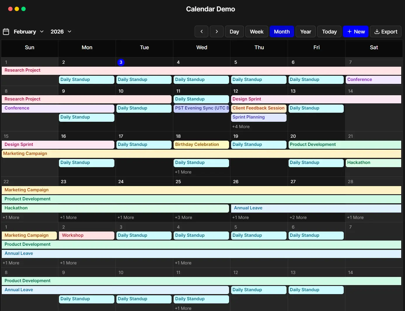
ilamy Calendar is a React/Next.js alternative to FullCalendar that creates feature-rich calendars with scheduling, event management, and recurring appointments.
It processes recurring events using RRULE patterns from RFC 5545, the same standard Google Calendar follows. Define a recurrence rule, and the library generates event instances across your calendar views.
Each view type (month, week, day, year, resource) renders these instances according to the schedule you configure. The library also exports iCalendar files with full RRULE support.
ilamy Calendar separates event data from presentation. You can pass an array of event objects with start dates, end dates, and optional recurrence rules. The calendar renders these events across multiple view types while handling drag-and-drop operations, timezone conversions, and locale formatting.
Features
🌍 Internationalization: Support for 100+ locales through dayjs library.
🎨 Customizable Styling: Extend default styles through Tailwind CSS classes and CSS variables.
⚡ Performance Optimized: Generate recurring events on demand for visible date ranges.
📱 Responsive Design: Layouts adapt to desktop, tablet, and mobile viewports.
🎛️ Advanced Event Management: Handle all-day events with timezone awareness, position multi-day events across calendar cells, validate event data before rendering, and perform batch updates on multiple events.
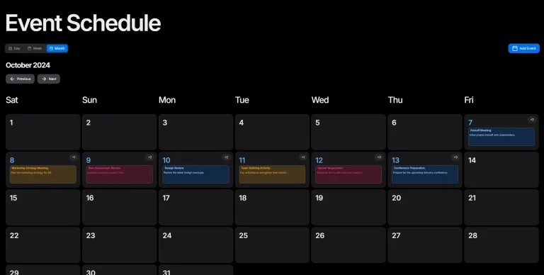
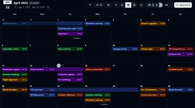
🗓️ Multiple Views: Month, Week, Day, and Year views display events across different time scales.
📊 Resource Calendar: Timeline layout visualizes events across multiple resources.
🎯 Drag and Drop: Move events between dates and time slots.
🔄 RFC 5545 Recurring Events: Define daily, weekly, monthly, or yearly patterns with custom frequencies, edit individual instances or entire series, and handle exceptions through EXDATE exclusions.
📤 iCalendar Export: Generate RFC 5545 compliant .ics files.
Use Cases
- Team Scheduling Dashboard: Build a resource view that shows meeting rooms or team member availability across a week. Handle recurring team meetings and drag events to reschedule.
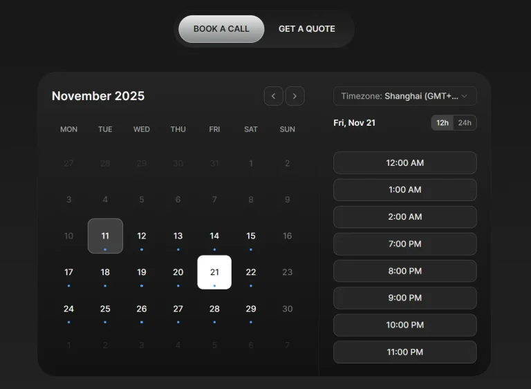
- Appointment Booking System: Create a day view for service appointments with 15-minute time slots. Export customer schedules as iCalendar files for their calendar apps.
- Project Timeline Tracker: Display project milestones and deadlines in a month view. Set recurring status check meetings and track multi-day events across sprints.
- Event Management Platform: Manage conference schedules with multiple tracks across different rooms. Export session schedules and handle speaker conflicts through the resource view.
How to Use It
Table Of Contents
Installation
Install the library through npm, pnpm, yarn, or bun.
# Yarn
$ yarn add @ilamy/calendar
# NPM
$ npm install @ilamy/calendar
# PNPM
$ pnpm install @ilamy/calendar
# BUN
$ bun add @ilamy/calendar
Configure Tailwind CSS
Register the calendar package source path in your CSS file. Tailwind v4 needs to scan the package directory to include component classes in your build.
Add this directive to your global CSS file:
@source "../node_modules/@ilamy/calendar/dist";This tells Tailwind to process the calendar package files. Without this configuration, component styles will not appear in your application.
Configure Day.js (Optional)
If you already use Day.js as a dependency, extend it with required plugins. The calendar needs these plugins for date manipulation and timezone handling.
Create a configuration file:
import dayjs from 'dayjs';
import isSameOrAfter from 'dayjs/plugin/isSameOrAfter.js';
import isSameOrBefore from 'dayjs/plugin/isSameOrBefore.js';
import timezone from 'dayjs/plugin/timezone.js';
import utc from 'dayjs/plugin/utc.js';
dayjs.extend(isSameOrAfter);
dayjs.extend(isSameOrBefore);
dayjs.extend(timezone);
dayjs.extend(utc);
Load this configuration early in your application entry point (main.tsx, index.tsx, or _app.tsx).
Basic Implementation
Import the calendar component and render it with an events array.
import { IlamyCalendar } from '@ilamy/calendar';
export default function MyCalendar() {
  return (
    <div className="p-6">
      <IlamyCalendar />
    </div>
  );
}
Working with Events
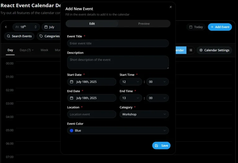
Define events using the CalendarEvent interface. Each event requires an id, title, start date, and end date.
import { IlamyCalendar } from '@ilamy/calendar';
const events = [
  {
    id: '1',
    title: 'Team Meeting',
    start: new Date('2024-01-15T10:00:00'),
    end: new Date('2024-01-15T11:00:00'),
    description: 'Weekly team sync',
    backgroundColor: '#3b82f6',
    color: 'black'
  },
  {
    id: '2',
    title: 'Project Deadline',
    start: new Date('2024-01-20T23:59:59'),
    end: new Date('2024-01-20T23:59:59'),
    allDay: true,
    backgroundColor: '#ef4444',
    color: 'black'
  }
];
function MyCalendar() {
  return (
    <IlamyCalendar events={events} />
  );
}
Next.js Integration
Mark your calendar component with the ‘use client’ directive. Next.js requires this for components that use client-side interactivity.
'use client';
import { IlamyCalendar } from '@ilamy/calendar';
import { useState } from 'react';
export default function CalendarPage() {
  const [events, setEvents] = useState([]);
  return (
    <IlamyCalendar
      events={events}
      onEventAdd={(event) => setEvents([...events, event])}
      onEventUpdate={(updatedEvent) => {
        setEvents(events.map(e => e.id === updatedEvent.id ? updatedEvent : e));
      }}
    />
  );
}
Astro Integration
Use the client:only directive when embedding the calendar in Astro. The calendar component requires full client-side rendering.
---
import { CalendarDemo } from '../components/calendar-demo';
---
<CalendarDemo client:only="react" />
Do not use client:load or client:idle directives. These render modes cause issues with the calendar’s event handling system.
Recurring Events
Define recurring events using RRULE patterns. The library generates event instances based on your recurrence rules.
const recurringEvent = {
  id: '3',
  title: 'Daily Standup',
  start: new Date('2024-01-15T09:00:00'),
  end: new Date('2024-01-15T09:15:00'),
  rrule: 'FREQ=DAILY;BYDAY=MO,TU,WE,TH,FR',
  backgroundColor: '#10b981',
  color: 'white'
};
Edit operations on recurring events affect individual instances, following instances, or the entire series. The library tracks exceptions through EXDATE entries.
Custom Event Rendering
Replace default event display with custom components through the renderEvent prop.
function MyCalendar() {
  return (
    <IlamyCalendar
      events={events}
      renderEvent={(event) => (
        <div className="custom-event-style">
          <strong>{event.title}</strong>
          <span>{event.description}</span>
        </div>
      )}
    />
  );
}
Business Hours Configuration
Restrict event creation to specific time ranges. Define business hours as a single object or array for different schedules per weekday.
const businessHours = {
  daysOfWeek: [1, 2, 3, 4, 5],
  startTime: '09:00',
  endTime: '17:00'
};
function MyCalendar() {
  return (
    <IlamyCalendar
      events={events}
      businessHours={businessHours}
      hideNonBusinessHours={true}
    />
  );
}
Internationalization
Set locale and timezone through props. The calendar formats dates according to the specified locale.
const [locale, setLocale] = useState('en');
const [timezone, setTimezone] = useState('America/New_York');
const [calendarKey, setCalendarKey] = useState(0);
const handleLocaleChange = (newLocale) => {
  setLocale(newLocale);
  setCalendarKey(prev => prev + 1);
};
return (
  <IlamyCalendar
    key={calendarKey}
    locale={locale}
    timezone={timezone}
    events={events}
  />
);
Force a component re-render when changing locale or timezone. Day.js operates outside React’s lifecycle and needs the component to remount.
iCalendar Export
Export events to .ics files with full recurring event support. The export function generates RFC 5545 compliant calendar files.
import { exportToICalendar } from '@ilamy/calendar';
function MyCalendar() {
  const handleExport = () => {
    exportToICalendar(events, 'my-calendar.ics');
  };
  return (
    <>
      <button onClick={handleExport}>Export Calendar</button>
      <IlamyCalendar events={events} />
    </>
  );
}
API Reference
Basic Props
events (CalendarEvent[]): Array of events to display in the calendar. Default: []
initialView (‘month’ | ‘week’ | ‘day’ | ‘year’): Sets the initial view when the calendar loads. Default: ‘month’
initialDate (dayjs.Dayjs | Date | string | undefined): Sets the initial date displayed when the calendar loads. When undefined, defaults to today’s date. Default: undefined
firstDayOfWeek (‘sunday’ | ‘monday’ | ‘tuesday’ | ‘wednesday’ | ‘thursday’ | ‘friday’ | ‘saturday’): The first day of the week to display. Default: ‘sunday’
dayMaxEvents (number): Maximum number of events to display in a day cell. Default: 4
renderEvent ((event: CalendarEvent) => ReactNode): Custom function to render individual events. Default: undefined
locale (string): Locale for date formatting (e.g., “en”, “fr”, “de”). Default: ‘en’
timezone (string): Timezone for date handling (e.g., “UTC”, “America/New_York”). Default: local timezone
timeFormat (’12-hour’ | ’24-hour’): Time format for displaying times in week and day views. Default: ’12-hour’
hideNonBusinessHours (boolean): Whether to hide hours outside of business hours in day and week views. Requires businessHours configuration. Default: false
stickyViewHeader (boolean): Whether to stick the view header to the top. Default: true
viewHeaderClassName (string): Custom class name for the view header. Default: ”
headerComponent (ReactNode): Custom header component to render above the calendar. Default: null
renderCurrentTimeIndicator ((context: RenderCurrentTimeIndicatorProps) => ReactNode): Custom function to render the current time indicator line. Default: undefined
disableCellClick (boolean): Disable cell click interactions. Default: false
disableEventClick (boolean): Disable event click interactions. Default: false
disableDragAndDrop (boolean): Disable drag-and-drop functionality for events. Default: false
eventSpacing (number): Spacing in pixels between events in calendar views. Default: 2
businessHours (BusinessHours | BusinessHours[]): Restrict calendar interactions to specified days and time ranges. Supports single object or array for different hours per day. Default: undefined
renderEventForm ((props: EventFormProps) => ReactNode): Custom function to render the event form for creating and editing events. When provided, replaces the default event form. Default: undefined
classesOverride (ClassesOverride): Custom class names to override default styling for various calendar elements. Default: undefined
translations (Translations): Translations object for internationalization. If both translations and translator are provided, translator takes priority. Default: undefined
translator (TranslatorFunction): Translator function for internationalization. Takes priority over translations object if both are provided. Default: undefined
Event Handlers
onEventClick ((event: CalendarEvent) => void): Called when an event is clicked. Default: undefined
onCellClick ((info: CellClickInfo) => void): Called when a date cell is clicked. Receives CellClickInfo object with start, end, and optional resourceId. Default: undefined
onViewChange ((view: ‘month’ | ‘week’ | ‘day’ | ‘year’) => void): Called when the calendar view changes. Default: undefined
onEventAdd ((event: CalendarEvent) => void): Called when a new event is created. Default: undefined
onEventUpdate ((event: CalendarEvent) => void): Called when an existing event is updated. Default: undefined
onEventDelete ((event: CalendarEvent) => void): Called when an event is deleted. Default: undefined
onDateChange ((date: dayjs.Dayjs) => void): Called when the calendar date changes. Default: undefined
Related Resources
- React Big Calendar: Handles event scheduling with Google Calendar-style views and drag-and-drop support for React applications.
- React Calendar: Provides a lightweight date picker and calendar component with minimal dependencies for React projects.
- Tui Calendar: Displays weekly and monthly schedules with drag-and-drop event management and timezone support.
FAQs
Q: Does the calendar support drag and drop by default?
A: The calendar includes drag-and-drop support that activates automatically. Set the disableDragAndDrop prop to true to turn it off.
Q: How do I handle timezone changes during runtime?
A: Day.js operates outside React’s lifecycle. When you change the timezone prop, force a component re-render by updating the key prop. This makes Day.js reinitialize with the new timezone setting.
Q: Can I customize how events render in the calendar?
A: Pass a custom function to the renderEvent prop. Your function receives each event object and returns a React component. This replaces the default event display while keeping calendar layout and interaction behavior.
Q: How do recurring events work with exports?
A: The iCalendar export function writes RRULE definitions directly to .ics files. Calendar applications that read these files generate event instances based on the recurrence rules you defined.
Q: How do I add custom styles to events?
A: Add a color or backgroundColor property to your event objects. You can also use the renderEvent prop for custom JSX.