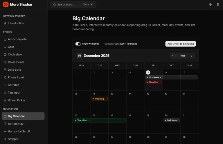
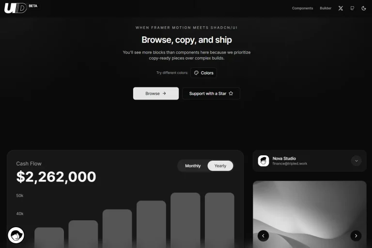
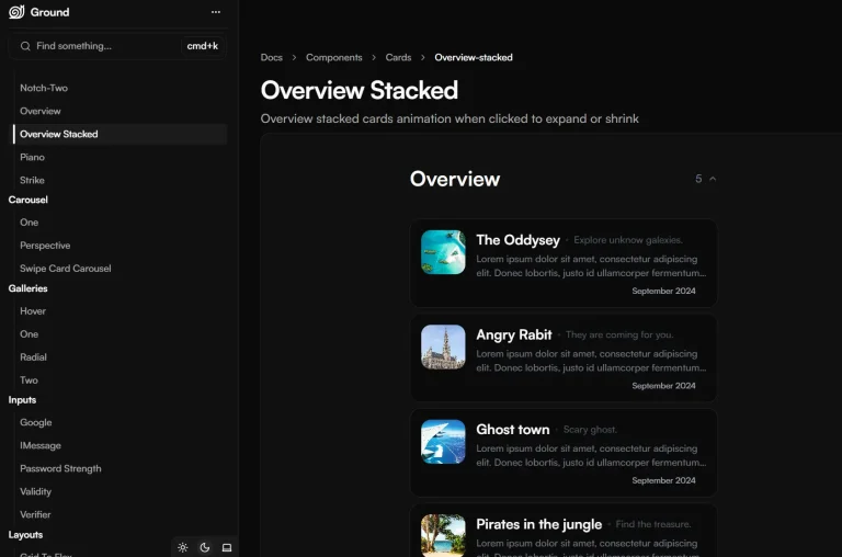
Bundui is a curated collection of pre-built animated UI components and layout blocks built with React, Tailwind CSS, and Motion.
You can use these UI components to add life and motion to your web applications without building animations from scratch.
Features
🎨 Copy-Paste Ready Components – Drop components directly into your projects without modification,
📱 Responsive Design – Components adapt to different screen sizes automatically,
🔧 TypeScript Support – Full type safety and IntelliSense support,
🎯 shadcn/ui Compatible – Integrates with shadcn/ui ecosystem,
🚀 CLI Installation – Quick setup with command-line interface,
🎭 Rich Animation Library – Includes tilt effects, morphing text, gradient animations, and more,
Use Cases
- Landing Pages – Create eye-catching hero sections with animated gradients, floating buttons, and dynamic backgrounds.
- Portfolio Websites – Showcase work with tilt effects, morphing text animations, and scroll progress indicators.
- E-commerce Applications – Build product cards with magnetic buttons, ripple effects, and hover animations.
- Marketing Sites – Implement marquee effects, count animations, and call-to-action sections with motion.
- Dashboard Interfaces – Add scroll progress bars, animated text, and subtle background effects for better user experience.
Installation
1. Create a new Next.js project with shadcn/ui:
npx shadcn@latest init2. Navigate to your project directory and start the development server:
cd my-app
npm run dev
3. For manual installation, install the Motion library:
npm install motionUsage
Manual Installation Method
Copy the component code directly into your project. Here’s an example with the TiltEffect component:
"use client";
import React, { useState, useRef, useEffect } from "react";
import { motion, useMotionValue, useSpring, useTransform } from "motion/react";
export type TiltEffectProps = {
  children: React.ReactNode;
  tiltFactor?: number;
  perspective?: number;
  transitionDuration?: number;
};
export const TiltEffect: React.FC<TiltEffectProps> = ({
  children,
  tiltFactor = 12,
  perspective = 1000,
  transitionDuration = 0.5
}) => {
  const ref = useRef<HTMLDivElement>(null);
  const [elementSize, setElementSize] = useState({ width: 0, height: 0 });
  const x = useMotionValue(0);
  const y = useMotionValue(0);
  const springConfig = { damping: 30, stiffness: 400, mass: 0.5 };
  const xSpring = useSpring(x, springConfig);
  const ySpring = useSpring(y, springConfig);
  const rotateX = useTransform(
    ySpring,
    [-elementSize.height / 2, elementSize.height / 2],
    [tiltFactor, -tiltFactor]
  );
  const rotateY = useTransform(
    xSpring,
    [-elementSize.width / 2, elementSize.width / 2],
    [-tiltFactor, tiltFactor]
  );
  // Component logic continues...
};
CLI Installation Method
Use the Bundui CLI for quick component installation:
npx shadcn@latest add https://bundui.io/r/tilt-effect.jsonRelated Resources
- Framer Motion – The animation library that powers Bundui’s motion effects
- shadcn/ui – Component library that Bundui integrates with for consistent styling
- Tailwind CSS – Utility-first CSS framework used for styling all components

