The Future of Web Dev
The Future of Web Dev
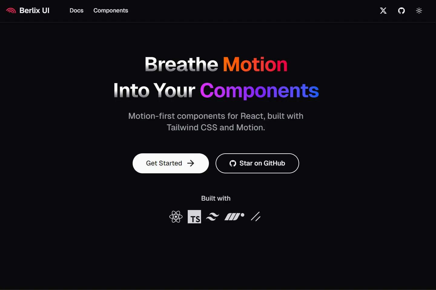
Animated UI Components with Tailwind & Framer Motion – Berlix UI
Build animated UIs with Berlix UI. A collection of minimal, motion-enhanced UI components for Next.js and React projects.
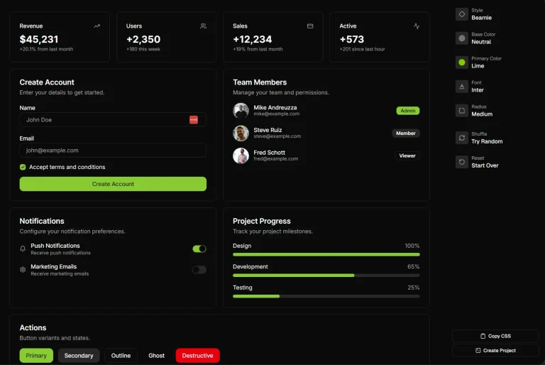
Berlix UI is a collection of animated UI components that use Tailwind CSS for styling and Framer Motion for animations.
This UI component library focuses on providing minimal, unstyled components that can be easily integrated into any design system.
Each component is fully customizable through props or by directly modifying the source code.
Features
🎨 Animation-First Design: Every component includes smooth, purposeful animations powered by Framer Motion
📋 Copy-Paste Simplicity: No installation required – components can be directly copied into projects
⚙️ CLI Integration: Compatible with shadcn/ui CLI for streamlined component management
🎯 Zero Configuration: Components work immediately without additional setup or configuration files
🎨 Tailwind CSS Foundation: Built on Tailwind CSS for consistent styling and easy customization
🔧 Full Customization: Components can be modified through props or direct code editing
📱 Framework Agnostic: Works with Next.js, React, and other React-based frameworks
🚀 Performance Optimized: Lightweight components that maintain smooth performance across devices
Use Cases
- Landing Pages: Create engaging hero sections with animated text effects like Text Reveal, Text Ripple, and Text Scramble to capture visitor attention and improve conversion rates.
- Dashboard Interfaces: Implement smooth navigation transitions using Menu Fluid and Menu Vertical components to create professional-looking admin panels and data visualization interfaces.
- E-commerce Platforms: Enhance product showcases with Flip Card and Tilt Card components to create interactive product galleries that encourage user engagement and exploration.
- Portfolio Websites: Build stunning personal or agency portfolios using animated text components and gradient effects to showcase work and skills.
- SaaS Applications: Develop impressive user interfaces with animated form elements like enhanced Checkbox and Input components to improve user experience and perceived application quality.
Installation
1. Create a new Next.js project or use an existing React application:
npx create-next-app@latest my-project
cd my-project
2. Install the required dependencies for Berlix UI functionality:
npm install motion clsx tailwind-merge
npm install tailwindcss @tailwindcss/postcss @tailwindcss/cli
3. Create or update your global CSS file with Tailwind imports and custom theme variables:
@import "tailwindcss";
@theme inline {
  --font-display: "Inter", "sans-serif";
  --color-primary-500: oklch(0.84 0.18 117.33);
  --spacing: 0.25rem;
}
4. Create a utility file for class name management:
import { ClassValue, clsx } from "clsx";
import { twMerge } from "tailwind-merge";
export function cn(...inputs: ClassValue[]) {
  return twMerge(clsx(inputs));
}
5. Choose between CLI installation or manual copy-paste:
- CLI:
npx shadcn@latest add "https://berlix.vercel.app/registry/[component-name].json" - Manual: Copy component code directly from the Berlix UI documentation
6. Here’s an example of how to implement a TextCircle component:
Code
import { TextCircle } from "@/components/core/text-circle";
const AnimatedHeader = () => {
  return (
    <TextCircle
      text="BERLIX UI * BERLIX UI * "
      className="font-black text-3xl"
    />
  );
};
CLI
npx shadcn@latest add "https://berlix.vercel.app/registry/text-circle.json"
pnpm dlx shadcn@latest add "https://berlix.vercel.app/registry/text-circle.json"
yarn dlx shadcn@latest add "https://berlix.vercel.app/registry/text-circle.json"
bunx shadcn@latest add "https://berlix.vercel.app/registry/text-circle.json"
Related Resources
- Framer Motion Documentation: Official documentation for the animation library that powers Berlix UI animations – https://www.framer.com/motion/
- Tailwind CSS Framework: Complete utility-first CSS framework documentation and component examples – https://tailwindcss.com/
- shadcn/ui Component System: Base component library that Berlix UI extends with animation capabilities – https://ui.shadcn.com/
- Next.js Framework Guide: Official documentation for the recommended React framework for Berlix UI projects – https://nextjs.org/docs
FAQs
Q: Can I use Berlix UI components without installing the entire library?
A: Yes, Berlix UI supports copy-paste implementation. You can copy individual component code directly from the documentation without installing any packages, though you will still need the motion, clsx, and tailwind-merge dependencies.
Q: Are Berlix UI components compatible with existing shadcn/ui installations?
A: Yes, Berlix UI is built on top of shadcn/ui architecture and maintains full compatibility. You can use Berlix UI components alongside existing shadcn/ui components in the same project.
Q: Do the animations affect application performance?
A: Berlix UI components are optimized for performance using Framer Motion’s efficient animation system. The animations are hardware-accelerated and designed to maintain smooth 60fps performance across modern devices.
Q: Can I customize the animation timing and effects?
A: Yes, all animation properties can be customized either through component props or by directly modifying the component code after installation. The library provides sensible defaults while maintaining full customization flexibility.