The Future of Web Dev
The Future of Web Dev
Retro 8-Bit Components Based on shadcn/ui – 8bitcn/ui
Get accessible, 8-bit styled UI components with 8bitcn/ui. Integrates easily via shadcn/ui for unique retro web interfaces.

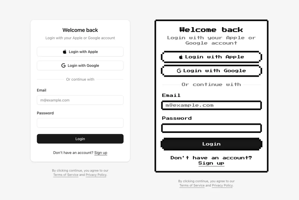
8bitcn/ui is a lightweight UI component library that provides a collection of accessible, 8-bit styled UI components for developers seeking to create nostalgic, pixel-art inspired interfaces.
Built on shadcn/ui, this library offers ready-to-use components with a nostalgic aesthetic, including badges, buttons, cards, inputs, selects, labels, textareas, and more.
Use Cases
- Game development portals needing consistent retro UI elements
- Nostalgia-themed web applications targeting retro gaming audiences
- Marketing sites for pixel art games or 8-bit inspired products
- Developer portfolios showcasing unique design capabilities
- Interactive coding tutorials with distinctive visual style
How To Use It
1. Install a specific 8bitcn/ui component. The library currently comes with seven core components that you can implement in your projects:
- Textarea: For multi-line text input areas
- Badge: For displaying status indicators or tags
- Button: For interactive elements with 8-bit styling
- Card: For content containers with pixel-art borders
- Input: For text entry fields with retro styling
- Select: For dropdown selection menus
- Label: For form field labels
pnpm:
pnpm dlx shadcn@canary add https://8bitcn.com/r/8bit-badge.jsonnpx:
npx shadcn@latest add https://8bitcn.com/r/8bit-badge.jsonyarn:
yarn dlx shadcn@latest add https://8bitcn.com/r/8bit-badge.jsonbun:
bunx --bun shadcn@latest add https://8bitcn.com/r/8bit-badge.jsonFollow the same pattern to install other components by replacing the URL with the appropriate component path.
2. Add the component to your project.
import { Badge } from "@/components/ui/8bit/badge"<Badge>Badge</Badge>
3. Other components like Button, Card, Input, etc., follow a similar import and usage pattern after installation.
FAQs
Q: Is 8bitcn/ui a complete replacement for shadcn/ui?
A: No, 8bitcn/ui provides 8-bit styled versions of some components using the shadcn/ui installation method. It complements shadcn/ui rather than replacing it.
Q: Can I customize the appearance of 8bitcn/ui components?
A: Yes, since the component code is added directly to your project, you can modify the source files (styles, structure) as needed.
Preview