The Future of Web Dev
The Future of Web Dev
Accessible shadcn/ui Persian Date Picker with RTL and Dark Mode Support
A UI component for Persian (Jalali) calendar with Shadcn UI. Supports single, range, and multiple date selection with full RTL and dark mode.
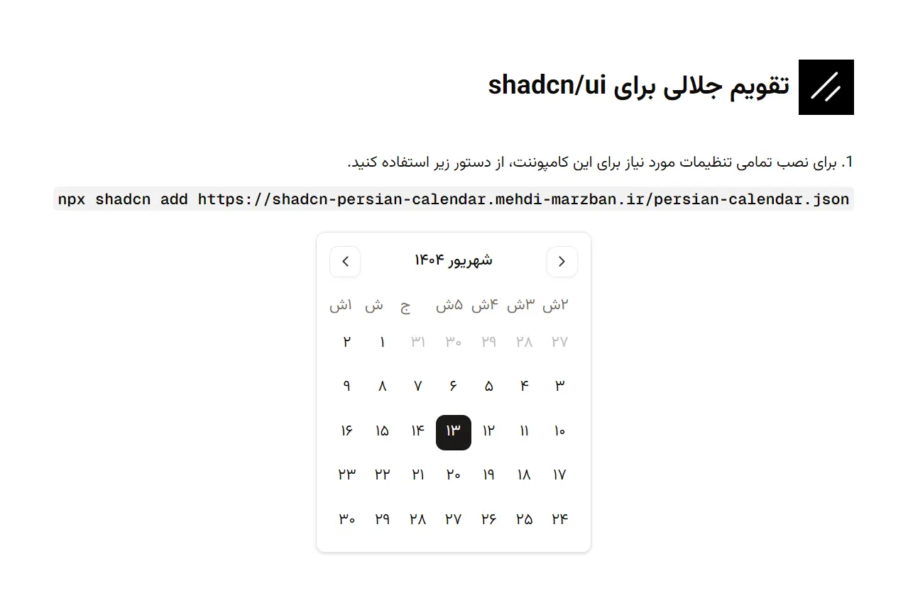
Shadcn Persian Date Picker is a React component library that brings Persian (Jalali) calendar functionality to your web applications.
It builds on top of shadcn/ui to create a clean date picker component that understands the Persian calendar system used across Iran and other Persian-speaking regions.
Features & Effects
🇮🇷 Native Persian (Jalali/Shamsi) calendar system with accurate date conversions.
🎨 Full Tailwind CSS customization through className props for every calendar element.
🌙 Dark mode support that works with your application’s theme configuration.
♿ WAI-ARIA compliant markup for screen reader compatibility and keyboard navigation.
📱 Responsive layout that adapts to mobile, tablet, and desktop viewports.
🔄 Year switcher interface for quick navigation across multiple years.
📅 Three selection modes for single dates, date ranges, and multiple date picking.
🌐 RTL (right-to-left) text direction support for Persian language interfaces.
How to Use It
1. Install these dependencies with the following command:
npm install @radix-ui/react-slot lucide-react react-day-picker date-fns2. Run the shadcn-ui CLI command to add the persian-calendar component into your project’s components directory.
npx shadcn-ui@latest add https://shadcn-persian-calendar.mehdi-marzban.ir/persian-calendar.json3. Import and use the PersianCalendar component in your application. The following example shows a basic setup for a single-date picker. You will need to manage the selected date using React’s state.
"use client";
import { useState } from "react";
import { PersianCalendar } from "@/components/ui/persian-calendar";
export default function CalendarPage() {
  const [date, setDate] = useState<Date | undefined>(new Date());
  return (
    <div className="p-4">
      <PersianCalendar
        mode="single"
        selected={date}
        onSelect={setDate}
        className="rounded-md border"
      />
    </div>
  );
}
4. Here is a list of the available props for the PersianCalendar component. It accepts all props from react-day-picker/persian along with some additional options for customization.
className: Astringthat applies additional CSS classes to the root calendar component.showOutsideDays: Abooleanthat determines if days from the previous and next months are visible. It defaults totrue.showYearSwitcher: Abooleanthat toggles the year switcher dropdown. It is enabled by default.yearRange: Anumberthat sets the number of years to display in the year switcher. The default value is12.numberOfMonths: Anumberthat specifies how many months to display at once. The default is1.mode: Astringthat defines the selection mode. It can be set to"single","multiple","range", or"default". The default mode is"single".selected: Accepts aDate, an array ofDateobjects, or aDateRangeobject to represent the currently selected date(s).onSelect: A callback function that is executed when a date is selected. It receives the new date, date array, or date range as an argument.- Styling Props: You can pass additional string props with Tailwind CSS classes to style specific parts of the calendar, such as
monthsClassName,dayClassName, andselectedClassName.
5. You can customize the component’s styling by passing Tailwind CSS classes to various props. This allows for detailed control over elements like the calendar container, individual days, and the selected date.
<PersianCalendar
  className="rounded-xl border-gray-300"
  monthsClassName="space-x-4"
  dayClassName="text-lg"
  selectedClassName="bg-green-600 text-white hover:bg-green-700"
/>
Related Resources
- Shadcn UI provides the component primitives and design system that this Persian calendar builds upon.
- React Day Picker serves as the foundation for the calendar logic and date selection behavior.
- date-fns-jalali offers utilities for working with Jalali dates in JavaScript applications.
- Persian Tools delivers a collection of utilities for Persian language and date handling in web applications.
FAQs
Q: Does this component work with Next.js App Router?
A: Yes. The component works in both Next.js Pages Router and App Router. Mark your parent component with “use client” since the calendar requires client-side React hooks for state management.
Q: Can I use this component with existing form libraries like React Hook Form?
A: Yes. The component accepts controlled value and onChange props that integrate with form libraries. Pass your form field’s value to the selected prop and your setter function to onSelect.
Q: How do I convert between Jalali and Gregorian dates?
A: The component handles date conversions internally using the react-day-picker Persian locale. The Date objects you receive from onSelect are standard JavaScript Date objects. Use date-fns or date-fns-jalali for additional conversion utilities.
Q: Does the component support different Persian calendar variants?
A: The component uses the standard Solar Hijri (Shamsi) calendar system used in Iran. This is the official calendar system for the Iranian government and business operations.
Q: Can I disable specific dates or date ranges?
A: Yes. The component inherits all react-day-picker props, including disabled dates. Pass a disabled prop with date-matching functions to prevent users from selecting specific dates.