The Future of Web Dev
The Future of Web Dev
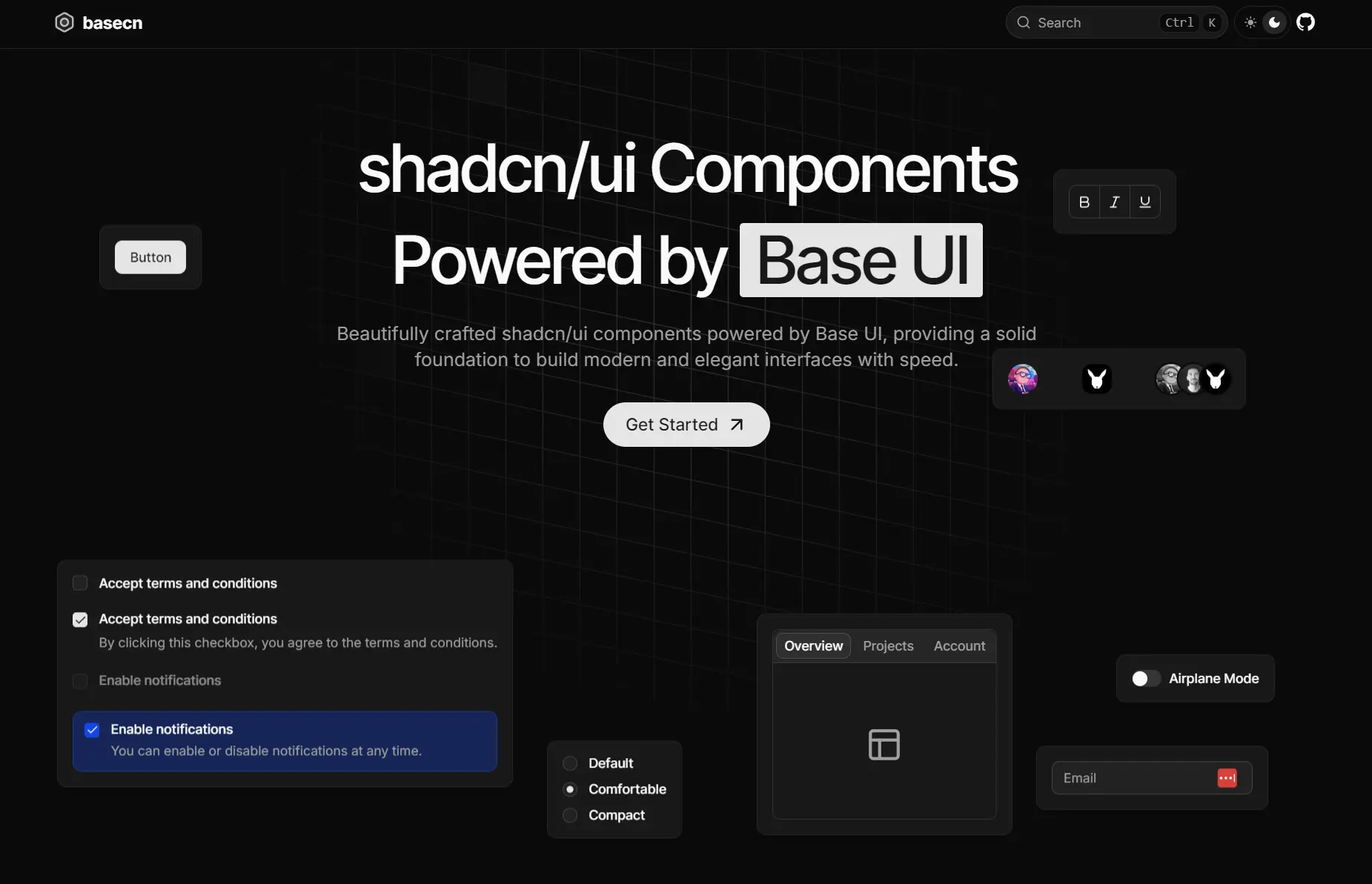
Accessible shadcn/ui Components Built on Base UI – basecn
Accessible UI components combining shadcn/ui design patterns with Base UI performance. Easy installation and customization options.
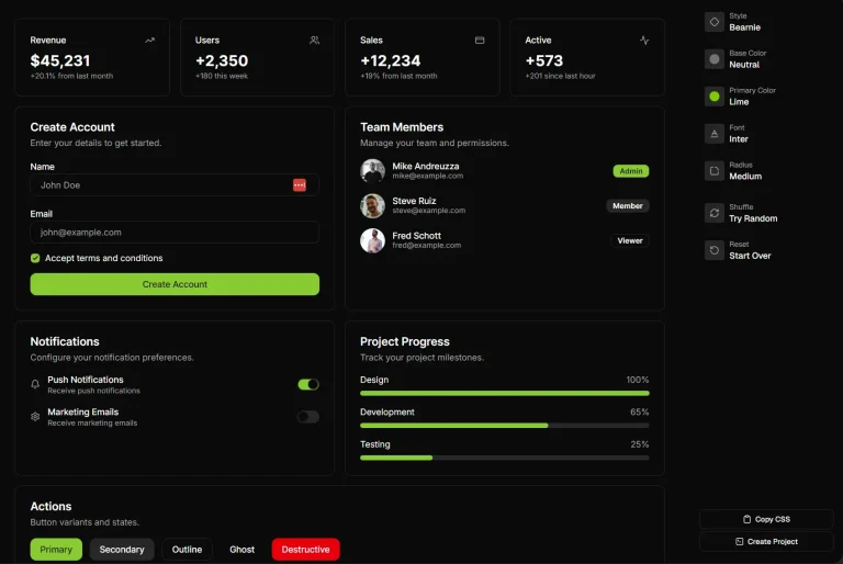
basecn is a modern UI component library that provides a collection of 55+ accessible components built with shadcn/ui and Base UI.
It extends the familiar shadcn/ui components with additional variants and styling options. You can copy and paste the component source directly into your project.
Features
📚 Detailed Examples: Includes multiple demo variations for each component to show different implementations.
🎨 Tailwind CSS Styling: Styled with Tailwind CSS, which allows for direct and simple customization.
♿ Accessibility Focused: Delivers WAI-ARIA compliant components to support all users.
🔧 Fully Customizable: You receive the source code for every component, enabling you to modify it to fit your design system.
Use Cases
- Building modern web applications that require accessible UI components with consistent design patterns.
- Migrating existing shadcn/ui projects to a more robust foundation while maintaining visual consistency.
- Creating design systems that need enhanced accessibility compliance for enterprise applications.
- Developing React applications where component customization and ownership are critical requirements.
- Building user interfaces that require multiple component variants and styling flexibility.
How to Use It
1. Configure basecn in your project by adding the namespaced registry to your components.json file. This allows you to install components using the simplified @basecn/component-name format.
{
  "registries": {
    "@basecn": "https://basecn.dev/r/{name}.json"
  }
}
2. Install individual components using the shadcn CLI with the basecn namespace. You can choose from multiple package managers based on your project setup.
# Using pnpm
pnpm dlx shadcn@latest add @basecn/accordion
# Using npm
npx shadcn@latest add @basecn/accordion
# Using yarn
yarn shadcn@latest add @basecn/accordion
# Using bun
bunx --bun shadcn@latest add @basecn/accordion
Or install components using the full URL format if you prefer not to configure the registry.
pnpm dlx shadcn@latest add https://basecn.dev/r/accordion.json3. Import the component into your React application. Here’s a practical implementation of the Accordion component.
pnpm dlx shadcn@latest add @basecn/accordion
npx shadcn@latest add @basecn/accordion
yarn shadcn@latest add @basecn/accordion
bunx --bun shadcn@latest add @basecn/accordion

OR:
pnpm dlx shadcn@latest add https://basecn.dev/r/accordion.json
npx shadcn@latest add https://basecn.dev/r/accordion.json
yarn shadcn@latest add https://basecn.dev/r/accordion.json
bunx --bun shadcn@latest add https://basecn.dev/r/accordion.json
import {
Accordion,
AccordionContent,
AccordionItem,
AccordionTrigger,
} from "@/components/ui/accordion";
export default function AccordionDemo() {
return (
<Accordion
className="w-full max-w-sm mx-auto"
defaultValue={["item-1"]}
openMultiple={false}
>
<AccordionItem value="item-1">
<AccordionTrigger>Product Information</AccordionTrigger>
<AccordionContent className="flex flex-col gap-4">
<p>
Our flagship product combines cutting-edge technology with sleek
design. Built with premium materials, it offers unparalleled
performance and reliability.
</p>
<p>
Key features include advanced processing capabilities, and an
intuitive user interface designed for both beginners and experts.
</p>
</AccordionContent>
</AccordionItem>
<AccordionItem value="item-2">
<AccordionTrigger>Shipping Details</AccordionTrigger>
<AccordionContent className="flex flex-col gap-4">
<p>
We offer worldwide shipping through trusted courier partners.
Standard delivery takes 3-5 business days, while express shipping
ensures delivery within 1-2 business days.
</p>
<p>
All orders are carefully packaged and fully insured. Track your
shipment in real-time through our dedicated tracking portal.
</p>
</AccordionContent>
</AccordionItem>
<AccordionItem value="item-3">
<AccordionTrigger>Return Policy</AccordionTrigger>
<AccordionContent className="flex flex-col gap-4">
<p>
We stand behind our products with a comprehensive 30-day return
policy. If you're not completely satisfied, simply return the
item in its original condition.
</p>
<p>
Our hassle-free return process includes free return shipping and
full refunds processed within 48 hours of receiving the returned
item.
</p>
</AccordionContent>
</AccordionItem>
</Accordion>
);
}4. UI components included:
- Accordion
- Alert Dialog
- Alert
- Aspect Ratio
- Autocomplete
- New
- Avatar
- Badge
- Breadcrumb
- Button
- Calendar
- Card
- Carousel
- Chart
- Checkbox
- Collapsible
- Combobox (Base UI)
- New
- Combobox (Popover + Command)
- Command
- Context Menu
- Data Table
- Date Picker
- Dialog
- Drawer
- Dropdown Menu
- Form (React Hook Form)
- Form (TanStack Form)
- New
- Hover Card
- Input OTP
- Input
- Label
- Menubar
- Navigation Menu
- Pagination
- Popover
- Progress
- Radio Group
- Resizable
- Scroll Area
- Select
- Separator
- Sheet
- Sidebar
- Skeleton
- Slider
- Sonner
- Switch
- Table
- Tabs
- Textarea
- Toggle Group
- Toggle
- Tooltip
Related Resources
- shadcn/ui – The original component library that inspired basecn’s design patterns and philosophy.
- Base UI – The foundational accessibility library that powers basecn components.
- Tailwind CSS – The utility-first CSS framework used for styling basecn components.
- Radix UI – Alternative headless UI components for React applications.
FAQs
Q: How does basecn differ from shadcn/ui?
A: basecn maintains the same design aesthetic and copy-paste philosophy as shadcn/ui but builds components on Base UI instead of Radix UI. This provides enhanced accessibility features and performance optimizations while keeping familiar APIs.
Q: Can I migrate from shadcn/ui to basecn?
A: Yes, basecn provides a straightforward migration path. The component APIs are designed to be similar to shadcn/ui, requiring minimal changes to existing implementations.
Q: Do I need to install all components at once?
A: No, basecn follows a modular approach where you install only the components you need. Each component is independent and can be installed individually using the shadcn CLI.