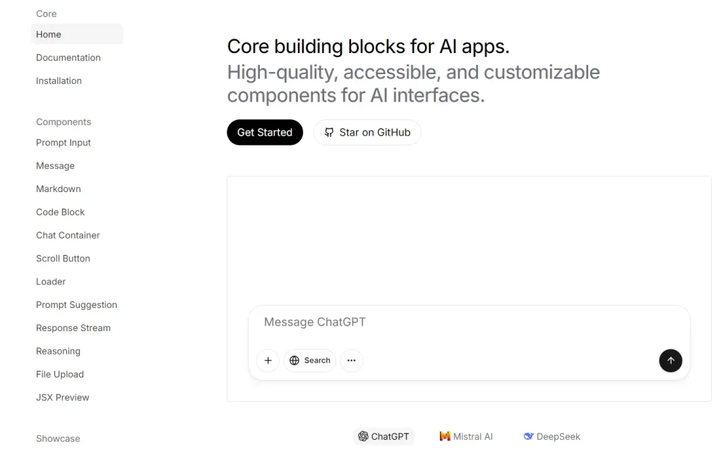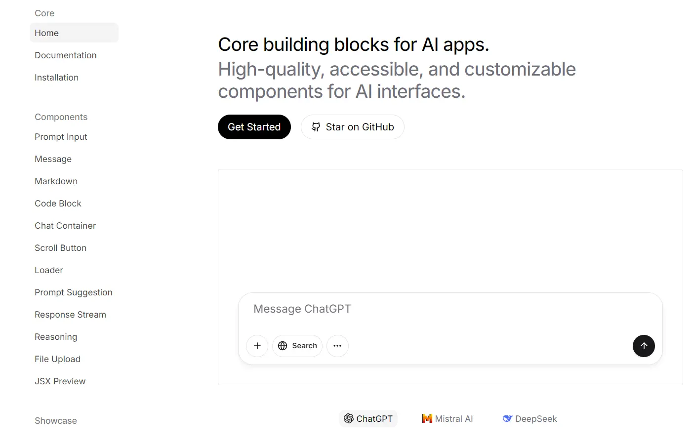
prompt-kit is a UI component library that provides a set of customizable, accessible, high-quality components for AI applications and AI SaaS.
It extends the capabilities of shadcn/ui library by providing dedicated components for AI conversations, text displays, code presentation, and more.
UI Components Included
⌨️ Prompt Input: An input field for users to enter text prompts for an AI model.
📜 Markdown: Renders Markdown content, including GitHub Flavored Markdown (GFM), with custom styling options.
🔄 Chat Container: Manages chat interfaces with intelligent auto-scrolling for a smooth user experience.
⏳ Loader: Indicates processing states with multiple visual variants for user feedback.
✍️ Response Stream: Displays text with streaming animations, suitable for progressive AI responses.
📤 File Upload: Creates drag-and-drop file upload areas supporting single/multiple files and visual feedback.
💬 Message: Displays messages in conversation UIs, supporting avatars, markdown, and actions.
💻 Code Block: Shows code snippets with syntax highlighting and customizable styles.
⏬ Scroll Button: A floating button that appears on scroll-up, allowing quick navigation to the bottom.
💡 Prompt Suggestion: Implements interactive prompt suggestions within AI interfaces.
🧠 Reasoning: Shows collapsible “thought process” or step-by-step explanations from AI models.
📄 JSX Preview: Renders JSX strings as React components, supporting streaming content and tag completion.
Use Cases
- Educational AI Platforms: Develop interactive learning tools where AI explains concepts, using
Markdown,Reasoning, andMessagecomponents. - AI Chatbot Development: Construct user-friendly chat interfaces for customer service bots, personal assistants, or information retrieval systems. Use components like
PromptInput,Message, andChatContainer. - AI Agent Frontends: Build interfaces for AI agents that perform tasks, display reasoning (
Reasoningcomponent), and handle user inputs or file uploads (FileUpload). - Developer Tooling UIs: Create interfaces for AI-powered developer tools, such as code generation assistants, using
CodeBlock,PromptInput, andJSXPreview. - Content Generation Interfaces: Design applications where users interact with AI to generate text or code, utilizing
ResponseStreamto show output progressively.
Installation
1. Install shadcn/ui: Follow the official shadcn/ui installation guide to add it to your project.
2. Install prompt-kit Components: After setting up shadcn/ui, use the shadcn CLI to add individual prompt-kit components as needed:
bash npx shadcn@latest add prompt-kit/[component]Replace [component] with the specific component name you want to install (e.g., prompt-input, message).
Usage
After installation, you can import and use the components directly in your app. Here is a basic example using the PromptInput component:
"use client"
import {
  PromptInput,
  PromptInputAction,
  PromptInputActions,
  PromptInputTextarea,
} from "@/components/prompt-kit/prompt-input"
import { Button } from "@/components/ui/button"
import { ArrowUp, Square } from "lucide-react"
import { useState } from "react"
export function PromptInputBasic() {
  const [input, setInput] = useState("")
  const [isLoading, setIsLoading] = useState(false)
  const handleSubmit = () => {
    setIsLoading(true)
    setTimeout(() => {
      setIsLoading(false)
    }, 2000)
  }
  const handleValueChange = (value: string) => {
    setInput(value)
  }
  return (
    <PromptInput
      value={input}
      onValueChange={handleValueChange}
      isLoading={isLoading}
      onSubmit={handleSubmit}
      className="w-full max-w-(--breakpoint-md)"
    >
      <PromptInputTextarea placeholder="Ask me anything..." />
      <PromptInputActions className="justify-end pt-2">
        <PromptInputAction
          tooltip={isLoading ? "Stop generation" : "Send message"}
        >
          <Button
            variant="default"
            size="icon"
            className="h-8 w-8 rounded-full"
            onClick={handleSubmit}
          >
            {isLoading ? (
              <Square className="size-5 fill-current" />
            ) : (
              <ArrowUp className="size-5" />
            )}
          </Button>
        </PromptInputAction>
      </PromptInputActions>
    </PromptInput>
  )
}
FAQs
Q: Do I need to install shadcn/ui to use prompt-kit?
A: Yes, prompt-kit is built on top of shadcn/ui and uses its CLI for installation and core styling. You must install and configure shadcn/ui first.
Q: Are the prompt-kit components customizable?
A: Yes, similar to shadcn/ui components, you can customize the appearance and behavior of prompt-kit components by modifying the underlying code directly in your project.
Q: How does prompt-kit differ from regular UI component libraries?
A: While standard UI libraries provide general-purpose components, prompt-kit offers specialized components designed specifically for AI interfaces, such as response streaming, reasoning displays, and prompt inputs.
Q: Is prompt-kit suitable for production applications?
A: Yes, prompt-kit is built on the same principles as shadcn/ui, which is used in production by many companies. The components are designed to be accessible, performant, and reliable.
Q: How do I integrate prompt-kit with my AI backend?
A: prompt-kit provides the UI components but is backend-agnostic. You can integrate it with any AI API or framework by handling the data flow in your application code.
Preview