The Future of Web Dev
The Future of Web Dev
Animated Loading Spinner Component For Shadcn/ui – ShadCN Spinner
A loading spinner component to create loading states in your React & Shadcn/ui projects.
ShadCN Spinner is a loading spinner component built for the Shadcn/UI component library.
It allows developers to create smooth, animated loading indicators for web applications, taking inspiration from the Radix UI Spinner design.
Features
🎨 Customizable size options (sm, md, lg).
⚡ Smooth fade animations with configurable timing.
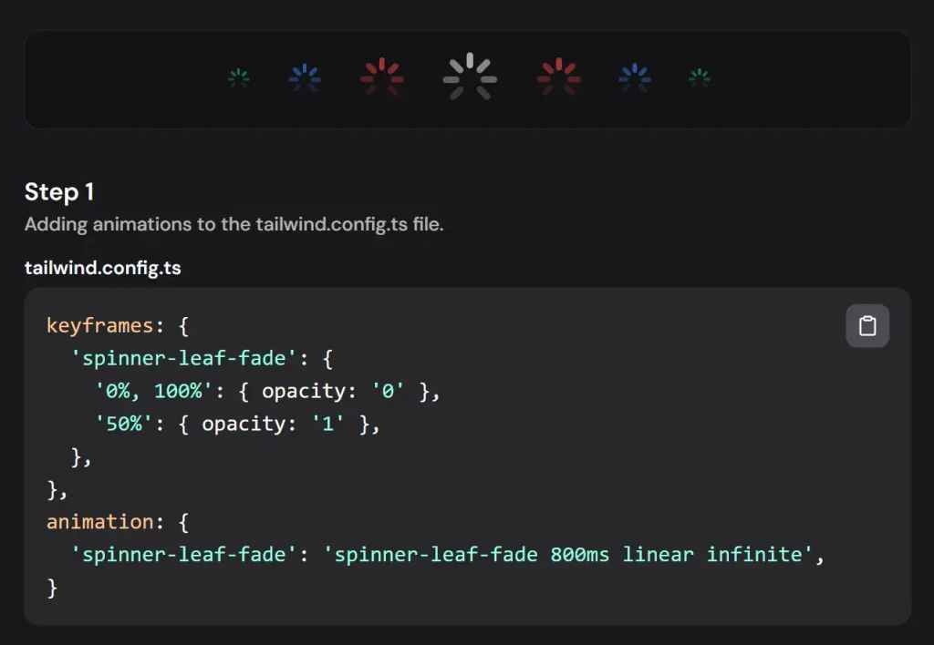
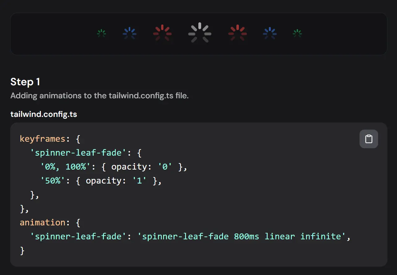
🔄 Eight-segment spinner design for visual clarity.
🌗 Dark mode support with automatic color adaptation.
🎯 Built-in slot support for flexible rendering.
🎨 Integrates with Tailwind CSS for effortless styling and customization.
Use Cases
- Data Fetching: Display the spinner while fetching data from an API to inform users of the ongoing process. Imagine a product page loading product details; the spinner provides visual feedback during the data retrieval.
- Form Submissions: Indicate loading status during form submission to prevent duplicate submissions and manage user expectations. For instance, when a user submits a contact form, the spinner reassures them that their request is being processed.
- File Uploads: Provide visual feedback during file uploads, showing the progress and preventing user interaction until the upload completes. Think of a user uploading an image to a social media platform; the spinner indicates the upload status.
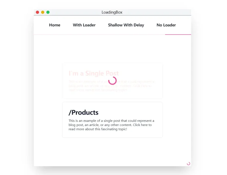
- Page Transitions: Use the spinner during page transitions to create a smoother user experience and mask loading times. This is particularly useful for single-page applications where content updates dynamically.
- Complex Calculations: Display the spinner while performing complex calculations or background tasks to signal that the application is actively working. For example, a financial application might use the spinner while calculating investment returns.
Installation
1. Add Animation Configuration:
// tailwind.config.ts
module.exports = {
  theme: {
    extend: {
      keyframes: {
        'spinner-leaf-fade': {
          '0%, 100%': { opacity: '0' },
          '50%': { opacity: '1' },
        },
      },
      animation: {
        'spinner-leaf-fade': 'spinner-leaf-fade 800ms linear infinite',
      }
    }
  }
}
2. Create ui/spinner.tsx and add the provided component code.
3. Dependencies:
- @radix-ui/react-slot
- class-variance-authority
- clsx (or equivalent utility for class name management)
Usage
Basic Implementation:
<Spinner size="sm" className="bg-black dark:bg-white" />Size Variations:
<Spinner size="sm" />
<Spinner size="md" />
<Spinner size="lg" />
Custom Colors:
<Spinner className="bg-blue-500 dark:bg-blue-300" />Related Resources
- Radix UI: A library for building accessible UI components. Radix UI Documentation.
- Tailwind CSS: A utility-first CSS framework for building custom designs. Tailwind CSS Documentation.
- React: A JavaScript library for building user interfaces. React Documentation.
Preview