The Future of Web Dev
The Future of Web Dev
Custom Loading Indicators For Pages Router in Next.js – Next-Loading-Box
A React component for Next.js applications to manage route change loading states.

Next-Loading-Box is a React component for Next.js applications to manage route change loading states.
With complex computations and data fetching in server-side rendering (SSR) applications, users may experience delays during page navigation.
Next-Loading-Box provides a simple, customizable solution that displays loading indicators to help maintain user engagement and improve the perceived performance of your application.
Features
✨ Simplified Loading State Management: Manage loading states with minimal code.
🎯 Scoped or Global Loading: Implement loading indicators for individual components or the entire application.
⚡️ Improved Perceived Performance: Keeps users engaged during page transitions.
⌛ Configurable Animation Delays: Control when the loading indicator appears.
🧱 Customizable Loading Components: Use any component as a loading indicator.
➕ Additive Loading: Overlay loading components without replacing existing content.
Use Cases
- Blog Post Loading: When navigating to a blog post, a skeleton component can be displayed while the actual content is fetched from the server. This provides a preview of the page layout and prevents a blank screen, improving the user experience.
- Product Page Loading: On an e-commerce site, when a user clicks on a product, a product-specific skeleton component (showing placeholders for images, descriptions, and prices) can appear while the detailed product information loads.
- Global Loading Overlay: A subtle loading bar at the top of the page can indicate overall application loading during navigation, providing feedback for any route change.
- Search Results Loading: When a user performs a search, a loading spinner within the search results container can indicate that the query is being processed and results are being fetched.
- Dynamic Route Loading: For routes with dynamic segments, such as
/products/[id], distinct loading components can be configured based on the specific route, enhancing the visual feedback for different data fetching scenarios.
Installation Guide
Install next-loading-box using your preferred package manager:
npm install next-loading-box
// or
pnpm install next-loading-box
// or
yarn add next-loading-box
Usage Guide
1. Scoped Loader:
import { LoadingBox } from 'next-loading-box';
const MyComponent = () => {
  return (
    <div>
      <h1>My Component</h1>
      <LoadingBox loadingComponent={<LoadingComponent />}>
        <Link href="/slowLoadingPage">With Loader</Link>
      </LoadingBox>
    </div>
  );
};
2. Global Loader with Multiple Loading Components:
// _app.tsx
import { AppProps } from 'next/app';
import { LoadingBox } from 'next-loading-box';
const loadingComponents = [
  { path: '/blogPost', component: <BlogPostSkeleton /> },
  { path: '/products', component: <ProductListSkeleton /> },
  { path: '/products/', component: <ProductDetailSkeleton /> },
];
function MyApp({ Component, pageProps }: AppProps) {
  return (
    <LoadingBox loadingComponent={loadingComponents} global>
      <Component {...pageProps} />
    </LoadingBox>
  );
}
3. Global Loader with Additive Loading:
// _app.tsx
import { AppProps } from 'next/app';
import { LoadingBox } from 'next-loading-box';
import TopLoadingBar from '../components/TopLoadingBar';
function MyApp({ Component, pageProps }: AppProps) {
  return (
    <LoadingBox loadingComponent={<TopLoadingBar />} global addToChildren>
      <Component {...pageProps} />
    </LoadingBox>
  );
}
4. Available props.
| Prop | Type | Default | Description |
|---|---|---|---|
loadingComponent | React.ReactNode | LoadingComponentConfig[] | - | The loading component(s) to display. This can be a single ReactNode (e.g., <div>Loading...</div>) or an array of LoadingComponentConfig objects for route-specific loading components. |
children | React.ReactNode | - | The content to be wrapped by the LoadingBox. Typically, this will be a Link component or, for global loading, the entire application content within _app.tsx. |
animateAfter | number | 0 | The delay (in milliseconds) before the loading component is shown. This is useful for preventing flicker on very fast transitions. |
style | CSSProperties | - | Inline styles to apply to the wrapper element. |
className | string | - | CSS class name to apply to the wrapper element. |
shallowRouting | boolean | false | Enable the loading state for shallow routing changes (updates within the same page). |
disableSameURL | boolean | true | Disable the loading state when navigating to the same URL. This prevents the loader from showing unnecessarily when refreshing the page or using client-side navigation to the same route. |
global | boolean | false | Use as a global loader for all route changes. When set to true, the LoadingBox should wrap your application’s root component in _app.tsx. |
addToChildren | boolean | false | Only for global loaders. Add the loading component to the existing children instead of replacing them. This is useful for components like top loading bars. |
Related Resources
- Next.js Documentation on Routing: https://nextjs.org/docs/app/building-your-application/routing – Learn more about Next.js routing concepts.
- React Suspense: https://reactjs.org/docs/concurrent-mode-suspense.html – Explore React’s built-in mechanism for handling asynchronous operations and loading states.
- React Transition Group: https://reactcommunity.org/react-transition-group/ – Create smooth transitions and animations for loading indicators.
FAQs
Does next-loading-box work with Next.js App Router?
No, it’s designed for the Pages Router. The App Router has built-in loading UI support.
Can I use different loading components for different routes?
Yes, use the loadingComponent prop with an array of configurations specifying the path and component for each route.
How do I customize the appearance of the loading indicator?
Pass any React component to the loadingComponent prop.
How can I delay the appearance of the loading indicator?
Use the animateAfter prop to specify a delay in milliseconds.
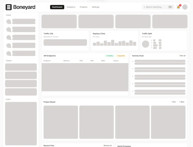
Preview