The Future of Web Dev
The Future of Web Dev
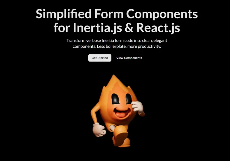
Build Modern React Forms with Shadcn/ui and TanStack Form
Build type-safe React forms with Shadcn UI and TanStack Form integration. Get beautiful components, real-time validation, and TypeScript support.
Shadcn-Tanstack Form is a modern solution for building forms in React applications. It combines the clean, accessible components of Shadcn UI with the robust, type-safe state management of TanStack Form.
The library offers a set of ready-to-use form blocks and field components. You can manage form state, validation, and submission logic with full type safety. It uses Zod for schema validation and Tailwind CSS for styling.
Features
🎨 Pre-built UI components with Shadcn UI styling and accessibility features.
🔒 Type-safe form validation using TanStack Form with full TypeScript support.
⚡ Built on React, TypeScript, and Tailwind CSS for modern development workflows.
🔄 Real-time form validation with immediate user feedback.
🎯 Form blocks including login and shipping information forms.
🔑 Specialized input components like password fields and phone number inputs.
📦 Easy installation through Shadcn CLI with optional Zod integration.
🧩 Modular architecture that allows you to use individual components or complete forms.
Use Cases
- Authentication Forms. Build secure and intuitive login, registration, and password reset forms.
- E-commerce Checkouts. Create multi-step checkout processes for collecting shipping and payment information.
- User Profile Management. Construct detailed forms for users to update their personal information and preferences.
- Complex Data Entry. Develop forms for business applications that require inputting large amounts of structured data.
- Feedback and Surveys. Design interactive surveys and feedback forms to collect user opinions.
How to Use It
1. Install Shadcn-Tanstack Form using the Shadcn CLI. This will add all necessary components and dependencies to your project:
npx shadcn@canary add https://shadcn-tanstack-form.netlify.app/r/tanstack-form.json2. Install Zod for enhanced form validation. OPTIONAL.
npm install zod3. Defining your validation schema using Zod:
import { z } from "zod";
const UserProfileSchema = z.object({
  firstName: z.string().min(2, "First name must be at least 2 characters"),
  lastName: z.string().min(2, "Last name must be at least 2 characters"),
  email: z.string().email("Please enter a valid email address"),
});
4. Build your form using the useAppForm hook and the following form components.
import { Button } from "@/components/ui/button";
import { Input } from "@/components/ui/input";
import { useAppForm } from "@/components/ui/tanstack-form";
import { useCallback } from "react";
export function UserProfileForm() {
  const form = useAppForm({
    validators: { onChange: UserProfileSchema },
    defaultValues: {
      firstName: "",
      lastName: "",
      email: "",
    },
    onSubmit: ({ value }) => {
      console.log("Form submitted:", value);
      // Handle form submission logic
    },
  });
  const handleSubmit = useCallback(
    (e: React.FormEvent) => {
      e.preventDefault();
      e.stopPropagation();
      form.handleSubmit();
    },
    [form],
  );
  return (
    <form.AppForm>
      <form className="space-y-6" onSubmit={handleSubmit}>
        <form.AppField
          name="firstName"
          children={(field) => (
            <field.FormItem>
              <field.FormLabel>First Name</field.FormLabel>
              <field.FormControl>
                <Input
                  placeholder="John"
                  value={field.state.value}
                  onChange={(e) => field.handleChange(e.target.value)}
                  onBlur={field.handleBlur}
                />
              </field.FormControl>
              <field.FormMessage />
            </field.FormItem>
          )}
        />
        <Button type="submit">Save Profile</Button>
      </form>
    </form.AppForm>
  );
}
5. Use pre-built form blocks and UI components to simplify the form creation.
pnpm dlx shadcn@canary add https://shadcn-tanstack-form.netlify.app/r/basic-info.json
"use client";
import { Button } from "@/components/ui/button";
import { Input } from "@/components/ui/input";
import { useAppForm } from "@/components/ui/tanstack-form";
import { Textarea } from "@/components/ui/textarea";
import { type FormHTMLAttributes, useCallback } from "react";
import { z } from "zod";
const FormSchema = z.object({
username: z.string().min(2, {
message: "Username must be at least 2 characters.",
}),
email: z.string().email({
message: "Please enter a valid email address.",
}),
age: z.number().min(8, {
message: "Age must be at least 18 years.",
}),
bio: z.string().max(160, {
message: "Bio must not exceed 160 characters, ss again.",
}),
});
interface FormProps
extends Omit<FormHTMLAttributes<HTMLFormElement>, "onSubmit"> {}
interface BasicInfoFormProps extends FormProps {
onSubmit: (data: z.infer<typeof FormSchema>) => void;
defaultValues?: z.infer<typeof FormSchema>;
}
function BasicInfoForm({
onSubmit,
defaultValues,
...props
}: BasicInfoFormProps) {
const form = useAppForm({
validators: { onBlur: FormSchema },
defaultValues: defaultValues ?? {
username: "",
email: "",
age: 0,
bio: "",
},
onSubmit: ({ formApi, value }) => {
onSubmit(value);
formApi.reset();
},
});
const handleSubmit = useCallback(
(e: React.FormEvent) => {
e.preventDefault();
e.stopPropagation();
form.handleSubmit();
},
[form],
);
return (
<form.AppForm>
<form
className="@container mx-auto w-full max-w-lg space-y-8 rounded-md border p-4 py-10"
onSubmit={handleSubmit}
noValidate
{...props}
>
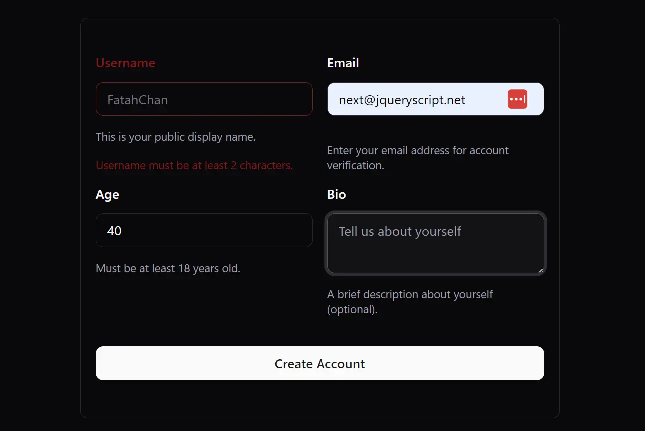
<div className="grid @md:grid-cols-2 grid-cols-1 items-start gap-4">
<form.AppField
name="username"
children={(field) => (
<field.FormItem className="space-y-1.5">
<field.FormLabel>Username</field.FormLabel>
<field.FormControl>
<Input
placeholder="FatahChan"
value={field.state.value}
onChange={(e) => field.handleChange(e.target.value)}
onBlur={field.handleBlur}
/>
</field.FormControl>
<field.FormDescription className="text-xs">
This is your public display name.
</field.FormDescription>
<field.FormMessage className="text-xs" />
</field.FormItem>
)}
/>
<form.AppField
name="email"
children={(field) => (
<field.FormItem className="space-y-1.5">
<field.FormLabel>Email</field.FormLabel>
<field.FormControl>
<Input
type="email"
placeholder="[email protected]"
value={field.state.value}
onChange={(e) => field.handleChange(e.target.value)}
onBlur={field.handleBlur}
/>
</field.FormControl>
<field.FormDescription className="text-xs">
Enter your email address for account verification.
</field.FormDescription>
<field.FormMessage className="text-xs" />
</field.FormItem>
)}
/>
<form.AppField
name="age"
children={(field) => (
<field.FormItem className="space-y-1.5">
<field.FormLabel>Age</field.FormLabel>
<field.FormControl>
<Input
type="number"
inputMode="numeric"
value={field.state.value}
onChange={(e) => field.handleChange(Number(e.target.value))}
onBlur={field.handleBlur}
/>
</field.FormControl>
<field.FormDescription className="text-xs">
Must be at least 18 years old.
</field.FormDescription>
<field.FormMessage className="text-xs" />
</field.FormItem>
)}
/>
<form.AppField
name="bio"
children={(field) => (
<field.FormItem className="space-y-1.5">
<field.FormLabel>Bio</field.FormLabel>
<field.FormControl>
<Textarea
placeholder="Tell us about yourself"
value={field.state.value}
onChange={(e) => field.handleChange(e.target.value)}
onBlur={field.handleBlur}
/>
</field.FormControl>
<field.FormDescription className="text-xs">
A brief description about yourself (optional).
</field.FormDescription>
<field.FormMessage className="text-xs" />
</field.FormItem>
)}
/>
</div>
<Button type="submit" className="w-full">
Create Account
</Button>
</form>
</form.AppForm>
);
}
BasicInfoForm.displayName = "BasicInfoForm";
export default BasicInfoForm;
Related Resources
- Shadcn UI Documentation – Complete guide to Shadcn UI components and customization options.
- TanStack Form Documentation – Official documentation for TanStack Form with advanced usage examples.
- Zod Documentation – Schema validation library documentation with TypeScript integration guides.
- React Hook Form – An Alternative form library with similar capabilities and performance focus.
FAQs
Q: Do I need to use Zod for validation?
A: Zod is optional but recommended for type-safe validation. You can also use TanStack Form’s built-in validation or other validation libraries.
Q: Can I customize the styling of pre-built form blocks?
A: Absolutely. All components use Tailwind CSS classes that you can override or extend. You can also modify the component source code after installation to match your design requirements.
Q: Can I use other Shadcn UI components within these forms?
A: Yes, you can integrate any Shadcn UI component into the form structure. The components are designed to be composable.