The Future of Web Dev
The Future of Web Dev
Minimal Color Picker Component with shadcn/ui and react-colorful
Build accessible color pickers with shadcn-color-picker. Combines shadcn/ui styling with react-colorful for clean, modern color selection.
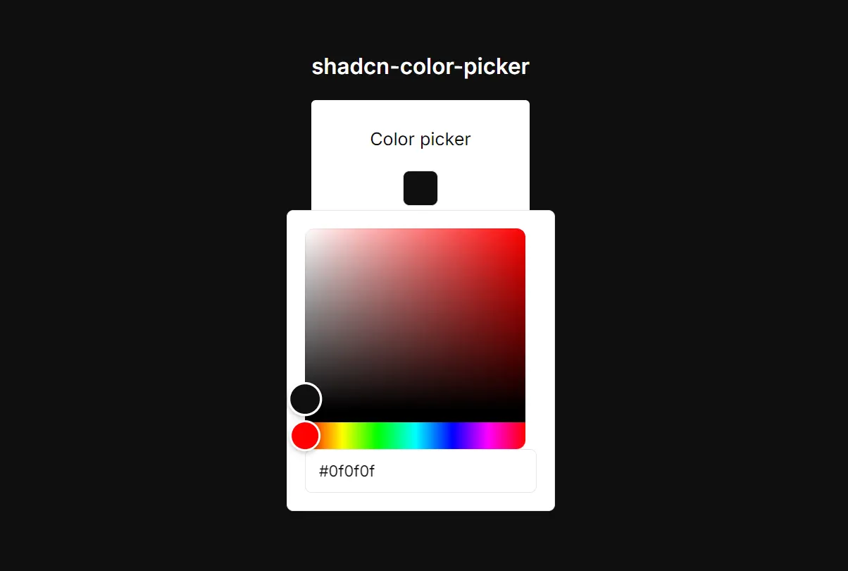
shadcn-color-picker is a minimalist color picker component created for React applications that use shadcn/ui.
You can add it to your application to let users select colors for themes, profiles, or specific design elements.
Features
🎨 Built on react-colorful for reliable color picking functionality.
♿ Accessible design with proper keyboard navigation and screen reader support.
📱 Responsive popover that works across different screen sizes.
🔧 Customizable styling through className props and CSS variables.
🎛️ Dual input methods with both visual picker and hex input field.
🔒 Form integration support with proper ref forwarding and event handling.
How to Use It
1. The component requires react-colorful. You also need to have the Button, Input, and Popover components from shadcn/ui.
Install react-colorful using your preferred package manager.
npm install react-colorfulIf you do not have the necessary shadcn/ui components, add them using the CLI.
npx shadcn-ui@latest add button input popover2. Clone the color picker component from GitHub.
https://github.com/nightspite/shadcn-color-picker.git
3. You can now import and use the ColorPicker in your application. Manage its state using a React hook like useState.
Here is a basic implementation.
'use client';
import { useState } from 'react';
import { ColorPicker } from './ui/color-picker';
import { Button } from './ui/button';
export const ColorPickerDemo = () => {
  const [color, setColor] = useState('#0f0f0f');
  return (
    <div
      className='flex flex-col justify-center items-center min-h-[100dvh] space-y-4'
      style={{
        backgroundColor: color,
      }}
    >
      <h1 className='text-white text-xl font-semibold'>shadcn-color-picker</h1>
      <div className='px-12 py-6 bg-white flex flex-col items-center gap-4 rounded-sm'>
        <h2>Color picker</h2>
        <ColorPicker
          onChange={(v) => {
            setColor(v);
          }}
          value={color}
        />
        <h2>Disabled</h2>
        <ColorPicker
          disabled
          onChange={(v) => {
            setColor(v);
          }}
          value={color}
        />
        <a
          href='https://github.com/nightspite/shadcn-color-picker/blob/master/src/components/ui/color-picker.tsx'
          className='block'
        >
          <Button>View code</Button>
        </a>
      </div>
    </div>
  );
};
In this example, the useState hook initializes and manages the color state. The ColorPicker component receives the current color as its value and the setColor function as its onChange handler to update the state when a new color is selected.
Related Resources
- react-colorful – The underlying color picker library that provides the core functionality.
- shadcn/ui – The component library that provides the Button, Popover, and Input components used in this implementation.
FAQs
Q: Can I use this component without shadcn/ui?
A: No, this component is specifically designed as an extension of shadcn/ui. It relies on several shadcn/ui components, including Popover, Button, and Input, and its styling is intended to match that ecosystem.
Q: Is it possible to change the size of the color picker trigger?
A: Yes. The trigger is a shadcn/ui Button component. You can pass any standard Button props, such as size or className, to modify its appearance.
Q: Does the color picker support formats other than hex?
A: This specific implementation uses the HexColorPicker from react-colorful, so it is limited to hexadecimal color codes. The react-colorful library itself offers other formats, but you would need to modify the component’s source code to use them.
Q: Can I add validation to ensure users select valid colors?
A: The component includes basic hex validation through the maxLength prop on the input field. You can add additional validation in your onChange handler to restrict color ranges or validate against your application’s requirements.