The Future of Web Dev
The Future of Web Dev
Advanced Component Library for shadcn/ui – Kibo UI
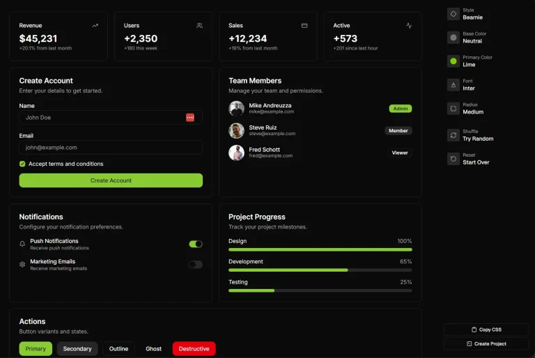
Build richer UIs faster with Kibo UI for shadcn/ui. Get pre-built components like Tables, Dropzones, and AI Inputs.
Kibo UI is a collection of composable, accessible, and open-source UI components built for shadcn/ui.
It extends shadcn/ui’s primitives with ready-to-use complex components while maintaining the same design philosophy.
Features
🧩 Composable Components: Building blocks designed for complex UI structures.
📦 Complex Logic Wrapped: Encapsulates logic from headless libraries for ease of use.
♿ Accessibility Focused: Built with accessibility standards in mind.
🏗️ Reduces Boilerplate: Offers pre-built components for common, complex patterns.
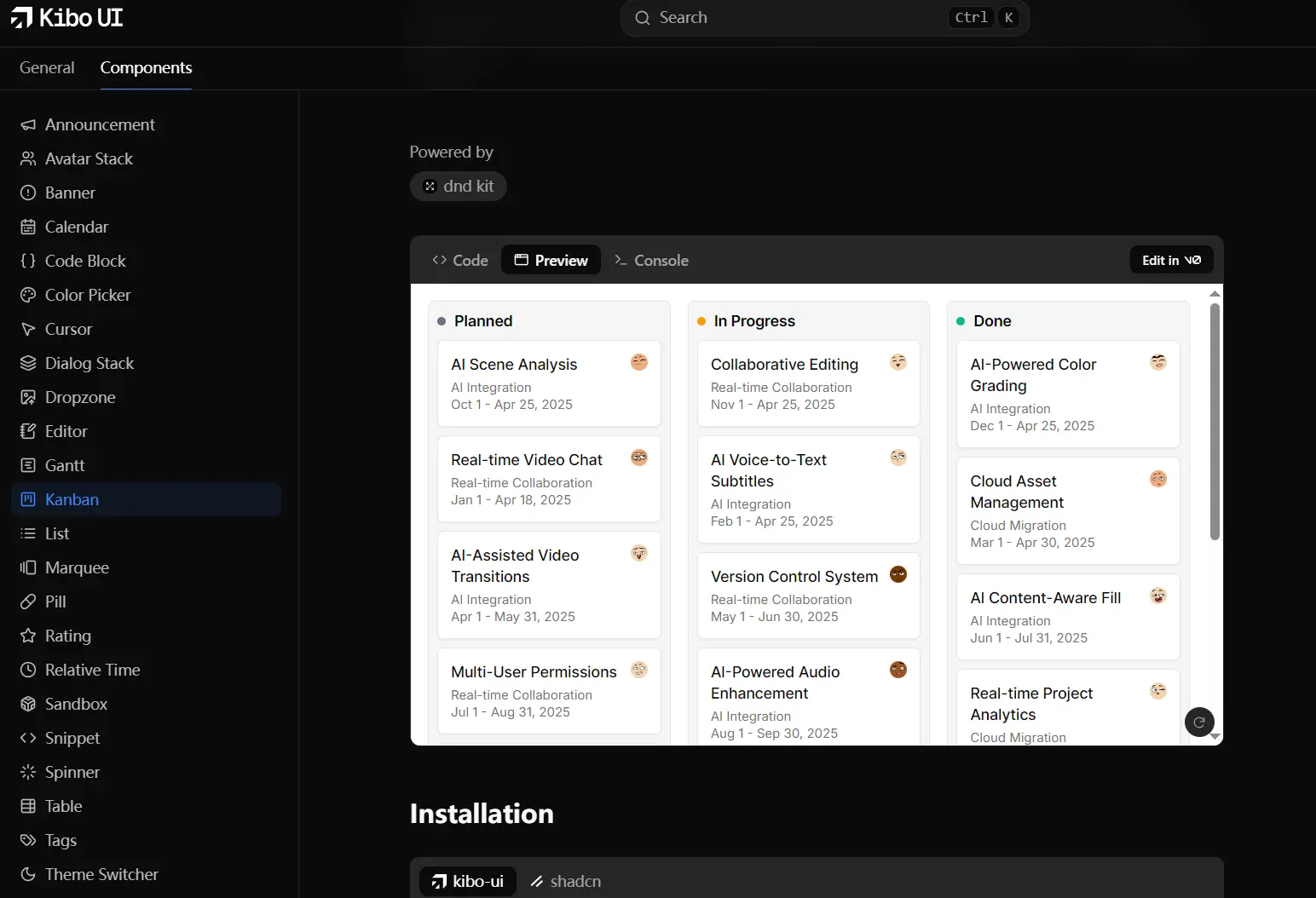
All UI Components Included:
- Announcement
- Avatar Stack
- Banner
- Calendar
- Code Block
- Color Picker
- Cursor
- Dialog Stack
- Dropzone
- Editor
- Gantt
- Kanban
- List
- Marquee
- Pill
- Rating
- Relative Time
- Sandbox
- Snippet
- Spinner
- Table
- Tags
- Theme Switcher
- AI Input
Installation
1. Prerequisites:
- Node.js version 18 or later.
- A React project version 18 or later.
- shadcn/ui already installed in your project.
- Your shadcn/ui setup must use the CSS Variables version (this is the default).
2. Install Kibo UI components using either the kibo-ui CLI or the shadcn CLI. Replace {package} with the specific component name (e.g., calendar, kanban).
npx kibo-ui@latest add {package}Or with shadcn:
npx shadcn add {package}Usage
After installation, you can import and use Kibo UI components like any other React component.
Here’s a basic example using the Annoucement component:
// App.tsx
'use client';

import {
  Announcement,
  AnnouncementTag,
  AnnouncementTitle,
} from '@/components/ui/kibo-ui/announcement';
import { ArrowUpRightIcon } from 'lucide-react';

const Example = () => (
  <div className="flex w-full h-screen items-center justify-center gap-4 bg-secondary">
    <Announcement>
      <AnnouncementTag>Latest update</AnnouncementTag>
      <AnnouncementTitle>
        New feature added
        <ArrowUpRightIcon size={16} className="shrink-0 text-muted-foreground" />
      </AnnouncementTitle>
    </Announcement>
  </div>
);

export default Example;
Preview