The Future of Web Dev
The Future of Web Dev
Country & Region Select Components for shadcn/ui
Add country-region selection to your apps with Shadcn UI components. Includes priority options, filtering, and responsive design for better UX.
Shadcn Country & Region Select is an enhanced input UI component built for the Shadcn design system.
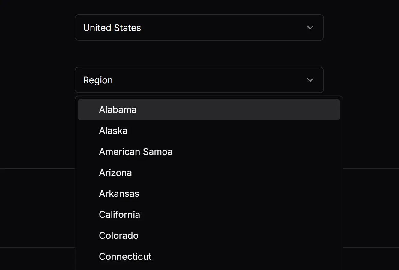
The library comes with two components: one for selecting a country and another for selecting a region or state. The region select is dependent on the country select, automatically populating its options based on the chosen country.
Features
🌍 Full country and region data from the country-region-data package.
🔄 Dynamic region filtering based on selected country.
⭐ Priority options for frequently used countries or regions.
📋 Whitelist and blacklist functionality for controlling available options.
🎯 Customizable placeholders and styling through className props.
📱 Responsive design that works across different screen sizes.
Use Cases
- E-commerce checkout forms requiring shipping address selection.
- User registration forms for international applications.
- Business directory platforms organizing listings by location.
- Travel booking systems filtering destinations by country and state.
- Survey forms collecting demographic information about participants.
How to Use It
1. Set up Shadcn UI in your project.
npx shadcn-ui@latest init2. Add the select component from Shadcn/ui.
npx shadcn-ui@latest add select3. The component requires the country-region-data package for its data.
npm install country-region-data4. Import and use the CountrySelect and RegionSelect components. You will need to manage the state of the selected country to link the two inputs. The countryCode from the CountrySelect component is passed as a prop to the RegionSelect component.
import { useState } from "react";
import CountrySelect from "@/components/ui/country-select";
import RegionSelect from "@/components/ui/region-select";
function UserLocationForm() {
  const [country, setCountry] = useState("");
  const [region, setRegion] = useState("");
  return (
    <div className="space-y-4">
      <CountrySelect
        className="w-[240px]"
        onChange={(value) => setCountry(value)}
        placeholder="Select a Country"
        priorityOptions={["US", "CA", "GB"]}
      />
      <RegionSelect
        className="w-[240px]"
        countryCode={country}
        onChange={(value) => setRegion(value)}
        placeholder="Select a Region"
      />
    </div>
  );
}
5. Available component props.
CountrySelect Properties
className(string): Applies a CSS class to the component for custom styling.onChange(function): A callback function that is executed when the selected country changes. It receives the country’s short code as an argument.placeholder(string): Sets the placeholder text displayed when no country is selected. The default is “Country”.priorityOptions(string[]): An array of country short codes to display at the top of the selection list.whiteList(string[]): An array of country short codes. Only the countries in this list will be displayed as options.blackList(string[]): An array of country short codes to exclude from the selection list.
RegionSelect Properties
blackList(string[]): An array of region names to exclude from the selection list.countryCode(string): The short code of the selected country, which determines the regions to display.className(string): Applies a CSS class to the component for custom styling.onChange(function): A callback function that is executed when the selected region changes.placeholder(string): Sets the placeholder text displayed when no region is selected. The default is “Region”.priorityOptions(string[]): An array of region names to display at the top of the selection list.whiteList(string[]): An array of region names. Only the regions in this list will be displayed.
Related Resources
- Shadcn/UI Documentation – Official documentation for the Shadcn UI component library and design system.
- Country Region Data NPM Package – The data source package providing country and region information.
- React Select – Alternative select component library with advanced features for complex selection scenarios.
FAQs
Q: Can I customize the appearance of the select components?
A: Yes, both CountrySelect and RegionSelect accept a className prop that allows you to apply custom Tailwind CSS classes or other styling approaches consistent with Shadcn UI theming.
Q: How do I handle form validation with these components?
A: The components work well with form libraries like React Hook Form. Use the onChange callbacks to update your form state and apply validation rules as needed for your specific requirements.
Q: Can I restrict the available countries or regions?
A: Both components support whiteList and blackList props. Use whiteList to show only specific countries or regions, or blackList to exclude certain options from the dropdown menus.
Q: How do I set default selected values?
A: Control the selected values through React state. Initialize your state variables with the desired country and region codes, and the components will display those selections by default.