The Future of Web Dev
The Future of Web Dev
Flexible Autocomplete & Custom Select Component for Svelte – Svelecte
A flexible Svelte autocomplete component for building dynamic and user-friendly select elements. Customizable, searchable, and easy to integrate.
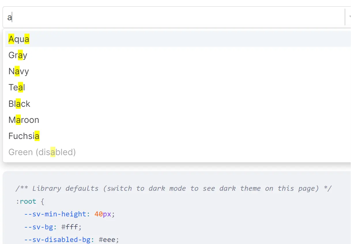
Svelecte is a flexible autocomplete and custom select component built as a robust alternative to the standard HTML select element.
Inspired by Selectize.js, it behaves similarly to a standard <select> element and can be used in forms or as a custom element.
Features
🔍 Searchable: Enables you to quickly find options within large datasets by typing keywords.
⚙️ Customizable Items: Handles both simple arrays and complex objects as data items.
➕ Create New Items: Facilitates the creation of new options on the fly, useful for tagging systems or dynamic data entry.
🎨 Customizable Styling: Provides extensive CSS customization options to match your application’s design.
♿ ARIA Support: Includes basic ARIA support to enhance accessibility for users relying on assistive technologies.
✅ Client-Side Validation: Compatible with client-side validation libraries like sveltekit-superforms for robust form handling.
🏷️ Custom Element: Usable as a custom element, broadening its application across different web environments.
🔄 Drag and Drop (DnD) Integration: Integrates with svelte-dnd-action for drag-and-drop reordering of selected items.
🗂️ Multiselect: Supports the selection of multiple items, with options to limit the maximum number of selections.
🎨 Custom Rendering: Allows for complete control over item display in dropdowns and selections using custom renderers.
☁️ Remote Data Fetch: Supports fetching options from remote APIs, ideal for applications with large or dynamically changing datasets.
🌐 Internationalization (i18n): Flexible internationalization support for adapting to different languages and regions.
📦 SSR Compatibility: Supports server-side rendering, crucial for performance and SEO in modern web applications.
⏳ Lazy Dropdown Rendering: Defers dropdown rendering until it’s first needed, improving initial load times.
🚀 Virtual List: Optimizes performance for extensive lists by rendering only visible items, ensuring smooth scrolling and responsiveness.
Use Cases
- Custom Input Interfaces: Develop unique input experiences beyond standard dropdowns, such as interactive search bars with advanced filtering or selection components with rich visual representations using custom renderers.
- Dynamic Form Creation: Incorporate Svelecte into forms where users need to select from a predefined list of options, such as choosing categories, tags, or countries. The searchable and creatable features are particularly useful in scenarios requiring flexible data input.
- Tagging and Filtering Systems: Implement tag selection in blog posts, project management tools, or e-commerce platforms. Svelecte’s multiselect and create new item functionalities enable users to categorize and filter content efficiently.
- Large Dataset Selection: Utilize Svelecte when dealing with extensive datasets, like selecting products from a large inventory or users from a substantial database. The virtual list and remote data fetch features ensure smooth performance and efficient data handling.
- Dependent Select Fields: Build forms with fields that are conditionally revealed or populated based on the selection in a parent field. Svelecte’s
parentValueproperty facilitates the creation of such dependent dropdowns, streamlining complex form interactions.
Installation
Install Svelecte using npm:
npm install svelecteUsage
Here’s a basic example of using Svelecte in a Svelte component:
<script>
  import Svelecte from 'svelecte';
  const list = [{ id: 1, name: 'Item 1' }, { id: 2, name: 'Item 2'}, { id: 3, name: 'Item 3'}];
  let myValue = null;
</script>
<Svelecte options={list} bind:value={myValue} placeholder="Select an item"></Svelecte>
<p>Selected value: {myValue}</p>
In this snippet, options is an array of objects representing the selectable items. The bind:value directive connects the selected value to the myValue variable. Svelecte automatically handles the dropdown, search, and selection logic based on the provided options.
Related Resources
- Svelte Form Library: Explore libraries like sveltekit-superforms for advanced form handling and validation in Svelte applications, which integrates well with Svelecte.
- Svelte Material UI: Consider UI libraries like Svelte Material UI for a comprehensive set of Material Design components in Svelte, potentially complementing Svelecte with other UI elements.
- Svelte Documentation: Refer to the official Svelte documentation to deepen your understanding of Svelte and how to build interactive components, providing a solid foundation for using Svelecte effectively.
FAQs
Q: Can I use Svelecte to fetch data from a remote API as the user types?
A: Yes, Svelecte is equipped with a fetch property that allows you to specify a URL for fetching options from a remote source. It also includes features like debounce time and minimum query length to optimize API calls during user input.
Q: Is it possible to customize the appearance of the dropdown and selected items?
A: Absolutely. Svelecte offers extensive customization through CSS classes and renderer functions. You can define custom renderers to control how options and selections are displayed, and utilize CSS classes to style various elements of the component.
Q: Can I allow users to create new options that are not initially in the list?
A: Yes, the creatable property in Svelecte enables the creation of new options. You can configure prefixes for new items and define handlers to manage the creation process, making it suitable for tagging and dynamic data entry scenarios.
Preview