shadcn-table-view is a component registry for shadcn/ui that creates full-featured data tables and table views in your React/shadcn projects.
The package delivers five core components:
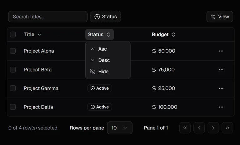
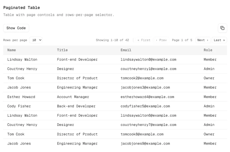
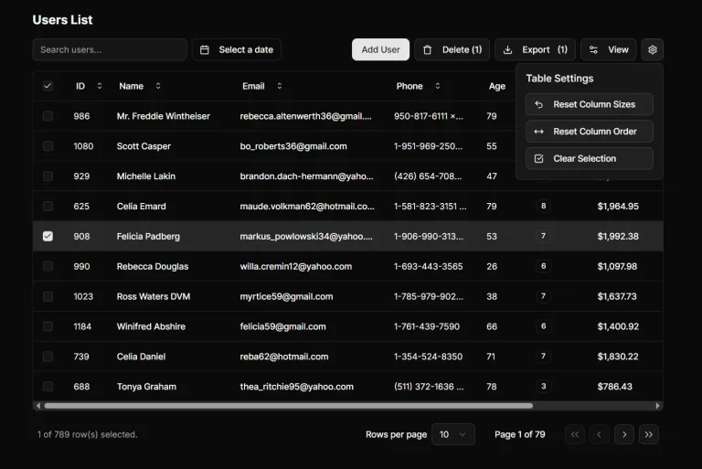
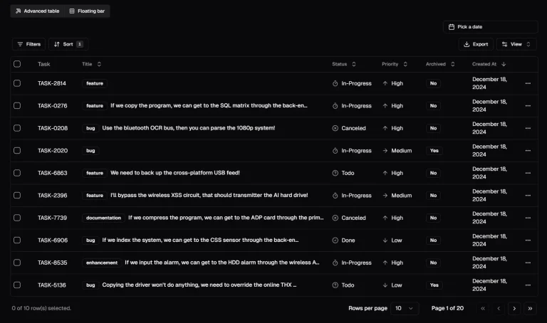
- DataTable manages sortable rows with pagination and selection.
- ViewManager coordinates tabbed filtering and saved view persistence.
- SearchCommand parses structured queries with field-based syntax.
- BulkActionsBar surfaces actions for multiple selected rows.
- TablePagination controls page navigation and items-per-page settings.
The registry follows shadcn/ui conventions. Components install directly into your src directory as editable TypeScript files. You can modify the source when your project needs deviate from the default behavior. The code stays in your repository under your version control.
Features
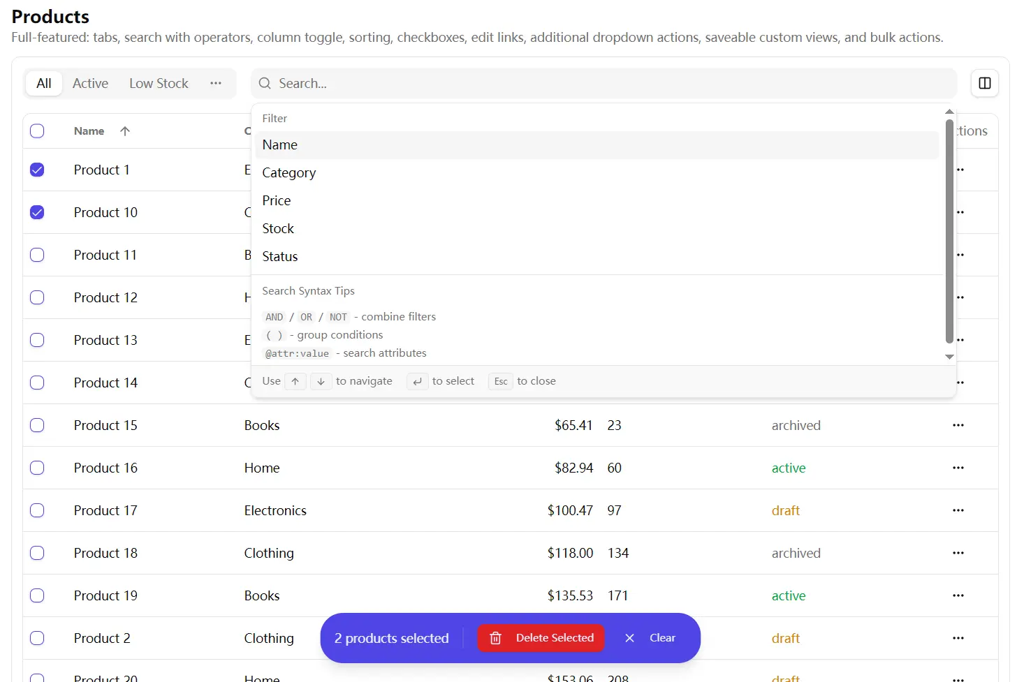
🔍 Structured Search System: Parse queries using field-based syntax with operators for exact matches, wildcards, comparisons, and boolean logic.
📊 Sortable Data Tables: Click column headers to toggle sort direction. DataTable renders rows from paginated API responses and tracks sort state through callback props. Shift-click checkboxes to select ranges across multiple rows.
👁️ Column Visibility Controls: Toggle columns on and off through a dropdown menu. Column configuration persists per view and applies to both the table headers and row cells.
📑 Tabbed View Management: Switch between predefined views or custom saved filters. ViewManager displays the first two views as tabs and groups remaining views in an overflow dropdown menu.
💾 Custom View Persistence: Save current filter state, sort settings, column visibility, and search queries as named views. The adapter pattern connects to your backend API for CRUD operations.
✅ Bulk Selection Actions: Select multiple rows and trigger batch operations. BulkActionsBar appears as a floating element when you select one or more items and disappears when you clear the selection.
🎯 Inline Row Actions: Render action buttons directly in each table row. Configure icons, labels, click handlers, and disabled states per action through typed props.
📄 Remote Pagination: Load table data through XHR requests based on page number and items-per-page settings. The component expects responses in a specific ListResponse format with total counts and page metadata.
🔗 Custom Edit Links: Replace the default edit dropdown item with your own React component. Pass a render function that returns a DropdownMenuItem with your routing logic.
⚡ Query Builder Interface: Select fields from a list, choose operators, and pick values from autocomplete suggestions or predefined options.
Use Cases
- Admin Dashboards: Manage large lists of users or orders with persistent view settings.
- SaaS Applications: Build customer management tools that require advanced filtering and bulk email actions.
- Inventory Systems: Track stock levels across multiple categories using structured search queries.
- Data Analysis Tools: Present complex datasets with sortable columns and custom visibility controls.
How to Use It
Table Of Contents
- Installation
- Basic DataTable Setup
- Adding Row Selection and Bulk Actions
- Configuring Inline Actions
- Customizing Row Dropdown Actions
- Implementing View Management
- Setting Up Saved Views with an Adapter
- Building Structured Search Queries
- Syntax Highlighting in Search Input
- DataTable Props
- ViewManager Props
- SearchCommand Props
- SearchInput Props
- BulkActionsBar Props
- TablePagination Props
- Type Definitions
Installation
Install the complete registry with all components in a single command.
npx shadcn@latest add https://raw.githubusercontent.com/chrisboulton/shadcn-components-table-view/main/public/r/table-view.jsonYou can also install individual components as follows
npx shadcn@latest add https://raw.githubusercontent.com/chrisboulton/shadcn-components-table-view/main/public/r/data-table.json
npx shadcn@latest add https://raw.githubusercontent.com/chrisboulton/shadcn-components-table-view/main/public/r/view-manager.json
npx shadcn@latest add https://raw.githubusercontent.com/chrisboulton/shadcn-components-table-view/main/public/r/search-command.json
The shadcn CLI copies TypeScript files into your project’s components directory. Check src/components/ui for the new files after installation completes.
Basic DataTable Setup
Import the DataTable component and define your column configuration. The component requires a columns array that specifies which fields to display and a columnConfig array that controls visibility.
import { DataTable, type DataTableColumn, type ColumnConfig, type ListResponse } from '@/components/ui/table-view'
interface Customer {
  id: string
  name: string
  email: string
  status: 'active' | 'inactive'
}
function CustomerTable() {
  const [page, setPage] = useState(1)
  const [sortField, setSortField] = useState<keyof Customer>('name')
  const [sortOrder, setSortOrder] = useState<'asc' | 'desc'>('asc')
  const columns: DataTableColumn<Customer>[] = [
    { id: 'name', label: 'Name', sortable: true },
    { id: 'email', label: 'Email', sortable: true },
    {
      id: 'status',
      label: 'Status',
      render: (item) => (
        <Badge variant={item.status === 'active' ? 'default' : 'secondary'}>
          {item.status}
        </Badge>
      )
    }
  ]
  const columnConfig: ColumnConfig[] = [
    { id: 'name', label: 'Name', visible: true },
    { id: 'email', label: 'Email', visible: true },
    { id: 'status', label: 'Status', visible: true }
  ]
  const { data } = useCustomers({ page, sortField, sortOrder })
  return (
    <DataTable
      data={data}
      columns={columns}
      columnConfig={columnConfig}
      onPageChange={setPage}
      onSortChange={(field, order) => {
        setSortField(field)
        setSortOrder(order)
      }}
      sortBy={sortField}
      sortOrder={sortOrder}
      itemName="customers"
      getItemId={(item) => item.id}
    />
  )
}
The data prop expects a ListResponse object with pagination metadata. Your API must return an object matching this structure.
interface ListResponse<T> {
  data: T[]
  total: number
  page: number
  per_page: number
  total_pages: number
  sort?: string
  order?: 'asc' | 'desc'
}
Transform offset-based API responses into this format using the included utility function.
import { transformToListResponse } from '@/components/ui/table-view'
const apiResponse = await fetch('/api/customers?offset=20&limit=10')
const offsetData = await apiResponse.json()
const listData = transformToListResponse(offsetData)
Adding Row Selection and Bulk Actions
Enable checkboxes by tracking selected IDs in state and passing selection callbacks to DataTable. The BulkActionsBar component appears when the selection array contains items.
function CustomerTableWithBulkActions() {
  const [selectedIds, setSelectedIds] = useState<string[]>([])
  const handleBulkDelete = async () => {
    await deleteCustomers(selectedIds)
    setSelectedIds([])
  }
  const handleBulkEmail = async () => {
    await sendBulkEmail(selectedIds)
  }
  return (
    <>
      <DataTable
        data={data}
        columns={columns}
        columnConfig={columnConfig}
        selectedItems={selectedIds}
        onSelectionChange={setSelectedIds}
        onPageChange={setPage}
        itemName="customers"
        getItemId={(item) => item.id}
        getItemDisplayName={(item) => item.name}
      />
      <BulkActionsBar
        selectedCount={selectedIds.length}
        actions={[
          {
            icon: Mail,
            label: 'Send Email',
            onClick: handleBulkEmail
          },
          {
            icon: Trash2,
            label: 'Delete',
            onClick: handleBulkDelete,
            variant: 'destructive'
          }
        ]}
        onClearSelection={() => setSelectedIds([])}
        itemName="customers"
      />
    </>
  )
}
Click the header checkbox to select all rows on the current page. Hold shift and click a second checkbox to select all rows between the first and second selection. Click individual checkboxes to toggle single rows.
Configuring Inline Actions
Add action buttons directly to each table row through the inlineActions prop. Each action receives the row item as an argument when clicked.
<DataTable
  data={data}
  columns={columns}
  columnConfig={columnConfig}
  onPageChange={setPage}
  itemName="customers"
  getItemId={(item) => item.id}
  inlineActions={[
    {
      id: 'view',
      icon: Eye,
      label: 'View',
      showLabel: false,
      onClick: (item) => navigate(`/customers/${item.id}`)
    },
    {
      id: 'edit',
      icon: Edit,
      label: 'Edit',
      showLabel: true,
      onClick: (item) => navigate(`/customers/${item.id}/edit`)
    }
  ]}
/>
Set showLabel to true when you want the button text visible next to the icon. Leave it false or omit it to show icons only.
Disable actions conditionally based on row data by adding a disabled function.
inlineActions={[
  {
    id: 'archive',
    icon: Archive,
    label: 'Archive',
    onClick: (item) => archiveCustomer(item.id),
    disabled: (item) => item.status === 'archived'
  }
]}
Customizing Row Dropdown Actions
DataTable automatically adds a three-dot menu to each row with Edit and Delete options. Replace the edit action with a custom link component through renderEditLink.
import { Link } from 'react-router-dom'
import { DropdownMenuItem } from '@/components/ui/dropdown-menu'
<DataTable
  data={data}
  columns={columns}
  columnConfig={columnConfig}
  onPageChange={setPage}
  onDelete={(id) => deleteCustomer(id)}
  renderEditLink={(item) => (
    <DropdownMenuItem asChild>
      <Link to={`/customers/${item.id}`}>
        <Edit className="mr-2 h-4 w-4" />
        Edit Customer
      </Link>
    </DropdownMenuItem>
  )}
  itemName="customers"
  getItemId={(item) => item.id}
/>
Add extra menu items through additionalActions. This prop accepts a function that returns React nodes for each row.
<DataTable
  data={data}
  columns={columns}
  columnConfig={columnConfig}
  onPageChange={setPage}
  itemName="customers"
  getItemId={(item) => item.id}
  additionalActions={(item) => (
    <>
      <DropdownMenuItem onClick={() => duplicateCustomer(item.id)}>
        <Copy className="mr-2 h-4 w-4" />
        Duplicate
      </DropdownMenuItem>
      <DropdownMenuItem onClick={() => exportCustomer(item.id)}>
        <Download className="mr-2 h-4 w-4" />
        Export
      </DropdownMenuItem>
    </>
  )}
/>
Hide the dropdown menu completely by setting hideDropdownActions to true. This pattern works when you only need inline action buttons.
Implementing View Management
ViewManager handles tab navigation, search input, and column visibility controls. Define your views as an array of DataView objects with filter criteria, sort settings, and column configurations.
import { ViewManager, type DataView, type SearchField } from '@/components/ui/table-view'
function CustomerPage() {
  const [currentView, setCurrentView] = useState<DataView>()
  const [searchQuery, setSearchQuery] = useState('')
  const builtInViews: DataView[] = [
    {
      id: 'all',
      name: 'All Customers',
      isBuiltIn: true,
      filters: { search: '' },
      sort: { field: 'name', order: 'asc' },
      columns: [
        { id: 'name', label: 'Name', visible: true },
        { id: 'email', label: 'Email', visible: true },
        { id: 'status', label: 'Status', visible: true },
        { id: 'created_at', label: 'Created', visible: false }
      ]
    },
    {
      id: 'active',
      name: 'Active',
      isBuiltIn: true,
      filters: { search: 'status:active' },
      sort: { field: 'name', order: 'asc' },
      columns: [
        { id: 'name', label: 'Name', visible: true },
        { id: 'email', label: 'Email', visible: true },
        { id: 'status', label: 'Status', visible: true }
      ]
    }
  ]
  const searchFields: SearchField[] = [
    { id: 'name', label: 'Name', type: 'text' },
    { id: 'email', label: 'Email', type: 'text' },
    {
      id: 'status',
      label: 'Status',
      type: 'combobox',
      options: [
        { value: 'active', label: 'Active' },
        { value: 'inactive', label: 'Inactive' }
      ]
    },
    { id: 'created_at', label: 'Created', type: 'date' }
  ]
  const handleColumnToggle = (columnId: string) => {
    const updatedColumns = currentView.columns.map(col =>
      col.id === columnId ? { ...col, visible: !col.visible } : col
    )
    setCurrentView({ ...currentView, columns: updatedColumns })
  }
  return (
    <ViewManager
      currentView={currentView}
      builtInViews={builtInViews}
      searchQuery={searchQuery}
      searchFields={searchFields}
      entity="customers"
      storeId="store-1"
      onViewChange={setCurrentView}
      onSearchChange={setSearchQuery}
      onColumnToggle={handleColumnToggle}
    />
  )
}
ViewManager displays the first two views as tabs. Additional views appear in a dropdown menu labeled “More views”. Override this behavior by setting showAllViewsInTabs to true.
The entity and storeId props identify where to save custom views. Use different entity values for different table types in your application. Use different storeId values when you have multiple independent instances of the same entity type.
Setting Up Saved Views with an Adapter
Connect saved view persistence to your backend through the SavedViewsAdapter interface. Implement three required methods: list, create, and delete.
import type { SavedViewsAdapter, SavedView, CreateSavedViewRequest } from '@/components/ui/table-view'
const mySavedViewsAdapter: SavedViewsAdapter = {
  list: async (entity: string) => {
    const response = await fetch(`/api/saved-views?entity=${entity}`)
    return response.json()
  },
  create: async (data: CreateSavedViewRequest) => {
    const response = await fetch('/api/saved-views', {
      method: 'POST',
      headers: { 'Content-Type': 'application/json' },
      body: JSON.stringify(data)
    })
    return response.json()
  },
  delete: async (id: string) => {
    await fetch(`/api/saved-views/${id}`, { method: 'DELETE' })
  }
}
Pass the adapter to ViewManager through the savedViewsAdapter prop. The component calls these methods when users create, load, or delete custom views.
<ViewManager
  currentView={currentView}
  builtInViews={builtInViews}
  searchQuery={searchQuery}
  searchFields={searchFields}
  entity="customers"
  storeId="store-1"
  onViewChange={setCurrentView}
  onSearchChange={setSearchQuery}
  onColumnToggle={handleColumnToggle}
  savedViewsAdapter={mySavedViewsAdapter}
/>
Implement get and update methods when you need to fetch individual views or modify existing ones.
interface ExtendedAdapter extends SavedViewsAdapter {
  get: async (id: string) => {
    const response = await fetch(`/api/saved-views/${id}`)
    return response.json()
  },
  update: async (id: string, data: UpdateSavedViewRequest) => {
    const response = await fetch(`/api/saved-views/${id}`, {
      method: 'PATCH',
      headers: { 'Content-Type': 'application/json' },
      body: JSON.stringify(data)
    })
    return response.json()
  }
}
Use the provided React Query hooks to manage saved views in your components.
import { useSavedViews, useCreateSavedView, useDeleteSavedView } from '@/components/ui/table-view'
function ViewManagementExample() {
  const { data: savedViews } = useSavedViews('customers', mySavedViewsAdapter)
  const createView = useCreateSavedView(mySavedViewsAdapter)
  const deleteView = useDeleteSavedView(mySavedViewsAdapter)
  const handleSaveView = () => {
    createView.mutate({
      name: 'My Custom View',
      entity: 'customers',
      visible_by: 'owner',
      search_query: searchQuery,
      sort_by: 'name',
      sort_direction: 'asc',
      columns: ['name', 'email', 'status'],
      per_page: 25
    })
  }
  return (
    // Component JSX
  )
}
Omit the savedViewsAdapter prop completely to disable custom view functionality. ViewManager hides the “Save view” button when no adapter is present.
Building Structured Search Queries
SearchCommand parses field-based queries with support for operators, wildcards, boolean logic, and grouping. Users type queries in a format similar to GitHub or Gmail search.
Define available fields through the searchFields prop. Each field specifies its type, which determines what operators and input methods appear in the command palette.
const searchFields: SearchField[] = [
  {
    id: 'name',
    label: 'Customer Name',
    type: 'text'
  },
  {
    id: 'email',
    label: 'Email Address',
    type: 'text'
  },
  {
    id: 'status',
    label: 'Status',
    type: 'combobox',
    options: [
      { value: 'active', label: 'Active' },
      { value: 'inactive', label: 'Inactive' },
      { value: 'pending', label: 'Pending' }
    ]
  },
  {
    id: 'score',
    label: 'Credit Score',
    type: 'number',
    operators: ['>', '<', '>=', '<=', '=']
  },
  {
    id: 'created_at',
    label: 'Created Date',
    type: 'date'
  },
  {
    id: 'verified',
    label: 'Email Verified',
    type: 'boolean'
  }
]
Add the @ prefix to field IDs when you want to mark them as attribute fields. Attribute fields render with different syntax highlighting in the search input.
{
  id: '@plan',
  label: 'Subscription Plan',
  type: 'combobox',
  options: [
    { value: 'free', label: 'Free' },
    { value: 'pro', label: 'Pro' },
    { value: 'enterprise', label: 'Enterprise' }
  ]
}
Connect dynamic value suggestions to your backend through the searchCallback function. The callback receives the current store ID and search term, then returns matching options.
{
  id: 'company',
  label: 'Company',
  type: 'combobox',
  searchCallback: async (storeId: string, searchTerm: string) => {
    const response = await fetch(`/api/companies/search?q=${searchTerm}&store=${storeId}`)
    const companies = await response.json()
    return companies.map(c => ({ id: c.id, name: c.name }))
  }
}
The search syntax supports multiple operators and patterns. Users type field names followed by a colon and their search criteria.
Exact match syntax requires the field name and value without any operators.
name:JohnWildcard patterns use asterisks for partial matches. Place the asterisk at the start, end, or both sides of the value.
email:*@gmail.com
name:John*
company:*Tech*
Comparison operators work with numbers and dates. Supported operators include greater than, less than, greater than or equal, less than or equal, and equals.
score:>700
created_at:>=2024-01-01
age:<30
Quote values that contain spaces or special characters.
name:"John Doe"
company:"Acme Corp"
Attribute fields use the @ prefix before the field name.
@plan:enterprise
@role:admin
Combine multiple criteria with AND, OR, and NOT operators. The parser treats uppercase keywords as boolean operators.
name:John AND status:active
email:*@gmail.com OR email:*@yahoo.com
status:active NOT @plan:free
Group conditions with parentheses when you need complex logic.
(name:John OR name:Jane) AND status:active
@plan:enterprise AND (score:>700 OR verified:true)
Negate individual conditions by prefixing them with a minus sign.
-status:archived
name:John -@plan:free
Parse queries programmatically using the included utility functions.
import { parseSearchQuery, buildFilterString, updateQueryWithFilter } from '@/components/ui/table-view'
const query = 'name:John AND status:active'
const parseResult = parseSearchQuery(query, query.length)
// Build a new filter string
const filterString = buildFilterString('email', '[email protected]', 'contains')
// Returns: 'email:*[email protected]*'
// Insert filter into existing query at cursor position
const { query: newQuery, cursorPosition } = updateQueryWithFilter(
  'name:John ',
  11,
  'status:active'
)
// Returns: { query: 'name:John status:active', cursorPosition: 25 }
SearchCommand stores recent searches in localStorage automatically. Retrieve and manage search history through the utility functions.
import {
  getSearchHistory,
  addToSearchHistory,
  clearSearchHistory,
  removeFromSearchHistory
} from '@/components/ui/table-view'
const history = getSearchHistory('customers')
addToSearchHistory('customers', 'status:active')
removeFromSearchHistory('customers', 'old-query')
clearSearchHistory('customers')
The component limits history to 10 entries per entity. New searches push older ones out when the limit is reached.
Syntax Highlighting in Search Input
SearchInput wraps the cmdk CommandInput component and adds a transparent overlay that displays syntax-highlighted tokens. The component tokenizes the query string and applies CSS classes based on token type.
import { SearchInput } from '@/components/ui/table-view'
<SearchInput
  value={searchQuery}
  onValueChange={setSearchQuery}
  enableHighlight={true}
  knownAttributeFields={['plan', 'role', 'tier']}
  placeholder="Search customers..."
/>
Pass field names without the @ prefix to knownAttributeFields. The highlighter adds different styling to recognized attribute fields versus regular fields.
Token types include field names, colons, operators, values, keywords (AND, OR, NOT), parentheses, wildcards, and plain text. Each type receives a distinct CSS class.
import { tokenizeForHighlight, getTokenClassName } from '@/components/ui/table-view'
const tokens = tokenizeForHighlight('name:John AND @plan:pro')
tokens.forEach(token => {
  const className = getTokenClassName(token.type)
  // Render token with className
})
Customize token colors by overriding the CSS classes in your stylesheet. The default classes follow this pattern.
.search-token-field { color: hsl(var(--primary)); }
.search-token-operator { color: hsl(var(--muted-foreground)); }
.search-token-value { color: hsl(var(--foreground)); }
.search-token-keyword { color: hsl(var(--destructive)); }
API Reference
DataTable Props
data (ListResponse, required): Paginated response containing data array, total count, current page, items per page, and total pages. The component reads pagination state from this object.
columns (DataTableColumn[], required): Column definitions with id, label, optional sortable flag, optional render function, and optional className. The render function receives the row item and returns a React node.
columnConfig (ColumnConfig[], required): Column visibility configuration with id, label, visible boolean, and optional width. Controls which columns appear in the table.
selectedItems (string[], default []): Array of selected item IDs. Pass state from your component to track selection across renders.
onSelectionChange ((ids: string[]) => void): Callback fired when row selection changes. Receives the updated array of selected IDs.
onEdit ((item: T) => void): Edit handler shown in the dropdown menu. Omit when using renderEditLink for custom routing.
onDelete ((itemId: string) => void): Delete handler shown in the dropdown menu. The component displays a confirmation dialog before calling this function.
onPageChange ((page: number) => void, required): Page change handler. Receives 1-indexed page numbers.
onSortChange ((field: TSortField, order: ‘asc’ | ‘desc’) => void): Sort change handler. Called when users click sortable column headers.
onItemsPerPageChange ((itemsPerPage: number) => void): Items per page change handler. Called when users select a different page size from the dropdown.
sortBy (TSortField): Current sort field. Must match a column id with sortable set to true.
sortOrder (‘asc’ | ‘desc’): Current sort direction. Controls the arrow icon in column headers.
loading (boolean, default false): Loading state. Displays a spinner overlay when true.
itemName (string, required): Plural noun for display text. Used in aria labels, empty states, and pagination text.
getItemId ((item: T) => string, required): Function that extracts the unique identifier from a row item. Required for selection and action handlers.
getItemDisplayName ((item: T) => string): Function that extracts a display name from a row item. Used in aria labels for screen readers.
additionalActions ((item: T) => ReactNode): Extra dropdown menu items rendered per row. Return DropdownMenuItem components from this function.
renderEditLink ((item: T) => ReactNode): Custom edit link that replaces the default edit action in the dropdown menu. Return a DropdownMenuItem with your routing component.
inlineActions (InlineAction[]): Action buttons rendered directly in the actions cell before the dropdown menu.
hideDropdownActions (boolean, default false): Hide the three-dot dropdown menu completely. Use when you only need inline action buttons.
showCheckboxes (boolean, default true): Display row selection checkboxes. Set to false for read-only tables.
showSorting (boolean, default true): Enable sortable column headers. Set to false to disable all sorting interactions.
ViewManager Props
currentView (DataView, required): Active view object containing filters, sort, and column configuration.
builtInViews (DataView[], required): Array of predefined views. These views appear as tabs or in the views dropdown.
searchQuery (string, required): Current search query string. Pass state from your component to control the search input.
searchFields (SearchField[], required): Available search fields for the command palette. Defines which fields users can search and what input methods appear.
entity (string, required): Entity type identifier used for saved view storage and search history.
storeId (string, required): Store identifier used to scope saved views and searches to specific contexts.
onViewChange ((view: DataView) => void, required): Called when the active view changes through tab clicks, dropdown selection, or saved view loading.
onSearchChange ((query: string) => void, required): Called when the search query changes. Receives the updated query string.
onColumnToggle ((columnId: string) => void, required): Called when a user toggles column visibility through the dropdown menu.
showSearch (boolean, default true): Display the search bar. Set to false to hide search functionality.
showAllViewsInTabs (boolean, default false): Show all views as tabs instead of using the two-tab-plus-dropdown pattern.
allowCustomViews (boolean, default true): Enable the “Save view” button and custom view management. Automatically disabled when savedViewsAdapter is not provided.
showColumnToggle (boolean, default true): Display the column visibility dropdown button.
savedViewsAdapter (SavedViewsAdapter): Adapter implementation for saved view CRUD operations. Custom views are disabled when omitted.
SearchCommand Props
searchFields (SearchField[], required): Available fields for search queries. Each field defines its type, operators, and value input method.
searchQuery (string, required): Current query string displayed in the input.
recentSearches (string[], required): Array of recent search queries from history. Display these as suggestions in the command palette.
onQueryChange ((query: string) => void, required): Called when the query text changes.
onSelectField ((field: SearchField) => void, required): Called when a user selects a field from the suggestions list.
onSelectValue ((value: string, operator?: string) => void, required): Called when a user selects a value from autocomplete or the value picker.
onSelectSuggestion ((query: string) => void, required): Called when a user clicks a recent search suggestion.
onSubmit (() => void, required): Called when the user presses Enter or clicks the search button.
enableHighlight (boolean, default true): Enable syntax highlighting in the search input overlay.
SearchInput Props
value (string): Input value controlled by parent component.
onValueChange ((value: string) => void): Value change handler.
enableHighlight (boolean, default false): Enable syntax highlighting overlay on top of the input field.
knownAttributeFields (string[]): Array of attribute field names without the @ prefix. Used to apply distinct highlighting to attribute tokens.
className (string): Additional CSS classes applied to the input wrapper.
All standard cmdk CommandInput props are also supported, including placeholder, onFocus, onBlur, onKeyDown, and others.
BulkActionsBar Props
selectedCount (number, required): Number of selected items. The bar automatically hides when this value is zero.
actions (BulkAction[], required): Array of action button configurations with icon, label, click handler, and optional variant.
onClearSelection (() => void, required): Called when the user clicks the “Clear selection” button.
itemName (string): Singular or plural noun displayed in the selection count text.
TablePagination Props
currentPage (number, required): Current page number using 1-indexed numbering.
totalPages (number, required): Total number of pages calculated from total items and items per page.
onPageChange ((page: number) => void, required): Page change handler called when users click page numbers or navigation arrows.
totalItems (number, required): Total count of items across all pages.
itemsPerPage (number, required): Number of items displayed per page.
onItemsPerPageChange ((itemsPerPage: number) => void): Items per page change handler. When provided, displays a dropdown for selecting page size.
itemName (string, default “items”): Noun used in the “Showing X-Y of Z items” text.
Type Definitions
ListResponse: Page-based pagination response format.
interface ListResponse<T> {
  data: T[]
  total: number
  page: number
  per_page: number
  total_pages: number
  sort?: string
  order?: 'asc' | 'desc'
}DataView: Named view configuration.
interface DataView<TSortField = string> {
  id: string
  name: string
  description?: string
  isBuiltIn: boolean
  filters: ViewFilter
  sort: { field: TSortField; order: 'asc' | 'desc' }
  columns: ColumnConfig[]
}DataTableColumn: Column definition for table headers and cells.
interface DataTableColumn<T = any> {
  id: string
  label: string
  sortable?: boolean
  render?: (item: T) => React.ReactNode
  className?: string
}ColumnConfig: Column visibility entry.
interface ColumnConfig {
  id: string
  label: string
  visible: boolean
  width?: string
}SearchField: Search field configuration for the command palette.
interface SearchField {
  id: string
  label: string
  type: 'text' | 'boolean' | 'date' | 'number' | 'combobox'
  operators?: string[]
  options?: { value: string; label: string }[]
  searchCallback?: (storeId: string, searchTerm: string) => Promise<Array<{ id: string; name: string }>>
}InlineAction: Action button rendered in the table row.
interface InlineAction<T = any> {
  id: string
  icon: React.ComponentType<{ className?: string }>
  label: string
  showLabel?: boolean
  onClick: (item: T) => void
  disabled?: (item: T) => boolean
  variant?: 'default' | 'secondary' | 'outline' | 'ghost' | 'destructive'
  className?: string
}BulkAction: Bulk action button configuration.
interface BulkAction {
  icon: LucideIcon
  label: string
  onClick: () => void
  variant?: 'default' | 'secondary' | 'destructive' | 'outline' | 'ghost'
}ViewFilter: Filter object stored in DataView.
interface ViewFilter {
  search: string
  [key: string]: any
}SavedView: Persisted view returned from the adapter.
interface SavedView {
  id: string
  name: string
  entity: SavedViewEntity
  visible_by: SavedViewVisibility
  search_query?: string
  sort_by: string
  sort_direction: 'asc' | 'desc'
  columns: string[]
  per_page: number
}SavedViewsAdapter: Persistence interface for saved views.
interface SavedViewsAdapter {
  list: (entity: string) => Promise<SavedView[]>
  create: (data: CreateSavedViewRequest) => Promise<SavedView>
  delete: (id: string) => Promise<void>
}
Extended adapter with get and update methods:
interface ExtendedAdapter extends SavedViewsAdapter {
  get: (id: string) => Promise<SavedView>
  update: (id: string, data: UpdateSavedViewRequest) => Promise<SavedView>
}OffsetPaginationResponse: Offset-based API response format for transformation utilities.
interface OffsetPaginationResponse<T> {
  data: T[]
  pagination: {
    total: number
    limit: number
    offset: number
    has_more: boolean
  }
}
Related Resources
- TanStack Table: Headless table library with TypeScript support, column resizing, filtering, and virtualization for large datasets.
- React Query: Data fetching and caching library that works well with the saved views hooks in this package.
- 10 Best And Free Data Table Libraries For React Applications
- 10 Best Data Table/Grid Systems In JavaScript
FAQs
Q: How do I connect DataTable to a REST API that uses cursor-based pagination?
A: Transform cursor responses into the ListResponse format using a custom adapter. Calculate page numbers from cursor position and item count, then convert back to cursors when making API requests. Store the cursor state alongside page numbers in your component.
Q: Can I use this with server components in Next.js App Router?
A: The components require client-side interactivity for sorting, selection, and search. Mark your page or wrapper component with ‘use client’ directive. Fetch initial data server-side through Server Components and pass it as props to client components.
Q: How do I persist column visibility and sort preferences across sessions?
A: Store currentView state in localStorage or sync it to your backend through the saved views adapter. Load the stored view on component mount and update it whenever users change columns or sort settings.
Q: What happens when users modify the query syntax incorrectly?
A: SearchCommand tokenizes the query but does not validate correctness. Your backend API receives the raw query string and handles parsing errors. Return meaningful error messages from your API when queries fail validation.
Q: Can I disable specific operators for certain field types?
A: Pass a custom operators array in the SearchField configuration. Limit number fields to comparison operators or restrict text fields to exact matches by specifying which operators appear in the command palette.