The Future of Web Dev
The Future of Web Dev
Pre-built shadcn/ui Form Components for Inertia.js – Wandry UI
Add production-ready form components to Laravel Inertia.js apps using the shadcn CLI. Get text fields, checkboxes, and selects with built-in validation.
Wandry UI is a component registry that extends shadcn/ui with production-ready form fields built for Inertia.js applications.
It works in tandem with @wandry/inertia-form to deliver pre-configured form components that eliminate repetitive setup work.
Features
🚀 CLI-Based Installation: Add components to your project using the shadcn CLI with the @wandry-ui namespace.
🔄 Automatic State Synchronization: Form state updates and validation errors sync automatically with backend responses through Inertia.js.
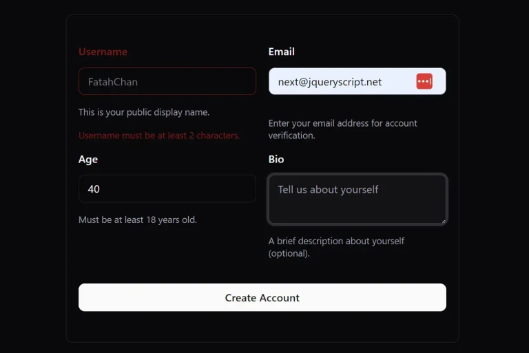
📝 Pre-Built Form Fields: Access text inputs, checkboxes, radio buttons, select menus, OTP inputs, and password fields without writing boilerplate code.
🎨 Tailwind and Radix UI Foundation: Built on Tailwind CSS utility classes and Radix UI primitives for consistent styling and behavior.
🔌 Zero Configuration Required: Components work immediately after installation with no additional wrapper code or setup files.
♿ Accessibility Built In: ARIA attributes, keyboard navigation, and focus management come configured in every component.
Use Cases
- Laravel SaaS Applications: Build user dashboards, account settings, and admin panels with consistent form patterns across all pages.
- Multi-Step Registration Flows: Create onboarding wizards and checkout processes using validated form fields that maintain state between Inertia page visits.
- Data Management Interfaces: Construct CRUD operations, search filters, and bulk edit forms for content management systems and internal tools.
- Survey and Feedback Forms: Deploy dynamic forms with conditional fields and complex validation rules in customer-facing applications.
How to Use It
1. Create a new Laravel project that uses Inertia.js and React.
laravel new my-app --react2. Add the @wandry/inertia-form package to your project. This library will manage the form’s state and logic.
npm install @wandry/inertia-form3. You can now add individual form components using the shadcn/ui CLI. For instance, to add a text input and a checkbox, run the following commands.
npx shadcn@latest add @wandry-ui/text-field
pnpm dlx shadcn@latest add @wandry-ui/checkbox-field
These commands will place the component files into your resources/js/components directory.
4. Import the components and use them within the Form component from @wandry/inertia-form.
"use client";
import * as React from "react";
import { Form } from "@wandry/inertia-form";
import CheckboxField from "@/components/checkbox-field";
export type CheckboxFieldDemoProps = {};
const CheckboxFieldDemo: React.FC<CheckboxFieldDemoProps> = (props) => {
  return (
    <Form action="#">
      <CheckboxField
        name="is_checked"
        label="I agree to the terms and conditions"
      />
    </Form>
  );
};
export CheckboxFieldDemo;
5. All UI components included:
Available UI Components
- AsyncAutocompleteField: An input field that provides search-as-you-type functionality by fetching suggestions from an API.
- Checkbox Field: A standard checkbox for making a binary choice.
- Choicebox Field: A component for selecting one or more options, often presented in a visually distinct card-like format.
- DatepickerField: An input that opens a calendar for selecting a single date.
- Datepicker Range Field: An input for selecting a start and end date from a calendar interface.
- Dropzone Field: An area that allows users to drag and drop files for uploading.
- File Field: A standard button for browsing and selecting local files.
- InputOtpField: A set of inputs designed for entering one-time passwords or verification codes.
- Password Field: A text input that masks characters for secure password entry.
- Radio Field: A group of options where only one can be selected at a time.
- Select Field: A dropdown menu for selecting a single option from a list.
- Slider Field: A control for selecting a value from a given range by moving a handle.
- Submit Button: A button to trigger form submission, with built-in handling for disabled states during submission.
- Switch Field: A toggle switch for on/off or true/false selections.
- TextField: A standard single-line input for text, numbers, or email.
- Textarea Field: A multi-line text input for longer content.
- Timepicker Field: An input for selecting a specific time of day.
Related Resources
- Inertia.js Documentation covers the full API for building single-page applications with server-side routing in Laravel.
- shadcn/ui provides the component architecture and design system that Wandry UI extends for form fields.
- @wandry/inertia-form on GitHub contains the source code, issue tracker, and contribution guidelines for the form management library.
FAQs
Q: Can I use Wandry UI components without @wandry/inertia-form?
A: No. The components depend on @wandry/inertia-form for state management, validation handling, and error display. The library provides the Form wrapper and hooks that the components expect to be present.
Q: Do I need to configure Radix UI or Tailwind CSS separately?
A: No. Laravel projects created with laravel new --react include Tailwind CSS by default. Radix UI dependencies install automatically when you add Wandry UI components through the shadcn CLI.
Q: How do I handle custom validation rules?
A: Define validation rules in your Laravel controller using standard Laravel validation. The Form component receives validation errors from Inertia.js responses and displays them automatically next to the corresponding fields.
Q: Can I modify the component source code after installation?
A: Yes. Components install as source files in your project’s component directory. You can modify styling, add props, or change behavior directly in these files without affecting other projects.