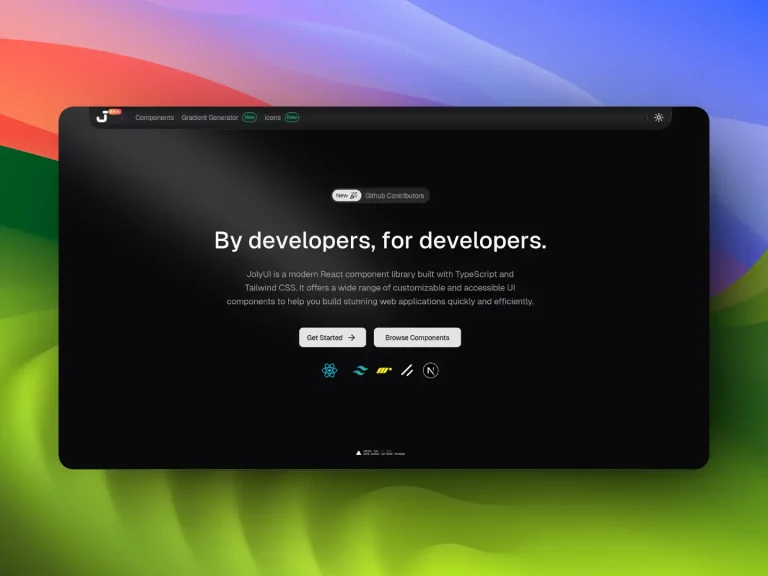
The Future of Web Dev
The Future of Web Dev
100+ Shadcn and Framer Motion Components for Next.js – UI TripleD
Access over 100 production-ready UI components built with shadcn/ui and Framer Motion. Copy and paste animated blocks directly into your Next.js apps.
UI TripleD is a UI library that provides over 100 animated, production-ready UI components and blocks based on shadcn/ui, Framer Motion, and Tailwind CSS.
You can use these components and blocks to implement complex UI patterns like microinteractions, page transitions, and data animations without writing the underlying logic from scratch.
Features
🔧 Visual Builder: Drag-and-drop interface that lets you preview and test components before copying them into your codebase.
📋 Copy & Paste: One-click code copying that transfers complete component code to your clipboard for direct implementation.
🔒 TypeScript Support: Full type definitions included for all components, props, and configuration options.
♿ Accessibility: Components include proper ARIA attributes, keyboard navigation, and reduced motion support.
🎭 Framer Motion: All animations use Framer Motion with configurable transition properties and motion preferences.
🎨 Tailwind CSS Styling: Components use Tailwind utility classes that you can customize through your existing theme configuration.
Use Cases
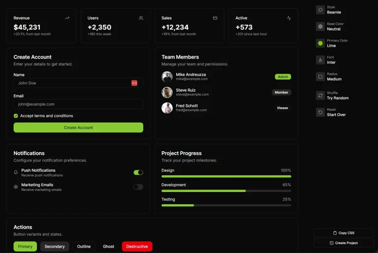
- Dashboard Applications: Use the stats dashboard, charts, and data visualization components to build admin panels and analytics interfaces.
- Marketing Websites: Implement hero sections, CTA blocks, testimonial grids, and pricing tables for landing pages and promotional sites.
- SaaS Applications: Add authentication forms, profile settings, command palettes, and notification centers to web applications.
- Content Platforms: Build blog layouts, gallery grids, timeline blocks, and FAQ sections for content-focused websites.
How to Use It
1. Install the required dependencies before using UI TripleD components.
npm install framer-motion
npm install @radix-ui/react-icons
npx shadcn@latest init
2. The shadcn init command sets up your project with the base configuration. After initialization, you can add individual shadcn components that UI TripleD components depend on:
npx shadcn@latest add badge
npx shadcn@latest add button
npx shadcn@latest add card
3. Visit the UI TripleD documentation site to preview available components. The site organizes components into categories including Blocks, Microinteractions, Components, Page Transitions, Data Animations, and Decorative elements.
4. When you find a component you want to use, click the Copy Code button. The library copies the complete component code to your clipboard. Paste this code into a new file in your components directory.
Check the component code you copied to see which shadcn components it imports. Install those specific components using the shadcn CLI.
Here is an example of adding a hover card component to your project. Create a new file called hover-expand-card.tsx in your components folder:
"use client";

import { motion, useReducedMotion } from "framer-motion";
import { Badge } from "@/components/ui/badge";

export function HoverExpandCard() {
  const shouldReduceMotion = useReducedMotion();

  return (
    <div className="">
      <motion.div
        whileHover={shouldReduceMotion ? undefined : { y: -10, scale: 1.015 }}
        whileFocus={shouldReduceMotion ? undefined : { y: -10, scale: 1.015 }}
        transition={{ type: "spring", stiffness: 260, damping: 26 }}
        className="group rounded-3xl border border-border/60 bg-card/80 p-6 backdrop-blur-xl transition-shadow duration-300 hover:shadow-[0_28px_90px_-40px_rgba(15,23,42,0.75)] focus-visible:outline-none focus-visible:ring-2 focus-visible:ring-primary/40 focus-visible:ring-offset-2 focus-visible:ring-offset-background"
        tabIndex={0}
        role="group"
        aria-label="Hover expand card demonstrating glassmorphic elevation."
      >
        <div className="relative mb-4 h-40 overflow-hidden rounded-2xl border border-border/60 bg-gradient-to-br from-foreground/10 via-background/40 to-transparent">
          <motion.div
            aria-hidden
            className="absolute inset-0 bg-[radial-gradient(circle_at_30%_20%,rgba(255,255,255,0.4),transparent_55%),radial-gradient(circle_at_80%_0%,rgba(79,70,229,0.45),transparent_60%)] transition-transform duration-500"
            whileHover={shouldReduceMotion ? undefined : { scale: 1.05 }}
          />
        </div>
        <Badge
          variant="outline"
          className="mb-3 w-fit rounded-full border-border/60 bg-white/5 px-3 py-1 text-[10px] uppercase tracking-[0.3em] text-muted-foreground"
        >
          Feature
        </Badge>
        <h3 className="mb-2 text-xl font-semibold text-foreground">
          Beautiful Card
        </h3>
        <p className="text-sm leading-relaxed text-muted-foreground">
          Hover or focus to gently lift and expand the surface. Animations stay
          calm but responsive, matching the glassmorphic system.
        </p>
      </motion.div>
    </div>
  );
}
5. You can modify component styling by adjusting Tailwind classes directly in the component code.
6. Adjust motion properties by modifying the values passed to Framer Motion props. Change whileHover, transition, and other motion properties to match your design requirements.
All Available Components & Blocks
Components
Hover Expand Card
Detail Task Card
E-commerce Highlight Card
Notification Center
Weather Dashboard
Browse Folder
Animated Card Stack
Credit Card
Accessible Image Slider Card
Animated List
Chat App
Messenger
AI Chat Interface
Animated Dialog
Bottom Modal
Animated Profile Menu
Draggable List
Avatar Group
Glass Sign-In Card
Glass Sign-Up Card
Glass Forgot Password Card
Glass Verification Code Card
Glass Profile Settings Card
Glass Account Settings Card
Command Palette
Multiple Accounts Switcher
Mac Searchbar
Context Menu
Projects Block
Interactive Timeline
AI Loading Skeleton
Context Menu Bubble
Expanding Search Dock
AI Glow Input
AI Response Typing Stream
Glassmorphism Statistics Card
Microinteractions
Magnetic Button
Preview Details Card
Animated Badge
Morphing Action Button
Magnetic Cursor Link
Notification Bell
AI Unlock Animation
Decorative
Liquid Cursor
Typewriter Effect
Gradient Animation
Floating Gradient
Dynamic Tag Cloud
Animated Quote Block
Floating Info Panel
Holographic Wall
Blocks
Glowy Waves Hero
Stocks Dashboard
Dashboard
Hero Block
Testimonials Block
CTA Block
Blog Block
Contact Block
New Hero Section
About Us
Contact Form
Our Services
Team Section Block
Newsletter Signup Block
Feature Comparison Table
Gallery Grid with Lightbox
Footer Block
CTA Hero Block
Bento Grid Block
Services Grid
Stats Counter Block
Notion Blog Page
Timeline Block
FAQ Accordion
Glassmorphism Hero
Feature Cards Grid
Glassmorphism CTA
Glassmorphism Listen App
Glassmorphism Pricing
Glassmorphism Testimonials
Glassmorphism Launch Timeline
Glassmorphism Minimal Metrics
Glassmorphism Logo Showcase
Glassmorphism Portfolio
Glassmorphism Product Updates
N8N Workflow Block
Currency Converter Card
Interactive Logs Table
Kanban Board
Page Transitions
Staggered Text Hero
About Us Page
Hero Section
Scroll Reveal
Stats Section
Pricing Section
Feature Grid Section
FAQ Section
CTA Banner Section
Auto-Revealing Heading
Dynamic Spotlight CTA
Data Animations
Animated Counter
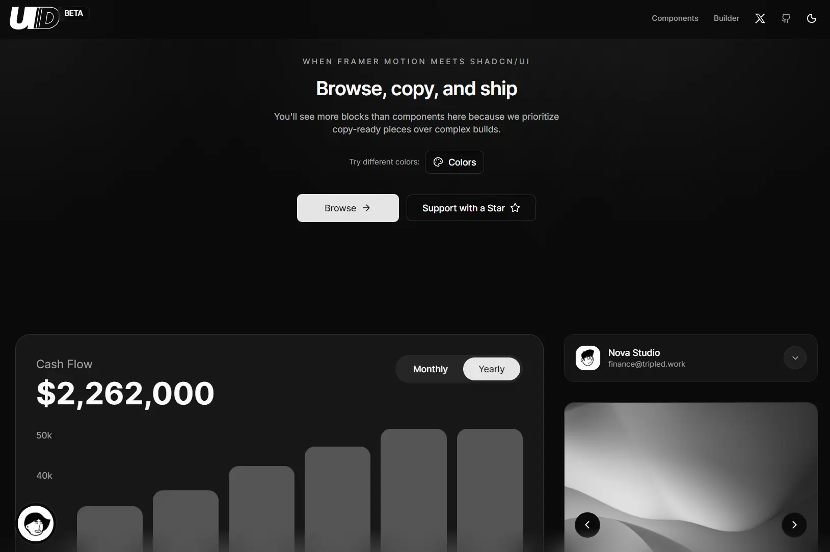
Accessible Cash Flow Chart
Related Resources
- shadcn/ui – React component library built on Radix UI with Tailwind CSS styling.
- Framer Motion – Production-ready animation library for React applications.
- Tailwind CSS – Utility-first CSS framework for rapid UI development.
FAQs
Q: Can I modify the component code after copying it?
A: Yes, you own the code after copying it. Modify styling, animations, and functionality to match your project requirements
Q: Do I need to install all shadcn components?
A: No, install only the shadcn components that your copied UI TripleD components import.
Q: How do I customize the animation speed?
A: Adjust the transition properties in the motion component. Modify the stiffness and damping values for spring animations, or change the duration value for tween animations.
Q: Are these components compatible with Next.js App Router?
A: Yes, all components work with Next.js and the App Router.