The Future of Web Dev
The Future of Web Dev
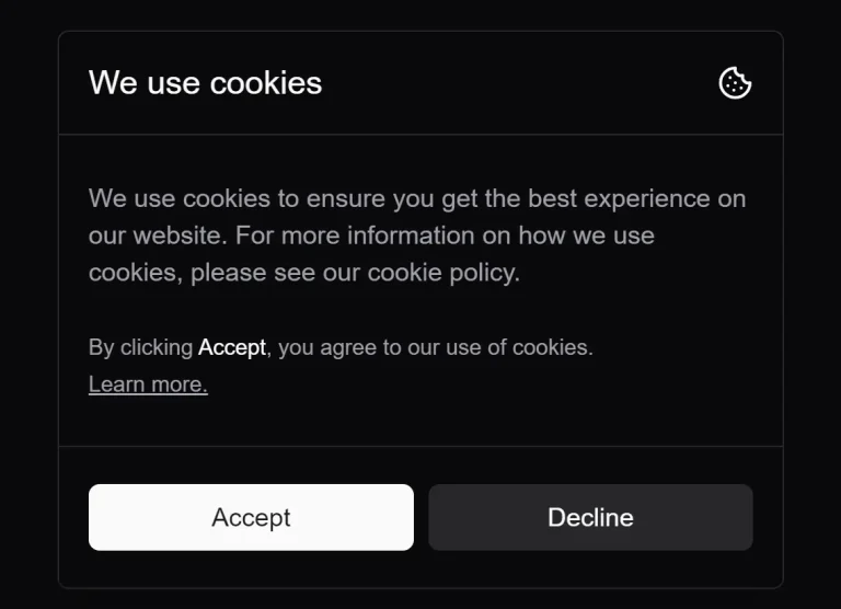
Modern GDPR-Compliant Cookie Consent Compoinent for shadcn/ui
Implement modern and customizable GDPR-compliant cookie consent banners in your React applications with Shadcn Cookie Consent component.

This is a modern, customizable shadcn/ui cookie consent component styled with TailwindCSS.
It handles the core logic for displaying the banner, capturing user consent (accept or decline), and storing that preference in a cookie.
Features
🔒 GDPR Compliance – Helps websites meet cookie consent regulations with clear accept/decline options.
⚙️ Customizable Callbacks – Built-in functionality for custom actions upon user acceptance or rejection.
🌓 Dark Mode Support – Automatically adapts to light or dark themes through Shadcn UI integration.
🎨 Two Design Variants – Choose between standard and compact layouts to match your site’s aesthetic.
📱 Fully Responsive – Adapts seamlessly to different screen sizes with mobile-first design.
🛠️ Highly Customizable – Supports custom CSS, TailwindCSS config, and Shadcn themes.
See It In Action
CookieConsent.jsx
"use client";

import {
  CookieIcon
} from "lucide-react";
import {
  Button
} from "./ui/button";
import {
  useEffect,
  useState
} from "react";
import {
  cn
} from "@/lib/utils";

export default function CookieConsent({
  variant = "default",
  demo = false,
  onAcceptCallback = () => {},
  onDeclineCallback = () => {}
}) {
  const [isOpen, setIsOpen] = useState(false);
  const [hide, setHide] = useState(false);

  const accept = () => {
    setIsOpen(false);
    document.cookie = "cookieConsent=true; expires=Fri, 31 Dec 9999 23:59:59 GMT";
    setTimeout(() => {
      setHide(true);
    }, 700);
    onAcceptCallback();
  };

  const decline = () => {
    setIsOpen(false);
    setTimeout(() => {
      setHide(true);
    }, 700);
    onDeclineCallback();
  };

  useEffect(() => {
    try {
      setIsOpen(true);
      if (document.cookie.includes("cookieConsent=true")) {
        if (!demo) {
          setIsOpen(false);
          setTimeout(() => {
            setHide(true);
          }, 700);
        }
      }
    } catch (e) {
      // console.log("Error: ", e);
    }
  }, []);

  return (
    variant == "default" ? ( <
      div className = {
        cn("fixed z-[200] bottom-0 left-0 right-0 sm:left-4 sm:bottom-4 w-full sm:max-w-md duration-700", !isOpen ? "transition-[opacity,transform] translate-y-8 opacity-0" : "transition-[opacity,transform] translate-y-0 opacity-100", hide && "hidden")
      } >
      <
      div className = "dark:bg-card bg-background rounded-md m-3 border border-border shadow-lg" >
      <
      div className = "grid gap-2" >
      <
      div className = "border-b border-border h-14 flex items-center justify-between p-4" >
      <
      h1 className = "text-lg font-medium" > We use cookies < /h1> <
      CookieIcon className = "h-[1.2rem] w-[1.2rem]" / >
      <
      /div> <
      div className = "p-4" >
      <
      p className = "text-sm font-normal text-start" >
      We use cookies to ensure you get the best experience on our website.For more information on how we use cookies, please see our cookie policy. <
      br / >
      <
      br / >
      <
      span className = "text-xs" > By clicking "<span className="
      font - medium opacity - 80 ">Accept</span>", you agree to our use of cookies. < /span> <
      br / >
      <
      a href = "#"
      className = "text-xs underline" > Learn more. < /a> <
      /p> <
      /div> <
      div className = "flex gap-2 p-4 py-5 border-t border-border dark:bg-background/20" >
      <
      Button onClick = {
        accept
      }
      className = "w-full" > Accept < /Button> <
      Button onClick = {
        decline
      }
      className = "w-full"
      variant = "secondary" > Decline < /Button> <
      /div> <
      /div> <
      /div> <
      /div>
    ) : variant == "small" && ( <
      div className = {
        cn("fixed z-[200] bottom-0 left-0 right-0 sm:left-4 sm:bottom-4 w-full sm:max-w-md duration-700", !isOpen ? "transition-[opacity,transform] translate-y-8 opacity-0" : "transition-[opacity,transform] translate-y-0 opacity-100", hide && "hidden")
      } >
      <
      div className = "m-3 dark:bg-card bg-background border border-border rounded-lg" >
      <
      div className = "flex items-center justify-between p-3" >
      <
      h1 className = "text-lg font-medium" > We use cookies < /h1> <
      CookieIcon className = "h-[1.2rem] w-[1.2rem]" / >
      <
      /div> <
      div className = "p-3 -mt-2" >
      <
      p className = "text-sm text-left text-muted-foreground" >
      We use cookies to ensure you get the best experience on our website.For more information on how we use cookies, please see our cookie policy. <
      /p> <
      /div> <
      div className = "p-3 flex items-center gap-2 mt-2 border-t" >
      <
      Button onClick = {
        accept
      }
      className = "w-full h-9 rounded-full" > accept < /Button> <
      Button onClick = {
        decline
      }
      className = "w-full h-9 rounded-full"
      variant = "outline" > decline < /Button> <
      /div> <
      /div> <
      /div>
    )
  )
}
Related Resources
- Shadcn UI – The component library that powers Shadcn Cookie Consent with accessible and customizable UI components – https://ui.shadcn.com/
- TailwindCSS – The utility-first CSS framework used to style the cookie consent component – https://tailwindcss.com/
- GDPR Compliance Guidelines – Official resources for understanding cookie consent requirements – https://gdpr.eu/cookies/
FAQs
Q: How can I customize the appearance of the cookie banner?
A: You can modify the styling by adding custom CSS rules, adjusting your tailwind.config.js, or altering your Shadcn UI theme variables. The component uses standard Shadcn Button and layout classes, which respond to theme changes.
Q: Can I execute custom actions when a user accepts or declines?
A: Yes, you can pass functions to the onAcceptCallback and onDeclineCallback props. These functions will run after the user clicks the respective buttons.
Q: How does the component remember the user’s choice?
A: When the user clicks “Accept”, the component sets a browser cookie named cookieConsent with the value true and a far-future expiration date. It checks for this cookie on load to determine if the banner should be displayed.
Q: Is this component compatible with Next.js?
A: Yes, it’s designed as a client component ("use client"), making it suitable for Next.js App Router and Pages Router implementations.
Q: What is the difference between the ‘default’ and ‘small’ variants?
A: The default variant displays a larger banner with more detailed text and structure. The small variant provides a more compact banner, suitable for less intrusive display.