The Future of Web Dev
The Future of Web Dev
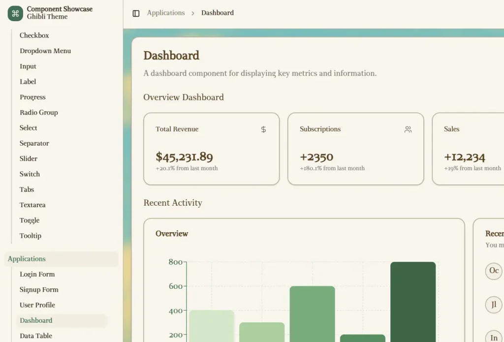
Build Elegant UIs with Ghibli-Inspired Shadcn Theme for Next.js
Add a dreamy, Ghibli-inspired look to your Next.js app with this Shadcn/ui theme. Features soft colors for calm, elegant interfaces.

This is a beautifully crafted UI theme inspired by Studio Ghibli’s distinctive aesthetic, built for Next.js applications using the shadcn/ui component library.
This theme transforms standard UI components into soft-colored, dreamy interface elements that create calm and elegant user experiences.
Features
🎨 Ghibli-Inspired Color Palette – Soft, dreamy colors that evoke the distinctive Studio Ghibli aesthetic.
🔄 Next.js 15 Compatibility – Built specifically for the latest Next.js framework features.
🎭 Customizable Elements – Base styling that can be extended for project-specific needs.
🧩 Complete shadcn/ui Component Integration – All standard UI components styled consistently within the theme.
🛠️ TypeScript Support – Fully typed components for improved development experience.
🔌 Easy Implementation – Simple integration into existing Next.js projects.
Installation
Prerequisites:
- Node.js installed on your system
- Package manager (npm, yarn, or pnpm)
- Clone the repository:
git clone https://github.com/cefeng06/Ghibli-Shadcn-Theme.git- Navigate to the project directory:
cd Ghibli-Shadcn-Theme- Install dependencies using your preferred package manager:
pnpm install- Start the development server:
pnpm run dev- Open your browser and navigate to the local development URL (typically http://localhost:3000)
Related Resources
- shadcn/ui: https://ui.shadcn.com/ – The component library used as the foundation for this theme. Check the official documentation for component usage and customization.
- Next.js: https://nextjs.org/docs – The React framework used. Refer to its documentation for framework-specific features and best practices.
- Tailwind CSS: https://tailwindcss.com/docs – The utility-first CSS framework used for styling. Its documentation provides details on all available utility classes.
FAQs
Q: Are the components accessible according to WCAG standards?
A: Yes, the theme builds upon shadcn/ui, which prioritizes accessibility. The color palette has been selected to maintain proper contrast ratios.
Q: Does this theme impact performance compared to standard shadcn/ui?
A: The theme adds minimal overhead, primarily through CSS classes. Performance impact is negligible compared to using the standard shadcn/ui components.
Q: Can I customize the components?
A: Yes, since it uses shadcn/ui and Tailwind CSS, you can customize the components by modifying the underlying code and utility classes according to their respective documentation.
Preview