The Future of Web Dev
The Future of Web Dev
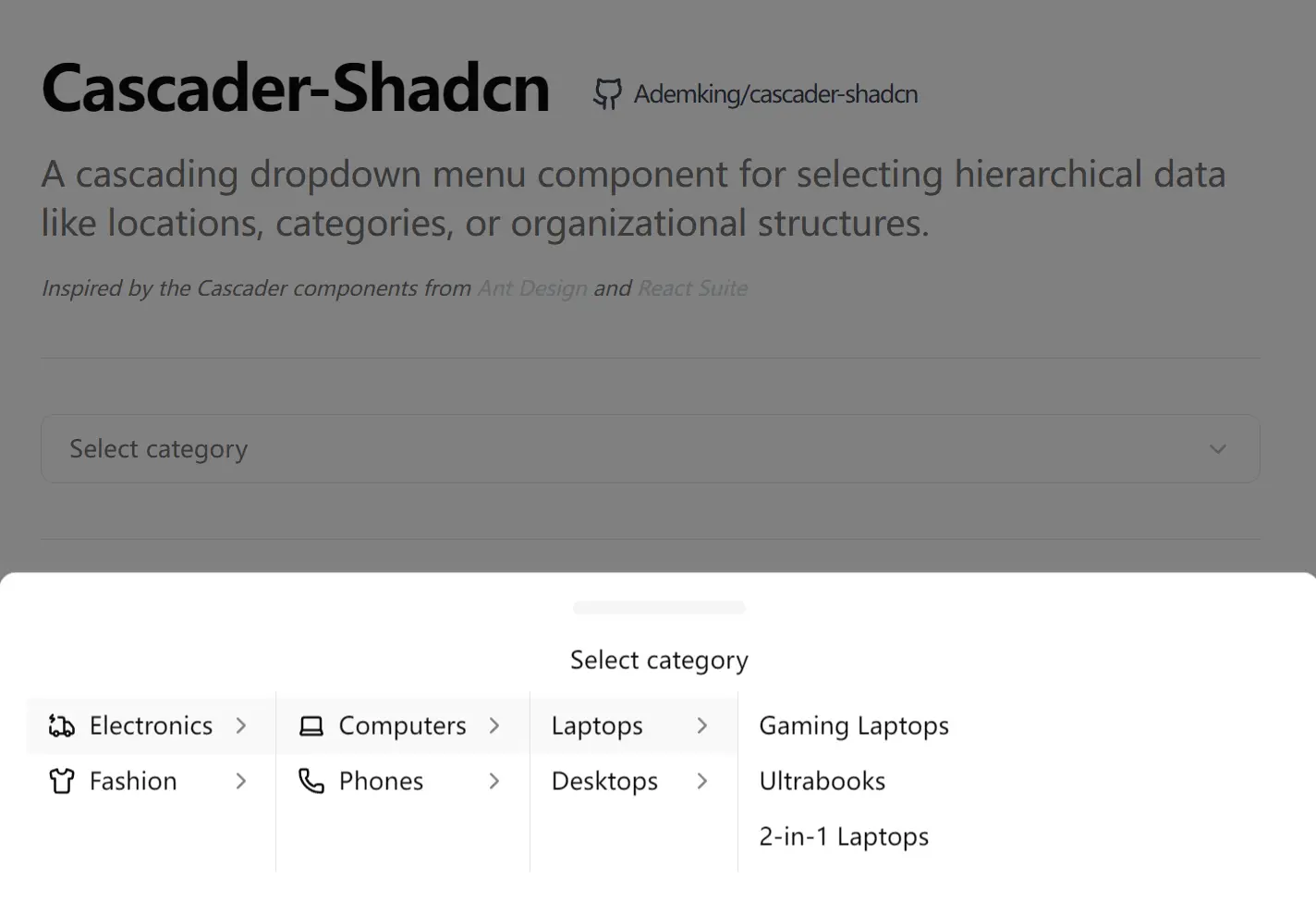
Hierarchical Data Selection for shadcn/ui – Cascader-Shadcn
Select hierarchical data with Cascader-Shadcn's cascading dropdown component. Works with Shadcn UI primitives and Tailwind CSS styling.
Cascader-Shadcn is a cascading dropdown component for handling hierarchical data selection in your React, shadcn/ui, and TailwindCSS projects.
You can use it to build interfaces where users need to navigate through nested categories, locations, organizational structures, or any data that follows a parent-child relationship pattern.
The component supports both desktop and mobile interactions. On desktop, it uses a popover for precise selection. On mobile devices, it switches to a drawer interface to improve usability on smaller screens.
Features
🔄 Hierarchical Navigation: Cascading columns expand dynamically as you traverse nested data structures.
🖱️ Dual Expansion Modes: Switch between click and hover triggers.
♿ Keyboard Interactions: Arrow keys, Enter, Escape, Tab, and Backspace all function as expected for accessibility compliance.
📱 Mobile-friendly: Automatically switches from popover to drawer layout on mobile viewports.
🎨 Custom Rendering: Replace default label displays with custom React components or formatted strings.
🎯 Clear Selection: Built-in clear button removes selected values in one action.
Use Cases
- Location Selectors: Build a country, state, and city selector where each level filters the next set of options.
- Product Categories: Navigate through category hierarchies in e-commerce applications where products exist in nested taxonomies.
- Organization Charts: Select departments, teams, and individual members through structured organizational data.
- File System Navigation: Browse through folder structures where directories contain subdirectories and files.
How to Use It
1. Install the cascader component through shadcn/ui.
npx shadcn@latest add https://cascader-shadcn.surge.sh/r/cascader.json2. If you prefer manual control, create a new file named cascader.tsx inside your components/ui folder. Copy the source code from the repository into this file.
3. Install the necessary dependencies:
npm install lucide-react4. Import the component and define your data structure. The options prop requires an array of objects where each object contains a value, a label, and an optional children array.
The
onChangecallback returns two arguments: an array of selectedvaluestrings and an array of the corresponding fullCascaderOptionobjects.
import React, { useState } from "react";
import { Cascader } from "@/components/ui/cascader";
const categoryData = [
  {
    value: "electronics",
    label: "Electronics",
    children: [
      {
        value: "computers",
        label: "Computers",
        children: [
          { value: "laptops", label: "Laptops" },
          { value: "desktops", label: "Desktops" },
        ],
      },
      {
        value: "phones",
        label: "Mobile Phones",
      },
    ],
  },
  {
    value: "furniture",
    label: "Furniture",
    children: [
      { value: "tables", label: "Tables" },
      { value: "chairs", label: "Chairs" },
    ],
  },
];
export function CategorySelector() {
  const [selected, setSelected] = useState([]);
  const handleChange = (value, selectedOptions) => {
    setSelected(value);
    console.log("Current Selection:", value);
  };
  return (
    <div className="p-4 w-full max-w-sm">
      <label className="block text-sm font-medium mb-2">
        Choose a Category
      </label>
      <Cascader
        options={categoryData}
        value={selected}
        onChange={handleChange}
        placeholder="Select category..."
        expandTrigger="hover"
        className="w-full"
      />
      <div className="mt-4 text-sm text-gray-600">
        Selected Path: {selected.join(" / ")}
      </div>
    </div>
  );
}
5. You can customize how the selected value appears in the input box using the displayRender prop.
<Cascader
  options={categoryData}
  displayRender={(labels) => labels.join(" > ")}
  placeholder="Custom separator..."
/>
API Reference
Cascader Props
| Prop | Type | Default | Description |
|---|---|---|---|
options | CascaderOption[] | — | The hierarchical data array to render. |
value | string[] | — | The controlled value of the selected path. |
defaultValue | string[] | — | The initial selected path. |
onChange | function | — | Callback function triggered on selection. |
placeholder | string | "Please select" | Text displayed when the input is empty. |
disabled | boolean | false | Disables interaction with the component. |
allowClear | boolean | true | Shows a button to clear the current selection. |
expandTrigger | "click" | "hover" | "click" | Defines the action that opens submenus. |
displayRender | function | — | Customizes the display format of selected labels. |
className | string | — | CSS class for the trigger element. |
popupClassName | string | — | CSS class for the dropdown content. |
CascaderOption Interface
| Property | Type | Description |
|---|---|---|
value | string | Unique identifier for the option. |
label | ReactNode | The content to display for the option. |
textLabel | string | Plain text fallback for the label. |
disabled | boolean | Prevents selection of this specific option. |
children | CascaderOption[] | Array of nested options. |
Related Resources
- Shadcn UI: A collection of re-usable components built with Radix UI and Tailwind CSS.
- Lucide React: A consistent and clean icon library used within the component.
- Tailwind CSS: A utility-first CSS framework for rapid UI development.
FAQs
Q: Can I load child options asynchronously when a parent is selected?
A: The current implementation expects all data upfront in the options prop. You can modify the component to fetch children on demand by updating the options array in your onChange handler and passing the new data back through the value prop.
Q: How do I restrict selection to only leaf nodes?
A: You can only complete a selection by choosing an option without children. Options with children only expand to the next level.
Q: Does keyboard navigation work across all columns?
A: Yes. Arrow keys move within a column, right arrow or Enter expands into child columns, left arrow or Backspace returns to parent columns, and Tab cycles between columns. Escape closes the entire menu.
Q: Can I use this with React Hook Form or other form libraries?
A: Yes. Use the controlled pattern with value and onChange props. Connect these to your form library’s field registration system like you would with any controlled input component.
Q: How do I customize the column width or maximum height?
A: Override the default classes through popupClassName. Target the column divs with CSS to adjust their min-width and max-height properties.
