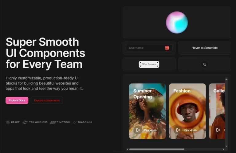
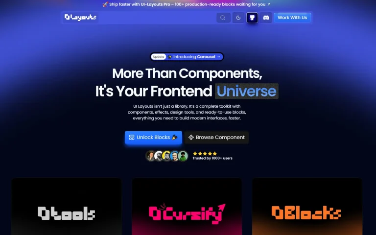
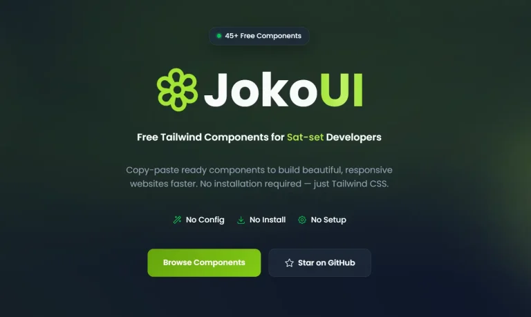
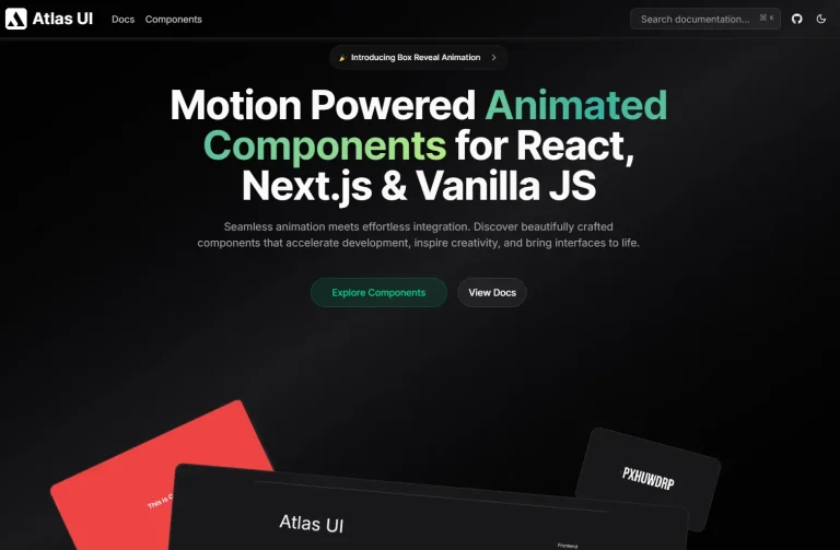
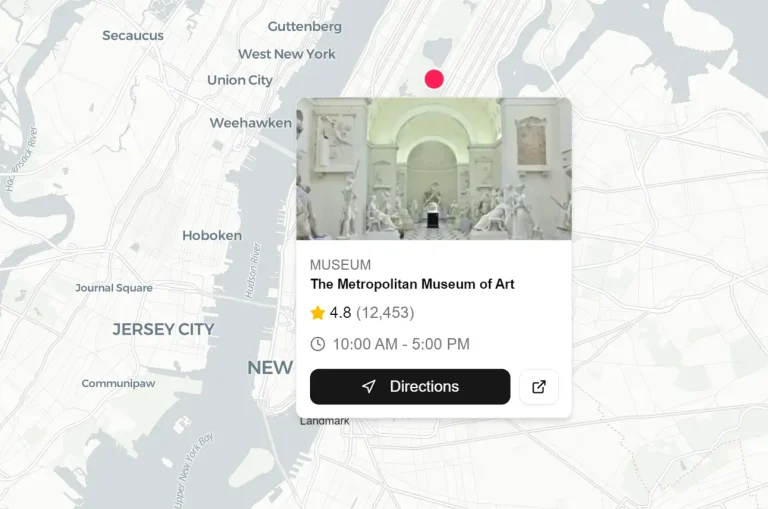
This is a collection of open-source, ready-to-use layouts and UI components built with Origin UI and shadcn/ui.
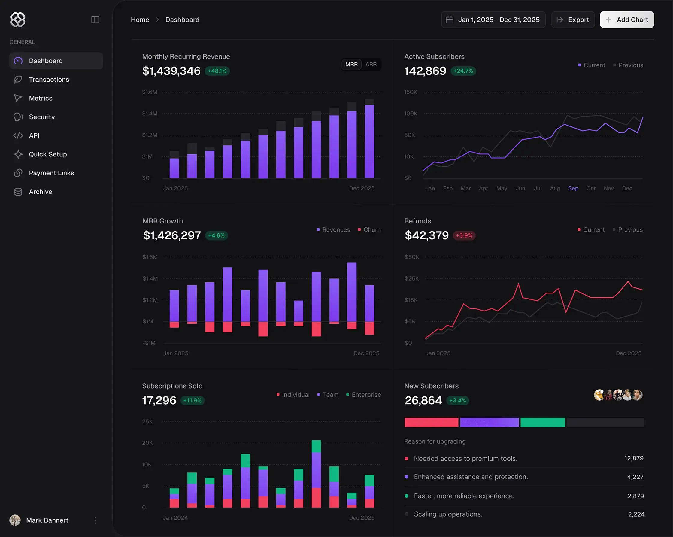
Each represents a complete UI solution, from data visualization tools like candlestick charts to complex interface patterns such as SaaS dashboards and AI chat interfaces.
Features
🎨 Seven modern layouts and UI experiments.
⚡ One-command installation through the shadcn CLI tool.
🔧 Built on shadcn/ui with full customization support.
🌙 Dark mode support across all components.
🎯 Production-ready code with proper TypeScript support.
🔄 Monorepo structure for easy maintenance and updates.
Use Cases
- Building SaaS application interfaces with pre-designed dashboard layouts and navigation patterns
- Creating data visualization applications that require specialized chart components like candlestick displays
- Developing AI-powered applications with ready-made chat interface components
- Prototyping complex UI patterns for fintech applications including crypto wallet interfaces
- Building calendar and scheduling applications with complete event management systems
How to Use It
1. Run the init command from the shadcn/ui CLI. This installs necessary dependencies and creates configuration files, including components.json.
pnpm dlx shadcn@latest init2. Add a Layout or UI Experiment:
Schema Visualizer
npx shadcn init https://ui-experiment-07.vercel.app/r/experiment-07.json

Event Calendar
npx shadcn init https://ui-experiment-06.vercel.app/r/experiment-06.json

Candlestick Chart
npx shadcn init https://ui-experiment-05.vercel.app/r/experiment-05.json

Crypto Wallet
npx shadcn init https://ui-experiment-04.vercel.app/r/experiment-04.json
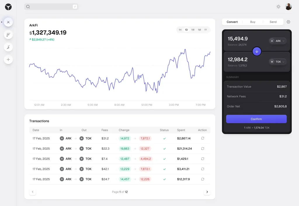
SaaS Dashboard
npx shadcn init https://ui-experiment-03.vercel.app/r/experiment-03.json

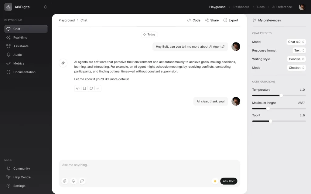
AI Chat
npx shadcn init https://ui-experiment-02.vercel.app/r/experiment-02.json
Dark Table
npx shadcn init https://ui-experiments-green.vercel.app/r/experiment-01.json

Related Resources
- shadcn/ui Documentation – Complete guide to the underlying component library and installation methods
- Origin UI – The design system and component collection that powers these experiments
- Tailwind CSS Documentation – Styling framework used throughout the components
FAQs
Q: Can I use these components in commercial projects?
A: Yes, you can use these layouts and UI experiments for both personal and commercial projects.
Q: Do I need to install all experiments or can I choose specific ones?
A: You can install individual experiments based on your project needs. Each experiment has its own installation command and can be used independently of the others.
Q: Are these components compatible with existing shadcn/ui projects?
A: Yes, these components are built on shadcn/ui and integrate directly with existing projects that use the same foundation. They follow the same patterns and conventions.
Q: Can I customize the styling of these components?
A: These components support full customization through Tailwind CSS classes and custom styling. You can modify colors, spacing, and layout properties to match your design requirements.
