The Future of Web Dev
The Future of Web Dev
Modern Next.js UI Components with Tailwind CSS – Origin UI
Hundreds of customizable UI components built with Tailwind CSS and Next.js. Integrate them into your React project for faster UI development.
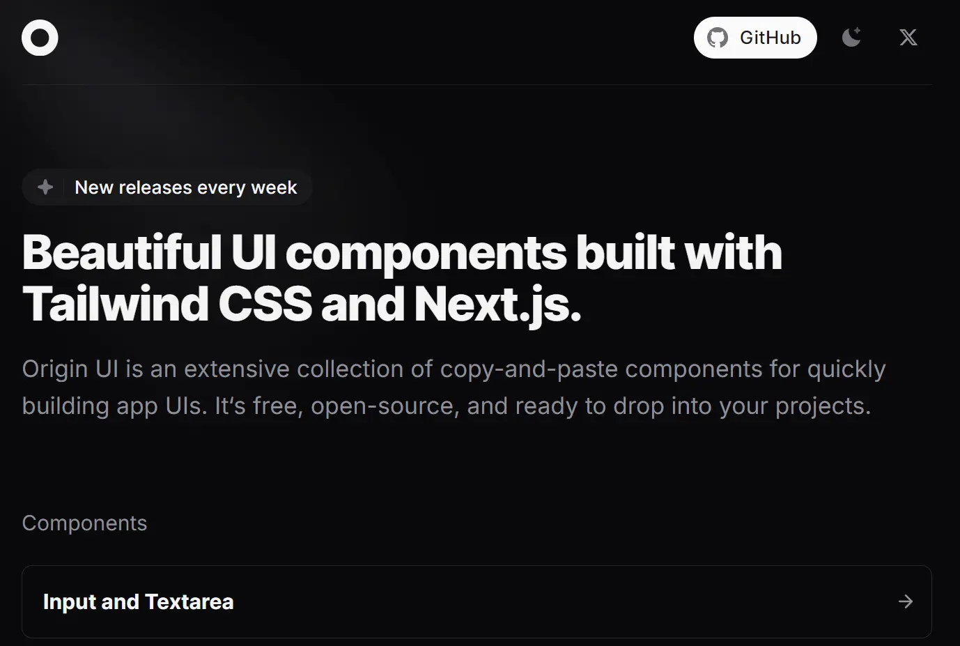
Origin UI is a collection of customizable, pre-built UI components for developers building applications with Tailwind CSS and Next.js.
You can use Origin UI to build consistent and modern-looking UIs without writing extensive custom CSS. All UI components can be copied and pasted directly into your project.
Features
🎨 Dark Mode Support – Built-in dark theme switching with consistent styling across all components
🧩 200+ Components – From basic form elements to complex data visualization components
🎯 TypeScript Support – Full type definitions for enhanced code reliability
⚡ Performance Optimized – Lightweight implementation using Tailwind CSS utility classes
🔄 Weekly Updates – Regular addition of new components and improvements
💻 Developer Experience – Copy-paste implementation with clear documentation
UI Components Included
- Input and Textarea
- Button
- Checkbox, Radio, and Switch
- Select
- Slider
- Alert, Notification, and Banner
- Dialog
- Accordion
- Tooltip
- Dropdown and Popover
- Avatar and Badge
- Tab
- Breadcrumb and Pagination
- Layouts, Navigation menus, Tables, and more…
Use Cases
- Building Admin Dashboards: Quickly assemble navigation menus, data tables, and form elements for internal tools. For developers facing tight deadlines and needing to deliver a functional backend interface rapidly, Origin UI provides the necessary building blocks.
- Creating E-commerce Product Pages: Utilize components like product cards, carousels, and buttons to construct engaging online shopping experiences. Small businesses or startups can benefit from the readily available, visually consistent components to present their products professionally.
- Developing Landing Pages: Construct landing pages with pre-styled sections, including hero sections, feature lists, and contact forms. Marketing teams or individuals launching new products can efficiently create compelling landing pages without extensive design and coding effort.
- Prototyping Web Applications: Rapidly prototype user interfaces to test concepts and gather feedback. Designers and developers can iterate quickly on UI ideas using the ready-made components.
- Enhancing Existing React Projects: Integrate individual components to improve the design and functionality of existing applications. Teams looking to modernize their UI or add specific features can leverage Origin UI’s component library without overhauling their entire codebase.
Installation
1. Copy all .tsx files from the components/ui folder in the Origin UI library to your project’s components/ui folder.
2. Copy the utils.ts file from the Origin UI’s lib folder to your project’s lib folder.
If you have previously used shadcn, consider using Origin UI components for style consistency.
3. Add the provided CSS variables to your stylesheet. If these variables already exist, there is no need to replace them.
@layer base {
  :root {
    --background: 0 0% 100%;
    --foreground: 240 10% 3.9%;
    --card: 0 0% 100%;
    --card-foreground: 240 10% 3.9%;
    --popover: 0 0% 100%;
    --popover-foreground: 240 10% 3.9%;
    --primary: 240 5.9% 10%;
    --primary-foreground: 0 0% 98%;
    --secondary: 240 4.8% 95.9%;
    --secondary-foreground: 240 5.9% 10%;
    --muted: 240 4.8% 95.9%;
    --muted-foreground: 240 3.8% 46.1%;
    --accent: 240 4.8% 95.9%;
    --accent-foreground: 240 5.9% 10%;
    --destructive: 0 84.2% 60.2%;
    --destructive-foreground: 0 0% 100%;
    --border: 240 5.9% 90%;
    --input: 240 4.9% 83.9%;
    --ring: 240 5% 64.9%;
    --radius: 0.5rem;
  }
  .dark {
    --background: 240 10% 3.9%;
    --foreground: 0 0% 98%;
    --card: 240 10% 3.9%;
    --card-foreground: 0 0% 98%;
    --popover: 240 10% 3.9%;
    --popover-foreground: 0 0% 98%;
    --primary: 0 0% 98%;
    --primary-foreground: 240 5.9% 10%;
    --secondary: 240 3.7% 15.9%;
    --secondary-foreground: 0 0% 98%;
    --muted: 240 5.9% 10%;
    --muted-foreground: 240 4.4% 58%;
    --accent: 240 5.9% 10%;
    --accent-foreground: 0 0% 98%;
    --destructive: 0 84.2% 60.2%;
    --destructive-foreground: 0 0% 100%;
    --border: 240 3.7% 15.9%;
    --input: 240 3.7% 15.9%;
    --ring: 240 3.8% 46.1%;
  }
}
4. In your tailwind.config.js file, include the defined variables within the extend section.
extend: {
  fontFamily: {
    sans: ["var(--font-sans)"],
  },
  borderRadius: {
    lg: "var(--radius)",
    md: "calc(var(--radius) - 2px)",
    sm: "calc(var(--radius) - 4px)",
  },
  colors: {
    background: "hsl(var(--background))",
    foreground: "hsl(var(--foreground))",
    card: {
      DEFAULT: "hsl(var(--card))",foreground: "hsl(var(--card-foreground))",
    },
    popover: {
      DEFAULT: "hsl(var(--popover))",
      foreground: "hsl(var(--popover-foreground))",
    },
    primary: {
      DEFAULT: "hsl(var(--primary))",
      foreground: "hsl(var(--primary-foreground))",
    },
    secondary: {
      DEFAULT: "hsl(var(--secondary))",
      foreground: "hsl(var(--secondary-foreground))",
    },
    muted: {
      DEFAULT: "hsl(var(--muted))",
      foreground: "hsl(var(--muted-foreground))",
    },
    accent: {
      DEFAULT: "hsl(var(--accent))",
      foreground: "hsl(var(--accent-foreground))",
    },
    destructive: {
      DEFAULT: "hsl(var(--destructive))",
      foreground: "hsl(var(--destructive-foreground))",
    },
    border: "hsl(var(--border))",
    input: "hsl(var(--input))",
    ring: "hsl(var(--ring))",
  },
},
Usage
After completing the installation, access the Origin UI component library. Copy the desired components and integrate them into your project.
Note that certain components, such as number inputs or date pickers, might require additional libraries. Refer to the comments within each component file for specific dependencies.
FAQs
Q: Can I use Origin UI with frameworks other than Next.js?
A: Yes, Origin UI is fully compatible with any React-based framework, so you can use it in projects built with Create React App, Gatsby, or other setups.
Q: How often are new components added to Origin UI?
A: New components and updates are released on a weekly basis, making it a continuously evolving resource.
Q: Is Origin UI A Replacement For Shadcn?
A: Origin UI follows similar conventions to shadcn. For consistent styling, using Origin UI components is recommended over mixing with shadcn components.
Related Resources
- Origin UI – Svelte: A version of Origin UI built with Tailwind CSS and Svelte. This can be useful for developers working with Svelte.
Preview

Video