The Future of Web Dev
The Future of Web Dev
Linear.app-Style Priority Combobox Component for shadcn/ui
React priority combox component that replicates Linear.app's task priority interface. Features search, shortcuts, and tooltips.
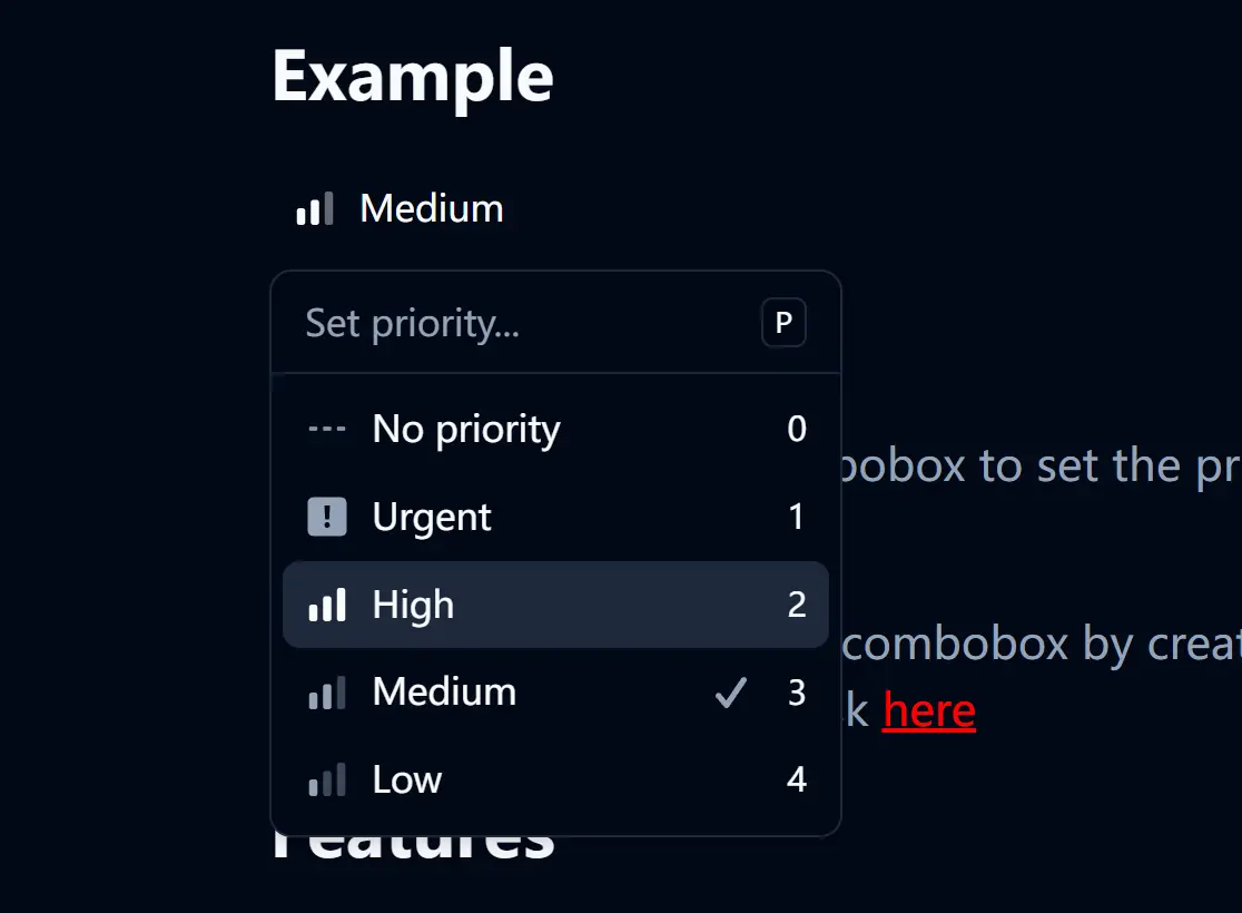
shadcn-linear-combobox is a React component that replicates the priority selection combobox found in Linear.app.
It combines a popover, command menu, and tooltips to create a user experience similar to Linear’s task management system.
Features
🎯 Exact Linear.app priority interface replication with custom icons and styling.
⌨️ Keyboard shortcuts support, including “P” key to open and number keys for quick selection.
🔍 Search functionality with real-time filtering of priority options.
💡 Interactive tooltips that display keyboard shortcuts and priority information.
✅ Visual feedback with check marks indicating currently selected priority.
♿ Built-in accessibility features including proper ARIA labels and keyboard navigation.
Use Cases
- Task management applications requiring priority categorization similar to Linear or Jira.
- Project management dashboards where users need to quickly assign and modify task priorities.
- Bug tracking systems that use priority levels for issue triage and management.
- Team collaboration tools with workflow management features requiring priority indicators.
- Customer support platforms organizing tickets by urgency and importance levels.
How to Use It
1. Install shadcn/ui in your React project. You’ll need the following shadcn/ui components: Button, Command, Popover, and Tooltip.
npx shadcn-ui@latest add button command popover tooltip2. Copy the LinearCombobox component code from the repository and place it in your components directory.
3. Import and use the LinearCombobox component in your application:
import { LinearCombobox } from '@/components/linear-combobox';

export default function TaskManager() {
  return (
    <div>
      <h2>Task Priority</h2>
      <LinearCombobox />
    </div>
  );
}
Related Resources
- shadcn/ui – The component library foundation used for building this combobox interface.
- Radix UI – The underlying primitives that power shadcn/ui components.
- Linear.app – The original application that inspired this component’s design and functionality.
FAQs
Q: Can I customize the priority levels?
A: Yes, you can modify the priorities array within the linear-combobox/index.tsx file to change the labels, values, and icons to fit your application’s needs.
Q: How do I handle priority selection in my application logic?
A: You can extend the component to accept an onChange callback prop that receives the selected priority value, allowing you to integrate it with your application’s state management system.