The Future of Web Dev
The Future of Web Dev
Mind Map Component for shadcn/ui – mindmapcn
A React mind map component styled with Tailwind and compatible with shadcn/ui. Install in one command, zero config needed.
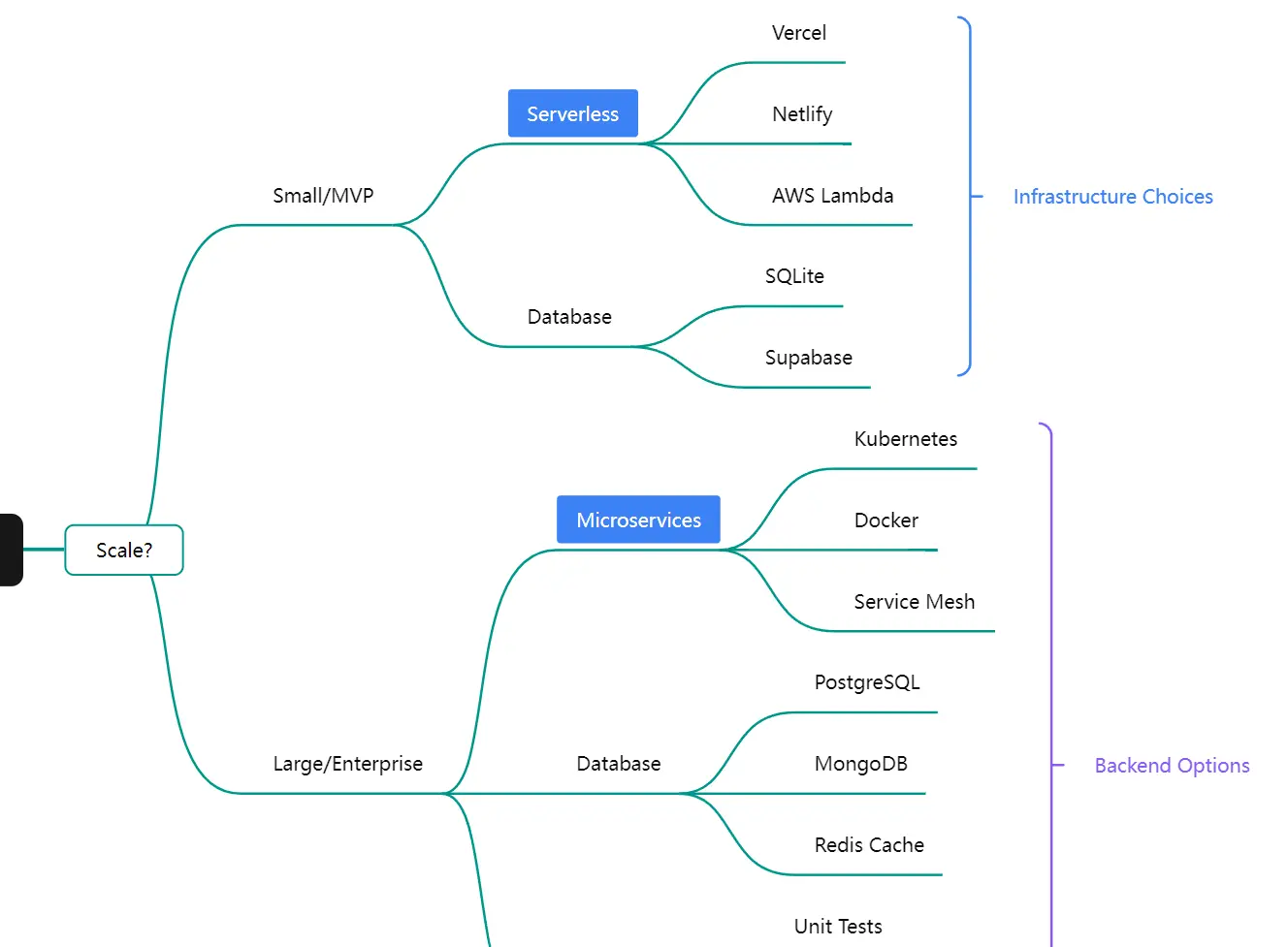
mindmapcn is a React component that adds interactive, theme-aware mind mapping to your shadcn/ui projects.
It wraps Mind Elixir, an open-source JavaScript mind mapping engine, and exposes a fully typed React API that follows the same component conventions as shadcn/ui.
Features
🎨 Theme-Aware Styling: Adapts to light and dark mode automatically through Tailwind CSS and your existing design tokens.
📦 shadcn/ui Compatible: Follows the same component installation pattern and styling conventions as shadcn/ui.
🧠 Mind Elixir Core: Runs on Mind Elixir, a JavaScript mind mapping engine with full node editing capabilities.
🎮 Built-In Controls: Includes zoom, fit-to-screen, export, and fullscreen controls as a separate overlay component.
📊 Multiple Layout Directions: Supports left-only, right-only, and bilateral branch layouts.
🎨 Node Customization: Accepts tags, icons, colors, and hyperlinks on individual nodes.
⌨️ Keyboard Navigation: Responds to Enter and Tab keys for node creation and indentation.
🌐 Localization: Supports English, Simplified Chinese, Traditional Chinese, Japanese, and Portuguese.
Use Cases
- Build a project planning dashboard where teams map out tasks and dependencies in a visual tree.
- Add a knowledge base section that displays documentation structures as interactive mind maps.
- Create an organizational chart that shows reporting lines with clickable nodes.
- Use it in educational tools to help students visualize concepts and their relationships.
How to Use It
1. Your project needs Tailwind CSS and shadcn/ui configured before installing mindmapcn.
2. Install mindmapcn:
pnpm
pnpm dlx shadcn@latest add https://mindmapcn.vercel.app/mindmaps/mindmap.jsonnpm / npx
npx shadcn@latest add https://mindmapcn.vercel.app/mindmaps/mindmap.jsonYarn
yarn shadcn@latest add https://mindmapcn.vercel.app/mindmaps/mindmap.jsonBun
bunx -bun shadcn@latest add https://mindmapcn.vercel.app/mindmaps/mindmap.json3. Import MindMap and MindMapControls from your registry, then drop them into a sized container.
The container needs an explicit height. The
overflow-hiddenandrelativeclasses keep the controls overlay positioned correctly inside the bounds.
import { MindMap, MindMapControls } from "@/registry/mindmap";
export function MyMindMap() {
  return (
    <div className="h-[500px] w-full border rounded-lg overflow-hidden relative">
      <MindMap>
        <MindMapControls />
      </MindMap>
    </div>
  );
}
4. Pass a MindElixirData object to the data prop to populate the map on mount:
import { MindMap, MindMapControls } from "@/registry/mindmap";
import type { MindElixirData } from "mind-elixir";
const initialData: MindElixirData = {
  nodeData: {
    id: "root",
    topic: "Project Plan",
    children: [
      { id: "1", topic: "Research" },
      { id: "2", topic: "Design" },
      { id: "3", topic: "Development" },
    ],
  },
};
export function ProjectMap() {
  return (
    <div className="h-[600px] w-full border rounded-lg overflow-hidden relative">
      <MindMap
        data={initialData}
        direction={2}
        onChange={(data) => console.log(data)}
      >
        <MindMapControls position="bottom-right" />
      </MindMap>
    </div>
  );
}
5. Use the useMindMap hook inside any component nested within MindMap to reach the underlying Mind Elixir instance directly:
Check
isLoadedbefore calling methods on the instance. The flag turnstrueonce the component has mounted and loaded its initial data.
import { useMindMap } from "@/registry/mindmap";
function MapActions() {
  const { mind, isLoaded } = useMindMap();
  const handleReset = () => {
    if (isLoaded && mind) {
      mind.refresh();
    }
  };
  return <button onClick={handleReset}>Reset View</button>;
}
API Reference
MindMap Props
| Prop | Type | Default | Description |
|---|---|---|---|
data | MindElixirData | — | Initial data for the mind map. Updates to this prop refresh the map content. |
direction | 0 | 1 | 2 | 1 | Branch layout: 0 = left only, 1 = right only, 2 = both sides. |
draggable | boolean | true | Turns node drag-and-drop on or off. |
contextMenu | boolean | true | Turns the right-click context menu on or off. |
toolBar | boolean | false | Shows the built-in Mind Elixir toolbar. MindMapControls is the recommended alternative. |
nodeMenu | boolean | true | Shows a menu when a node receives a click. |
keypress | boolean | true | Turns keyboard shortcuts on or off (Enter adds siblings, Tab adds children). |
locale | "en" | "zh_CN" | "zh_TW" | "ja" | "pt" | "en" | Language for built-in menus and prompts. |
theme | "light" | "dark" | — | Forces a specific color mode. When omitted, the component follows the document theme. |
fit | boolean | true | Fits the map to the container bounds on load. |
onChange | (data: MindElixirData) => void | — | Fires when map data changes. |
onSelectNodes | (nodes: NodeObj[]) => void | — | Fires when one or more nodes are selected. |
useMindMap Hook
Call this hook inside any component nested within MindMap:
const { mind, isLoaded } = useMindMap();| Return Value | Type | Description |
|---|---|---|
mind | MindElixirInstance | The raw Mind Elixir instance. |
isLoaded | boolean | true once the instance has mounted and data has loaded. |
MindMapControls Props
| Prop | Type | Default | Description |
|---|---|---|---|
position | "top-left" | "top-right" | "bottom-left" | "bottom-right" | "top-right" | Corner position of the controls overlay. |
showZoom | boolean | true | Shows or hides the zoom in and zoom out buttons. |
showFit | boolean | true | Shows or hides the fit-to-screen button. |
showExport | boolean | true | Shows or hides the export button. |
onExport | (type: string) => void | — | Fires after the export action runs. |
Related Resources
- Mind Elixir: The open-source JavaScript mind mapping engine.
- React Flow: A node-based graph and diagram library for React.
FAQs
Q: Does mindmapcn work with the Next.js App Router?
A: Yes. Add the "use client" directive to any file that imports MindMap or useMindMap.
Q: Can I save mind map data to a database?
A: Use the onChange callback on the MindMap component. It fires with the full MindElixirData object after any edit.
Q: How do I export the mind map as an image?
A: Render MindMapControls with showExport set to true. The export button triggers the built-in export flow from Mind Elixir.
Q: What does the component render if I omit the data prop?
A: The component loads with its built-in placeholder data. Pass a MindElixirData object to data when you need the map to reflect your own content on mount.
Q: When should I use MindMapControls instead of the built in toolbar?
A: Use MindMapControls when you want the map actions to match a shadcn style UI.
