The Future of Web Dev
The Future of Web Dev
Minimalist Timeline Component for Next.js – Shadcn Timeline
Add a minimalist and responsive timeline to your Next.js project with the Shadcn Timeline component. Built for shadcn/ui and Tailwind CSS.

Shadcn Timeline is a minimalist timeline UI component built for the shadcn/ui ecosystem.
It allows you to quickly generate a clean, accessible, vertical timeline to display chronological information in your Next.js applications.
Features
🎨 Built with Tailwind CSS for complete styling control
♿ Accessible design following best practices
📱 Responsive layout that adapts to different screen sizes
🔧 TypeScript support with proper type definitions
📦 Copy-paste installation with no package manager required
🎨 Customizable styling through className props
📍 Automatic timeline connector lines and dots
🏷️ Built-in Badge component for time labels
Preview
How To Use It
1. Copy the timeline components into your project:
/src/app/components/timeline/timeline-layout.tsx
/src/app/components/timeline/timeline.tsx
2. Install the required shadcn/ui Badge component:
pnpm dlx shadcn@latest add badge3. You can now implement the timeline by importing its components and supplying your data.
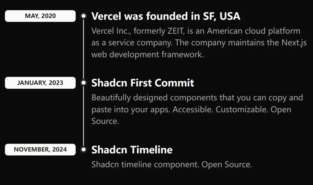
The timeline-layout.tsx file provides a clear example of how to structure your data and render the component. Each object in the timelineData array corresponds to an item on the timeline.
import {
  Timeline,
  TimelineItem,
  TimelineTitle,
  TimelineDescription,
  TimelineTime,
  TimelineHeader,
} from '@/components/timeline';

import { TimelineItemType } from '@/types';

const timelineData: TimelineItemType[] = [
  {
    id: 1,
    title: 'Vercel was founded in SF, USA',
    description:
      'Vercel Inc., formerly ZEIT, is an American cloud platform as a service company. The company maintains the Next.js web development framework.',
    time: 'May, 2020',
  },
  {
    id: 2,
    title: 'Shadcn First Commit',
    description:
      'Beautifully designed components that you can copy and paste into your apps. Accessible. Customizable. Open Source.',
    time: 'January, 2023',
  },
  {
    id: 3,
    title: 'Shadcn Timeline',
    description: 'Shadcn timeline component. Open Source.',
    time: 'November, 2024',
  },
];

export const TimelineLayout = () => {
  return (
    <Timeline className='mt-8'>
      {timelineData.map((item) => (
        <TimelineItem key={item.id}>
          <TimelineHeader>
            <TimelineTime>{item.time}</TimelineTime>
            <TimelineTitle>{item.title}</TimelineTitle>
          </TimelineHeader>
          {item.description && (
            <TimelineDescription>{item.description}</TimelineDescription>
          )}
        </TimelineItem>
      ))}
    </Timeline>
  );
};
Related Resources
- shadcn/ui: The UI component library that this timeline component extends
- Tailwind CSS: The utility-first CSS framework used for styling
- Next.js: The React framework recommended for use with this component
- React Timeline Components: Alternative timeline library with more advanced features
FAQs
Q: Can I customize the timeline connector line and dots?
A: Yes, you can modify the before: and after: pseudo-elements in the TimelineHeader component’s className to change colors, sizes, and styles.
Q: How do I add icons or images to timeline items?
A: You can extend the TimelineHeader component to include additional elements like icons by modifying the component structure and adding your own JSX elements.
Q: Is this component compatible with React Server Components?
A: Yes, the component uses React.forwardRef and standard React patterns that work with both client and server components in Next.js.