The Future of Web Dev
The Future of Web Dev
Shadcn Builder: No-code Form Builder with Drag and Drop
Build forms with drag and drop, then export clean React code. Shadcn Form Builder includes 100+ templates and 20+ components for rapid development.
Shadcn Builder is an open-source, no-code form builder that allows you to generate responsive, professional, product-ready forms for React applications.
You can drag form components onto a canvas, configure validation rules, and export clean TypeScript code that integrates with shadcn/ui, React Hook Form, and Zod.
Features
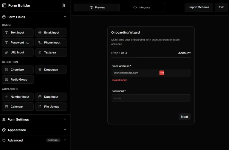
🖱️ Drag and Drop: Arrange form components by dragging them from a sidebar onto a canvas.
👁️ Live Preview: View form appearance and behavior as you add components and adjust configurations.
🎨 shadcn/ui: Use the same component variants and styling system from the shadcn/ui library.
⚙️ React Hook Form: Generated code includes form state management and submission handlers configured with React Hook Form.
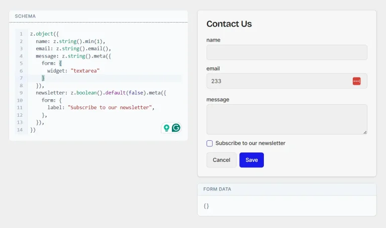
✅ Zod Validation: Validation schemas are created automatically based on field requirements you specify.
📋 100+ Templates: Start from pre-built forms.
🧩 20+ Components: Text inputs, textareas, selects, checkboxes, radio groups, date pickers, file uploads, switches, and more.
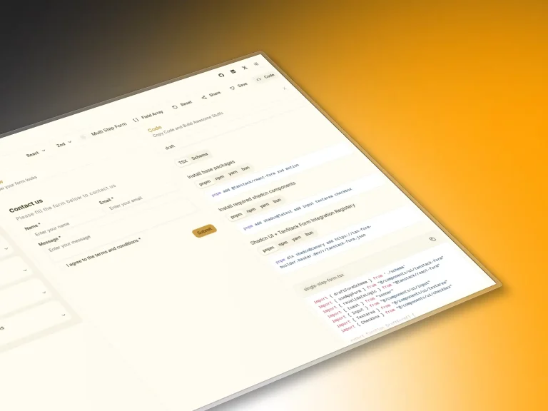
💾 Code Export: Copy complete React components with TypeScript definitions and Tailwind classes.
4. How to Use It
1. Log in to the Shadcn Builder with your GitHub account. You can start with a blank form or select one of the 100+ pre-built templates.
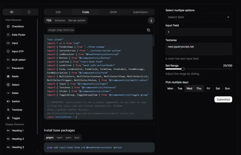
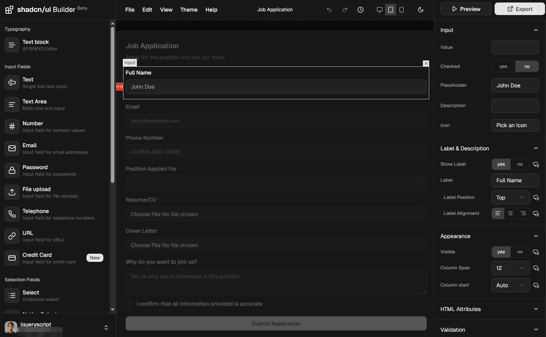
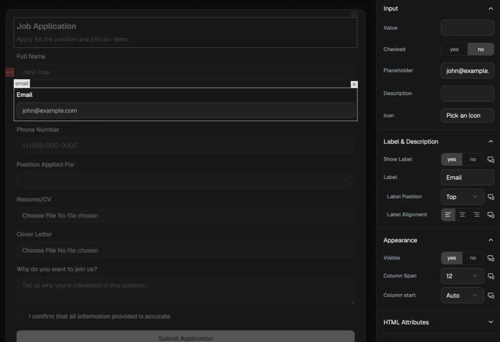
2. Drag the form components from the sidebar onto the main canvas.
3. Select an input field to define its validation rules. You can mark fields as required, set minimum or maximum lengths, and define specific patterns (like email or URL). The builder updates the underlying Zod schema automatically.
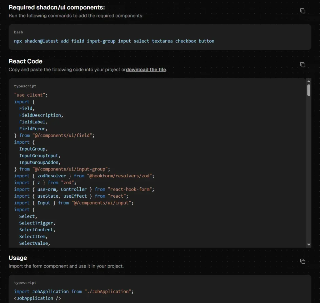
4. Click the “Export” button to reveal the generated code.
Available Form Components
| Component | Description |
|---|---|
| Text | Single line text input field |
| Text Area | Multi-line text input with adjustable height |
| Number | Input restricted to numeric values with optional min/max |
| Text input with email format validation | |
| Password | Masked text input for sensitive data |
| File Upload | File selection input with type and size restrictions |
| Telephone | Input formatted for phone numbers |
| URL | Input with URL format validation |
| Credit Card | Input formatted for credit card numbers |
| Select | Dropdown menu with searchable options |
| Native Select | Browser default select element |
| Checkbox | Single checkbox for boolean values |
| Checkbox Group | Multiple checkboxes for selecting several options |
| Radio Group | Multiple radio buttons for selecting one option |
| Date Picker | Calendar interface for date selection |
| Switch | Toggle control for on/off states |
| Text Block | Static text content with WYSIWYG editor |
| Button | Standard button element |
| Submit | Form submission button |
| Reset | Button to clear all form values |
Related Resources
- React Hook Form: Form state management library that handles validation and submission with minimal re-renders.
- Zod: TypeScript-first schema validation library for runtime type checking and error messages.
- shadcn/ui: Collection of reusable components built with Radix UI and Tailwind CSS.
FAQs
Q: Can I modify the generated code after export?
A: Yes. The code is standard React and TypeScript that you can edit freely.
Q: Do I need to install shadcn/ui components separately?
A: Yes. The builder generates code that imports shadcn/ui components. You must install the required components in your project using the shadcn CLI before the exported code will work.
Q: How do I add custom validation logic beyond the builder options?
A: Modify the Zod schema in the exported code. You can add custom refinements, transform functions, or complex validation rules that check multiple fields together.
Q: Does the builder support multi-step forms?
A: The builder creates single-page forms. For multi-step flows, generate each step separately and implement navigation logic in your application code.
Q: Is Shadcn Builder free to use?
A: Yes, the tool is open source and free. You can generate unlimited forms for both personal and commercial projects without licensing fees.