The Future of Web Dev
The Future of Web Dev
Responsive Dropdown/Drawer Component for shadcn/ui – DropDrawer
A responsive UI component for shadcn/ui that automatically switches between dropdown and drawer interfaces based on screen size.
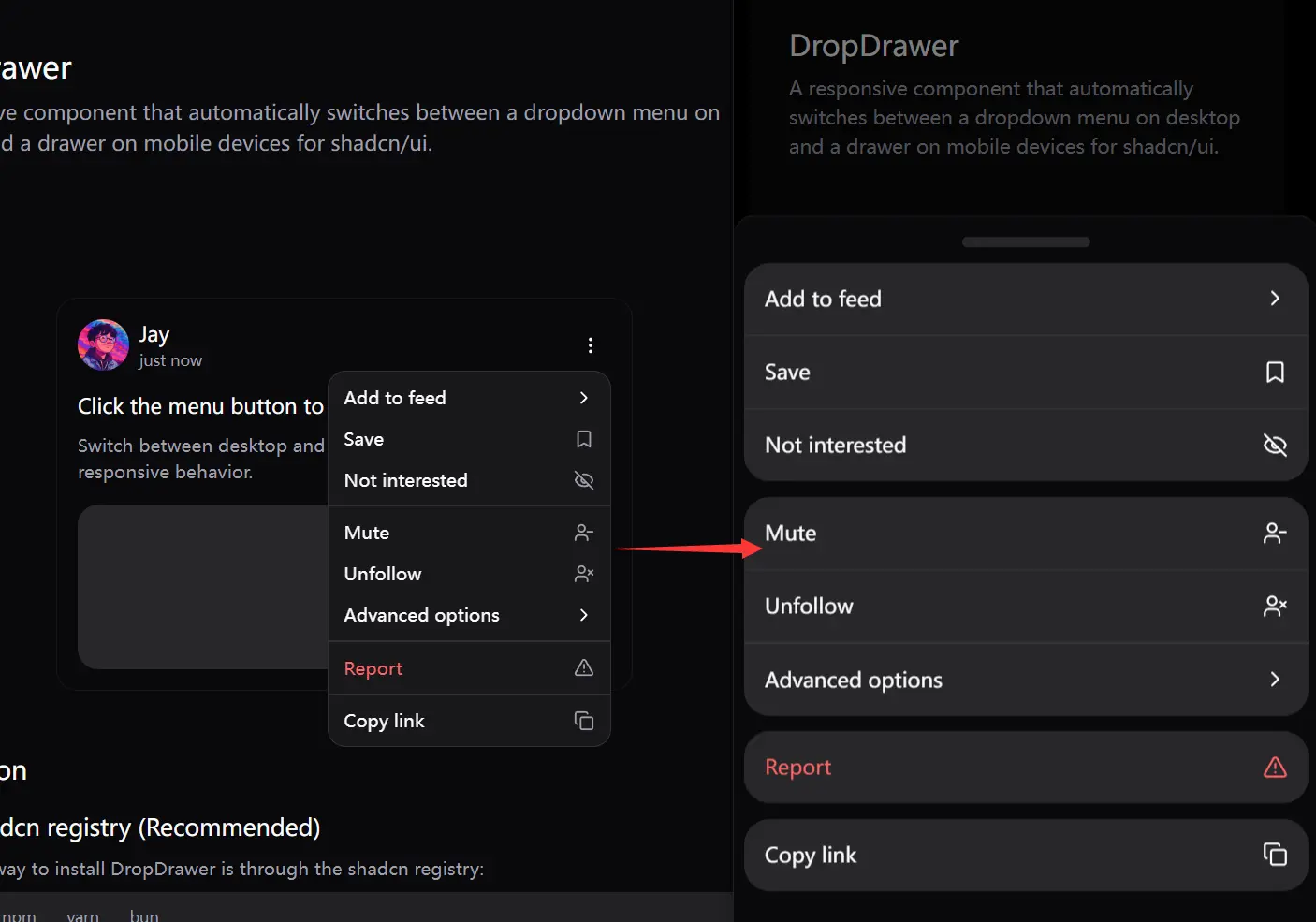
DropDrawer is a responsive dropdown component that acts as a replacement for shadcn/ui’s standard DropdownMenu component.
It intelligently switches between a traditional dropdown menu on desktop views and a modern drawer navigation (bottom sheet) on mobile devices.
You can use it to build navigation systems, action menus, or any interface element that benefits from adaptive menu presentation.
Features
🔄 Automatic Responsive Behavior – Switches between dropdown (desktop) and drawer (mobile) interfaces based on screen size.
📱 Mobile-Optimized UX – Provides a native-feeling drawer interface on smaller screens.
🔗 API Compatibility – Maintains the same component structure and props as the original DropdownMenu.
📦 Easy Installation – Available through shadcn registry for quick integration.
🧩 Drop-in Replacement – Direct replacement for shadcn/ui’s DropdownMenu with minimal code changes.
⚙️ Configurable Breakpoint – Default 768px breakpoint can be customized to match your design system.
🔍 Nested Submenu Support – Handles complex menu structures with submenus and groups.
Use Cases
- Navigation Menus – Create responsive navigation menus that work well on both desktop and mobile without separate implementations.
- User Account Controls – Implement user account dropdowns that transform into full-screen drawers on mobile for better touch interaction.
- App Settings Panels – Build settings interfaces that adapt to the available screen real estate automatically.
- Theme Switchers – Create theme selection components that feel native across all devices.
- E-commerce Product Actions – Develop product action menus (save, share, add to wishlist) that work intuitively regardless of device.
Installation
Using shadcn registry:
# pnpm
pnpm dlx shadcn@latest add https://dropdrawer.jiawei.dev/r/dropdrawer.json
# npm
npx shadcn@latest add https://dropdrawer.jiawei.dev/r/dropdrawer.json
# yarn
yarn dlx shadcn@latest add https://dropdrawer.jiawei.dev/r/dropdrawer.json
# bun
bunx shadcn@latest add https://dropdrawer.jiawei.dev/r/dropdrawer.json
This process installs required dependencies, adds the component to your project, and sets up necessary configurations.
For local development, you can use:
npx shadcn@latest add http://localhost:3000/r/dropdrawer.jsonManual Installation:
1. Add the dropdown-menu and drawer components from shadcn/ui if you have not already.
# pnpm
pnpm dlx shadcn@latest add dropdown-menu drawer
# npm
npx shadcn@latest add dropdown-menu drawer
# yarn
yarn dlx shadcn@latest add dropdown-menu drawer
# bun
bunx shadcn@latest add dropdown-menu drawer
Alternatively, manually copy these components from the shadcn/ui documentation. If you copy the drawer component manually, install vaul:
npm install vaul2. Copy the useIsMobile hook into your project.
// hooks/use-is-mobile.ts
import * as React from "react";
const MOBILE_BREAKPOINT = 768; // Default, can be customized
export function useIsMobile() {
  const [isMobile, setIsMobile] = React.useState<boolean | undefined>(
    undefined
  );
  React.useEffect(() => {
    const mql = window.matchMedia(`(max-width: ${MOBILE_BREAKPOINT - 1}px)`);
    const onChange = () => {
      setIsMobile(window.innerWidth < MOBILE_BREAKPOINT);
    };
    mql.addEventListener("change", onChange);
    // Set initial state
    setIsMobile(window.innerWidth < MOBILE_BREAKPOINT);
    return () => mql.removeEventListener("change", onChange);
  }, []);
  return !!isMobile;
}
3. Copy the dropdrawer component code into your components directory (e.g., components/ui/dropdrawer.tsx). You can find the full component code in the DropDrawer repository.
4. Adjust the import paths within the dropdrawer component file to match your project’s structure. For instance, update paths for useIsMobile, cn, and shadcn/ui components.
5. You can customize the mobile breakpoint by modifying the MOBILE_BREAKPOINT constant in your use-is-mobile.ts hook file.
Basic Usage
import { DropDrawer, DropDrawerContent, DropDrawerItem, DropDrawerTrigger } from "@/components/ui/dropdrawer";import {
DropDrawer,
DropDrawerContent,
DropDrawerItem,
DropDrawerTrigger,
} from "@/components/ui/dropdrawer";
import { Button } from "@/components/ui/button";
export function Example() {
return (
<DropDrawer>
<DropDrawerTrigger asChild>
<Button>Open Menu</Button>
</DropDrawerTrigger>
<DropDrawerContent>
<DropDrawerItem>Item 1</DropDrawerItem>
<DropDrawerItem>Item 2</DropDrawerItem>
<DropDrawerItem>Item 3</DropDrawerItem>
</DropDrawerContent>
</DropDrawer>
);
}FAQs
Q: How do I customize the breakpoint where DropDrawer switches between dropdown and drawer modes?
A: You can customize the breakpoint by modifying the MOBILE_BREAKPOINT constant in the useIsMobile hook. By default, this is set to 768px.
Q: Does DropDrawer support all features of the original DropdownMenu component?
A: DropDrawer supports most features of the original DropdownMenu, including nested submenus, labels, separators, and groups. However, some advanced components like DropdownMenuCheckboxItem, DropdownMenuRadioGroup, and DropdownMenuRadioItem are not currently implemented.
Q: Can I control the open state of DropDrawer programmatically?
A: Yes, you can control the open state using React state by passing open and onOpenChange props to the DropDrawer component.
Q: How can I add icons to menu items?
A: DropDrawerItem components accept an icon prop which takes a React node. This allows you to pass any icon component, such as those from Lucide React.
Preview


