The Future of Web Dev
The Future of Web Dev
Searchable, Customizable Icon Picker for shadcn/ui
Implement a searchable icon picker in your React app with Shadcn Icon Picker. Features infinite scroll, dark mode, and full Lucide icon support.
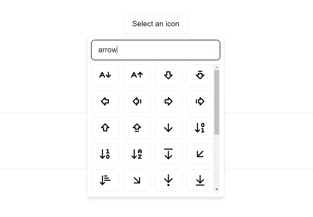
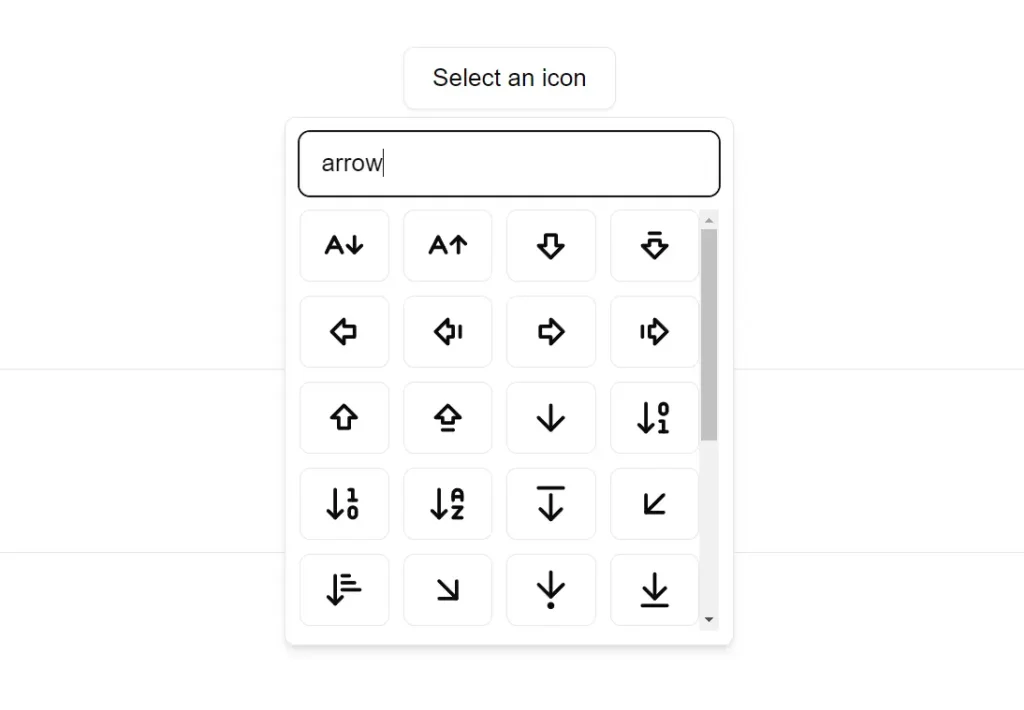
Shadcn Icon Picker is a lightweight UI component that allows you to integrate an elegant icon selection interface into your React applications.
This component provides a searchable, scrollable icon selection UI where you can easily find and integrate the perfect icon for any situation.
Features
🎨 Modern Design: The UI is responsive, adapting to different screen sizes.
⚡️ Lazy Loading: Icons load progressively as you scroll to maintain performance.
🎛️ Customization Options: Lots of customization options to fit your project’s needs.
🔍 Instant Search: Find icons quickly with real-time search functionality.
🎯 Complete Icon Set: You have access to the full range of Lucide icons.
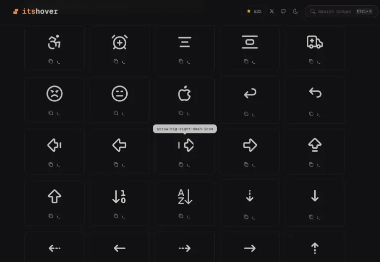
🌗 Theme Support: The Icon Picker is built to support dark mode.
Use Cases
- Dashboard Interfaces: If you’re building a dashboard, you likely need icons for various metrics, actions, and status indicators. The Shadcn Icon Picker allows you to quickly select and implement these icons.
- Form Design: Forms often use icons to represent different input fields or actions (e.g., a calendar icon for a date picker). This component simplifies adding those visual cues.
- Application Toolbars: Many applications have toolbars with icons for common actions (save, edit, delete, etc.). The picker provides an easy way to manage and implement these icons.
- Design Software Prototyping: When creating prototypes for design software, you often need a wide variety of icons. This component can speed up the prototyping process.
- E-commerce Platforms: For instance, you have different icons for categories, actions, or filters, so this component would be useful.
Installation
To install Shadcn Icon Picker, follow the instructions below. This package is available via npm, pnpm, Yarn, and Bun, making it compatible with most modern JavaScript package managers.
Using npm
npx shadcn@latest add "https://icon-picker.alan-courtois.fr/r/icon-picker"Using pnpm
pnpm dlx shadcn@latest add "https://icon-picker.alan-courtois.fr/r/icon-picker"Using Yarn
yarn dlx shadcn@latest add "https://icon-picker.alan-courtois.fr/r/icon-picker"Using Bun
bunx shadcn@latest add "https://icon-picker.alan-courtois.fr/r/icon-picker"Usage
Once installed, you can use the Icon Picker component in your project by importing it and rendering it in your React component.
import { IconPicker } from "@/components/ui/iconPicker";
export default function Home() {
  return <IconPicker />;
}
Props
The IconPicker component provides sevral props for customization and control. Here’s a complete list:
value(IconName): The currently selected icon. You control it.defaultValue(IconName): The initially selected icon.onValueChange((value: IconName) => void): A callback function. It’s triggered when a new icon is selected.open(boolean): The open/closed state of the picker. You control it.defaultOpen(boolean, default:false): The initial open/closed state of the picker.onOpenChange((open: boolean) => void): A callback function. It’s triggered when the picker’s open/closed state changes.children(ReactNode): You can provide a custom element here. It acts as the trigger to open the icon picker.searchable(boolean, default:true): Controls whether the search input is displayed.searchPlaceholder(string, default: “Search for an icon…”): The placeholder text in the search input.triggerPlaceholder(string, default: “Select an icon”): The text displayed on the default trigger button. It changes if no icon is selected.iconsList(IconList, default: all lucide icons): The set of icons to display. By default, it’s the complete Lucide icon set. You can customize this to show a subset or a different library.
Related Resources
- shadcn/ui: This is the base UI component library used to build the Icon Picker. Explore more components and utilities here: shadcn/ui Documentation.
- Lucide Icons: This is the default icon set used. You can browse the full icon library on their website: Lucide Icons.
FAQs
Q: Can I use this component with other icon libraries?
A: While it’s designed for Lucide Icons, you could adapt it by modifying the iconsList prop and associated logic.
Q: Is the search case-sensitive?
A: The default search implementation is typically case-insensitive for better usability.
Q: How do I customize the appearance?
A: You can use standard shadcn/ui and Tailwind CSS styling techniques to adjust the look and feel.
Q: Can I use a different trigger element?
A: Yes, you can use the children prop to provide a custom trigger element.
Q: Does this component offer keyboard accessibility?
A: Yes, the Shadcn Icon Picker is built to be fully accessible via keyboard.
Preview
