The Future of Web Dev
The Future of Web Dev
Copy-paste UI Components with Smooth Motion Effects – Spectrum UI
A collection of free, open-source animated UI components built with Next.js, shadcn/ui, Tailwind CSS, and Framer Motion. Copy, paste, and build.
Spectrum UI is a collection of free and open-source animated UI components with smooth motion effects. Built with Next.js, shadcn/ui, TypeScript, Tailwind CSS, and Framer Motion.
The library operates on a copy-paste philosophy rather than traditional package installation. You can browse through the collection, select the components you need, and integrate them directly into your codebase.
Features
🆓 Completely free for personal and commercial use
🎭 Framer Motion animations for fluid user interactions
🌓 Dark mode support across all components
📱 Responsive design for mobile and desktop
♿ Accessibility-focused component structure
🔧 Full customization control over component code
Use Cases
- Startup Landing Pages: Build modern landing pages with animated testimonials, hero sections, and call-to-action buttons that capture user attention and drive conversions.
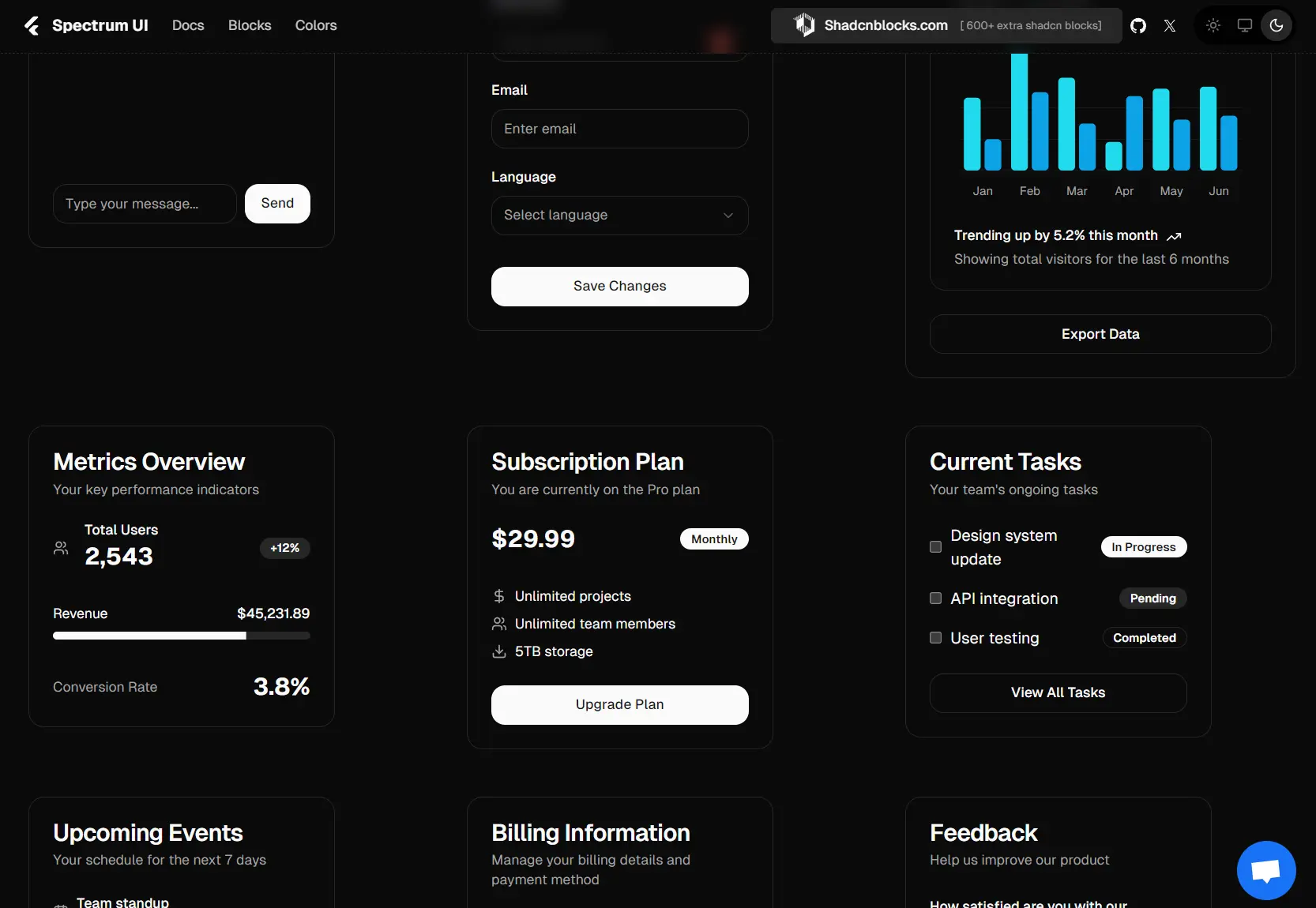
- SaaS Dashboard Interfaces: Create modern dashboard layouts with animated charts, progress indicators, status badges, and notification alerts that provide real-time feedback to users.
- E-commerce Platforms: Implement product galleries with image previews, animated loading states, shopping cart notifications, and interactive product cards that enhance the shopping experience.
- Portfolio Websites: Showcase work with animated project cards, skill progress bars, contact forms with floating labels, and smooth page transitions that create memorable user experiences.
- Blog and Content Platforms: Build engaging content layouts with animated article cards, infinite scroll components, feedback systems, and interactive navigation elements that keep readers engaged.
Installation
To get started, you need to set up a Next.js project and install Shadcn UI.
1. Create a Next.js project:
npx create-next-app@latest2. Install Shadcn UI:
npx shadcn-ui@latest initYou can use the -d flag for default settings.
npx shadcn-ui@latest init -d3. Configure components.json. You will be asked a few questions to configure components.json:
- Which style would you like to use? > New York
- Which color would you like to use as base color? > Zinc
- Do you want to use CSS variables for colors? > yes
Usage
You can then add components to your project by copying the code or using the CLI.
Manual Copy-Paste
Visit the Spectrum UI website, browse components, and copy the code directly into your project. For example, to add an alert component, you would copy its code into a file like components/ui/alert.tsx.
"use client";
import { Alert } from "@/components/ui/alert";
import { cn } from "@/lib/utils";
import { motion } from "framer-motion";
import { PartyPopper } from "lucide-react";
interface Alert04Props {
    className?: string;
}
export default function AlertDemo({ className }: Alert04Props) {
    return (
        <motion.div
            initial={{ opacity: 0, y: -8 }}
            animate={{ opacity: 1, y: 0 }}
            className={cn("w-full max-w-xl mx-auto", className)}
        >
            <Alert className={cn(
                "relative overflow-hidden",
                "bg-gradient-to-b from-violet-50 to-white",
                "border border-violet-100",
                "shadow-[0_1px_6px_0_rgba(139,92,246,0.06)]",
                "rounded-xl p-4",
                className
            )}>
                {/* Component content */}
            </Alert>
        </motion.div>
    );
}
Using the CLI:
You can also add components using the shadcn-ui CLI with the component’s URL.
# PNPM
$ pnpm dlx shadcn@latest add https://ui.spectrumhq.in/r/alert-demo.json

# NPX
$ npx shadcn@latest add https://ui.spectrumhq.in/r/alert-demo.json

# YARN
$ yarn dlx shadcn@latest add https://ui.spectrumhq.in/r/alert-demo.json

# BUN
$ bunx --bun shadcn@latest add https://ui.spectrumhq.in/r/alert-demo.json
Related Resources
- shadcn/ui – Base component library that Spectrum UI extends with additional animated components
- Framer Motion Documentation – Learn advanced animation techniques used in Spectrum components
- Aceternity UI – Premium animated components that inspired many Spectrum UI designs
- Magic UI – Collection of React components with beautiful animations and effects
FAQs
Q: Is Spectrum UI a component library?
A: No, it is not a traditional component library. It’s a collection of reusable components that you copy and paste into your projects.
Q: Which frameworks are supported?
A: You can use these components in any framework that supports React, including Next.js, Gatsby, and others.
Q: Can I modify the component code after copying it?
A: Yes, once you copy the code into your project, you have complete control to modify, customize, and adapt it to your specific needs


