The Future of Web Dev
The Future of Web Dev
Customizable Vue UI Components with Tailwind CSS – shadcn-vue
A Vue.js port of the popular shadcn/ui library. It provides a collection of beautifully designed, accessible, and highly customizable UI components.
shadcn-vue is a collection of reusable UI components that you copy and paste directly into your Vue/Nuxt/JavaScript applications.
It functions as a port of the original shadcn/ui component library and adapts its architecture for the Vue ecosystem.
shadcn-vue uses Radix Vue for accessible component primitives, Tailwind CSS for styling, and a flat-file schema for distribution. Each component arrives as a single .vue file with transparent implementations.
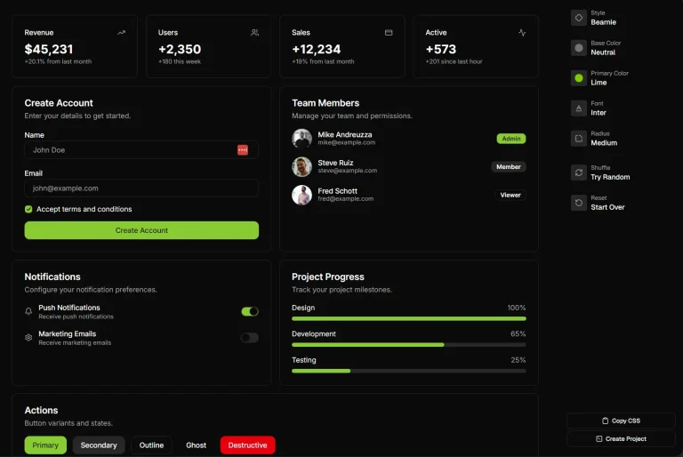
Features
🔓 Open Source: You can modify the implementation directly when you need custom behavior or styling.
🧩 Composable: Every component follows the same patterns from Radix Vue. Third-party components get wrapped to match this interface before distribution.
📦 CLI Distribution: The command-line tool installs components with their dependencies. The system handles path resolution and framework compatibility automatically.
🎨 Tailwind CSS Theming: Components use CSS variables for colors and spacing. You switch between CSS variables and utility classes based on your preference.
🌐 Vue Ecosystem Integration: The library supports Vue 3, Vite, and Nuxt.
♿ Accessibility Built-in: Radix Vue handles ARIA attributes, keyboard navigation, and focus management.
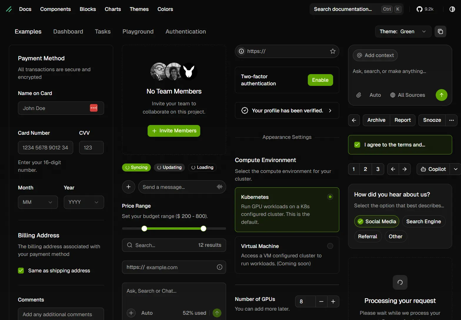
Available UI Components
- Accordion
- Alert
- Alert Dialog
- Aspect Ratio
- Avatar
- Badge
- Breadcrumb
- Button
- Button Group
- Calendar
- Card
- Carousel
- Chart
- Checkbox
- Collapsible
- Combobox
- Command
- Context Menu
- Data Table
- Date Picker
- Dialog
- Drawer
- Dropdown Menu
- Empty
- Field
- Form
- Hover Card
- Input
- Input Group
- Input OTP
- Item
- Kbd
- Label
- Menubar
- Native Select
- Navigation Menu
- Number Field
- Pagination
- Pin Input
- Popover
- Progress
- Radio Group
- Range Calendar
- Resizable
- Scroll Area
- Select
- Separator
- Sheet
- Sidebar
- Skeleton
- Slider
- Sonner
- Spinner
- Stepper
- Switch
- Table
- Tabs
- Tags Input
- Textarea
- Toast
- Toggle
- Toggle Group
- Tooltip
- Typography
Install & Config
Table Of Contents
Installation with Vite
Create a new Vue project with Vite and TypeScript.
npm create vite@latest my-vue-app --template vue-tsInstall Tailwind CSS and its Vite plugin.
npm install tailwindcss @tailwindcss/viteReplace the contents of src/style.css with Tailwind directives.
@import "tailwindcss";Configure TypeScript path resolution in two files. Open tsconfig.json and add path mappings.
{
  "files": [],
  "references": [
    { "path": "./tsconfig.app.json" },
    { "path": "./tsconfig.node.json" }
  ],
  "compilerOptions": {
    "baseUrl": ".",
    "paths": {
      "@/*": ["./src/*"]
    }
  }
}
Open tsconfig.app.json and add the same path configuration.
{
  "compilerOptions": {
    "baseUrl": ".",
    "paths": {
      "@/*": ["./src/*"]
    }
  }
}
Configure Vite to resolve path aliases. You have two options.
Option 1 – Using Node.js path resolution:
Install Node.js types.
npm install -D @types/nodeUpdate vite.config.ts to include Tailwind and path resolution.
import path from 'node:path'
import { defineConfig } from 'vite'
import tailwindcss from '@tailwindcss/vite'
import vue from '@vitejs/plugin-vue'
export default defineConfig({
  plugins: [vue(), tailwindcss()],
  resolve: {
    alias: {
      '@': path.resolve(__dirname, './src'),
    },
  },
})
Option 2 – Using vite-tsconfig-paths:
Install the plugin.
npm install -D vite-tsconfig-pathsUpdate vite.config.ts to use the plugin.
import { defineConfig } from 'vite'
import vue from '@vitejs/plugin-vue'
import tailwindcss from '@tailwindcss/vite'
import tsconfigPaths from 'vite-tsconfig-paths'
export default defineConfig({
  plugins: [vue(), tailwindcss(), tsconfigPaths()],
})
Run the shadcn-vue initialization command.
npx shadcn-vue@latest initThe CLI will prompt you to select a base color. Choose from neutral, gray, zinc, stone, or slate.
Which color would you like to use as base color? › NeutralInstall components using the add command. This example installs the Button component.
npx shadcn-vue@latest add buttonImport and use the component in your application.
<script setup lang="ts">
import { Button } from '@/components/ui/button'
</script>
<template>
  <div>
    <Button>Click me</Button>
  </div>
</template>
Installation with Nuxt
Create a new Nuxt project.
npm create nuxt@latestIf you encounter an error about missing TypeScript dependencies, install TypeScript.
npm install -D typescriptConfigure Tailwind CSS. You can use either the Vite plugin or the Nuxt module.
Option 1 – Using @tailwindcss/vite:
Install Tailwind CSS and the Vite plugin.
npm install tailwindcss @tailwindcss/vite -DReplace the contents of app/assets/css/tailwind.css.
@import "tailwindcss";Update nuxt.config.ts to include the Vite plugin.
import tailwindcss from '@tailwindcss/vite'
export default defineNuxtConfig({
  css: ['~/assets/css/tailwind.css'],
  vite: {
    plugins: [tailwindcss()],
  },
})
Option 2 – Using @nuxtjs/tailwindcss:
Install the Nuxt Tailwind module.
npm install tailwindcss @nuxtjs/[email protected] -DReplace the contents of app/assets/css/tailwind.css.
@import "tailwindcss";Add the module to nuxt.config.ts.
export default defineNuxtConfig({
  modules: ['@nuxtjs/tailwindcss'],
})
Install the shadcn-nuxt module to prevent console warnings from auto-imports. You can install it automatically or configure it manually.
Option 1 – Install module automatically:
npx nuxi@latest module add shadcn-nuxtOption 2 – Create the module manually:
Install Node types.
npm install -D @types/nodeCreate modules/shadcn.ts with the following code.
import { readdirSync } from 'node:fs'
import { join } from 'node:path'
import {
  addComponentExports,
  addComponentsDir,
  createResolver,
  defineNuxtModule,
} from 'nuxt/kit'
export interface ShadcnVueOptions {
  prefix: string
  componentDir: string
}
export default defineNuxtModule<ShadcnVueOptions>({
  defaults: {
    prefix: 'Ui',
    componentDir: '@/components/ui',
  },
  meta: {
    name: 'ShadcnVue',
    configKey: 'shadcn',
    version: '0.0.1',
    compatibility: {
      nuxt: '>=3.17.0',
    },
  },
  async setup({ componentDir, prefix }, nuxt) {
    const COMPONENT_DIR_PATH = componentDir!
    const ROOT_DIR_PATH = nuxt.options.rootDir
    const { resolve, resolvePath } = createResolver(ROOT_DIR_PATH)
    const componentsPath = await resolvePath(COMPONENT_DIR_PATH)
    addComponentsDir({
      path: componentsPath,
      extensions: [],
      ignore: ['**/*'],
    }, {
      prepend: true,
    })
    try {
      await Promise.all(readdirSync(componentsPath).map(async (dir) => {
        try {
          const filePath = await resolvePath(join(COMPONENT_DIR_PATH, dir, 'index'), { extensions: ['.ts', '.js'] })
          addComponentExports({
            prefix,
            filePath: resolve(filePath),
            priority: 1,
          })
        }
        catch (err) {
          if (err instanceof Error)
            console.warn('Module error: ', err.message)
        }
      }))
    }
    catch (err) {
      if (err instanceof Error)
        console.warn(err.message)
    }
  },
})
Configure the module in nuxt.config.ts.
export default defineNuxtConfig({
  modules: ['shadcn-nuxt'],
  shadcn: {
    prefix: '',
    componentDir: '@/components/ui'
  }
})
Add an SSR width plugin to prevent hydration errors on mobile. Create app/plugins/ssr-width.ts.
import { provideSSRWidth } from '@vueuse/core'
export default defineNuxtPlugin((nuxtApp) => {
  provideSSRWidth(1024, nuxtApp.vueApp)
})
Run Nuxt prepare to generate the .nuxt folder for new projects.
npx nuxi prepareInitialize shadcn-vue configuration.
npx shadcn-vue@latest initAdd components to your project. This example adds the Button component.
npx shadcn-vue@latest add buttonNuxt handles auto-imports. Use components directly in templates without manual imports.
<template>
  <div>
    <Button>Click me</Button>
  </div>
</template>
Manual Installation
Install Tailwind CSS following the official documentation at tailwindcss.com/docs/installation.
Install required dependencies.
npm install class-variance-authority clsx tailwind-merge lucide-vue-next tw-animate-cssConfigure path aliases in tsconfig.json.
{
  "compilerOptions": {
    "baseUrl": ".",
    "paths": {
      "@/*": ["./*"]
    }
  }
}
Create a global CSS file with Tailwind directives and CSS variables. Add this to src/styles/globals.css.
@import "tailwindcss";
@import "tw-animate-css";
@custom-variant dark (&:is(.dark *));
:root {
  --background: oklch(1 0 0);
  --foreground: oklch(0.145 0 0);
  --card: oklch(1 0 0);
  --card-foreground: oklch(0.145 0 0);
  --popover: oklch(1 0 0);
  --popover-foreground: oklch(0.145 0 0);
  --primary: oklch(0.205 0 0);
  --primary-foreground: oklch(0.985 0 0);
  --secondary: oklch(0.97 0 0);
  --secondary-foreground: oklch(0.205 0 0);
  --muted: oklch(0.97 0 0);
  --muted-foreground: oklch(0.556 0 0);
  --accent: oklch(0.97 0 0);
  --accent-foreground: oklch(0.205 0 0);
  --destructive: oklch(0.577 0.245 27.325);
  --destructive-foreground: oklch(0.577 0.245 27.325);
  --border: oklch(0.922 0 0);
  --input: oklch(0.922 0 0);
  --ring: oklch(0.708 0 0);
  --radius: 0.625rem;
}
.dark {
  --background: oklch(0.145 0 0);
  --foreground: oklch(0.985 0 0);
  --card: oklch(0.145 0 0);
  --card-foreground: oklch(0.985 0 0);
  --popover: oklch(0.145 0 0);
  --popover-foreground: oklch(0.985 0 0);
  --primary: oklch(0.985 0 0);
  --primary-foreground: oklch(0.205 0 0);
  --secondary: oklch(0.269 0 0);
  --secondary-foreground: oklch(0.985 0 0);
  --muted: oklch(0.269 0 0);
  --muted-foreground: oklch(0.708 0 0);
  --accent: oklch(0.269 0 0);
  --accent-foreground: oklch(0.985 0 0);
  --destructive: oklch(0.396 0.141 25.723);
  --destructive-foreground: oklch(0.637 0.237 25.331);
  --border: oklch(0.269 0 0);
  --input: oklch(0.269 0 0);
  --ring: oklch(0.439 0 0);
}
@theme inline {
  --color-background: var(--background);
  --color-foreground: var(--foreground);
  --color-card: var(--card);
  --color-card-foreground: var(--card-foreground);
  --color-popover: var(--popover);
  --color-popover-foreground: var(--popover-foreground);
  --color-primary: var(--primary);
  --color-primary-foreground: var(--primary-foreground);
  --color-secondary: var(--secondary);
  --color-secondary-foreground: var(--secondary-foreground);
  --color-muted: var(--muted);
  --color-muted-foreground: var(--muted-foreground);
  --color-accent: var(--accent);
  --color-accent-foreground: var(--accent-foreground);
  --color-destructive: var(--destructive);
  --color-destructive-foreground: var(--destructive-foreground);
  --color-border: var(--border);
  --color-input: var(--input);
  --color-ring: var(--ring);
  --radius-sm: calc(var(--radius) - 4px);
  --radius-md: calc(var(--radius) - 2px);
  --radius-lg: var(--radius);
  --radius-xl: calc(var(--radius) + 4px);
}
@layer base {
  * {
    @apply border-border outline-ring/50;
  }
  body {
    @apply bg-background text-foreground;
  }
}
Create a utility function for class name merging. Add this to lib/utils.ts.
import type { ClassValue } from 'clsx'
import { clsx } from 'clsx'
import { twMerge } from 'tailwind-merge'
export function cn(...inputs: ClassValue[]) {
  return twMerge(clsx(inputs))
}
Create a components.json file in your project root.
{
  "$schema": "https://shadcn-vue.com/schema.json",
  "style": "new-york",
  "typescript": true,
  "tailwind": {
    "config": "",
    "css": "src/styles/globals.css",
    "baseColor": "neutral",
    "cssVariables": true,
    "prefix": ""
  },
  "aliases": {
    "components": "@/components",
    "composables": "@/composables",
    "utils": "@/lib/utils",
    "ui": "@/components/ui",
    "lib": "@/lib"
  },
  "iconLibrary": "lucide"
}
You can now add components manually or use the CLI to install them.
Using the CLI
The init command configures your project and installs dependencies.
npx shadcn-vue@latest initOptions for the init command:
-t, --template <template>      Set template (next, next-monorepo)
-b, --base-color <base-color>  Set base color (neutral, gray, zinc, stone, slate)
-y, --yes                      Skip confirmation prompt
-f, --force                    Overwrite existing configuration
-c, --cwd <cwd>                Set working directory
-s, --silent                   Suppress output
--src-dir                      Use src directory
--no-src-dir                   Skip src directory
--css-variables                Use CSS variables for theming
--no-css-variables             Use utility classes instead
The add command installs components into your project.
npx shadcn-vue@latest add [component]Options for the add command:
-y, --yes                Skip confirmation
-o, --overwrite          Overwrite existing files
-c, --cwd <cwd>          Set working directory
-a, --all                Add all components
-p, --path <path>        Set installation path
-s, --silent             Suppress output
--src-dir                Use src directory
--no-src-dir             Skip src directory
--css-variables          Use CSS variables
--no-css-variables       Use utility classes
Add all components at once.
npx shadcn-vue@latest add --allThe build command generates registry JSON files for distribution.
npx shadcn-vue@latest buildThis reads registry.json and outputs to public/r by default. You can customize the output directory.
npx shadcn-vue@latest build --output ./public/registryConfiguration File (components.json)
$schema: URL to JSON schema for validation. Set to https://shadcn-vue.com/schema.json.
style: Visual style for components. Options are new-york or default. This cannot be changed after initialization.
typescript: Boolean flag for TypeScript support. Set to false to generate JavaScript components in .vue files.
tailwind.config: Path to your Tailwind configuration file. Leave blank for Tailwind CSS v4.
tailwind.css: Path to your global CSS file that imports Tailwind directives.
tailwind.baseColor: Base color for the default palette. Options are neutral, gray, zinc, stone, or slate. This cannot be changed after initialization.
tailwind.cssVariables: Boolean flag for theming approach. Set to true for CSS variables, false for utility classes. This cannot be changed after initialization.
tailwind.prefix: Prefix for Tailwind utility classes. Components will use this prefix when generated.
aliases.utils: Import alias for utility functions like the cn helper.
aliases.components: Import alias for component directory.
aliases.ui: Import alias for UI components. The CLI uses this path when installing components.
aliases.lib: Import alias for library functions.
aliases.composables: Import alias for Vue composables.
iconLibrary: Icon library to use. Currently supports lucide for lucide-vue-next.
CSS Variables
The system defines these CSS variables for theming.
–background: Main background color for your application.
–foreground: Main text color.
–card: Background color for card components.
–card-foreground: Text color for card content.
–popover: Background color for popover components.
–popover-foreground: Text color for popover content.
–primary: Primary brand color for buttons and interactive elements.
–primary-foreground: Text color on primary backgrounds.
–secondary: Secondary brand color for less prominent elements.
–secondary-foreground: Text color on secondary backgrounds.
–muted: Muted background color for disabled or inactive states.
–muted-foreground: Text color for muted content.
–accent: Accent color for highlighting and emphasis.
–accent-foreground: Text color on accent backgrounds.
–destructive: Color for destructive actions and errors.
–destructive-foreground: Text color on destructive backgrounds.
–border: Color for borders and dividers.
–input: Border color for form inputs.
–ring: Focus ring color for keyboard navigation.
–radius: Border radius for rounded corners.
–chart-1 through –chart-5: Color palette for data visualizations.
–sidebar: Background color for sidebar navigation.
–sidebar-foreground: Text color in sidebar.
–sidebar-primary: Primary color for sidebar items.
–sidebar-primary-foreground: Text color for primary sidebar items.
–sidebar-accent: Accent color for sidebar highlights.
–sidebar-accent-foreground: Text color on sidebar accents.
–sidebar-border: Border color for sidebar elements.
–sidebar-ring: Focus ring color in sidebar.
Add new colors by defining them in your CSS file and in the Tailwind theme.
:root {
  --warning: oklch(0.84 0.16 84);
  --warning-foreground: oklch(0.28 0.07 46);
}
.dark {
  --warning: oklch(0.41 0.11 46);
  --warning-foreground: oklch(0.99 0.02 95);
}
@theme inline {
  --color-warning: var(--warning);
  --color-warning-foreground: var(--warning-foreground);
}
Use the new color in your components.
<div class="bg-warning text-warning-foreground">Warning message</div>Related Resources
- Radix Vue: Unstyled, accessible components for Vue.
- Tailwind CSS: Utility-first CSS framework.
- VueUse: Collection of Vue composition utilities.
FAQs
Q: Can I update components after installing them?
A: Components are installed as source files in your project. You modify them directly. The CLI does not track versions or pull updates automatically. You maintain component code like any other part of your codebase.
Q: How do I handle component updates from the registry?
A: Compare the registry version with your modified version manually. Selectively merge changes you want to adopt.
Q: Can I use shadcn-vue with Nuxt 2?
A: No. The library requires Vue 3 and Composition API. Nuxt 3 is the minimum supported version for Nuxt projects.
Q: Why does the CLI install components instead of npm packages?
A: Installing as source code gives you complete control.
Q: Do I need to keep components.json after installation?
A: Yes if you plan to add more components. The CLI reads this file to understand your project structure and preferences. You can remove it after installing all needed components.