The Future of Web Dev
The Future of Web Dev
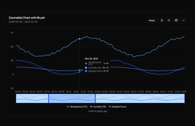
Simple Zoomable Shadcn Chart: Interactive Time-Series Visualization
Implement interactive zoomable charts in your React app using Shadcn UI and Recharts. Explore time-series data easily.
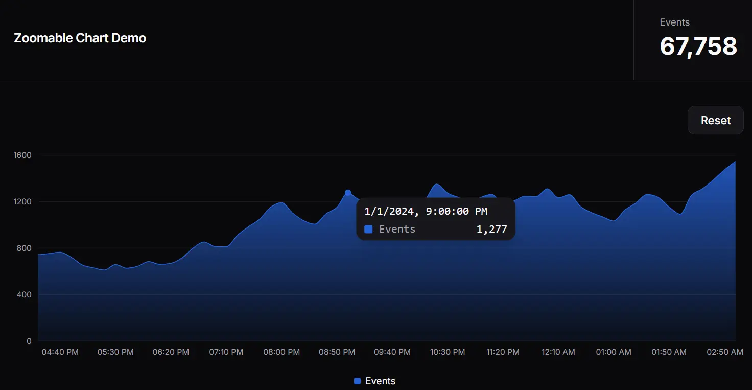
This is a simple, interactive, zoomable chart built using React, shadcn/ui components, and Recharts library.
It allows you to examine specific periods within a dataset by clicking and dragging to select a range or by using the mouse wheel to zoom in and out.
You can use this chart in dashboards, monitoring tools, or any application where users need to analyze trends or events over time with adjustable granularity.
Features
🔍 Interactive Zoom – Select areas by clicking and dragging to zoom into specific time ranges
📱 Touch Gesture Support – Includes pinch-to-zoom functionality for mobile devices
📈 Area Chart Visualization – Displays data with an attractive gradient fill below the line
🖱️ Mouse Wheel Support – Scroll to zoom in and out with the mouse positioned as the focal point
⚡ Performance Optimized – Uses React hooks like useMemo to minimize unnecessary re-renders
🔄 Real-time Statistics – Shows total event count that updates based on the visible data range
Use Cases
- User Activity Tracking – Visualize user engagement metrics with the ability to focus on peak usage periods or investigate unusual patterns.
- Financial Dashboard Applications – Track stock prices or trading volumes with the ability to zoom into specific time periods to analyze market fluctuations in detail.
- System Monitoring Tools – Monitor server performance, network traffic, or application metrics with the ability to isolate and examine incident periods by zooming into specific timeframes.
- Analytics Platforms – Provide users with the ability to explore large datasets by focusing on relevant time segments, improving data analysis capabilities.
- IoT Data Visualization – Display sensor data collected over time with interactive capabilities to examine specific events or anomalies more closely.
Installation
1. Clone the Repository:
git clone [email protected]:shelwinsunga/zoom-chart-demo.git2. Navigate to Directory:
cd zoom-chart-demo3. Install Dependencies:
npm install4. Run Development Server:
npm run dev5. View in Browser: Open http://localhost:3000 to see the component in action.
Related Resources
- Recharts: The underlying charting library used by this component. Explore its extensive documentation for more chart types and customization options. https://recharts.org/
- shadcn/ui: The UI component library providing the visual styling and base components (Card, Button, Chart primitives). https://ui.shadcn.com/
- shadcn/ui Charts Documentation: Specific documentation for the chart components within shadcn/ui, built upon Recharts. https://ui.shadcn.com/docs/components/chart
FAQs
Q: How does the click-and-drag zoom work?
A: It captures the start and end points (based on the X-axis data key, typically time) when you click, drag, and release the mouse over the chart area. These points then define the new visible range.
Q: Can I use my own data instead of the simulated data?
A: Yes, the component accepts a data prop. Format your data as an array of objects, where each object has a date (ISO string) and a events (number) key, or modify the component to accept your data structure.
Q: How is the scroll/pinch zoom implemented?
A: It uses onWheel and onTouchMove event listeners on a container div. These handlers calculate a new start and end time based on the scroll direction/pinch distance and the cursor’s position relative to the chart.
Q: Is the chart responsive?
A: Yes, it uses ResponsiveContainer from Recharts, which makes the chart adapt to the size of its parent container.
Q: How can I customize the chart’s appearance?
A: You can customize it by modifying the chartConfig object for colors and labels, adjusting the Recharts components (e.g., Area, XAxis, YAxis props), and applying Tailwind CSS classes via shadcn/ui conventions.
Q: Does this chart work with real-time data?
A: The chart can display real-time data if you update the data prop with new information. To optimize performance with frequently updating data, you may need to implement additional memoization techniques.
Q: How can I display multiple data series on the same chart?
A: The current implementation focuses on a single data series, but you can extend it by adding additional Area components in the ComposedChart and updating the chartConfig object to include new data keys.
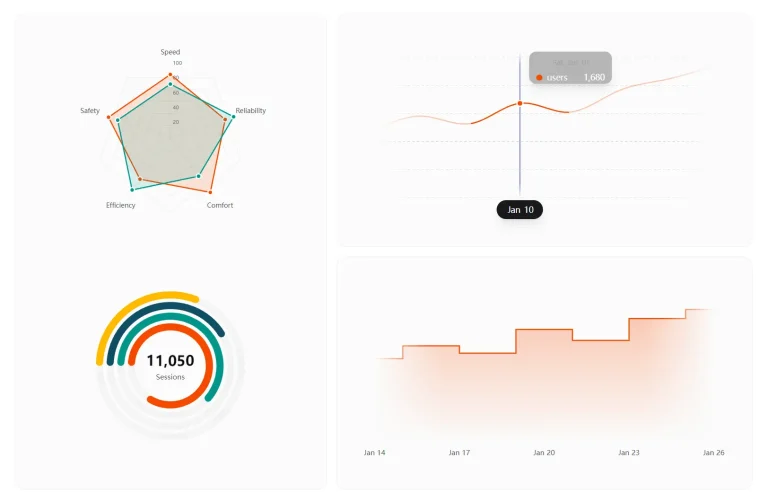
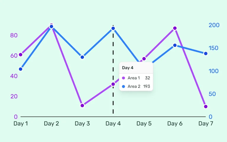
Preview