The Future of Web Dev
The Future of Web Dev
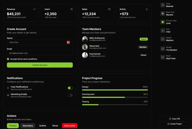
Advanced Svelte UI Components – more-shadcn-svelte
Enhance your Svelte apps with more-shadcn-svelte. Access a registry of copy-paste components built with Runes for forms, media, and navigation.

more-shadcn-svelte is a component library for Svelte that extends shadcn-svelte with additional UI components not found in the base registry.
The library follows the same philosophy as shadcn/ui. So you can copy components directly into your project and modify them as needed.
Every component runs on Svelte 5+ Runes. This means you get $state, $props, and $derived syntax out of the box.
The result is cleaner reactivity patterns and better runtime performance compared to older Svelte patterns.
Features
📦 Registry-Based Installation: Add components through the shadcn-svelte CLI. Components become part of your source code.
✨ Micro-Interactions and Animations: Built-in motion and visual feedback. Your interfaces feel polished without extra animation libraries.
🎨 Customizable Source Files: Components live in your project as editable files. You can adjust styles, logic, and structure.
🧩 shadcn-svelte Compatibility: Components integrate with existing shadcn-svelte primitives like Button, Badge, and the cn utility function.
Use Cases
- Form-Heavy Applications: Use Autocomplete, Tag Input, Phone Input, and Color Picker components to build data entry interfaces with validation and user feedback.
- Onboarding Flows: Combine Stepper and Walkthrough components to guide new users through multi-step setup processes or feature introductions.
- Media-Rich Dashboards: Add Audio Wave, Video, and Image Zoom components when your project displays multimedia content that needs interactive controls.
- Mobile-First Interfaces: Bottom Nav and Horizontal Scroll components handle touch interactions and navigation patterns common in responsive web apps.
How to Use It
1. Install shadcn-svelte in your Svelte project before adding more-shadcn-svelte components. The components depend on the cn utility and base primitives from shadcn-svelte.
npx shadcn-svelte@latest init2.Add components through the shadcn-svelte CLI with a custom registry URL. Each component installs as source files in your project.
Replace
autocompletewith any component name from the library. The CLI places files in your components directory.
# npm
npx shadcn-svelte@latest add https://more-shadcn.noair.fun/r/autocomplete.json
# pnpm
pnpm dlx shadcn-svelte@latest add https://more-shadcn.noair.fun/r/autocomplete.json
# yarn
npx shadcn-svelte@latest add https://more-shadcn.noair.fun/r/autocomplete.json
# bun
bun x shadcn-svelte@latest add https://more-shadcn.noair.fun/r/autocomplete.json
3. Import the component into your .svelte file. The following example demonstrates how to use the Autocomplete component with data binding and snippets.
<script lang="ts">
  import * as Autocomplete from "$lib/components/ui/autocomplete";

  let query = $state("");
  let loading = $state(false);

  // Example data source
  const users = [
    { id: 1, name: "Alice" },
    { id: 2, name: "Bob" },
    { id: 3, name: "Charlie" }
  ];

  // Filter logic based on query
  let filteredUsers = $derived(
    users.filter((u) => u.name.toLowerCase().includes(query.toLowerCase()))
  );
</script>

<div class="max-w-md p-4">
  <Autocomplete.Root
    id="user-search"
    bind:value={query}
    options={filteredUsers}
    {loading}
  >
    {#snippet itemSnippet(user)}
      <Autocomplete.Highlight text={user.name} {query} />
    {/snippet}
  </Autocomplete.Root>
</div>
Available UI Components
The library organizes components into four main categories. Each component supports standard HTML attributes and specific Svelte props.
Forms
- Autocomplete: Searchable dropdown with highlighting.
- Chip: Compact elements for input, attribute, or action.
- Choicebox: Selection interface for multiple options.
- Color Picker: Interface to select color values.
- Date Strip: Horizontal date selection tool.
- Phone Input: Formatted input for telephone numbers.
- Sortable: Drag-and-drop list reordering.
- Tag Input: Input field that tokenizes entries.
- Wheel Picker: iOS-style scrolling selector.
Navigation
- Big Calendar: Full-sized calendar view.
- Bottom Nav: Mobile-style navigation bar.
- Horizontal Scroll: Container for side-scrolling content.
- Stepper: Progress indicator for multi-step processes.
- Walkthrough: Onboarding or tutorial flow.
Visuals & Media
- Audio Wave: Visualization for audio playback.
- Cursor: Custom cursor effects.
- Image Zoom: Interaction to magnify images.
- Shiny Button: Button with light reflection effects.
- Spotlight Card: Card that highlights on hover.
- Video: Custom video player controls.
Data Display
- Number Ticker: Animated number counter.
- QR Code: Generator for QR codes.
- Status Dot: Indicator for system status.
Related Resources
- shadcn-svelte: The base component registry for Svelte that more-shadcn-svelte extends. Install this first.
- Bits UI: A headless component library for Svelte that handles accessibility primitives.
- Melt UI: Another headless UI library for Svelte with builder patterns. Good alternative for custom component development.
- Skeleton: A full UI toolkit for Svelte with Tailwind integration.
FAQs
Q: Can I use these components with Svelte 4?
A: No. The components require Svelte 5 because they use Runes syntax like $state, $props, and $derived.
Q: How do I update components after installation?
A: Run the same CLI command again. The CLI will prompt you to overwrite existing files. Back up your customizations before updating if you have modified the source.
Q: Is this an official shadcn project?
A: No. This is a community library that follows shadcn patterns. The maintainers build components that fall outside the scope of the core shadcn-svelte registry.
Q: Where do the component files install?
A: The CLI places files in your configured components directory, typically $lib/components/ui. You can adjust this path in your shadcn-svelte configuration.