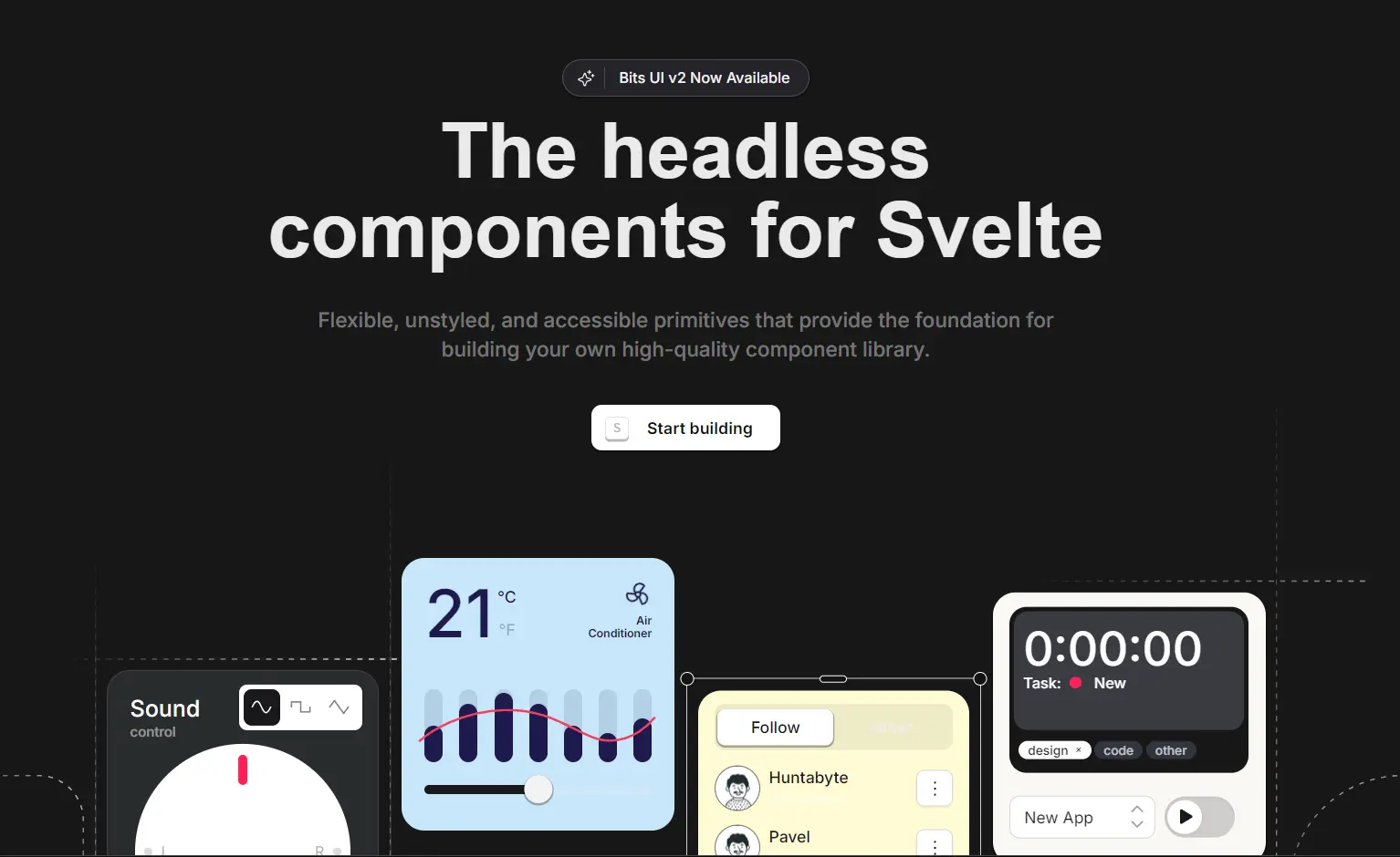
Bits UI is a headless component library for Svelte that provides a collection of flexible, unstyled, and accessible primitives.
The library prioritizes an excellent developer experience, built-in accessibility, and complete creative freedom over styling.
You get full control over the visual appearance while Bits UI handles the complex logic, accessibility features, and interaction patterns behind the scenes.
Features
🎨 Completely Unstyled – No CSS resets or design assumptions
♿ Built-in Accessibility – WAI-ARIA compliance and keyboard navigation out of the box
🔧 Full TypeScript Support – Comprehensive type definitions and autocompletion
🧩 Composable Design – Components work together cleanly as building blocks
🎯 Render Delegation – Total flexibility in how components render
📝 Stable APIs – Predictable interfaces with sensible defaults
🔄 Flexible Event System – Override and chain events easily
📱 Focus Management – Automatic focus handling for complex interactions
Use Cases
- Design System Implementation – Build consistent component libraries that match your brand guidelines while maintaining accessibility standards
- Custom Dashboard Development – Create data visualization interfaces with accessible form controls, modals, and navigation components
- E-commerce Applications – Implement product filters, shopping cart modals, and checkout flows with accessible dropdowns and form elements
- Content Management Systems – Build admin interfaces with accessible date pickers, rich text editors, and complex form layouts
- SaaS Platform Development – Create user-friendly interfaces with accessible tooltips, command palettes, and navigation menus
How To Use It
1. Install Bits UI.
# Yarn
$ yarn add bits-ui

# NPM
$ npm install bits-ui

# PNPM
$ pnpm install bits-ui
2. Import UI components directly from the bits-ui package. Here’s a basic dialog example:
<script lang="ts">
  import { Dialog, Label, Separator } from "bits-ui";
  import LockKeyOpen from "phosphor-svelte/lib/LockKeyOpen";
  import X from "phosphor-svelte/lib/X";
</script>

<Dialog.Root>
  <Dialog.Trigger
    class="rounded-input bg-dark text-background
    shadow-mini hover:bg-dark/95 focus-visible:ring-foreground focus-visible:ring-offset-background focus-visible:outline-hidden
    inline-flex h-12 items-center justify-center whitespace-nowrap px-[21px] text-[15px] font-semibold transition-colors focus-visible:ring-2 focus-visible:ring-offset-2 active:scale-[0.98]"
  >
    New API key
  </Dialog.Trigger>
  <Dialog.Portal>
    <Dialog.Overlay
      class="data-[state=open]:animate-in data-[state=closed]:animate-out data-[state=closed]:fade-out-0 data-[state=open]:fade-in-0 fixed inset-0 z-50 bg-black/80"
    />
    <Dialog.Content
      class="rounded-card-lg bg-background shadow-popover data-[state=open]:animate-in data-[state=closed]:animate-out data-[state=closed]:fade-out-0 data-[state=open]:fade-in-0 data-[state=closed]:zoom-out-95 data-[state=open]:zoom-in-95 outline-hidden fixed left-[50%] top-[50%] z-50 w-full max-w-[calc(100%-2rem)] translate-x-[-50%] translate-y-[-50%] border p-5 sm:max-w-[490px] md:w-full"
    >
      <Dialog.Title
        class="flex w-full items-center justify-center text-lg font-semibold tracking-tight"
      >
        Create API key
      </Dialog.Title>
      <Separator.Root class="bg-muted -mx-5 mb-6 mt-5 block h-px" />
      <Dialog.Description class="text-foreground-alt text-sm">
        Create and manage API keys. You can create multiple keys to organize
        your applications.
      </Dialog.Description>
      <div class="flex flex-col items-start gap-1 pb-11 pt-7">
        <Label.Root for="apiKey" class="text-sm font-medium">API Key</Label.Root
        >
        <div class="relative w-full">
          <input
            id="apiKey"
            class="h-input rounded-card-sm border-border-input bg-background placeholder:text-foreground-alt/50 hover:border-dark-40 focus:ring-foreground focus:ring-offset-background focus:outline-hidden inline-flex w-full items-center border px-4 text-base focus:ring-2 focus:ring-offset-2 sm:text-sm"
            placeholder="secret_api_key"
            name="name"
          />
          <LockKeyOpen
            class="text-dark/30 absolute right-4 top-[14px] size-[22px]"
          />
        </div>
      </div>
      <div class="flex w-full justify-end">
        <Dialog.Close
          class="h-input rounded-input bg-dark text-background shadow-mini hover:bg-dark/95 focus-visible:ring-dark focus-visible:ring-offset-background focus-visible:outline-hidden inline-flex items-center justify-center px-[50px] text-[15px] font-semibold focus-visible:ring-2 focus-visible:ring-offset-2 active:scale-[0.98]"
        >
          Save
        </Dialog.Close>
      </div>
      <Dialog.Close
        class="focus-visible:ring-foreground focus-visible:ring-offset-background focus-visible:outline-hidden absolute right-5 top-5 rounded-md focus-visible:ring-2 focus-visible:ring-offset-2 active:scale-[0.98]"
      >
        <div>
          <X class="text-foreground size-5" />
          <span class="sr-only">Close</span>
        </div>
      </Dialog.Close>
    </Dialog.Content>
  </Dialog.Portal>
</Dialog.Root>
3. Apply styles using the class prop with CSS utility frameworks like TailwindCSS or UnoCSS.
@import url("https://fonts.googleapis.com/css2?family=Source+Code+Pro:ital,wght@0,400;0,500;0,600;0,700;1,400;1,500;1,600;1,700&display=swap");
@import url("https://fonts.googleapis.com/css2?family=Inter:wght@400;500;600&display=swap");

@import "tailwindcss";
@plugin "tailwindcss-animate";

@custom-variant dark (&:is(.dark *));

@font-face {
  font-family: "Cal Sans";
  font-style: normal;
  font-weight: 600;
  font-display: swap;
  src: url("/CalSans-SemiBold.woff2") format("woff2");
}

:root {
  /* Colors */
  --background: hsl(0 0% 100%);
  --background-alt: hsl(0 0% 100%);
  --foreground: hsl(0 0% 9%);
  --foreground-alt: hsl(0 0% 32%);
  --muted: hsl(240 5% 96%);
  --muted-foreground: hsla(0 0% 9% / 0.4);
  --border: hsl(240 6% 10%);
  --border-input: hsla(240 6% 10% / 0.17);
  --border-input-hover: hsla(240 6% 10% / 0.4);
  --border-card: hsla(240 6% 10% / 0.1);
  --dark: hsl(240 6% 10%);
  --dark-10: hsla(240 6% 10% / 0.1);
  --dark-40: hsla(240 6% 10% / 0.4);
  --dark-04: hsla(240 6% 10% / 0.04);
  --accent: hsl(204 94% 94%);
  --accent-foreground: hsl(204 80% 16%);
  --destructive: hsl(347 77% 50%);
  --tertiary: hsl(37.7 92.1% 50.2%);
  --line: hsl(0 0% 100%);

  /* black */
  --contrast: hsl(0 0% 0%);

  /* Shadows */
  --shadow-mini: 0px 1px 0px 1px rgba(0, 0, 0, 0.04);
  --shadow-mini-inset: 0px 1px 0px 0px rgba(0, 0, 0, 0.04) inset;
  --shadow-popover: 0px 7px 12px 3px hsla(var(--dark-10));
  --shadow-kbd: 0px 2px 0px 0px rgba(0, 0, 0, 0.07);
  --shadow-btn: 0px 1px 0px 1px rgba(0, 0, 0, 0.03);
  --shadow-card: 0px 2px 0px 1px rgba(0, 0, 0, 0.04);
  --shadow-date-field-focus: 0px 0px 0px 3px rgba(24, 24, 27, 0.17);
}

.dark {
  /* Colors */
  --background: hsl(0 0% 5%);
  --background-alt: hsl(0 0% 8%);
  --foreground: hsl(0 0% 95%);
  --foreground-alt: hsl(0 0% 70%);
  --muted: hsl(240 4% 16%);
  --muted-foreground: hsla(0 0% 100% / 0.4);
  --border: hsl(0 0% 96%);
  --border-input: hsla(0 0% 96% / 0.17);
  --border-input-hover: hsla(0 0% 96% / 0.4);
  --border-card: hsla(0 0% 96% / 0.1);
  --dark: hsl(0 0% 96%);
  --dark-40: hsl(0 0% 96% / 0.4);
  --dark-10: hsl(0 0% 96% / 0.1);
  --dark-04: hsl(0 0% 96% / 0.04);
  --accent: hsl(204 90% 90%);
  --accent-foreground: hsl(204 94% 94%);
  --destructive: hsl(350 89% 60%);
  --line: hsl(0 0% 9.02%);
  --tertiary: hsl(61.3 100% 82.2%);
  /* white */
  --contrast: hsl(0 0% 100%);

  /* Shadows */
  --shadow-mini: 0px 1px 0px 1px rgba(0, 0, 0, 0.3);
  --shadow-mini-inset: 0px 1px 0px 0px rgba(0, 0, 0, 0.5) inset;
  --shadow-popover: 0px 7px 12px 3px hsla(0deg 0% 0% / 30%);
  --shadow-kbd: 0px 2px 0px 0px rgba(255, 255, 255, 0.07);
  --shadow-btn: 0px 1px 0px 1px rgba(0, 0, 0, 0.2);
  --shadow-card: 0px 2px 0px 1px rgba(0, 0, 0, 0.4);
  --shadow-date-field-focus: 0px 0px 0px 3px rgba(244, 244, 245, 0.1);
}

@theme inline {
  --color-background: var(--background);
  --color-background-alt: var(--background-alt);
  --color-foreground: var(--foreground);
  --color-foreground-alt: var(--foreground-alt);
  --color-muted: var(--muted);
  --color-muted-foreground: var(--muted-foreground);
  --color-border: var(--border-card);
  --color-border-input: var(--border-input);
  --color-border-input-hover: var(--border-input-hover);
  --color-border-card: var(--border-card);
  --color-dark: var(--dark);
  --color-dark-10: var(--dark-10);
  --color-dark-40: var(--dark-40);
  --color-dark-04: var(--dark-04);
  --color-accent: var(--accent);
  --color-accent-foreground: var(--accent-foreground);
  --color-destructive: var(--destructive);
  --color-tertiary: var(--tertiary);
  --color-line: var(--line);
  --color-contrast: var(--contrast);

  --shadow-mini: var(--shadow-mini);
  --shadow-mini-inset: var(--shadow-mini-inset);
  --shadow-popover: var(--shadow-popover);
  --shadow-kbd: var(--shadow-kbd);
  --shadow-btn: var(--shadow-btn);
  --shadow-card: var(--shadow-card);
  --shadow-date-field-focus: var(--shadow-date-field-focus);

  --text-xxs: 10px;

  --radius-card: 16px;
  --radius-card-lg: 20px;
  --radius-card-sm: 10px;
  --radius-input: 9px;
  --radius-button: 5px;
  --radius-5px: 5px;
  --radius-9px: 9px;
  --radius-10px: 10px;
  --radius-15px: 15px;

  --spacing-input: 3rem;
  --spacing-input-sm: 2.5rem;

  --breakpoint-desktop: 1440px;

  --animate-accordion-down: accordion-down 0.2s ease-out;
  --animate-accordion-up: accordion-up 0.2s ease-out;
  --animate-caret-blink: caret-blink 1s ease-out infinite;
  --animate-scale-in: scale-in 0.2s ease;
  --animate-scale-out: scale-out 0.15s ease;
  --animate-fade-in: fade-in 0.2s ease;
  --animate-fade-out: fade-out 0.15s ease;
  --animate-enter-from-left: enter-from-left 0.2s ease;
  --animate-enter-from-right: enter-from-right 0.2s ease;
  --animate-exit-to-left: exit-to-left 0.2s ease;
  --animate-exit-to-right: exit-to-right 0.2s ease;

  --font-sans: "Inter", "sans-serif";
  --font-mono: "Source Code Pro", "monospace";
  --font-alt: "Courier", "sans-serif";
  --font-display: "Cal Sans", "sans-serif";

  @keyframes accordion-down {
    from {
      height: 0;
    }
    to {
      height: var(--bits-accordion-content-height);
    }
  }

  @keyframes accordion-up {
    from {
      height: var(--bits-accordion-content-height);
    }
    to {
      height: 0;
    }
  }

  @keyframes caret-blink {
    0%,
    70%,
    100% {
      opacity: 1;
    }
    20%,
    50% {
      opacity: 0;
    }
  }

  @keyframes enter-from-right {
    from {
      opacity: 0;
      transform: translateX(200px);
    }
    to {
      opacity: 1;
      transform: translateX(0);
    }
  }

  @keyframes enter-from-left {
    from {
      opacity: 0;
      transform: translateX(-200px);
    }
    to {
      opacity: 1;
      transform: translateX(0);
    }
  }

  @keyframes exit-to-right {
    from {
      opacity: 1;
      transform: translateX(0);
    }
    to {
      opacity: 0;
      transform: translateX(200px);
    }
  }

  @keyframes exit-to-left {
    from {
      opacity: 1;
      transform: translateX(0);
    }
    to {
      opacity: 0;
      transform: translateX(-200px);
    }
  }

  @keyframes scale-in {
    from {
      opacity: 0;
      transform: rotateX(-10deg) scale(0.9);
    }
    to {
      opacity: 1;
      transform: rotateX(0deg) scale(1);
    }
  }

  @keyframes scale-out {
    from {
      opacity: 1;
      transform: rotateX(0deg) scale(1);
    }
    to {
      opacity: 0;
      transform: rotateX(-10deg) scale(0.95);
    }
  }

  @keyframes fade-in {
    from {
      opacity: 0;
    }
    to {
      opacity: 1;
    }
  }

  @keyframes fade-out {
    from {
      opacity: 1;
    }
    to {
      opacity: 0;
    }
  }
}

@layer base {
  *,
  ::after,
  ::before,
  ::backdrop,
  ::file-selector-button {
    border-color: var(--color-border-card, currentColor);
  }

  * {
    @apply border-border;
  }
  html {
    -webkit-text-size-adjust: 100%;
    font-variation-settings: normal;
    scrollbar-color: var(--bg-muted);
  }

  body {
    @apply bg-background text-foreground;
    font-feature-settings:
      "rlig" 1,
      "calt" 1;
  }

  ::selection {
    background: #fdffa4;
    color: black;
  }
}

@layer components {
  *:not(body):not(.focus-override) {
    outline: none !important;
    &:focus-visible {
      @apply focus-visible:ring-foreground focus-visible:ring-offset-background focus-visible:outline-hidden focus-visible:ring-2 focus-visible:ring-offset-1;
    }
  }

  .link {
    @apply hover:text-foreground/80 focus-visible:ring-foreground focus-visible:ring-offset-background rounded-xs focus-visible:outline-hidden inline-flex items-center gap-1 font-medium underline underline-offset-4 focus-visible:ring-2 focus-visible:ring-offset-2;
  }
}
All Available UI Components
- Accordion
- Alert Dialog
- Aspect Ratio
- Avatar
- Button
- Calendar
- Checkbox
- Collapsible
- Combobox
- Command
- Context Menu
- Date Field
- Date Picker
- Date Range Field
- Date Range Picker
- Dialog
- Dropdown Menu
- Label
- Link Preview
- Menubar
- Meter
- Navigation Menu
- Pagination
- PIN Input
- Popover
- Progress
- Radio Group
- Range Calendar
- Rating Group
- Preview
- Scroll Area
- Select
- Separator
- Slider
- Switch
- Tabs
- Time Field
- Time Range Field
- Toggle
- Toggle Group
- Toolbar
- Tooltip
Related Resources
- Radix UI – The React equivalent that inspired Bits UI’s design philosophy. Offers similar headless components for React applications. https://www.radix-ui.com/
- Headless UI – Tailwind’s official headless component library supporting React and Vue. Great alternative for non-Svelte projects. https://headlessui.com/
FAQs
Q: What does “headless” mean for UI components?
A: “Headless” means the components provide logic and accessibility features but come with minimal to no predefined styling. This gives you maximum control over the visual appearance, allowing you to apply your own styles using CSS, utility classes, or any styling solution you prefer.
Q: Is TypeScript required to use Bits UI?
A: While Bits UI is built with TypeScript and offers excellent type definitions for a better development experience, you can use it in plain JavaScript Svelte projects as well.
Q: How does Bits UI compare to other Svelte UI libraries like Flowbite Svelte or Skeleton?
A: Bits UI provides unstyled, headless primitives focusing on flexibility and custom styling. Libraries like Flowbite Svelte or Skeleton typically offer more pre-styled components for quicker UI assembly but with less granular control over the base styling compared to Bits UI.