The Future of Web Dev
The Future of Web Dev
30+ Animated UI Components Using Motion and TailwindCSS – Motion-Primitives
30+ animated UI components built using Motion and Tailwind CSS. Install via CLI, customize with props, and add smooth animations to your projects.
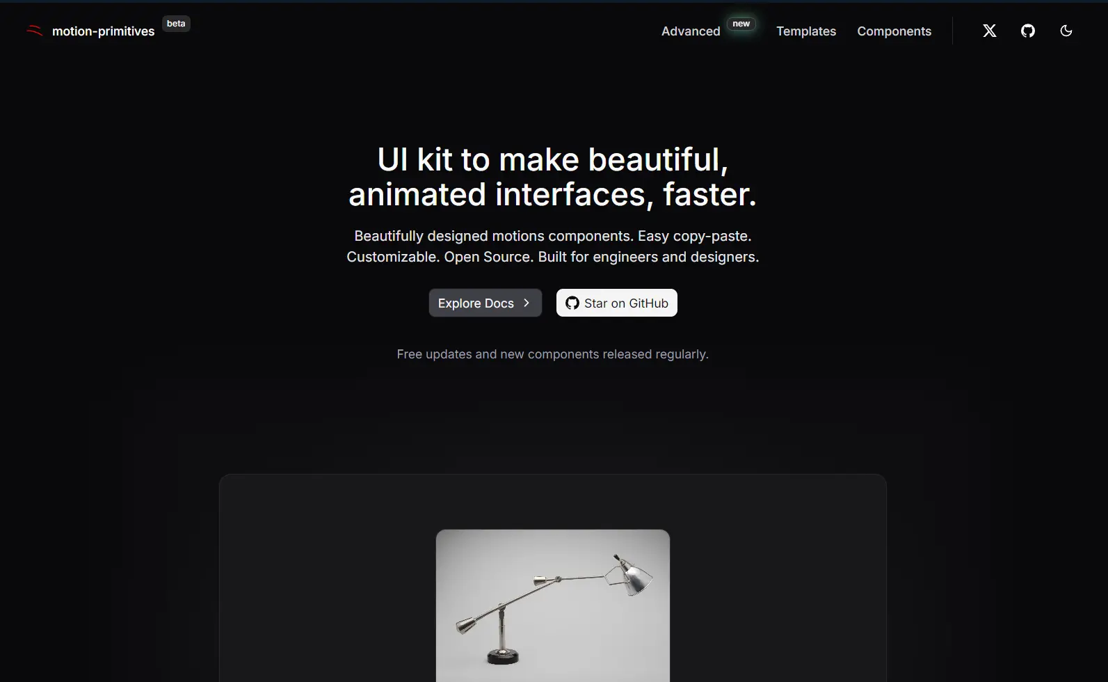
Motion-Primitives is an open-source component library that provides 30+ pre-built animated UI components built with Motion and Tailwind CSS.
Features
🎨 30+ Pre-Built Components: Access a collection that includes core UI elements, text effects, number animations, and interactive features.
🔧 Motion-Powered Animations: All animations use the Motion library for smooth, performant transitions and layout animations.
⚙️ Full Customizable: Modify components to match your design system through standard props and Tailwind classes.
📦 CLI Installation: Add components to your project using the npx command or shadcn/ui CLI.
🎯 Production-Ready Code: Components are built for real projects, tested in various environments, and optimized for performance.
📚 Manual Installation Option: Copy component code directly from the documentation when you prefer full control over implementation.
Use Cases
- Marketing Websites: Add animated backgrounds, text effects, and interactive elements to landing pages without writing custom animation code.
- SaaS Dashboards: Implement smooth transitions, morphing dialogs, and progress indicators that make applications feel more responsive.
- Portfolio Sites: Use spotlight effects, magnetic buttons, and image comparisons to create engaging project showcases.
- E-commerce Platforms: Deploy carousels, animated numbers for pricing, and hover effects that guide users through product catalogs.
Installation
1. Install Tailwind CSS in your project by following the official installation guide at tailwindcss.com.
2. Add Motion animation library to your project
npm install motion3. Create a utility file at lib/utils.ts to handle class name merging. This helper function combines Tailwind classes correctly.
import { clsx, type ClassValue } from 'clsx';
import { twMerge } from 'tailwind-merge';
export function cn(...inputs: ClassValue[]) {
  return twMerge(clsx(inputs));
}
4. Many components use icons, so you will need to install Lucide React.
npm install lucide-react5. You can now add components to your project. Install multiple components at once by running separate add commands for each. The CLI handles dependency management and prevents conflicts.
// motion-primitives
npx motion-primitives@latest add animated-background
// shadcn/ui CLI
npx shadcn@latest add "https://motion-primitives.com/c/animated-background.json"
6. You can also manually copy the component code from the official documentation.
'use client';
import { cn } from '@/lib/utils';
import { AnimatePresence, Transition, motion } from 'motion/react';
import {
  Children,
  cloneElement,
  ReactElement,
  useEffect,
  useState,
  useId,
} from 'react';

export type AnimatedBackgroundProps = {
  children:
    | ReactElement<{ 'data-id': string }>[]
    | ReactElement<{ 'data-id': string }>;
  defaultValue?: string;
  onValueChange?: (newActiveId: string | null) => void;
  className?: string;
  transition?: Transition;
  enableHover?: boolean;
};

export function AnimatedBackground({
  children,
  defaultValue,
  onValueChange,
  className,
  transition,
  enableHover = false,
}: AnimatedBackgroundProps) {
  const [activeId, setActiveId] = useState<string | null>(null);
  const uniqueId = useId();

  const handleSetActiveId = (id: string | null) => {
    setActiveId(id);

    if (onValueChange) {
      onValueChange(id);
    }
  };

  useEffect(() => {
    if (defaultValue !== undefined) {
      setActiveId(defaultValue);
    }
  }, [defaultValue]);

  return Children.map(children, (child: any, index) => {
    const id = child.props['data-id'];

    const interactionProps = enableHover
      ? {
          onMouseEnter: () => handleSetActiveId(id),
          onMouseLeave: () => handleSetActiveId(null),
        }
      : {
          onClick: () => handleSetActiveId(id),
        };

    return cloneElement(
      child,
      {
        key: index,
        className: cn('relative inline-flex', child.props.className),
        'data-checked': activeId === id ? 'true' : 'false',
        ...interactionProps,
      },
      <>
        <AnimatePresence initial={false}>
          {activeId === id && (
            <motion.div
              layoutId={`background-${uniqueId}`}
              className={cn('absolute inset-0', className)}
              transition={transition}
              initial={{ opacity: defaultValue ? 1 : 0 }}
              animate={{
                opacity: 1,
              }}
              exit={{
                opacity: 0,
              }}
            />
          )}
        </AnimatePresence>
        <div className='z-10'>{child.props.children}</div>
      </>
    );
  });
}
All Components
Core Components
- Accordion: A vertically stacked set of interactive headings that each contain a title, content snippet, or thumbnail representing a section of content.
- Animated Background: A component that animates the background of an element in response to user interaction.
- Animated Group: A container that applies coordinated animations to a group of child elements.
- Border Trail: Creates an animated border effect that follows the user’s cursor around the component.
- Carousel: A slideshow component for cycling through elements—images or slides of text—like a carousel.
- Cursor: A custom cursor that can be animated and styled to match the website’s design.
- Dialog: A window overlaid on either the primary window or another dialog window, rendering the content underneath inert.
- Disclosure: A component that shows and hides content when a user clicks on a control.
- In View: Triggers an animation when an element enters the viewport.
- Infinite Slider: A slider that loops infinitely in either direction.
- Transition Panel: A panel that provides smooth transitions between different content states.
Text Effects
- Text Effect: A generic component for applying various animation effects to text.
- Text Loop: A component that loops through a series of text strings with an animation.
- Text Morph: Creates a morphing effect between different text strings.
- Text Roll: A rolling animation effect for text, often used for displaying numbers or changing words.
- Text Scramble: Animates text with a scrambling effect before revealing the final text.
- Text Shimmer: Applies a shimmering light effect that moves across the text.
- Text Shimmer Wave: A wave-like shimmer effect that animates across text.
Number Effects
- Animated Number: Animates a number counting up or down to a target value.
- Sliding Number: A component that displays numbers with a sliding animation, similar to a classic odometer.
Interactive Elements
- Dock: A macOS-style dock component where icons magnify on hover.
- Glow Effect: Adds a glowing effect to an element, often on hover or focus.
- Image Comparison: A slider to compare two images by revealing one over the other.
- Scroll Progress: A visual indicator, typically a bar, that shows the user’s scroll progress on a page.
- Spotlight: A spotlight effect that follows the user’s cursor, illuminating a portion of the element.
- Spinning Text: Text that spins around a central point, often used for decorative purposes.
- Tilt: A component that tilts in 3D space based on the user’s cursor position.
Toolbars
- Toolbar Dynamic: A toolbar with items that can be dynamically added or removed.
- Toolbar Expandable: A toolbar that can be expanded or collapsed to show more or fewer options.
Advanced Effects
- Magnetic: An effect that makes an element “stick” to the cursor when it is nearby.
- Morphing Dialog: A dialog that morphs its shape during its open and close transitions.
- Morphing Popover: A popover that animates its shape as it appears and disappears.
- Progressive Blur: An effect that progressively blurs an element, often based on scroll position or other user interactions.
Related Resources
- Motion Documentation: Official documentation for the Motion animation library that powers all components.
- Tailwind CSS Documentation: Reference guide for the utility-first CSS framework used for styling.
- Framer Motion to Motion Migration Guide: Instructions for developers transitioning from Framer Motion to Motion.
- Lucide Icons: Icon library used across Motion-Primitives components.
- Bundui: A curated collection of pre-built animated UI components and layout blocks built with React, Tailwind CSS, and Motion.
- SHSF UI: Copy-paste React components with beautiful animations.
FAQs
Q: Can I use Motion-Primitives with frameworks other than React?
A: The library currently supports React only. Motion supports other frameworks, but Motion-Primitives components are built specifically for React applications.
Q: Do I need to install all components at once?
A: No. The CLI lets you install components individually. Add only what your project needs to keep bundle sizes small.
Q: Does Motion-Primitives work with Next.js App Router?
A: Yes. Components include the ‘use client’ directive and work with both Pages Router and App Router in Next.js 13+.

