The Future of Web Dev
The Future of Web Dev
Modern Animated Blossom Color Picker with React & TailwindCSS
Compact color picker with radial petal design. Auto-shifts within viewport. Accepts hex, RGB, HSL formats. Built with React & TailwindCSS.
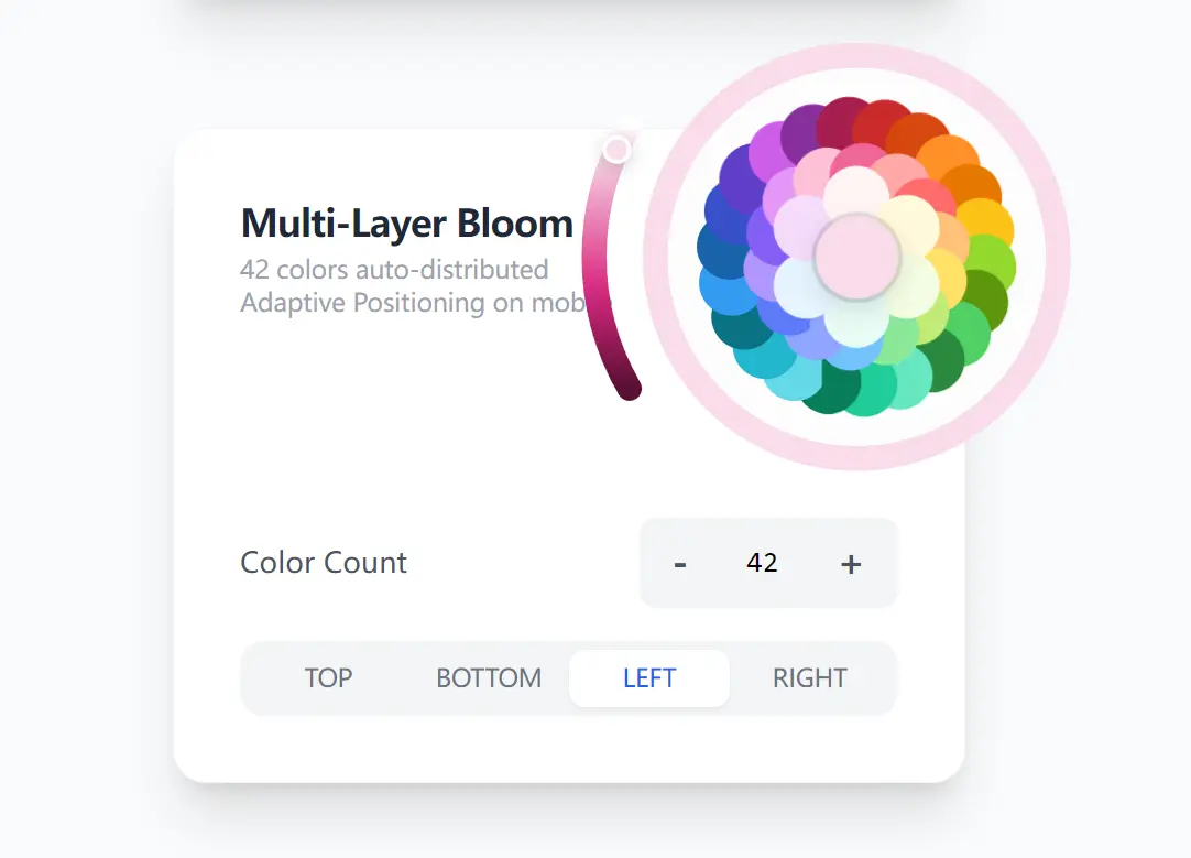
Blossom Color Picker is a React component that lets you pick colors in a radial petal layout, with color options arranged in nested layers around a central core.
The component has built-in viewport detection logic. If the expanded picker extends beyond the screen boundaries, it automatically shifts to remain visible. The arc slider repositions itself based on available space. The background applies a tinted overlay derived from the currently selected color. All positioning calculations happen at render time.
You can pass colors in multiple formats, including hex strings, RGB values, HSL strings, or HSL objects. The component parses each format and converts it internally for the geometric distribution algorithm. The state management supports both controlled and uncontrolled modes.
Features
📐 Geometric Nesting Algorithm: Uses trigonometric calculations to position petals in valley spaces between previous layers with zero gaps.
📱 Viewport Shifting: Detects screen boundaries and automatically shifts the expanded picker to prevent overflow on mobile devices.
🎯 Adaptive Arc Slider: Repositions the saturation slider to the side with maximum available space (top, bottom, left, or right).
🎨 Multi-Format Color Input: Accepts hex strings, RGB/RGBA, HSL/HSLA strings, space-separated HSL, and HSL objects in the same array.
⚙️ Controlled and Uncontrolled Modes: Supports both value prop for controlled state and defaultValue for uncontrolled initialization.
🌗 Theme-Aware Background: Applies a soft tinted overlay using the currently selected color for automatic dark mode compatibility.
⏱️ Configurable Animation: Adjusts blooming animation duration and supports hover-triggered expansion.
🔧 Fully Customizable: Exposes 16 props for core size, petal size, slider visibility, initial state, and positioning behavior.
How to Use It
Table Of Contents
Installation
Install the package from npm:
npm install @dayflow/blossom-color-pickerBasic Usage
Import the component and pass an onChange callback to handle color selection:
import { BlossomColorPicker } from '@dayflow/blossom-color-picker';
const MyComponent = () => {
  const handleColorChange = (color) => {
    console.log('Selected color:', color.hex);
    console.log('HSL format:', color.hsl);
    console.log('HSLA with alpha:', color.hsla);
  };
  return <BlossomColorPicker onChange={handleColorChange} />;
};
The onChange callback receives a complete color object containing hex, hsl, and hsla strings along with the raw hue, saturation, and alpha values.
Controlled Mode
Control the picker state externally by passing a value prop:
import { useState } from 'react';
import { BlossomColorPicker } from '@dayflow/blossom-color-picker';
const ControlledPicker = () => {
  const [color, setColor] = useState({
    hue: 210,
    saturation: 60,
    alpha: 100,
    layer: 'outer'
  });
  return (
    <BlossomColorPicker
      value={color}
      onChange={(newColor) => {
        setColor({
          hue: newColor.hue,
          saturation: newColor.saturation,
          alpha: newColor.alpha,
          layer: newColor.layer
        });
      }}
    />
  );
};
The value object requires hue (0-360), saturation (0-100), alpha (0-100), and layer (‘inner’ or ‘outer’) fields.
Custom Color Palette
Define your own color set using any supported format:
<BlossomColorPicker
  colors={[
    '#FF6B6B',
    '#4ECDC4',
    'rgb(107, 203, 119)',
    'rgba(65, 105, 225, 0.9)',
    'hsl(280, 70%, 55%)',
    'hsl(200 80% 60%)',
    { h: 45, s: 90, l: 65 },
    { h: 330, s: 85, l: 60 }
  ]}
  onChange={(color) => console.log(color)}
/>
The component automatically parses all formats and sorts colors by hue for optimal geometric distribution across layers.
Hover Interaction Mode
Trigger the bloom animation on hover instead of click:
<BlossomColorPicker
  openOnHover={true}
  initialExpanded={false}
  onChange={(color) => console.log(color)}
/>
This configuration works well in toolbars where users frequently switch between colors during active editing sessions.
Customized Layout
Adjust the core size, petal size, and animation timing:
<BlossomColorPicker
  coreSize={40}
  petalSize={36}
  animationDuration={500}
  showCoreColor={true}
  showAlphaSlider={true}
  sliderPosition="bottom"
  onChange={(color) => console.log(color)}
/>
The coreSize and petalSize props accept pixel values. The showCoreColor prop displays the selected color in the central circle while the picker remains expanded.
Disabled Positioning Features
Turn off adaptive positioning for fixed layout contexts:
<BlossomColorPicker
  adaptivePositioning={false}
  sliderPosition="right"
  onChange={(color) => console.log(color)}
/>
When adaptivePositioning is false, the picker maintains its default position regardless of viewport boundaries, and the slider stays at the specified position.
Collapse Callback
Handle the collapse event when the picker closes:
<BlossomColorPicker
  onChange={(color) => console.log('Color changed:', color.hex)}
  onCollapse={(color) => {
    console.log('Picker collapsed with final color:', color.hex);
    saveColorToDatabase(color.hex);
  }}
/>
The onCollapse callback fires when the user clicks outside the expanded picker or selects a final color and closes the interface.
API Reference
BlossomColorPickerProps
| Prop | Type | Default | Description |
|---|---|---|---|
value | BlossomColorPickerValue | – | Controlled value containing hue, saturation, alpha, and layer. |
defaultValue | BlossomColorPickerValue | { hue: 330, saturation: 70, alpha: 50, layer: 'outer' } | Initial value for uncontrolled mode (pink color). |
colors | ColorInput[] | 18-color default set | Array of colors automatically sorted and distributed into layers. |
onChange | (color: BlossomColorPickerColor) => void | – | Callback invoked when color changes. |
onCollapse | (color: BlossomColorPickerColor) => void | – | Callback invoked when picker collapses. |
disabled | boolean | false | Disables all interactions when true. |
openOnHover | boolean | false | Opens picker on hover instead of click. |
initialExpanded | boolean | false | Starts picker in expanded state. |
animationDuration | number | 300 | Duration of blooming animation in milliseconds. |
showAlphaSlider | boolean | true | Shows or hides the saturation arc slider. |
coreSize | number | 32 | Diameter of central circle in pixels. |
petalSize | number | 32 | Diameter of individual color petals in pixels. |
showCoreColor | boolean | true | Displays selected color in core while expanded. |
sliderPosition | 'top' | 'bottom' | 'left' | 'right' | 'right' | Fixed position for arc slider. |
adaptivePositioning | boolean | true | Automatically shifts picker within viewport and repositions slider. |
className | string | "" | Additional CSS class for container element. |
BlossomColorPickerValue
| Field | Type | Description |
|---|---|---|
hue | number | Hue angle from 0 to 360 degrees. |
saturation | number | Slider position from 0 (bright) to 100 (dark). |
lightness | number? | HSL lightness auto-computed from slider if omitted. |
originalSaturation | number? | Base saturation of selected petal. |
alpha | number | Alpha value from 0 to 100. |
layer | 'inner' | 'outer' | Layer identifier for selected petal. |
BlossomColorPickerColor
Extends BlossomColorPickerValue with formatted color strings:
| Field | Type | Description |
|---|---|---|
hex | string | Hex color string like “#6586E5”. |
hsl | string | HSL string like “hsl(225, 71%, 65%)”. |
hsla | string | HSLA string with alpha channel. |
ColorInput Type
type ColorInput = string | { h: number; s: number; l: number };Accepts hex strings, RGB/RGBA strings, HSL/HSLA strings (comma or space-separated), or HSL objects with h, s, and l properties.
Related Resources
- 10 Best Color Picker Plugins In JavaScript
- 7 Best Open-Source Color Picker Components For Vue.js
- 10 Best Color Manipulation JavaScript Libraries
FAQs
Q: How does the geometric nesting algorithm prevent gaps between petals?
A: The algorithm calculates the valley angle between adjacent petals in the previous layer and positions each new petal at that midpoint. It uses trigonometric functions to compute the exact radius offset needed for the petal edges to touch without overlapping. This creates a dense, gap-free structure regardless of how many colors you pass.
Q: What happens when adaptivePositioning is enabled on desktop screens?
A: The component still monitors viewport boundaries but rarely needs to shift since desktop screens provide more space. The adaptive slider positioning remains active and chooses the side with maximum available space. This prevents the slider from extending beyond the viewport when the picker sits near screen edges.
Q: Does the component support gradients or color mixing?
A: No. The picker handles solid colors with alpha transparency. Each petal represents a distinct color from your colors array. The saturation slider darkens or brightens the selected petal but does not blend multiple colors together.
Q: How do I disable the saturation arc slider completely?
A: Set the showAlphaSlider prop to false. This removes the arc slider from the UI entirely. Users can still select colors from the petals but cannot adjust the saturation value. The component returns the base saturation of each petal without modification.