The Future of Web Dev
The Future of Web Dev
Glassmorphism UI Component Library with TailwindCSS – Zentak Glass UI
A React & TailwindCSS UI library with glassmorphism UI components built for dashboards and SaaS interfaces.
Zentak Glass UI is a React component library that includes a set of glassmorphism-style UI components styled with Tailwind CSS.
Each component applies backdrop-blur filters, semi-transparent backgrounds, and gradient borders to produce the frosted-glass style you’ve seen in modern dashboards and SaaS.
The component set splits into atomic elements and full UI blocks. The atomic side covers buttons, inputs, toggles, badges, toast notifications, profile cards, and layout cards. The block side ships a login form, a vertical sidebar navigation, a three-tier pricing table, an interactive 3D card, and a magnetic CTA button.
Features
🔘 GlassButton: An interactive button with hover glow effects and smooth state transitions on click and focus.
📝 GlassInput: A semi-transparent text field with a modern focus ring that activates on interaction.
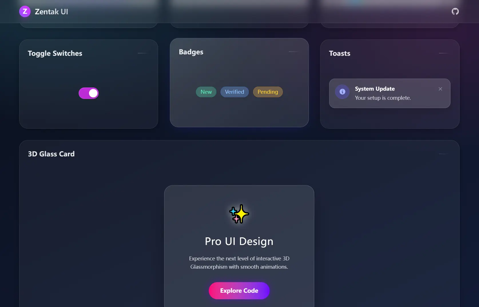
🔄 GlassToggle: An animated toggle switch with smooth on/off motion between states.
🏷️ GlassBadge: A status badge available in multiple semantic color variants for labeling and categorization.
🔔 GlassToast: A notification popup styled for alert and confirmation messages, with configurable display duration.
👤 GlassProfile: A user identity card with gradient avatar display and name/role layout.
🃏 GlassCard: A responsive layout container with a strong backdrop blur applied to the background layer.
🔐 GlassLoginForm: A complete login panel with a structured two-field input layout ready to wire up to a submit handler.
🔑 PasswordInput: A password field that runs real-time strength validation, detects active caps lock, and displays a live requirements checklist below the input.
📂 GlassSidebar Navigation: A vertical dashboard sidebar with expandable hover navigation and active route highlighting.
💳 GlassPricing Cards: A three-tier pricing table with a visually emphasized Pro tier at the center.
🖱️ GlassCard3D: A glass card that tilts in response to full-area pointer movement across the container.
🧲 MagneticButton: A CTA button with parallax text movement and an animated aurora border that reacts to cursor position.
How to Use It
Installation
npm install zentak-glass-uiSetting Up Tailwind CSS (If Not Already Configured)
npm install -D tailwindcss postcss autoprefixer
npx tailwindcss init -p
Update your tailwind.config.js to scan your source files:
/** @type {import('tailwindcss').Config} */
module.exports = {
  content: [
    "./src/**/*.{js,jsx,ts,tsx}",
  ],
  theme: {
    extend: {},
  },
  plugins: [],
};
Add the Tailwind directives to your global CSS file:
@tailwind base;
@tailwind components;
@tailwind utilities;
Basic Usage
Import any component from the package and render it in your JSX. The example below places a GlassButton centered on a gradient background:
import React from 'react';
import { GlassButton } from 'zentak-glass-ui';
function App() {
  return (
    <div className="min-h-screen bg-gradient-to-br from-indigo-900 to-fuchsia-900 p-10 flex items-center justify-center">
      <GlassButton onClick={() => alert('Clicked!')}>
        Click Me
      </GlassButton>
    </div>
  );
}
export default App;
Related Resources
- Tailwind CSS: The utility-first CSS framework that Zentak Glass UI depends on for all layout and styling.
- shadcn/ui: A set of accessible components you copy directly into your codebase and own.
FAQs
Q: Does Zentak Glass UI work with Next.js?
A: Yes. Install the package, confirm your Next.js project runs Tailwind CSS, then import components as you would in any React file.
Q: The glass effect is not appearing. What is wrong?
A: The backdrop-blur property requires a visible background layer behind the component. Wrap your glass components in a container with a gradient or image background.
Q: Can I override the default component styles?
A: Pass a className prop with your own Tailwind utility classes. The components merge the incoming class string with their internal defaults.
Q: Does PasswordInput send validation data anywhere?
A: No. All validation runs client-side on every keystroke. No data leaves the browser during the validation process.