The Future of Web Dev
The Future of Web Dev
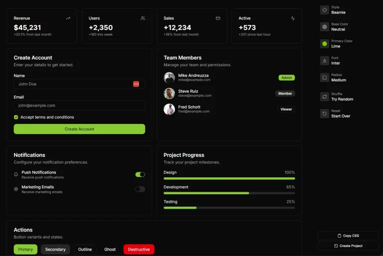
Zero-Config UI Component Library for TailwindCSS – KtUI

KtUI is a TailwindCSS and Vanilla JavaScript-powered UI component library for building modern, interactive web applications.
Inspired by shadcn/ui’s design philosophy, KtUI allows you to build with only HTML, Tailwind CSS, and vanilla JavaScript.
Features
🚀 Zero JavaScript Initialization – Configure components using data attributes without complex setup
🎨 Tailwind CSS Integration – Built on utility-first CSS framework for consistent styling
🌙 Dark Mode Support – Complete dark theme implementation with CSS variables
📱 RTL Language Support – Right-to-left text direction for international applications
♿ Accessibility – WCAG compliant components with keyboard navigation
🧩 Modular Architecture – Import only the components you need for optimal bundle size
🎯 Data-Attribute Configuration – Dynamic component behavior through HTML attributes
🎨 CSS Variable Theming – Global design system using CSS custom properties
Installation
Before starting, you need Node.js and Tailwind CSS installed in a working project.
1. Install via NPM:
npm i @keenthemes/ktui2. Include the KtUI variables in your main CSS file (e.g., style.css) to set up the theming.
3. To add automated dark mode, add the custom variant to your Tailwind CSS file.
@custom-variant dark (&:is(.dark *));4. Import the KtUI stylesheet into your main CSS file.
@import './node_modules/ktui/styles.css';5. Add the KtUI JavaScript file and your project’s compiled CSS file to your HTML.
<script src="./node_modules/@keenthemes/ktui/dist/ktui.min.js"></script>Usage
1. After installation, you can start using KtUI components directly in your HTML. Components are initialized and customized using data-kt-* attributes, which eliminates the need for writing initialization scripts.
For example, to add a tooltip, you can use the following HTML structure:
<div>
  <button
    class="kt-btn"
    data-kt-tooltip="#external_tooltip"
    data-kt-tooltip-placement="bottom-start"
  >
    Show Tooltip
  </button>
  <div id="external_tooltip" class="kt-tooltip">
    Hey, a delightful tooltip is here!
  </div>
</div>
2. Modify the CSS variables to match your brand colors:
:root {
  --primary: oklch(50% 0.2 240); /* Custom blue */
  --radius: 0.75rem; /* Rounded corners */
  ...
}
3. All possible UI Components:
- Accordion
- Avatar
- Alert
- Badge
- Breadcrumb
- Button
- Card
- Checkbox
- Collapse
- Datatable
- Datepicker
- Dismiss
- Drawer
- Dropdown
- Image Input
- Input
- Kbd
- Link
- Modal
- Pagination
- Progress
- Radio Group
- Reparent
- Scrollable
- Scrollspy
- Scrollto
- Select
- Separator
- Skeleton
- Stepper
- Sticky
- Switch
- Tabs
- Textarea
- Theme Switch
- Toast
- Toggle
- Toggle Group
- Toggle Password
- Tooltip
FAQs
Q: Can I use KtUI with frameworks like React or Vue?
A: KtUI is built with vanilla JavaScript and works with any framework.
Q: How does KtUI handle responsive design?
A: All KtUI components are built with Tailwind CSS responsive utilities. Components automatically adapt to different screen sizes using Tailwind’s responsive prefixes and mobile-first approach.
Q: Is KtUI suitable for large-scale applications?
A: Yes, KtUI is designed for production use with modular imports, TypeScript support, and performance optimization. The library follows best practices for scalability and maintainability.