The Future of Web Dev
The Future of Web Dev
Modern UI Components for Any Web Stack – Basecoat
Use Basecoat for modern, accessible Tailwind CSS UI components on any web stack. No React needed. Get clean HTML and shadcn/ui themes.
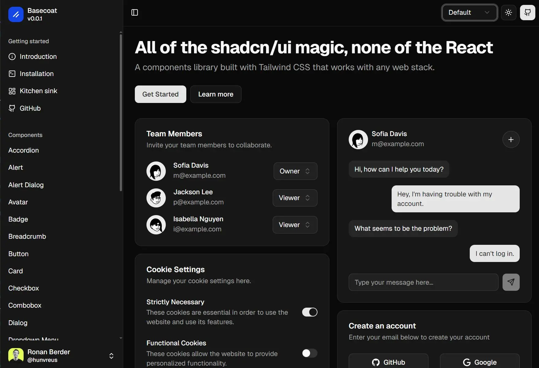
Basecoat is a lightweight and framework-agnostic UI component library built with Tailwind CSS that works across any web stack.
The library provides elegant, customized, accessible UI components like accordions, buttons, cards, forms, and modals using utility classes and minimal Alpine.js for interactivity.
You get clean markup without complex JavaScript frameworks like React and Vue.js. You can use it for projects built with plain HTML, or backend frameworks such as Flask, Rails, Laravel, or Django.
More Features
🌙 Dark mode ready: Basecoat respects your Tailwind CSS configuration for dark mode.
🎨 Themable: It is fully compatible with shadcn/ui themes.
🛠️ Extendable: You can modify styles using Tailwind utility classes or CSS variables.
📄 Readable: The markup remains clean, avoiding excessive utility classes.
Available Components
- Accordion
- Alert
- Alert Dialog
- Avatar
- Badge
- Breadcrumb
- Button
- Card
- Checkbox
- Combobox
- Dialog
- Dropdown Menu
- Form
- Input
- Label
- Pagination
- Popover
- Radio Group
- Select
- Skeleton
- Sidebar
- Slider
- Switch
- Table
- Tabs
- Textarea
- Toast
- Tooltip
Use Cases
- Integrating Modern UI into Legacy Systems: Update the look and feel of older applications built with traditional backend frameworks (e.g., Django, Rails, Flask) by adding modern, accessible components.
- Static Site Generation: Use Basecoat with static site generators where a full JavaScript framework might be excessive, providing interactive elements with minimal overhead.
- Projects Requiring High Accessibility: Develop web interfaces that need to meet accessibility standards, as Basecoat components are built with WAI-ARIA guidelines in mind.
- Developers Preferring HTML-centric Approaches: For those who favor writing HTML and CSS directly, Basecoat offers pre-styled components that integrate smoothly with Tailwind CSS.
Installation
Make sure you first have Tailwind CSS installed and configured in your project. Follow the official Tailwind CSS installation guide if you haven't already.
1. You can add Basecoat to your project using a package manager:
2. Add the Basecoat import to your main CSS file after Tailwind CSS imports:
@import "tailwindcss";
@import "basecoat-css";
3. Some components, like Select or Dialog, require JavaScript. Basecoat provides Alpine.js snippets for these.
- Install Alpine.js in your project.
- For simple components (e.g., Accordion, Slider), you can copy inline Alpine.js code from the documentation.
- For complex components (e.g., Dialog, Dropdown Menu), you can:
- Copy the JavaScript snippet from the documentation into your project.
- Download the script as a separate file. Load this file before the Alpine.js core script and register the componen
t.
4. Using the CLI (Optional). If you use Nunjucks or Jinja templating engines, the Basecoat CLI can install CSS and macros for complex components. For example, to add the Dialog component:
npx basecoat-cli add dialogThe CLI will prompt for your template engine and destination directories.
Usage
After installation, you can use Basecoat classes directly in your HTML. For example, to create a button, you would add the btn class: <button class="btn">Click me</button>.
Example: Accordion Component
Here is how you can implement an accordion using Basecoat and Alpine.js for interactivity:
<section
  x-init
  @click="
    const clickedSummary = $event.target.closest('summary');
    if (!clickedSummary) return;
    const clickedDetails = clickedSummary.closest('details');
    if (!clickedDetails) return;
    $el.querySelectorAll('details').forEach(detailsEl => {
      if (detailsEl !== clickedDetails) {
        detailsEl.removeAttribute('open');
      }
    });
  ">
  <details class="group border-b last:border-b-0">
    <summary class="w-full focus-visible:border-ring focus-visible:ring-ring/50 focus-visible:ring-[3px] transition-all outline-none rounded-md">
      <h2 class="flex flex-1 items-start justify-between gap-4 py-4 text-left text-sm font-medium hover:underline">
        Is it accessible?
        <svg xmlns="http://www.w3.org/2000/svg" width="24" height="24" viewBox="0 0 24 24" fill="none" stroke="currentColor" stroke-width="2" stroke-linecap="round" stroke-linejoin="round" class="text-muted-foreground pointer-events-none size-4 shrink-0 translate-y-0.5 transition-transform duration-200 group-open:rotate-180"><path d="m6 9 6 6 6-6" /></svg>
      </h2>
    </summary>
    <section class="pb-4">
      <p class="text-sm">Yes. It adheres to the WAI-ARIA design pattern.</p>
    </section>
  </details>
  <details class="group border-b last:border-b-0">
    <summary class="w-full focus-visible:border-ring focus-visible:ring-ring/50 focus-visible:ring-[3px] transition-all outline-none rounded-md">
      <h2 class="flex flex-1 items-start justify-between gap-4 py-4 text-left text-sm font-medium hover:underline">
        Is it styled?
        <svg xmlns="http://www.w3.org/2000/svg" width="24" height="24" viewBox="0 0 24 24" fill="none" stroke="currentColor" stroke-width="2" stroke-linecap="round" stroke-linejoin="round" class="text-muted-foreground pointer-events-none size-4 shrink-0 translate-y-0.5 transition-transform duration-200 group-open:rotate-180"><path d="m6 9 6 6 6-6" /></svg>
      </h2>
    </summary>
    <section class="pb-4">
      <p class="text-sm">Yes. It comes with default styles that matches the other components' aesthetic.</p>
    </section>
  </details>
</section>
Theming and Customization
Basecoat supports shadcn/ui compatible themes. You can import a theme by copying its CSS variables into a file (e.g., theme.css) and importing it in your main CSS:
@import "tailwindcss";
@import "basecoat-css";
@import "theme.css"; /* Your chosen theme */
You can override default styles using Tailwind utility classes directly on elements or by extending styles in your custom CSS files. For extensive changes, consider copying basecoat.css into your project and modifying it directly.
Related Resources
- shadcn/ui: https://ui.shadcn.com – The React component library that inspired Basecoat’s design system and theming capabilities.
- Tailwind CSS: https://tailwindcss.com/docs – The utility-first CSS framework that Basecoat is built upon. Understanding Tailwind is beneficial for customizing Basecoat components.
- Alpine.js: https://alpinejs.dev/start-here – A rugged, minimal JavaScript framework used by Basecoat for its interactive components.
FAQs
Q: Do I need React to use Basecoat?
A: No, Basecoat is specifically designed for web applications that do not use React. It works with plain HTML, server-side frameworks, or any stack where React is not a requirement.
Q: How does Basecoat handle component interactivity?
A: Basecoat uses CSS for styling and relies on small Alpine.js scripts for more interactive components. It avoids runtime JavaScript for many components.
Q: Can I customize the appearance of Basecoat components?
A: Yes, you can customize components using Tailwind utility classes, CSS variables, or by importing shadcn/ui compatible themes. For significant modifications, you can edit the Basecoat CSS file directly.
Q: Is Basecoat suitable for projects that require high accessibility?
A: Yes, Basecoat components are designed following WAI-ARIA standards to promote accessibility.
Q: How does Basecoat compare to other Tailwind CSS component libraries like Flowbite or Preline?
A: Basecoat aims to provide a cleaner HTML markup by avoiding large blocks of utility classes directly in the HTML, similar to shadcn/ui’s component-based approach but without React.