The Future of Web Dev
The Future of Web Dev
50+ Accessible Astro UI Components with Tailwind CSS – Bearnie
Copy-paste UI component library for Astro. Built with Tailwind. Zero framework runtime. Full accessibility support. Install with CLI or MCP.
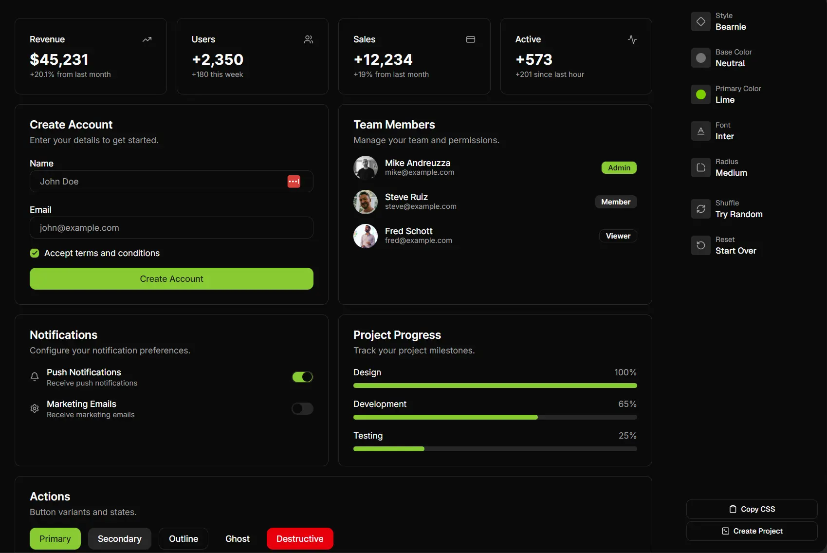
Bearnie is a collection of accessible, copy-paste UI components Astro and Tailwind CSS.
This component library works on the same principle as Shadcn/ui. You execute a CLI command to copy component source code directly into your project directory.
This approach grants you full ownership of the implementation. You read it, modify it, and own it completely.
Features
♿ WCAG 2.1 AA Compliance: Every component includes keyboard navigation, screen reader support, and focus management out of the box.
🎨 Tailwind CSS: Components use Tailwind v4 utility classes. Theme customization happens through CSS variables for light and dark modes.
🚀 Zero Framework Runtime: Interactive components use plain JavaScript. No framework code ships to the client.
📦 CLI Distribution: The bearnie CLI adds components with npx bearnie add button. The registry tracks component dependencies automatically.
🤖 MCP Server Support: AI assistants can add components directly through the Model Context Protocol server.
🔧 Progressive Enhancement: Components work without JavaScript enabled.
How to Use It
Table Of Contents
Installation
1. Start a new Astro project with Bearnie pre-configured using your preferred package manager (NPM, Bun, PNPM, or Yarn).
npm create bearnie my-app
cd my-app
npm install
npm run dev
2. Install all available components from the registry at project creation with the --full flag. This fetches every component and places them in your src/components/bearnie/ directory.
npx create-bearnie my-app --full3. This fetches every component and places them in your src/components/bearnie/ directory. The approach works well for exploration or when you need access to the complete component set.
Adding to Existing Projects
1. Run the init command to set up the required utilities and configuration in your existing Astro project.
npx bearnie init
bunx bearnie init
pnpm dlx bearnie init
yarn dlx bearnie init
This creates the cn utility at src/utils/cn.ts, configures path aliases in tsconfig.json, and sets up theme variables. You only run this once per project.
2. Install the theme CSS file that defines color variables and component styles.
npx bearnie add styles
bunx bearnie add styles
pnpm dlx bearnie add styles
yarn dlx bearnie add styles
This creates src/styles/bearnie.css with CSS variables for theming.
3. Add the Bearnie styles to your main CSS file after Tailwind imports.
@import "tailwindcss";
@import "./bearnie.css";
The import order matters. Tailwind must load before Bearnie styles.
4. Install individual components using the CLI.
Single component:
npx bearnie add buttonMultiple components:
npx bearnie add button card dialog tabsAll components:
npx bearnie add --allComponents copy to src/components/bearnie/ with their dependencies. Required utilities go to src/utils/.
Manual Setup
1. Create src/utils/cn.ts with the class name concatenation helper.
export function cn(...classes: (string | undefined | null | false)[]): string {
  return classes.filter(Boolean).join(' ');
}
This function merges Tailwind classes and handles conditional class application.
2. Add path configuration to your tsconfig.json file.
{
  "compilerOptions": {
    "baseUrl": ".",
    "paths": {
      "@/*": ["src/*"]
    }
  }
}
This enables @/ imports throughout your project.
3. Add theme styles using the CLI or create src/styles/bearnie.css manually with your theme variables.
npx bearnie add stylesImport the styles in your main CSS file.
@import "tailwindcss";
@import "./bearnie.css";
4. Use the CLI to copy components to your project.
npx bearnie add button cardYour project structure will look like this:
src/
├── components/
│   └── bearnie/
│       ├── button/
│       │   └── Button.astro
│       └── card/
│           ├── Card.astro
│           ├── CardHeader.astro
│           └── CardContent.astro
├── styles/
│   └── bearnie.css
└── utils/
    └── cn.ts
Using Components
Import components from the @/components/bearnie/ directory in your Astro pages or layouts.
---
import Button from '@/components/bearnie/button/Button.astro';
---
<Button>Click me</Button>
<Button variant="secondary">Secondary</Button>
<Button variant="outline">Outline</Button>
Components accept props for variants, sizes, and other customization options.
Theming
Customize colors through CSS variables in your theme file. The system supports light and dark modes.
:root {
  --background: oklch(1 0 0);
  --foreground: oklch(0.145 0 0);
  --primary: oklch(0.205 0 0);
  --primary-foreground: oklch(0.985 0 0);
}
.dark {
  --background: oklch(0.145 0 0);
  --foreground: oklch(0.985 0 0);
}
Change these values to match your brand colors. The OKLCH color space provides better perceptual uniformity than RGB or HSL.
Updating Components
Components don’t auto-update when new Bearnie versions release. You control when updates happen.
To update a component or styles, re-run the add command with the --yes flag.
npx bearnie add button --yesThis overwrites the existing component. If you customized the component, back up your changes first. After updating, merge your modifications back manually.
Listing Available Components
View all available components grouped by category.
npx bearnie listAdd the --json flag for machine-readable output.
npx bearnie list --jsonCLI Reference
bearnie init
Sets up the cn utility, path aliases, and theme variables in an existing Astro project. Run this once before adding components.
npx bearnie initOptions:
--cwd <path>: Set working directory
bearnie add
Copies components and their dependencies into your project.
npx bearnie add button
npx bearnie add button card dialog tabs
npx bearnie add --all
Options:
-y, --yes: Skip prompts and overwrite existing files-a, --all: Add all components from the registry--cwd <path>: Set working directory
bearnie list
Shows all available components grouped by category.
npx bearnie list
npx bearnie list --json
Options:
--json: Output as JSON format--cwd <path>: Set working directory
create-bearnie
Creates a new Astro project with Bearnie pre-configured.
npm create bearnie my-app
npm create bearnie my-app --full
Options:
--full: Install all components from the registry at creation
Available Components
Navigation: Breadcrumb, Menubar, Pagination, Sidebar, Tabs
Layout: Card, Separator, Aspect Ratio, Scroll Area
Forms: Button, Checkbox, Input, Input Group, Input OTP, Label, Radio, Select, Slider, Switch, Textarea, File Upload
Feedback: Alert, Alert Dialog, Toast, Progress, Spinner, Skeleton
Overlay: Dialog, Sheet, Dropdown Menu, Popover, Hover Card, Tooltip, Context Menu
Data Display: Avatar, Badge, Table, Typography, Tree, Empty, Kbd
Interactive: Accordion, Collapsible, Carousel, Command, Toggle, Toggle Group
Advanced: Button Group, Stepper
Related Resources
- Astro: The web framework Bearnie builds on top of. Delivers fast, content-focused sites with minimal JavaScript.
- Tailwind CSS: The utility-first CSS framework Bearnie components use for styling.
- shadcn/ui: A similar copy-paste component approach for React. Bearnie follows the same philosophy for Astro.
FAQs
Q: Do components update automatically when Bearnie releases new versions?
A: No. Components copy into your project as standalone files. You control when updates happen by re-running bearnie add component-name --yes. Back up customizations before updating.
Q: Can I use Bearnie with React or Vue components in Astro?
A: Bearnie components are pure Astro components. They work alongside React or Vue islands in the same project, but the Bearnie components themselves don’t use framework runtimes.
Q: How do I customize component styles beyond CSS variables?
A: Edit the component files directly in src/components/bearnie/. You own the code. Change markup, add classes, or modify behavior as needed.


