The Future of Web Dev
The Future of Web Dev
Mobile UI Component Library with TailwindCSS – Konsta UI
Build native-looking mobile interfaces with Konsta UI. Get 40+ TailwindCSS-styled components with iOS and Material Design styling for React, Vue, and Svelte.
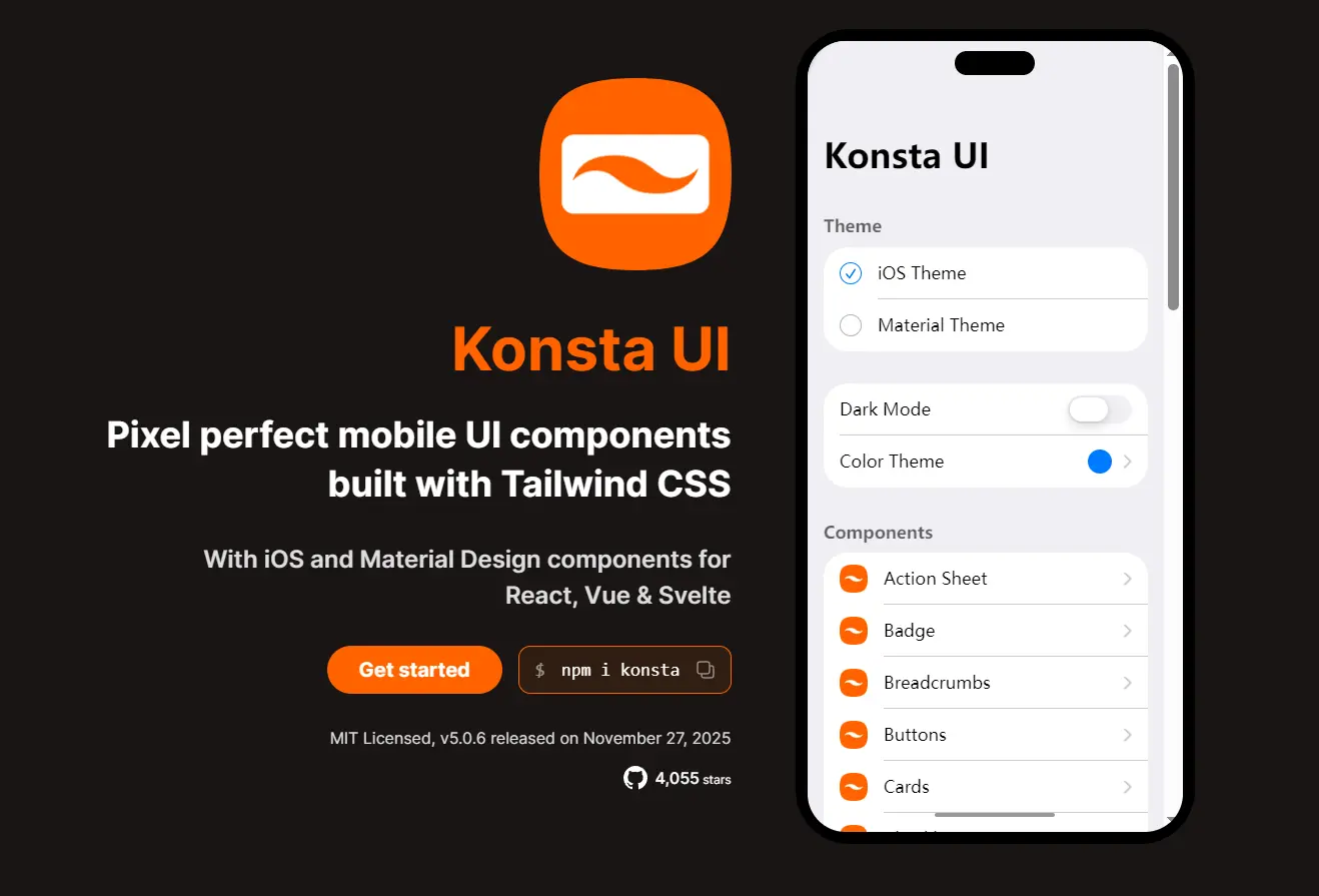
Konsta UI is a mobile component library built with Tailwind CSS that provides native iOS and Material Design UI components for React, Vue, and Svelte applications.
The library comes with dual-theme support based on official Apple and Google design guidelines. It’s ideal for web apps that need a mobile UI experience without native compilation.
Features
🎨 Dual Theme System: Includes pixel-accurate iOS and Material Design implementations following official platform guidelines.
📱 Mobile-First Design: Built specifically for mobile web apps with touch-optimized interactions and native-looking animations.
⚡ Tailwind CSS: Uses Tailwind utility classes for styling with minimal custom CSS.
🔧 Framework Flexibility: Works standalone or integrates with Ionic and Framework7 as a UI component layer.
🎯 Complete Component Set: 40+ mobile UI components from basic buttons to complex data tables and messaging interfaces.
🔌 Zero Runtime Dependencies: Ships as a standalone library with no required peer dependencies beyond your chosen framework.
Use Cases
- Hybrid Mobile Apps: Build iOS and Android interfaces using React, Vue, or Svelte.
- Framework7 Enhancement: Replace Framework7’s default components with Konsta UI while keeping Framework7’s routing and navigation structure.
- Progressive Web Apps: Create mobile-optimized PWAs that match platform design standards on both iOS and Android devices.
- Prototyping Mobile Interfaces: Rapidly build mobile UI mockups with production-ready components and accurate platform styling.
How to Use It
Table Of Contents
Installation
Install Konsta UI in your existing React and Tailwind CSS project. You need both dependencies configured before adding the library.
npm i konstaImport the Konsta UI theme file in your main CSS file to load the component styles.
@import 'tailwindcss';
@import 'konsta/react/theme.css';
Material Design components require the Roboto font family. Add it from Google Fonts in your HTML head.
<link rel="preconnect" href="https://fonts.googleapis.com" />
<link rel="preconnect" href="https://fonts.gstatic.com" crossorigin />
<link href="https://fonts.googleapis.com/css2?family=Roboto:ital,wght@0,400;0,500;0,700;1,400;1,500;1,700&display=swap" rel="stylesheet" />
Alternatively, import the font directly in your CSS file.
@import url('https://fonts.googleapis.com/css2?family=Roboto:ital,wght@0,400;0,500;0,700;1,400;1,500;1,700&display=swap');Basic Component Usage
Import components from konsta/react and use them in your React application.
import React from 'react';
import { Block, Button } from 'konsta/react';
export function MyApp() {
  return (
    <>
      <Block>
        <p>This is block with text</p>
      </Block>
      <Block className="space-y-4">
        <p>Here comes the button</p>
        <Button>Action</Button>
      </Block>
    </>
  );
}
Standalone App Setup
When using Konsta UI without a parent framework, wrap your entire application with the App component. This sets the global theme and handles platform-specific class application.
import React from 'react';
import { App, Page, Navbar, Block } from 'konsta/react';
export default function MyApp() {
  return (
    <App theme="ios">
      <Page>
        <Navbar title="My App" />
        <Block>
          <p>Here comes my app</p>
        </Block>
      </Page>
    </App>
  );
}
The App component accepts a theme prop with values of ios or material. This controls the visual appearance of all child components.
Integration with Framework7
For apps using Framework7, replace the App component with KonstaProvider. This configures Konsta UI globals without interfering with Framework7’s app structure.
import React from 'react';
import { App, View, Page, Navbar } from 'framework7-react';
import { KonstaProvider, Block, Button } from 'konsta/react';
export default function MyApp() {
  return (
    <KonstaProvider theme="ios">
      <App theme="ios" className="k-ios">
        <View>
          <Page>
            <Navbar title="My App" />
            <Block>
              <p>Here comes my app</p>
            </Block>
            <Block className="space-y-4">
              <p>Here comes the button</p>
              <Button>Action</Button>
            </Block>
          </Page>
        </View>
      </App>
    </KonstaProvider>
  );
}
Add the k-ios or k-material class to your app root element to activate the corresponding theme styles.
Next.js Integration
Create a new Next.js project using the official create-next-app tool.
npx create-next-app@latest my-konsta-app
cd my-konsta-app
Install Konsta UI in your Next.js project.
npm i konstaImport the theme file in your global CSS file.
@import 'tailwindcss';
@import 'konsta/react/theme.css';
Configure the App component in pages/_app.js to set global theme parameters.
import { App } from 'konsta/react';
import '../styles/globals.css';
function MyApp({ Component, pageProps }) {
  return (
    <App theme="ios">
      <Component {...pageProps} />
    </App>
  );
}
export default MyApp;
Build your pages using Konsta UI components. Here is a complete example for pages/index.js.
import {
  Page,
  Navbar,
  Block,
  Button,
  List,
  ListItem,
  Link,
  BlockTitle,
} from 'konsta/react';
export default function Home() {
  return (
    <Page>
      <Navbar title="My App" />
      <Block strong>
        <p>
          Here is your Next.js & Konsta UI app. Let's see what we have here.
        </p>
      </Block>
      <BlockTitle>Navigation</BlockTitle>
      <List>
        <ListItem href="/about/" title="About" />
        <ListItem href="/form/" title="Form" />
      </List>
      <Block strong className="flex space-x-4">
        <Button>Button 1</Button>
        <Button>Button 2</Button>
      </Block>
    </Page>
  );
}
Available UI Components
Layout Components: Page, Block, Navbar, Toolbar, Toolbar Pane, Tabbar
Navigation: List, List Item, List Button, Menu List, Breadcrumbs, Link
Form Elements: List Input, Checkbox, Radio, Toggle, Range Slider, Stepper, Searchbar, Segmented Control
Action Components: Button, Floating Action Button, Chip, Badge, Icon
Feedback: Dialog, Notification, Toast, Preloader, Progressbar
Content: Card, Contacts List, Data Table, Messages, Messagebar
Overlays: Action Sheet, Popover, Popup, Sheet Modal, Panel
Configuration: KonstaProvider, App
Available Utilities
Styling Utilities: Colors, Theme Variants, Hairlines, Safe Areas
Interaction Utilities: Touch Ripple, useTheme
Typography: Fonts
Related Resources
- Framework7: Full-featured mobile framework with routing, state management, and native API access that works as a parent framework for Konsta UI.
- Ionic Framework: Cross-platform mobile framework with native runtime capabilities that integrates with Konsta UI for interface components.
- Tailwind CSS: Utility-first CSS framework that Konsta UI builds upon for component styling.
FAQs
Q: Can I use Konsta UI without Framework7 or Ionic?
A: Yes. Wrap your app with the App component and use Konsta UI as a standalone component library. You handle routing and state management yourself.
Q: Can I customize component colors?
A: Yes. Pass Tailwind color classes through the colors prop on individual components or use the className prop for additional styling.
Q: Is server-side rendering supported?
A: Yes. Konsta UI works with Next.js and other SSR frameworks. No special configuration needed beyond the standard setup.
Q: Can I use this with Vue or Svelte?
A: Yes. While this guide focuses on React, Konsta UI maintains official support and documentation for both Vue and Svelte.