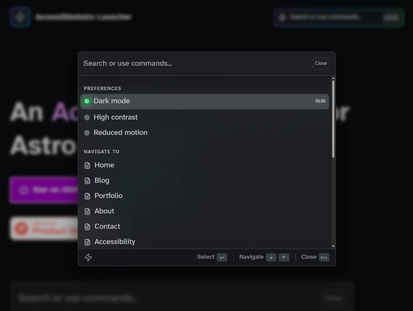
Accessible Astro Launcher is a command palette (CMD+K) component that brings keyboard-driven navigation to Astro applications. It implements the WAI-ARIA combobox pattern with full WCAG 2.2 AA compliance.
The architecture follows the accessible-astro-components ecosystem design. The launcher syncs automatically with DarkMode, HighContrast, and ReducedMotion toggles from that library.
You can install it as a standalone package, then compose the pieces in your Astro layouts. The component supports multiple triggers across your site that all control the same launcher instance.
Features
🎯 WAI-ARIA Combobox Pattern: Implements proper roles (combobox, listbox, option, group) with full attribute support.
⌨️ Keyboard Navigation: Opens with Cmd/Ctrl + K, navigates with arrow keys, selects with Enter, closes with Escape.
🔊 Screen Reader Support: Includes live region announcements, proper labeling, and semantic structure.
🔍 Client-Side Fuzzy Search: Filters results instantly as you type, matches labels and custom keywords.
🔗 Navigation Items: Links to any page with optional custom icons.
🎛️ Action Items: Toggles preferences with LED-style status indicators.
🔄 Preference Sync: Syncs automatically with accessible-astro-components toggles (DarkMode, HighContrast, ReducedMotion)
📍 Multiple Triggers: Places trigger buttons anywhere in your layout
🌓 Dark Mode: Switches themes automatically via light-dark() CSS function
🎨 CSS Custom Properties: Customizes appearance through –launcher-* variables
🌍 i18n Ready: Configures all text labels via props
📦 Zero Dependencies: Runs as pure Astro components
Use Cases
- Global Command Menus: Create a central hub where users navigate to any page in your application using only their keyboard.
- Admin Dashboards: Implement quick actions such as “Log Out,” “Switch Theme,” or “Clear Cache” without cluttering the UI.
- Documentation Search: Allow readers to filter through documentation pages by title or specific keywords.
- Accessibility Controls: Group accessibility toggles (motion, contrast, theme) in one easily accessible modal.
How to Use It
Installation
Install the package using your preferred package manager.
npm install accessible-astro-launcherpnpm add accessible-astro-launcheryarn add accessible-astro-launcherBasic Setup
Import the components in your Astro layout file. The minimum setup requires a LauncherTrigger and a Launcher with at least one LauncherItem inside a LauncherList.
---
import {
  Launcher,
  LauncherTrigger,
  LauncherList,
  LauncherItem,
} from 'accessible-astro-launcher'
---
<LauncherTrigger launcherId="site-launcher" />
<Launcher id="site-launcher">
  <LauncherList>
    <LauncherItem type="navigation" href="/" label="Home" />
    <LauncherItem type="navigation" href="/about" label="About" />
    <LauncherItem type="navigation" href="/contact" label="Contact" />
  </LauncherList>
</Launcher>
The trigger button displays a search icon and placeholder text by default. Users can click it or press Cmd/Ctrl + K from anywhere on the page to open the launcher.
Organizing Items with Groups
Wrap related items in LauncherGroup components to add section headers. This improves scannability and adds proper ARIA grouping.
---
import {
  Launcher,
  LauncherTrigger,
  LauncherList,
  LauncherGroup,
  LauncherItem,
} from 'accessible-astro-launcher'
---
<LauncherTrigger launcherId="site-launcher" />
<Launcher id="site-launcher">
  <LauncherList>
    <LauncherGroup label="Navigation">
      <LauncherItem type="navigation" href="/" label="Home" />
      <LauncherItem type="navigation" href="/about" label="About" />
    </LauncherGroup>
    <LauncherGroup label="Account">
      <LauncherItem type="navigation" href="/settings" label="Settings" />
      <LauncherItem type="navigation" href="/profile" label="Profile" />
    </LauncherGroup>
  </LauncherList>
</Launcher>
Adding Action Items
Action items trigger JavaScript functions instead of navigating to URLs. Set type=”action” and define an onAction identifier. The component dispatches a custom launcher:action event when users select these items.
---
import {
  Launcher,
  LauncherTrigger,
  LauncherList,
  LauncherGroup,
  LauncherItem,
} from 'accessible-astro-launcher'
---
<LauncherTrigger launcherId="site-launcher" />
<Launcher id="site-launcher">
  <LauncherList>
    <LauncherGroup label="Preferences">
      <LauncherItem type="action" onAction="toggle-dark-mode" label="Dark mode" />
      <LauncherItem type="action" onAction="toggle-high-contrast" label="High contrast" />
    </LauncherGroup>
    <LauncherGroup label="Account">
      <LauncherItem type="action" onAction="logout" label="Log out" />
    </LauncherGroup>
  </LauncherList>
</Launcher>
<script>
  document.addEventListener('launcher:action', (event) => {
    if (event.detail.action === 'logout') {
      window.location.href = '/logout'
    }
  })
</script>
Syncing with Accessible Astro Components
When you use DarkMode, HighContrast, or ReducedMotion components from accessible-astro-components, the launcher syncs toggle states automatically. Use the specific onAction identifiers toggle-dark-mode, toggle-high-contrast, or toggle-reduced-motion.
---
import {
  Launcher,
  LauncherTrigger,
  LauncherList,
  LauncherGroup,
  LauncherItem,
} from 'accessible-astro-launcher'
import { DarkMode, HighContrast, ReducedMotion } from 'accessible-astro-components'
---
<header>
  <nav>
    <a href="/">My Site</a>
    <LauncherTrigger launcherId="main-launcher" />
    <DarkMode />
    <HighContrast />
    <ReducedMotion />
  </nav>
</header>
<Launcher id="main-launcher">
  <LauncherList>
    <LauncherGroup label="Preferences">
      <LauncherItem type="action" onAction="toggle-dark-mode" label="Toggle dark mode" />
      <LauncherItem type="action" onAction="toggle-high-contrast" label="Toggle high contrast" />
      <LauncherItem type="action" onAction="toggle-reduced-motion" label="Toggle reduced motion" />
    </LauncherGroup>
  </LauncherList>
</Launcher>
The launcher listens for darkmode:change, highcontrast:change, and reducemotion:change events. When these fire, the LED indicators update automatically. When users open the launcher, it syncs the current states.
Customizing Search Keywords
Add custom keywords to LauncherItem components to improve search results. Users can type these keywords even if they do not appear in the label.
<LauncherItem
  type="navigation"
  href="/about"
  label="About Us"
  keywords={["team", "company", "info"]}
/>
<LauncherItem
  type="navigation"
  href="/blog"
  label="Blog"
  keywords={["articles", "posts", "news"]}
/>
Trigger Button Variants
The LauncherTrigger component accepts props to change its appearance. Use compact to remove the placeholder text, iconOnly to show just the icon, or gradientBorder to add an animated border effect.
<!-- Full trigger with placeholder -->
<LauncherTrigger launcherId="my-launcher" />
<!-- Compact trigger without placeholder -->
<LauncherTrigger launcherId="my-launcher" compact />
<!-- Icon only trigger -->
<LauncherTrigger launcherId="my-launcher" iconOnly />
<!-- With gradient border animation -->
<LauncherTrigger launcherId="my-launcher" gradientBorder />
Customizing Text Labels
Pass a labels object to the Launcher component to override default text. This supports internationalization or custom messaging.
<Launcher
  id="my-launcher"
  labels={{
    placeholder: "Search pages, actions...",
    noResults: "Nothing found. Try a different search.",
    endOfResults: "That's all we found.",
    resultsCount: "{count} matches",
    close: "Close dialog",
    clear: "Clear search",
    toSelect: "to choose",
    toNavigate: "to move",
    toClose: "to exit"
  }}
>
  <LauncherList>
    <!-- items -->
  </LauncherList>
</Launcher>
Adding Custom Icons
Pass SVG content to the icon slot of navigation items to replace the default icon.
<LauncherItem type="navigation" href="/settings" label="Settings">
  <svg slot="icon" viewBox="0 0 24 24" fill="none" stroke="currentColor" stroke-width="2">
    <circle cx="12" cy="12" r="3"></circle>
    <path d="M12 1v6m0 6v6m5.657-13.657L14.121 9.88m-4.242 4.242L6.343 17.657m13.657 0L16.464 14.12m-4.242-4.242L8.686 6.343"></path>
  </svg>
</LauncherItem>
Multiple Triggers
Place multiple LauncherTrigger components anywhere in your layout. All triggers with the same launcherId open the same launcher instance.
---
import { Launcher, LauncherTrigger, LauncherList, LauncherItem } from 'accessible-astro-launcher'
---
<header>
  <nav>
    <a href="/">Logo</a>
    <LauncherTrigger launcherId="global-launcher" compact />
  </nav>
</header>
<main>
  <aside>
    <LauncherTrigger launcherId="global-launcher" />
  </aside>
  <article>
    <!-- content -->
  </article>
</main>
<footer>
  <LauncherTrigger launcherId="global-launcher" iconOnly />
</footer>
<Launcher id="global-launcher">
  <LauncherList>
    <LauncherItem type="navigation" href="/" label="Home" />
  </LauncherList>
</Launcher>
API Reference
Launcher Props
- id (string, required): Unique identifier that matches launcherId on trigger components
- labels (LauncherLabels, optional): Object containing all UI text strings for internationalization
- class (string, optional): Additional CSS classes to apply to the dialog container
LauncherLabels Object
- placeholder (string, default: “Search or use commands…”): Search input placeholder text
- noResults (string, default: “No results found”): Message shown when search returns no matches
- endOfResults (string, default: “End of results”): Message shown at the end of the results list
- resultsCount (string, default: “{count} results”): Template for displaying result count
- close (string, default: “Close”): Label for close button
- clear (string, default: “Clear”): Label for clear search button
- toSelect (string, default: “to select”): Hint text for Enter key
- toNavigate (string, default: “to navigate”): Hint text for arrow keys
- toClose (string, default: “to close”): Hint text for Escape key
LauncherTrigger Props
- launcherId (string, required): ID of the launcher to open
- id (string, optional): Optional ID for the trigger element itself
- placeholder (string, default: “Search or use commands…”): Placeholder text displayed in the trigger
- shortcutKey (string, default: “K”): Keyboard shortcut key to display
- compact (boolean, default: false): Hides placeholder text for a compact appearance
- iconOnly (boolean, default: false): Shows only the icon without any text
- gradientBorder (boolean, default: false): Adds animated gradient border effect
- class (string, optional): Additional CSS classes
LauncherList Props
- class (string, optional): Additional CSS classes for the list container
LauncherGroup Props
- label (string, required): Text for the group heading
- class (string, optional): Additional CSS classes
LauncherItem Props
- type (“navigation” or “action”, required): Defines whether the item links to a URL or triggers an action
- label (string, required): Display text for the item
- href (string, required for navigation items): URL destination for navigation items
- onAction (string, required for action items): Action identifier dispatched in the launcher:action event
- pressed (boolean, default: false): Initial pressed state for action toggle items
- keywords (string[], default: []): Additional search terms that match this item
- typeLabel (string, default: “Go to” for navigation, “Run” for actions): Label for the type indicator badge
- class (string, optional): Additional CSS classes
LauncherItem Slots
- icon: Custom SVG icon for navigation items
Custom Events
- launcher:action: Dispatched when an action item is selected. Event detail contains an action property with the onAction identifier.
- launcher:open: Dispatched when the launcher opens. Useful for syncing preference states.
Keyboard Shortcuts
- Cmd/Ctrl + K: Opens the launcher from anywhere on the page
- Arrow Up/Down: Navigates between items in the results list
- Enter: Selects the currently focused item
- Escape: Closes the launcher and returns focus to the trigger
- Tab: Moves focus between elements in the launcher header
CSS Custom Properties
Theme Colors
--launcher-theme-light (default: #fff): Base color for light theme
--launcher-theme-dark (default: #090b0f): Base color for dark theme
--launcher-text-color: Auto-generated text color based on theme
--launcher-subtle-text-color: Auto-generated subtle text color
--launcher-outer-border-color: Auto-generated outer border color
--launcher-inner-border-color: Auto-generated inner border color
--launcher-main-body-color: Auto-generated main body background
--launcher-action-bar-color: Auto-generated action bar background
--launcher-kbd-color: Auto-generated keyboard shortcut indicator color
--launcher-interaction-color: Auto-generated hover/focus color
--launcher-backdrop-color (default: rgba(0 0 0 / 0.3)): Backdrop overlay color
Dimensions
--launcher-width (default: min(90vw, 650px)): Dialog width
--launcher-height (default: min(60vh, 500px)): Dialog height
--launcher-trigger-width-min (default: 44px): Minimum trigger button width
--launcher-trigger-width-max (default: 350px): Maximum trigger button width
--launcher-trigger-height (default: 40px): Trigger button height
--launcher-trigger-compact-width (default: 95px): Compact trigger width
--launcher-trigger-icon-only-size (default: 44px): Icon-only trigger size
Spacing
--launcher-space-xs (default: clamp(0.25rem, 0.2283rem + 0.1087vw, 0.3125rem)): Extra small spacing
--launcher-space-sm (default: clamp(0.5rem, 0.4783rem + 0.1087vw, 0.5625rem)): Small spacing
--launcher-space-md (default: clamp(0.75rem, 0.7065rem + 0.2174vw, 0.875rem)): Medium spacing
--launcher-space-lg (default: clamp(1rem, 0.9565rem + 0.2174vw, 1.125rem)): Large spacing
--launcher-space-xl (default: clamp(1.5rem, 1.4348rem + 0.3261vw, 1.6875rem)): Extra large spacing
Border Radius
--launcher-radius-sm (default: 0.25rem): Small border radius
--launcher-radius-md (default: 0.5rem): Medium border radius
--launcher-radius-lg (default: 0.75rem): Large border radius
Animation
--launcher-animation-duration (default: 0.2s): Animation timing
--launcher-animation-timing (default: cubic-bezier(0.165, 0.84, 0.44, 1)): Animation easing function
Related Resources
- Astro: Static site generator that builds fast websites with any frontend framework or none at all.
- accessible-astro-components: Collection of accessible components for Astro, including DarkMode, HighContrast, and ReducedMotion toggles that sync with this launcher.
- cmdk: React command palette library that inspired the command palette pattern for this component.
- kbar: React command bar component with fuzzy search and keyboard navigation.
FAQs
Q: How do I change the keyboard shortcut from Cmd/Ctrl + K?
A: The launcher currently uses Cmd/Ctrl + K as a hardcoded shortcut following common command palette conventions. You can hide the shortcut hint in the trigger by customizing the shortcutKey prop, but the actual keyboard listener remains Cmd/Ctrl + K.
Q: How do I add icons from icon libraries like Lucide or Heroicons?
A: Pass the icon SVG to the icon slot of LauncherItem. Most icon libraries export SVG elements you can copy. For example, copy the SVG code from Lucide Icons and paste it inside the LauncherItem tags with slot=”icon” attribute.
Q: Do the preference toggles work without accessible-astro-components?
A: The launcher dispatches launcher:action events for any action item, so you can implement custom handlers. However, the automatic syncing with DarkMode, HighContrast, and ReducedMotion only works if you install and use those components from accessible-astro-components. For custom preference systems, listen for the launcher:action event and call your own toggle functions.