Astro Photo Grid is a single-page, responsive, minimal-looking photo gallery component with lightbox integrated.
It utilizes Astro’s native image optimization features to ensure your photos load quickly, even on slower connections.
Features
📱 Responsive justified grid layout: Built with modern CSS techniques that automatically reflow images without JavaScript positioning logic.
🖼️ Integrated Fancybox lightbox: Full-screen image preview with swipe, drag, pinch-to-zoom, and customizable toolbar functionality.
⚡ Optimized image loading: Uses Astro’s native Image component for automatic optimization and lazy loading beyond the first screen.
🎯 Thumbnail navigation: Click thumbnails at the bottom to navigate between images in lightbox mode.
🚀 Zero JavaScript layout dependency: All positioning and reflow logic handled entirely with CSS for better performance.
🔧 Sitemap integration: Includes automatic sitemap generation for better search engine indexing.
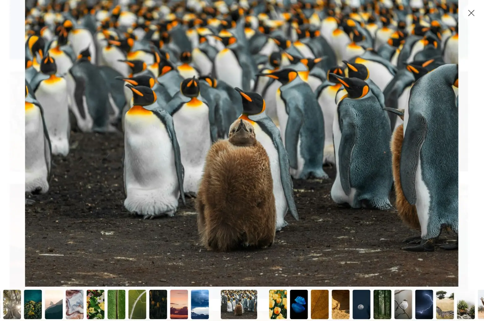
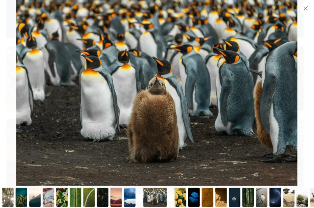
Preview
Use Cases
- Photography portfolio websites: Display your work in a professional grid layout with full-screen viewing capabilities.
- Product gallery pages: Showcase product images for e-commerce sites with zoom and navigation features.
- Event documentation sites: Create galleries for weddings, conferences, or corporate events with mobile-friendly navigation.
- Art and design showcases: Present creative work with a clean, distraction-free interface that puts focus on the images.
- Travel and lifestyle blogs: Add photo galleries to blog posts with automatic optimization for faster loading times.
How to Use It
Follow these steps to integrate Astro Photo Grid into your project.
1. Go to the Astro Photo Grid GitHub repository and select “Use this template” to generate a new repository for your project.
2. Modify the astro.config.mjs file to set your website’s URL. Change the site property from the placeholder to your actual domain.
import sitemap from "@astrojs/sitemap";
import { defineConfig } from "astro/config";
export default defineConfig({
  site: "https://your-domain.com", // Update this line
  devToolbar: {
    enabled: false,
  },
  integrations: [sitemap()],
  prefetch: true,
  vite: {
    ssr: {
      noExternal: ["smartypants"],
    },
  },
});
3. In the src/layouts/BaseLayout.astro file, update the siteName variable to reflect your site’s name. This name is used in the page title.
---
import "~/styles/reset.css";
import "~/styles/base.css";
import smartypants from "smartypants";
const siteName = "Your Site Name"; // Update this line
export interface Props {
  title: string;
  description: string;
  image?: {
    src: string;
    alt: string;
  };
}
const { title, description, image } = Astro.props;
const canonicalURL = new URL(Astro.url.pathname, Astro.site);
const pageTitle = Astro.url.pathname === "/" ? title : `${title} · ${siteName}`;
---
4. Add your images to the src/images directory. You can remove the default demo images and place your own photo files here. The gallery will automatically populate with the images from this folder.
Related Resources
- Astro Image Component: The official documentation for Astro’s built-in image optimization component. https://docs.astro.build/en/guides/images/
- Fancybox: The official website for the lightbox library used in this project, with detailed documentation on customization options. https://fancyapps.com/fancybox/
- SmolCSS: A collection of minimal CSS snippets, including the aspect-ratio gallery that inspired this project’s layout. https://smolcss.dev/#smol-aspect-ratio-gallery
FAQs
Q: Can I customize the lightbox appearance and behavior?
A: Yes, you can modify Fancybox settings in the template files. The lightbox supports custom themes, toolbar configurations, and animation effects through its API.
Q: How does the CSS-only grid layout work without JavaScript?
A: The template uses modern CSS Grid and Flexbox properties to create a justified gallery layout. CSS handles all positioning calculations, which reduces JavaScript dependencies and improves performance.
Q: Will my images be automatically optimized for different devices?
A: Astro’s Image component automatically generates multiple image sizes and formats. The template serves appropriate image sizes based on the user’s device and screen resolution.
Q: Can I add more pages or sections to the gallery?
A: The template provides a single-page gallery by default, but you can extend it using Astro’s routing system to create multiple gallery pages or add additional content sections.
Q: Is the gallery SEO-friendly?
A: Yes, the template includes sitemap generation and proper meta tags. Images can include alt text and structured data for better search engine visibility.