Accessible Astro Components is a UI component library that provides a collection of pre-built components created with web accessibility standards at the forefront.
You can integrate these components into your Astro applications to create UI that supports keyboard navigation, screen readers, and other assistive technologies.
UI Components Included
♿ Accessible by Default: Components follow WCAG guidelines and ARIA best practices.
⚡ Performance: Optimized with Core Web Vitals considered.
🌍 i18n Ready: Supports internationalization needs.
🗣️ Screen Readers: Implements proper ARIA labels and semantic HTML.
🚫 Zero Dependencies: Consists of pure Astro components.
🔒 TypeScript: Provides full type support and documentation.
🎨 Modern CSS: Uses logical properties and current CSS selectors.
📱 Responsive: Features a mobile-first and touch-friendly design.
🌗 Dark Mode: Includes light and dark theme support via light-dark().
⌨️ Keyboard Navigation: Offers full keyboard support with focus management.
🔧 Customizable: Style and adapt components to fit your project’s design.
🚀 Modern: Utilizes current web standards and practices.
Use Cases
- Accessibility Compliance Projects – Implement these components to meet legal accessibility requirements for government, education, or enterprise websites.
- Rapid Development Workflows – Accelerate development by using pre-built, tested components rather than creating accessible UI elements from scratch.
- Design System Foundation – Use as the core of a custom design system that prioritizes accessibility from the start.
- Content-focused Websites – Implement for blogs, documentation sites, or content platforms where readability and navigation are critical.
- Progressive Web Applications – Build inclusive PWAs with components that work across devices and assistive technologies.
Installation
# Using npm
npm install accessible-astro-components
# Using pnpm
pnpm add accessible-astro-components
# Using yarn
yarn add accessible-astro-components
Usage
1. Here is a basic example of how to use a card component:
---
import { Card } from 'accessible-astro-components'
---
<Card
  img="path/to/image.jpg"
  url="/blog/post"
  title="Card Title"
>
  <p>This is the card content that can include any HTML.</p>
</Card>
Import the desired components into your Astro page or component script. Then, use them in your template markup like standard HTML tags, passing data through props as needed. Consult the official documentation for detailed usage instructions for each component.
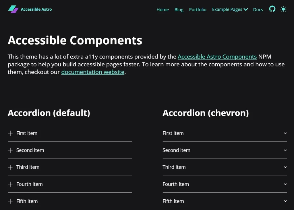
2. Available UI components:
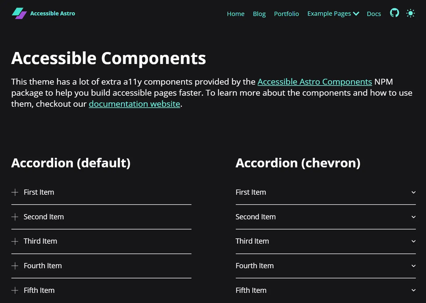
- Accordion (expandable sections)
- Avatar (user representation with images or initials)
- AvatarGroup (displays multiple avatars)
- Badge (versatile label component)
- Breadcrumbs (navigation path indicators)
- Card (content containers)
- DarkMode (theme toggle)
- Media (responsive images)
- Modal (accessible dialogs)
- Notification (alert messages)
- Pagination (page navigation)
- SkipLinks (keyboard navigation aid)
- Tabs (content organization)
- Video (YouTube embeds)
- And more coming soon…
FAQs
Q: Does this work with other frameworks like React or Vue?
A: These components are designed specifically for Astro’s component model. They don’t require client-side JavaScript frameworks.
Q: How often are components updated for new accessibility standards?
A: The library maintains regular updates to align with WCAG 2.2 and emerging best practices.
Q: Can I use my own CSS framework with these components?
A: Yes, components expose CSS variables for styling while maintaining accessibility.
Q: Is there support for right-to-left languages?
A: The components use logical CSS properties that automatically adapt to RTL layouts.
Preview