The Future of Web Dev
The Future of Web Dev
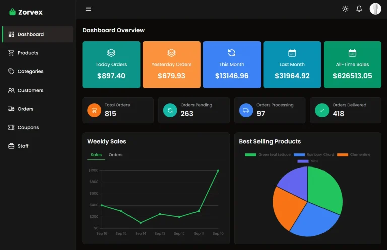
Modern Glassmorphism-style Dashboard Template for Next.js
Modern admin panel template built on Next.js. Includes glassmorphism design system, theme controls, and management components.
Glassmorphism Admin Panel UI is a full-featured admin dashboard template that implements modern glassmorphism design patterns.
The template is built with Next.js/shadcn/ui/TailwindCSS, and includes management interfaces for courses, bootcamps, e-books, enrollments, and team training programs.
You can adjust the glass effect’s opacity, blur, and color palette. These settings persist in the browser’s local storage between sessions.
Features
🎨 Eight Theme Palettes: Pre-configured color schemes including Slate, Peach, Lavender, Lilac, Sage, Blush, Sand, and Sky with automatic dark mode support.
📊 Revenue Analytics Dashboard: Interactive charts built with Recharts that display revenue trends, course performance metrics, and withdrawal request tracking.
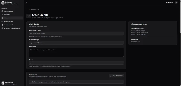
👥 Multi-Role User Management: Admin, instructor, and student role support with search filters, activity tracking, and user statistics.
📚 Course Management Interface: CRUD operations for courses with category filtering, status controls, pricing management, and student enrollment tracking.
🎓 Bootcamp Administration: Duration tracking, participant management, date scheduling, and pricing controls for bootcamp programs.
📖 E-Book Catalog System: Sales tracking, rating management, and category organization for digital book products.
🤝 Affiliate Program Dashboard: Partner management tools with referral tracking and earnings calculation.
🏢 Team Training Module: Corporate training program management with company progress tracking and employee oversight.
📈 Reports and Analytics: Monthly revenue reports with export functionality and user activity visualization.
⚙️ Font Customization: Support for Inter, Poppins, Roboto, Montserrat, and Space Grotesk through Google Fonts.
💾 Settings Persistence: All theme configurations, including glass effects and color choices, save automatically to localStorage.
Use Cases
- SaaS Administration Panels: Build admin interfaces for software platforms that manage users, subscriptions, and analytics.
- Educational Platform Dashboards: Create management tools for online learning platforms that handle courses, enrollments, instructors, and student progress tracking.
- E-Commerce Backend Systems: Develop admin panels for digital product stores that track sales, manage inventory, and monitor affiliate partnerships.
- Corporate Training Portals: Implement internal training management systems that track employee progress, course completion, and company-wide learning initiatives.
How to Use It
1. Clone the repository and install dependencies.
git clone https://github.com/nesdesignco/Glassmorphism-Admin-Panel-UI.git
cd Glassmorphism-Admin-Panel-UI
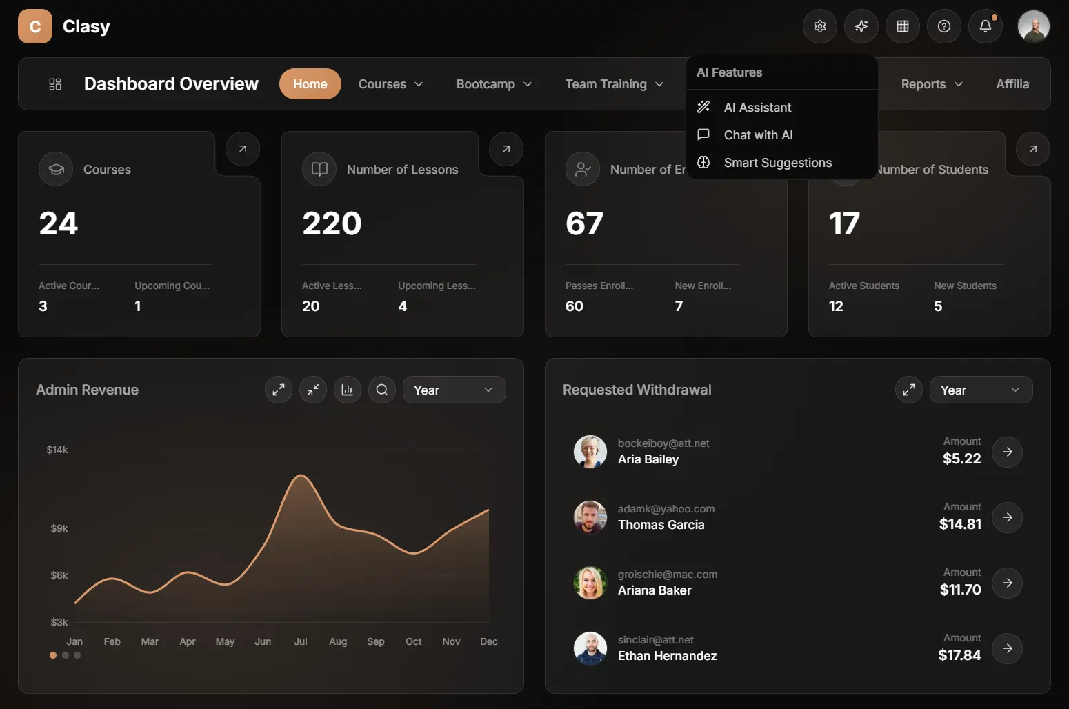
npm install2. Run the development server to view the template locally. The dashboard opens at http://localhost:3000 with the main overview page displaying course statistics, revenue charts, and enrollment data
npm run dev3. The dashboard template uses a ThemeContext to manage visual preferences. You can adjust the glass effect parameters programmatically or through the settings UI. The system applies these variables to the CSS root.
// src/contexts/theme-context.tsx

"use client"

import { createContext, useContext, useEffect, useState, ReactNode } from "react"

export type ThemeColor = "slate" | "orange" | "indigo" | "purple" | "emerald" | "rose" | "amber" | "blue"
export type ThemeFont = "inter" | "poppins" | "roboto" | "montserrat" | "space-grotesk"
export type GlassPreset = "off" | "subtle" | "normal" | "strong" | "custom"

export interface GlassSettings {
  preset: GlassPreset
  opacity: number      // 0 - 0.20
  blur: number         // 0 - 40
  borderOpacity: number // 0 - 0.30
  saturation: number   // 100 - 200
  // Hover add values
  hoverOpacityAdd: number   // 0 - 0.10
  hoverBorderAdd: number    // 0 - 0.15
}

...
4. The components currently use mock data located in src/lib/mock-data.ts. To connect a real backend, replace the mock imports with your API calls.
// src/lib/mock-data.ts

// Stats Data
export const statsData = {
  courses: {
    total: 24,
    active: 3,
    upcoming: 1,
  },
  lessons: {
    total: 220,
    active: 20,
    upcoming: 4,
  },
  enrollments: {
    total: 67,
    passed: 60,
    new: 7,
  },
  students: {
    total: 17,
    active: 12,
    new: 5,
  },
}

// Revenue Data for Chart
export const revenueData = [
  { month: 'Jan', revenue: 4200 },
  { month: 'Feb', revenue: 5800 },
  { month: 'Mar', revenue: 4900 },
  { month: 'Apr', revenue: 6200 },
  { month: 'May', revenue: 5400 },
  { month: 'Jun', revenue: 7800 },
  { month: 'Jul', revenue: 12400 },
  { month: 'Aug', revenue: 9200 },
  { month: 'Sep', revenue: 8600 },
  { month: 'Oct', revenue: 7400 },
  { month: 'Nov', revenue: 8900 },
  { month: 'Dec', revenue: 10200 },
]

...
5. Add new pages by creating route folders under the app directory. The template follows Next.js App Router conventions with server and client components.
6. Update the navigation configuration to include new routes in the sidebar.
// src/lib/navigation.ts

export const navigationTabs = [
  { name: "Home", href: "/" },
  { name: "Courses", href: "/courses", hasDropdown: true },
  { name: "Bootcamp", href: "/bootcamp", hasDropdown: true },
  { name: "Team Training", href: "/team-training", hasDropdown: true },
  { name: "EBook", href: "/ebooks", hasDropdown: true },
  { name: "Enrollments", href: "/enrollments", hasDropdown: true },
  { name: "Reports", href: "/reports", hasDropdown: true },
  { name: "Affiliate", href: "/affiliate" },
]
7. Configure external image domains in next.config.js if you need to load images from additional sources beyond the pre-configured domains.
// next.config.ts

import type { NextConfig } from "next";

const nextConfig: NextConfig = {
  images: {
    remotePatterns: [
      {
        protocol: 'https',
        hostname: 'images.unsplash.com',
      },
      {
        protocol: 'https',
        hostname: 'randomuser.me',
      },
      {
        protocol: 'https',
        hostname: 'i.pravatar.cc',
      },
    ],
  },
};

export default nextConfig;
8. Build the production version when ready to deploy. The template exports static assets and server components for deployment to Vercel, Netlify, or any Node.js hosting platform.
npm run build
npm start
Related Resources
- Next.js: React framework that handles server-side rendering, routing, and static site generation for modern web applications.
- shadcn/ui: Component library that implements Radix UI primitives with Tailwind CSS styling for accessible React components.
- Recharts: Charting library built on React components that renders SVG-based data visualizations.
- Framer Motion: Animation library for React that handles gestures, transitions, and complex animation sequences.
FAQs
Q: Can I modify the glass effect parameters beyond the custom controls?
A: Yes. Edit the CSS variables in the theme context or override the Tailwind configuration to extend the ranges. The template applies glass effects through CSS custom properties that accept any valid CSS values.
Q: How do I connect the template to a backend API?
A: Replace the mock data imports with fetch calls or API client functions. Each page component accepts data as props, so you can pass API responses directly to the existing components.
Q: Does the template support server-side rendering for all pages?
A: Yes. All page components run as React Server Components by default. Client-side interactivity loads only where needed through the use client directive in specific components.
Q: Can I add custom color palettes beyond the eight included themes?
A: Yes. Define new color variables in the global CSS file and add corresponding entries to the theme context.