The Future of Web Dev
The Future of Web Dev
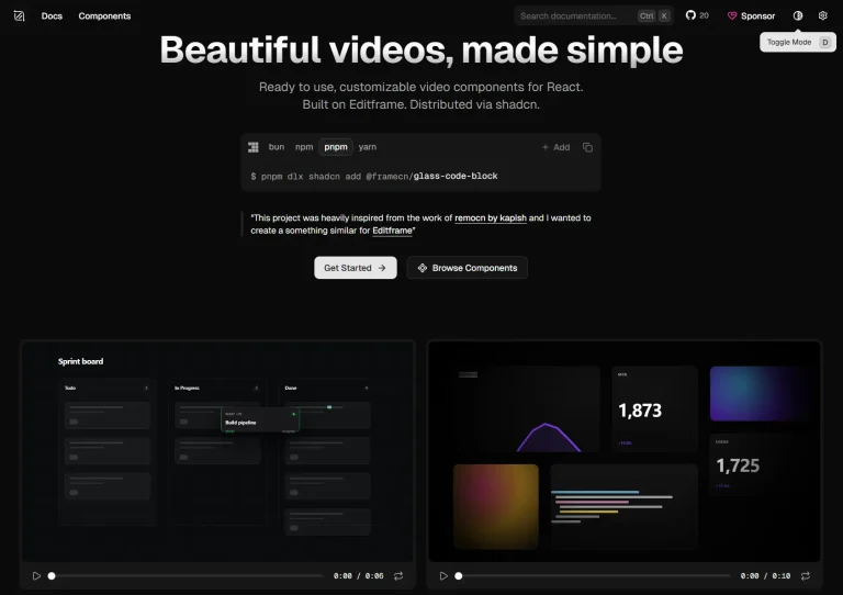
Modern, Customizable UI Components for Next.js – HextaUI
Build stunning Next.js interfaces quickly with HextaUI's copy-paste components. Fully customizable and responsive.

HextaUI is a collection of modern and responsive UI components specifically designed for Next.js applications. It provides you with a range of pre-built elements that can be easily copied, adapted, and customized to fit unique project requirements. This resource aims to accelerate the development process by offering ready-to-use components that are both professional-looking and performant.
HextaUI focuses on providing building blocks for creating contemporary web interfaces. These components are designed to be highly adaptable through the use of props and Tailwind CSS classes. This approach allows for significant flexibility in styling and behavior without requiring deep modifications to the underlying code. Developers can leverage HextaUI to rapidly prototype and build functional user interfaces with a consistent and modern aesthetic.
UI Components Included
- 3D Carousel
- Meteors
- Particles
- Spotlight Card
- Animated Underline
- Blurred Stagger
- Shining Text
- Typewriter Text
- Animated Dock
- Animated Tabs
- Counter
- DraggableList
- Feedback
- Multi-Step Form
- Post Card
- Searchbar
- Chart
- Brand Scroller
- Testimonial Card
- And more…
Features
🎨 Component Customization with Tailwind CSS props and utility classes.
⚡️ Performance-optimized rendering and animations.
🔌 Direct integration with Next.js App Router.
🎭 Animation capabilities through Framer Motion.
🌓 Built-in dark mode support across all components.
📱 Responsive design for all screen sizes.
🛠️ TypeScript support with full type definitions.
🧩 Modular architecture for selective component usage.
Use Cases
- Dashboard Development: Quickly build interactive admin dashboards with charts, data tables, and animated components like draggable lists and counters.
- E-Commerce Websites: Create engaging product pages using testimonial cards, brand scrollers, and search bars to enhance the shopping experience.
- Marketing Campaigns: Develop visually appealing landing pages with shining text, animated underlines, and spotlight cards to capture attention.
- Personal Portfolios: Showcase your work creatively using 3D carousels, typewriter text effects, and post cards.
- Educational Platforms: Use multi-step forms, feedback tools, and animations to make learning platforms more interactive.
Installation
Prerequisites
- Node.js and npm installed on your system.
Create a New Next.js Project
- Run the following command to set up your project:
npx create-next-app@latest- Answer the prompts as shown below:
   Project Name: my-app
   Use TypeScript: Yes
   Use ESLint: No
   Use Tailwind CSS: Yes
   Use src/ directory: Yes
   Use App Router: Yes
Customize default import alias: No - Navigate to your project folder and start the development server:
   cd my-app
   npm run dev
Install ShadCN
- Initialize your project for ShadCN:
npx shadcn@latest init - Follow the prompts to configure your components.json file. For default options, use the
-dflag:
npx shadcn@latest init -d - Add your first component:
npx shadcn@latest add button Usage Examples
Adding a Button Component
Import and use the button component in your application:
import { Button } from "@/components/ui/button";
export default function Home() {
  return (
    <div>
      <Button>Click me</Button>
    </div>
  );
}
Animations with Framer Motion
Integrate Framer Motion for animations:
import { motion } from "motion/react";
export default function Home() {
  return (
    <motion.div initial={{ opacity: 0 }} animate={{ opacity: 1 }}>
      Hello World
    </motion.div>
  );
}
Add Icons with React Icons
Install and use React Icons to enhance your design:
import { FaSearch } from "react-icons/fa";
export default function Home() {
  return (
    <div>
      <FaSearch />
    </div>
  );
}
Related Resources
- Next.js Documentation: The official documentation for the Next.js framework. It provides comprehensive guides and API references. https://nextjs.org/docs
- Tailwind CSS Documentation: The official documentation for Tailwind CSS, a utility-first CSS framework used for styling HextaUI components. https://tailwindcss.com/docs
- ShadCN UI: A collection of accessible and customizable UI primitives for React, often used in Next.js projects. https://ui.shadcn.com/
- Framer Motion Documentation: The documentation for Framer Motion, a powerful library for creating animations and gestures in React. https://www.framer.com/motion/
FAQs
Q: Does HextaUI require Tailwind CSS?
A: Yes, Tailwind CSS is required as the components use Tailwind utility classes for styling.
Q: Can I use HextaUI components with TypeScript?
A: Yes, the library includes TypeScript definitions and supports type checking.
Q: How do I customize component styles?
A: Components accept Tailwind CSS classes through props and can be modified through the source code.
Q: Is HextaUI suitable for production applications?
A: Yes, the components in HextaUI are designed and tested to be production-ready for building real-world applications.
Q: Does HextaUI support dark mode?
A: Yes, HextaUI includes built-in support for dark mode, enhancing the accessibility and user experience of your applications.
Preview