The Future of Web Dev
The Future of Web Dev
Scroll-Driven Animation Library for React and Next.js – Kino
A lightweight scroll‑driven storytelling component library for React & Next.js. Build parallax, reveals, and video scrubbing with declarative components.

react-kino is a scroll-driven animation library for React and Next.js that maps page scroll progress to declarative, component-based animations. It supports server-side rendering by deferring animation logic until the client mounts.
The library provides declarative components for complex scroll effects. You can compose scenes, parallax layers, and reveal animations directly within your React component tree.
Features
🏋️ Sub-1 KB Core Engine: @react-kino/core handles all scroll math in under 1 KB gzipped with zero runtime dependencies.
🧩 Declarative Component API: <Scene>, <Reveal>, <ScrollTransform>, <Parallax>, <Counter>, <Marquee>, <TextReveal>, <VideoScroll>, <HorizontalScroll>, and <CompareSlider> compose as standard React components.
🖥️ SSR-Compatible Rendering: Every component renders its children on the server and defers scroll tracking to useEffect on the client.
♿ Automatic Reduced Motion Handling: All animation components detect prefers-reduced-motion and skip animation.
🎬 Video Scrubbing via Scroll: <VideoScroll> sets currentTime directly from scroll progress to recreate the Apple AirPods-style product video effect.
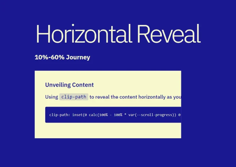
↔️ Horizontal Scroll Panels: <HorizontalScroll> and <Panel> translate vertical scroll movement into horizontal panel transitions.
🔢 Animated Scroll Counters: <Counter> counts from one number to another as scroll advances through a scene, with custom easing and format functions.
✅ Before/After Comparison Slider: <CompareSlider> runs in interactive drag mode or ties the slider position to scroll progress inside a <Scene>.
🖋️ Token-Based Text Reveal: <TextReveal> splits text by word, character, or line and reveals each token as scroll progresses through the defined range.
⚡ Tree-Shakeable Exports: Import only what you use. Unused components get eliminated from the final bundle at build time.
🛠️ CLI Template Scaffolding: @react-kino/cli scaffolds a complete scroll page from one of four templates in a single command.
📦 Pre-Built Page Templates: Product Launch, Case Study, and Portfolio.
🚀 GPU-Accelerated Transforms: Parallax and reveal animations target transform and opacity exclusively. will-change hints apply to animating elements automatically.
📡 Passive Scroll Listeners with RAF Batching: Scroll events register as passive listeners. Updates batch through requestAnimationFrame to avoid layout recalculations.
See It In Action
Use Cases
- Product Launch Pages: Build Apple-style scroll narratives with pinned scenes, video scrubbing, 3D device tilts, and animated stat counters.
- Developer and Design Portfolios: Compose scroll-driven case study layouts with
<HorizontalScroll>,<TextReveal>, and<CompareSlider>to present before/after work samples in a controlled, sequential flow. - SaaS Landing Pages: Reveal feature sections and count up key metrics as users scroll through the page.
- Long-Form Interactive Articles: Synchronize background movement and text animation with reader scroll position using
<TextReveal>and<Parallax>.
How to Use It
Table Of Contents
- Installation
- Setting Up the Root Provider
- Next.js App Router Setup
- Building a Basic Scroll Scene
- Scroll-Driven 3D Transforms
- Parallax Layers
- Animated Stat Counters
- Video Scrubbing
- Before/After Comparison Slider
- Horizontal Scroll Sections
- Text Reveal Animation
- Sticky Header
- Marquee Ticker
- Scaffolding with the CLI
- Pre-Built Page Templates
- shadcn Registry
- Available Hooks
- <Kino>
- <Scene>
- <Reveal>
- <ScrollTransform>
- <Parallax>
- <Counter>
- <CompareSlider>
- <HorizontalScroll>
- <Panel>
- <Progress>
- <VideoScroll>
- <StickyHeader>
- <Marquee>
- <TextReveal>
- Hooks Summary
Installation
Install the react-kino package with npm, pnpm, or bun.
npm install react-kinopnpm add react-kinobun add react-kinoSetting Up the Root Provider
<Kino> initializes the scroll tracking engine. Wrap your app or page layout with it before using any other react-kino components.
import { Kino } from "react-kino";
export default function Layout({ children }) {
  return (
    <Kino>
      {children}
    </Kino>
  );
}
Next.js App Router Setup
react-kino uses scroll events and browser APIs that run on the client. In Next.js App Router, add the "use client" directive to any file that imports react-kino components.
// app/page.tsx
"use client";
import { Kino, Scene, Reveal } from "react-kino";
export default function Page() {
  return (
    <Kino>
      <Scene duration="200vh">
        <Reveal animation="fade-up">
          <h1>Works with App Router</h1>
        </Reveal>
      </Scene>
    </Kino>
  );
}
Building a Basic Scroll Scene
<Scene> pins its content in the viewport and tracks how far the user has scrolled through its duration. Progress runs from 0 at the top of the scene to 1 at the bottom. Place <Reveal> components inside to trigger entrance animations at specific progress values.
import { Kino, Scene, Reveal, Counter } from "react-kino";
function App() {
  return (
    <Kino>
      <Scene duration="300vh">
        {(progress) => (
          <div style={{ height: "100vh", display: "grid", placeItems: "center" }}>
            <Reveal animation="fade-up" at={0}>
              <h1>Welcome</h1>
            </Reveal>
            <Reveal animation="scale" at={0.3}>
              <p>Scroll-driven storytelling, made simple.</p>
            </Reveal>
            <Reveal animation="fade" at={0.6}>
              <Counter from={0} to={10000} format={(n) => `${n.toLocaleString()}+ users`} />
            </Reveal>
          </div>
        )}
      </Scene>
    </Kino>
  );
}
<Scene> exposes a render prop that passes the current progress value. Child components like <Reveal> and <Counter> read progress automatically from context, so the render prop is optional unless you need direct access to the value.
Scroll-Driven 3D Transforms
<ScrollTransform> interpolates CSS transforms between a from state and a to state as scroll advances. It updates every frame and reverses direction on scroll-up. Use it for 3D perspective tilts and continuous transform animations.
import { Kino, Scene, ScrollTransform } from "react-kino";
function DeviceTilt() {
  return (
    <Kino>
      <Scene duration="350vh">
        <ScrollTransform
          from={{ rotateX: 40, rotateY: -12, scale: 0.82, opacity: 0.3 }}
          to={{ rotateX: 0, rotateY: 0, scale: 1, opacity: 1 }}
          perspective={1200}
          span={0.5}
          easing="ease-out-cubic"
          transformOrigin="center bottom"
        >
          <img src="/device.png" alt="Product" style={{ width: "100%", borderRadius: "20px" }} />
        </ScrollTransform>
      </Scene>
    </Kino>
  );
}
The perspective prop enables 3D transforms. Set transformOrigin to control which point the element rotates around.
Parallax Layers
<Parallax> moves its content at a different rate than the page scroll. A speed value below 1 creates a background feel. A value above 1 moves the element faster than normal scroll, creating a foreground effect.
import { Parallax } from "react-kino";
{/* Background image scrolls slowly */}
<Parallax speed={0.3}>
  <img src="/hero-bg.jpg" alt="" style={{ width: "100%", height: "120vh", objectFit: "cover" }} />
</Parallax>
{/* Foreground element moves faster */}
<Parallax speed={1.5}>
  <div className="floating-badge">New</div>
</Parallax>
Animated Stat Counters
<Counter> reads scene progress from context and counts a number between from and to. The at prop sets the progress point at which counting starts. The span prop controls how much of the scene’s progress range the animation covers.
import { Kino, Scene, Reveal, Counter } from "react-kino";
function Stats() {
  return (
    <Kino>
      <Scene duration="250vh">
        <div style={{ display: "flex", gap: "4rem", justifyContent: "center", alignItems: "center", height: "100vh" }}>
          <Reveal animation="fade-up" at={0.1}>
            <div style={{ textAlign: "center" }}>
              <Counter from={0} to={50} at={0.15} span={0.4} className="stat-number" />
              <p>Countries</p>
            </div>
          </Reveal>
          <Reveal animation="fade-up" at={0.2}>
            <div style={{ textAlign: "center" }}>
              <Counter from={0} to={10000000} at={0.25} span={0.4} className="stat-number" />
              <p>Users</p>
            </div>
          </Reveal>
          <Reveal animation="fade-up" at={0.3}>
            <div style={{ textAlign: "center" }}>
              <Counter from={0} to={99.9} at={0.35} span={0.4} format={(n) => `${n.toFixed(1)}%`} />
              <p>Uptime</p>
            </div>
          </Reveal>
        </div>
      </Scene>
    </Kino>
  );
}
Video Scrubbing
<VideoScroll> plays a video by setting currentTime directly from scroll progress. The video never autoplays and stays muted. This pattern matches the product page effect on Apple’s AirPods Pro and iPhone pages.
import { VideoScroll } from "react-kino";
<VideoScroll src="/product.mp4" duration="400vh" poster="/poster.jpg">
  {(progress) => (
    <div style={{ position: "absolute", inset: 0, display: "grid", placeItems: "center" }}>
      <h2 style={{ opacity: progress, color: "#fff", fontSize: "4rem" }}>
        Scroll to reveal
      </h2>
    </div>
  )}
</VideoScroll>
Before/After Comparison Slider
<CompareSlider> clips the after content over the before content. Set scrollDriven to true inside a <Scene> to tie the slider position to scroll progress.
import { Kino, Scene, CompareSlider } from "react-kino";
function BeforeAfter() {
  return (
    <Kino>
      <Scene duration="300vh">
        <div style={{ height: "100vh", display: "grid", placeItems: "center" }}>
          <CompareSlider
            scrollDriven
            before={
              <img src="/old-design.png" alt="Before"
                style={{ width: "100%", height: "100%", objectFit: "cover" }} />
            }
            after={
              <img src="/new-design.png" alt="After"
                style={{ width: "100%", height: "100%", objectFit: "cover" }} />
            }
          />
        </div>
      </Scene>
    </Kino>
  );
}
Horizontal Scroll Sections
<HorizontalScroll> sets the outer spacer height to childCount * 100vh. As the user scrolls through that space, panels translate horizontally across the viewport. Wrap content in <Panel> components inside it.
import { Kino, HorizontalScroll, Panel } from "react-kino";
function FeatureShowcase() {
  const features = [
    { title: "Fast", description: "Sub-1 KB scroll engine", bg: "#0a0a0a" },
    { title: "Declarative", description: "Compose like React components", bg: "#111" },
    { title: "Accessible", description: "Respects prefers-reduced-motion", bg: "#1a1a1a" },
    { title: "Universal", description: "SSR + Next.js App Router ready", bg: "#222" },
  ];
  return (
    <Kino>
      <HorizontalScroll>
        {features.map((f) => (
          <Panel key={f.title}>
            <div style={{ background: f.bg, color: "#fff", height: "100%", display: "grid", placeItems: "center" }}>
              <div style={{ textAlign: "center" }}>
                <h2 style={{ fontSize: "3rem" }}>{f.title}</h2>
                <p style={{ opacity: 0.7 }}>{f.description}</p>
              </div>
            </div>
          </Panel>
        ))}
      </HorizontalScroll>
    </Kino>
  );
}
Text Reveal Animation
<TextReveal> splits its children string into tokens and reveals each one as scroll progresses. The mode prop controls whether to split by word, character, or line.
import { Scene, TextReveal } from "react-kino";
<Scene duration="300vh">
  {(progress) => (
    <TextReveal progress={progress} mode="word" at={0.1} span={0.7}>
      Scroll-driven storytelling components for React. Build cinematic experiences at any scale.
    </TextReveal>
  )}
</Scene>
Sticky Header
<StickyHeader> stays at the top of the viewport and transitions from transparent to solid once the user scrolls past the threshold in pixels.
import { StickyHeader } from "react-kino";
<StickyHeader threshold={40} background="rgba(0, 0, 0, 0.72)" blur>
  <div style={{ maxWidth: 980, margin: "0 auto", height: 48, display: "flex", alignItems: "center", justifyContent: "space-between", padding: "0 24px" }}>
    <span>My Site</span>
    <nav>
      <a href="#features">Features</a>
      <a href="#pricing">Pricing</a>
    </nav>
  </div>
</StickyHeader>
Marquee Ticker
<Marquee> loops its children in an infinite horizontal ticker. Items duplicate automatically to fill the container. The animation pauses on hover if pauseOnHover is set.
import { Marquee } from "react-kino";
<Marquee speed={30} direction="left" pauseOnHover>
  <span>React</span>
  <span>TypeScript</span>
  <span>Next.js</span>
  <span>Tailwind</span>
</Marquee>
Scaffolding with the CLI
Run the CLI to scaffold a complete scroll page from a template. The command prompts for a template type and a project name, then generates the required files.
npx @react-kino/cli initPre-Built Page Templates
Install @react-kino/templates to access three ready-made full-page scroll layouts.
npm install @react-kino/templatesEach template accepts props to customize content without editing the layout code.
import { ProductLaunch } from "@react-kino/templates/product-launch";
<ProductLaunch
  name="Your Product"
  tagline="The tagline that changes everything."
  accentColor="#dc2626"
  stats={[
    { value: 10000, label: "Users", format: (n) => `${n.toLocaleString()}+` },
    { value: 99, label: "Uptime", format: (n) => `${n}%` },
  ]}
  features={[
    { title: "Tiny core", description: "Core engine under 1 KB gzipped.", icon: "⚡" },
    { title: "GPU accelerated", description: "Compositor-only properties.", icon: "🚀" },
  ]}
/>| Template | Import | Description |
|---|---|---|
ProductLaunch | @react-kino/templates/product-launch | Apple-style launch page with hero, stats, and feature panels |
CaseStudy | @react-kino/templates/case-study | Project page with challenge, solution, and results sections |
Portfolio | @react-kino/templates/portfolio | Personal portfolio with bio, projects, and contact |
shadcn Registry
Install individual thin wrapper components directly into your project via the shadcn CLI. Each wrapper re-exports from react-kino. Install the main package alongside it.
npx shadcn add https://react-kino.dev/registry/components/scene.json
npm install react-kino
Available Hooks
useScrollProgress() returns the page-level scroll progress as a number from 0 to 1.
import { useScrollProgress } from "react-kino";
function ScrollPercentage() {
  const progress = useScrollProgress();
  return <div>{Math.round(progress * 100)}%</div>;
}
useSceneProgress(ref, durationPx) returns scene-level progress for a specific element. Use it to build custom scroll components outside the <Scene> component.
import { useRef } from "react";
import { useSceneProgress } from "react-kino";
function CustomScene() {
  const ref = useRef<HTMLDivElement>(null);
  const progress = useSceneProgress(ref, 1500);
  return (
    <div ref={ref} style={{ height: 1500 }}>
      <div style={{ position: "sticky", top: 0 }}>
        Progress: {progress.toFixed(2)}
      </div>
    </div>
  );
}
useSceneContext() reads the progress value from a parent <Scene>. This hook targets custom components that need to react to scene progress. It throws if called outside a <Scene>.
import { useSceneContext } from "react-kino";
function CustomFadeIn() {
  const { progress } = useSceneContext();
  return <div style={{ opacity: progress }}>Fades in as you scroll</div>;
}
useIsClient() returns false on the server and during hydration, then true after mount. Use it to guard browser-only code in SSR environments.
import { useIsClient } from "react-kino";
function SafeComponent() {
  const isClient = useIsClient();
  if (!isClient) return <div>Loading...</div>;
  return <div>Window width: {window.innerWidth}</div>;
}
useKino() returns the root ScrollTracker instance from <Kino>. This hook targets advanced cases where you need direct access to the scroll engine’s subscribe, start, and stop methods. It throws if called outside <Kino>.
import { useKino } from "react-kino";
function AdvancedComponent() {
  const { tracker } = useKino();
  // tracker.subscribe(), tracker.start(), tracker.stop()
}
API Reference
<Kino>
Root provider that starts the scroll tracking engine. Wrap your app or page layout with it.
| Prop | Type | Default | Description |
|---|---|---|---|
children | ReactNode | — | Child elements |
<Scene>
A pinned scroll section. Content stays fixed in the viewport while the user scrolls through the scene’s duration. Children can be static ReactNode or a render function that receives the current progress value.
| Prop | Type | Default | Description |
|---|---|---|---|
duration | string | — | Scroll distance the scene spans. Accepts vh and px units (e.g., "200vh", "1500px") |
pin | boolean | true | Whether to sticky-pin the inner content during scroll |
children | ReactNode | (progress: number) => ReactNode | — | Static content or a render function receiving progress (0–1) |
className | string | — | CSS class for the outer spacer element |
style | CSSProperties | — | Inline styles for the sticky inner container |
<Reveal>
Scroll-triggered entrance animation. Place inside a <Scene> or pass a progress prop directly.
| Prop | Type | Default | Description |
|---|---|---|---|
at | number | 0 | Progress value (0–1) when the animation triggers |
animation | RevealAnimation | "fade" | Animation preset |
duration | number | 600 | Animation duration in milliseconds |
delay | number | 0 | Delay before animation starts in milliseconds |
progress | number | — | Direct progress override. If omitted, reads from parent <Scene> context |
children | ReactNode | — | Content to reveal |
className | string | — | CSS class for the wrapper div |
Animation presets:
| Preset | Effect |
|---|---|
"fade" | Opacity 0 to 1 |
"fade-up" | Fade in with a 40px upward slide |
"fade-down" | Fade in with a 40px downward slide |
"scale" | Fade in with scale from 0.9 to 1 |
"blur" | Fade in with unblur from 12px |
<ScrollTransform>
Continuously interpolates CSS transforms and opacity between two states as the user scrolls. Tracks every frame and reverses on scroll-up.
| Prop | Type | Default | Description |
|---|---|---|---|
from | TransformState | — | Starting transform state |
to | TransformState | — | Ending transform state |
at | number | 0 | Progress value (0–1) when the transform begins |
span | number | 1 | Fraction of the progress range the transform spans |
easing | string | (t: number) => number | "ease-out" | Easing preset name or custom function |
perspective | number | — | CSS perspective in px |
transformOrigin | string | "center center" | CSS transform-origin value |
progress | number | — | Direct progress override. If omitted, reads from parent <Scene> context |
className | string | — | CSS class for the wrapper div |
style | CSSProperties | — | Inline styles merged with the computed transform |
TransformState properties: x, y, z (px), scale, scaleX, scaleY, rotate, rotateX, rotateY (deg), skewX, skewY (deg), opacity (0–1).
<Parallax>
A layer that scrolls at a different speed than the page.
| Prop | Type | Default | Description |
|---|---|---|---|
speed | number | 0.5 | Speed multiplier. 1 = normal scroll, below 1 = slower, above 1 = faster |
direction | "vertical" | "horizontal" | "vertical" | Scroll direction for the parallax offset |
children | ReactNode | — | Content to apply parallax to |
className | string | — | CSS class |
style | CSSProperties | — | Inline styles merged with the transform |
<Counter>
An animated number that counts between two values as the user scrolls. Reads progress from the parent <Scene> context automatically.
| Prop | Type | Default | Description |
|---|---|---|---|
from | number | — | Starting value |
to | number | — | Ending value |
at | number | 0 | Progress value (0–1) when counting begins |
span | number | 0.3 | Fraction of the progress range the count animation spans |
format | (value: number) => string | toLocaleString | Formatting function for the displayed value |
easing | string | (t: number) => number | "ease-out" | Easing preset or custom easing function |
progress | number | — | Direct progress override. If omitted, reads from parent <Scene> context |
className | string | — | CSS class for the <span> element |
<CompareSlider>
A before/after comparison slider with drag and scroll-driven modes.
| Prop | Type | Default | Description |
|---|---|---|---|
before | ReactNode | — | Content on the “before” side |
after | ReactNode | — | Content revealed on the “after” side via clip |
scrollDriven | boolean | false | Ties slider position to scroll progress |
progress | number | — | Progress override (0–1) |
initialPosition | number | 0.5 | Initial slider position (0–1) in drag mode |
className | string | — | CSS class for the container |
<HorizontalScroll>
Converts vertical scroll into horizontal panel movement. Wrap <Panel> components inside it.
| Prop | Type | Default | Description |
|---|---|---|---|
children | ReactNode | — | <Panel> components |
className | string | — | CSS class for the outer spacer |
panelHeight | string | "100vh" | Height of each panel as a CSS string |
<Panel>
| Prop | Type | Default | Description |
|---|---|---|---|
children | ReactNode | — | Panel content |
className | string | — | CSS class |
style | CSSProperties | — | Inline styles merged with the default 100vw × 100vh sizing |
<Progress>
A fixed scroll progress indicator with bar, dots, and ring styles.
| Prop | Type | Default | Description |
|---|---|---|---|
type | "bar" | "dots" | "ring" | "bar" | Visual style of the indicator |
position | "top" | "bottom" | "left" | "right" | "top" | Fixed position on screen |
color | string | "#3b82f6" | Color of the progress fill, active dots, or ring stroke |
trackColor | string | "transparent" | Background or inactive color |
progress | number | — | Progress override. If omitted, reads page scroll progress |
dotCount | number | 5 | Number of dots (only for "dots" type) |
ringSize | number | 48 | Diameter in pixels (only for "ring" type) |
className | string | — | CSS class for the wrapper |
<VideoScroll>
Scrubs through a video as the user scrolls, setting currentTime directly from progress.
| Prop | Type | Default | Description |
|---|---|---|---|
src | string | — | URL of the video file (MP4 recommended) |
duration | string | "300vh" | Scroll distance the video scrubbing spans |
pin | boolean | true | Whether to pin the video during scrubbing |
poster | string | — | Poster image shown before the video loads |
children | ReactNode | (progress: number) => ReactNode | — | Overlay content rendered on top of the video |
className | string | — | CSS class for the outer spacer |
The video is muted and playsInline, and never autoplays. If prefers-reduced-motion is active, the video stays on the poster frame.
<StickyHeader>
A sticky navigation bar that transitions from transparent to solid as the user scrolls past a threshold.
| Prop | Type | Default | Description |
|---|---|---|---|
threshold | number | 80 | Scroll distance in px before the header becomes solid |
background | string | "rgba(0,0,0,0.8)" | Background color when scrolled past threshold |
blur | boolean | true | Applies backdrop blur when scrolled |
children | ReactNode | — | Header content |
className | string | — | CSS class |
style | CSSProperties | — | Inline styles |
<Marquee>
An infinitely scrolling ticker. Items duplicate automatically to create a seamless loop.
| Prop | Type | Default | Description |
|---|---|---|---|
speed | number | 40 | Speed in pixels per second |
direction | "left" | "right" | "left" | Scroll direction |
pauseOnHover | boolean | true | Pauses animation on hover |
gap | number | 32 | Gap between items in px |
children | ReactNode | — | Items to scroll |
className | string | — | CSS class |
<TextReveal>
Word-by-word, character-by-character, or line-by-line text reveal driven by scroll progress.
| Prop | Type | Default | Description |
|---|---|---|---|
children | string | — | The text to reveal |
mode | "word" | "char" | "line" | "word" | How to split the text into tokens |
at | number | 0 | Progress value (0–1) when the reveal starts |
span | number | 0.8 | Fraction of the progress range the full reveal spans |
color | string | currentColor | Color of revealed tokens |
dimColor | string | — | Color of unrevealed tokens (defaults to 15% opacity) |
progress | number | — | Direct progress override. If omitted, reads from parent <Scene> context |
className | string | — | CSS class for the wrapper |
Hooks Summary
| Hook | Returns | Description |
|---|---|---|
useScrollProgress() | number | Page-level scroll progress from 0 to 1 |
useSceneProgress(ref, durationPx) | number | Scene-level progress for a specific element ref |
useSceneContext() | { progress: number } | Progress from the nearest parent <Scene> |
useKino() | { tracker: ScrollTracker } | Root scroll tracker instance from <Kino> |
useIsClient() | boolean | SSR guard: false on server, true after mount |
Related Resources
- Motion: A React animation library that handles gestures, layout animations, and transitions through a declarative API.
- GSAP ScrollTrigger: A GSAP plugin for scroll-driven animations with an imperative timeline API.
- Lenis: A smooth scroll library that normalizes scroll behavior across browsers.
FAQs
Q: Does react-kino work with Next.js App Router?
A: Yes. Add "use client" at the top of any file that imports react-kino components. On the server, components render children with no animation styles applied. Scroll tracking starts after client hydration.
Q: How does react-kino handle users who have reduced motion preferences?
A: Every animation component checks prefers-reduced-motion automatically. <Reveal> renders content in its visible state, <Parallax> disables the offset, <Counter> jumps to the final value, <Marquee> falls back to a static flex layout, and <VideoScroll> stays on the poster frame.
Q: Can I use react-kino components outside of a <Scene> container?
A: Yes. Pass a progress prop directly to any component that normally reads from scene context, such as <Reveal progress={myProgress}>. Use useScrollProgress() to get page-level progress, or useSceneProgress(ref, durationPx) to compute scene progress for a custom element.
Q: Does the scroll engine affect page scroll performance?
A: The engine registers all listeners as passive scroll events and batches updates through requestAnimationFrame. Animations target transform and opacity exclusively. This keeps all animation work on the compositor thread.

