The Future of Web Dev
The Future of Web Dev
Copy-Paste Components with Framer Motion Animations – Sera UI
Build stunning websites with Sera UI's animated components. Includes buttons, forms, carousels and more with Framer Motion animations and Tailwind CSS.
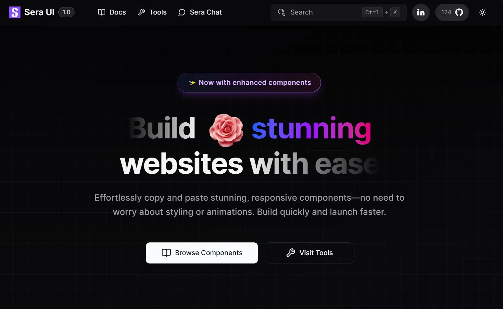
Sera UI is a fresh new component library designed for developers who need beautiful, animated UI components without the complexity of building them from scratch.
The library provides production-ready components and blocks that you can copy and paste directly into your React or Next.js applications.
Each component comes with built-in animations powered by Framer Motion and follows modern design principles.
Features
🎨 Modern design system with clean, contemporary aesthetics.
⚡ High-performance components optimized for React and Next.js.
🔄 Smooth animations powered by Framer Motion.
🧱 Full Tailwind CSS customization support.
📦 CLI installation tool for rapid component integration.
📋 Copy-paste manual installation option.
🧩 Built-in Lucide React icons.
🎯 Accessibility-focused component architecture.
🌈 Built-in theming system for brand customization.
⚙️ Framework compatibility with Next.js, Vite, Laravel, and more.
How to use it
Sera UI supports both CLI and manual installation methods. Before installation, ensure you have a React or Next.js project with Tailwind CSS configured.
CLI Installation
The CLI method automatically handles dependencies and configuration:
# Using npm
npx shadcn@latest add "https://seraui.seraprogrammer.com/registry/button.json"
# Using pnpm
pnpm dlx shadcn@latest add "https://seraui.seraprogrammer.com/registry/button.json"
# Using yarn
yarn dlx shadcn@latest add "https://seraui.seraprogrammer.com/registry/button.json"
# Using bun
bunx shadcn@latest add "https://seraui.seraprogrammer.com/registry/button.json"
Manual Installation
For manual installation, browse the component library, copy the source code, and paste it into your project. You may need to install additional dependencies like Framer Motion and Lucide React manually.
Here’s a basic example of using the Button component:
import Button from "./components/ui/button"
export default function MyComponent() {
  return (
    <div className="flex gap-4">
      <Button variant="default">Primary Action</Button>
      <Button variant="outline">Secondary Action</Button>
      <Button variant="destructive">Delete Item</Button>
      <Button loading>Processing...</Button>
    </div>
  )
}
Customization
The library uses Tailwind CSS classes for styling, so you can customize the appearance by modifying your tailwind.config.js file or applying additional classes directly to components. Each component accepts standard React props along with library-specific variant and size options.
For animated components like Text Reveal or Orbiting Circles, the animations trigger automatically based on scroll position or user interaction. You can customize animation timing and behavior through component props or by modifying the underlying Framer Motion configurations.
Available Components & Blocks
General
- Loaders – A collection of loading spinner animations to indicate processing.
- Patterns Collection – A set of repeatable background patterns for visual texture.
- Color Palette – Pre-defined color schemes to apply to your project.
- Gradient – Tools for creating and applying gradient effects.
- Marquee – A scrolling text or image component for announcements or tickers.
- Code Profile – A component designed to showcase code snippets or developer profiles.
- Portfolio – A layout for creating a personal or project portfolio.
- Orbiting Circles – An animation component where elements move in a circular path.
- Network – A component for visualizing network connections or graphs.
- Video Text – A component to display text overlaid on a video background.
- Image Swiper – A touch-enabled slider for browsing through images.
Buttons
- Button – A standard, versatile button with multiple style variants.
- Retro Button – A button with a vintage or old-school design aesthetic.
- Dropdown – A button that reveals a list of options when clicked.
- Shimmer Button – A button with a shimmering animation effect on hover.
Badge & Toast
- Badge – A small component for displaying status indicators or counts.
- Animated Badge – A badge with added animations for emphasis.
- Toast – A small, non-intrusive notification that appears briefly.
Input
- Search – An input field specifically designed for search functionality.
- Prompt – An input field for user prompts or commands.
- Password – An input field for securely entering passwords, with visibility toggle.
Text Animation
- Fuzzy – A text animation that blurs and sharpens text.
- Flip Words – An animation that flips through a series of words.
- Text Reveal – An effect where text is gradually revealed.
- Decrypting – An animation that simulates text being decrypted.
- Aurora Text – Text with a colorful, aurora-like background effect.
- Sparkles Text – An animation that adds sparkling effects to text.
- Number Ticker – A component that animates counting up to a target number.
Tabs
- Dock Tabs – A tab component that resembles a desktop dock interface.
- Carousel – A rotating carousel for displaying a series of content panels.
- Tabs – A standard tabbed interface for organizing content.
- Fancy Tabs – A stylized tab component with more elaborate design and animations.
- Classic Tabs – A traditional and simple tab implementation.
- Dock – A navigation component that mimics a desktop or mobile dock.
- File Tree – A component for displaying a hierarchical file or folder structure.
- Copy Button – A button that copies specified content to the clipboard.
Accordion
- Accordion – A standard accordion for collapsing and expanding content sections.
- Fancy Accordion – A stylized accordion with enhanced visual effects.
- Gradient Accordion – An accordion that uses gradients in its design.
Form & Cards
- Login – A pre-built form for user login.
- Sign In – A form for user sign-in or registration.
- Waitlist – A form for users to join a waitlist.
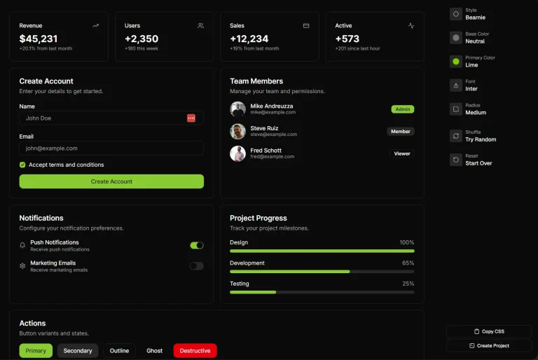
- Card – A basic container for grouping related content.
- Two Step – A component for implementing two-step verification processes.
- Amazon Gift Card – A card component styled to resemble an Amazon gift card.
- Magic Card – A card with interactive and magical animation effects.
- Gradient Card – A card that incorporates gradient colors.
- Spotlight Card – A card that highlights itself with a spotlight effect on hover.
- Multi Select – A form element that allows for selecting multiple options.
- NFT Marketplace – A card layout designed for displaying items in an NFT marketplace.
Grid
- Masonry Grid – A grid layout where items are arranged in a masonry-style collage.
Website Blocks
- Hero – A large, prominent section for the top of a webpage.
- Header – A navigation bar or header for a website.
- Pricing – A section for displaying pricing plans or tiers.
- Testimonial – A component for showcasing user testimonials.
- Footer – A footer section for a website.
- Forgot Password – A form for handling password reset requests.
- Team Member – A component to display profiles of team members.
Related Resources
- Shadcn/ui – The component architecture that Sera UI builds upon.
- Framer Motion – The animation library powering Sera UI’s smooth transitions and interactive effects.
- Tailwind CSS Documentation – Complete styling reference for customizing Sera UI components and creating consistent design systems.
- Lucide React – The icon library integrated with Sera UI components.